What Five Failed Rebrands Reveal About Brand Names and Customer Recognition
From Consignia to WW, these cases show how name changes can confuse customers, weaken recognition and disrupt the systems behind a brand.
Latest stories
From Consignia to WW, these cases show how name changes can confuse customers, weaken recognition and disrupt the systems behind a brand.
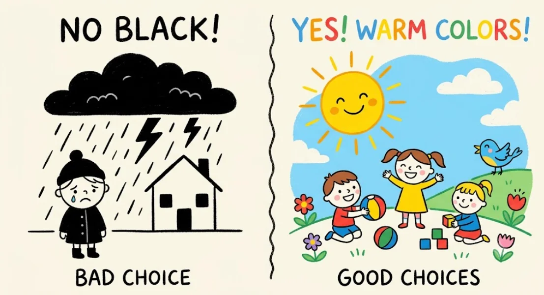
Research cited in the source favors warm, saturated hues for children’s brands. Here’s how to use that finding as a practical design guide.
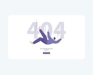
A useful 404 page pairs clear language and brand-aware design with search and links that help visitors recover from a broken path.
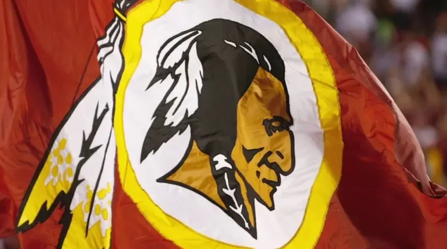
A mascot can build recognition or divide an audience. These cases show how cultural meaning, legal defense and stunt marketing shape its value.
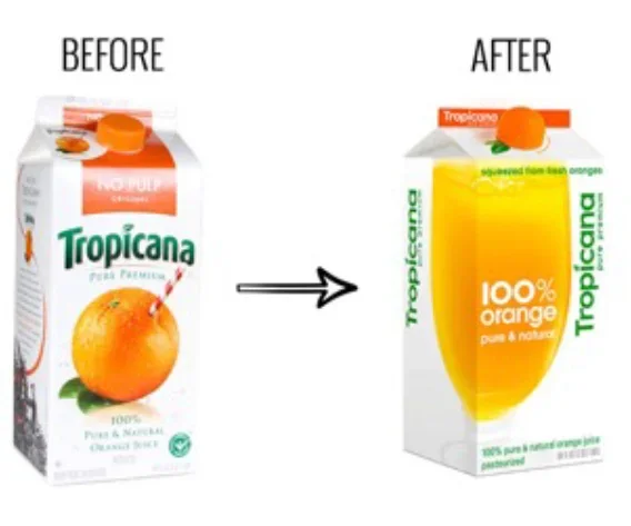
Tropicana’s stripped-back juice carton lost its orange-and-straw cue and cap colours, making familiar products harder to spot and distinguish.
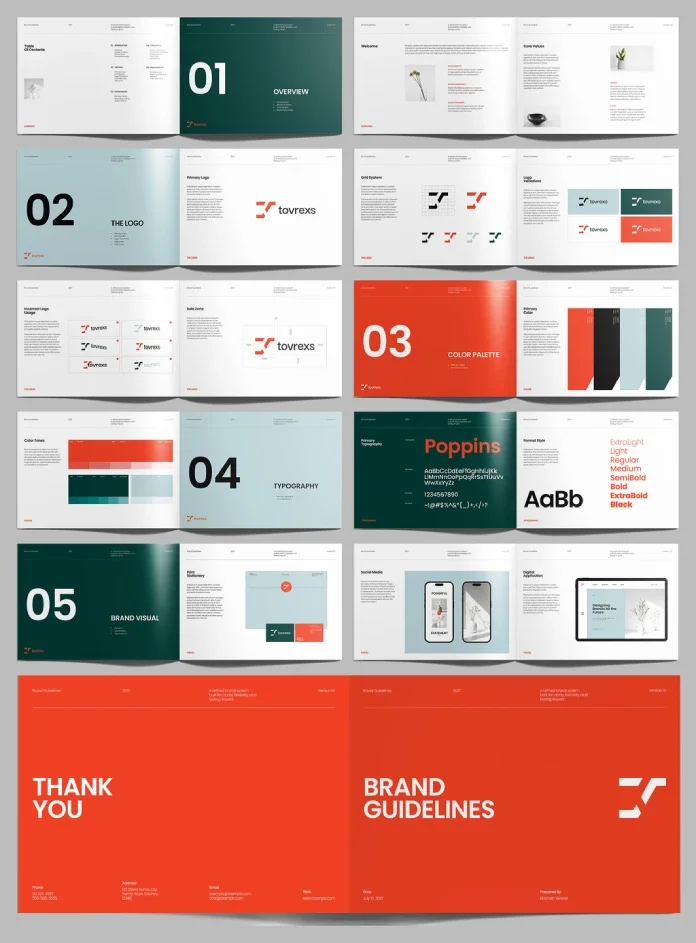
Designcy Studio’s A4 InDesign template pairs oversized section numbers with orange, green and pale blue to make brand rules easier to scan.
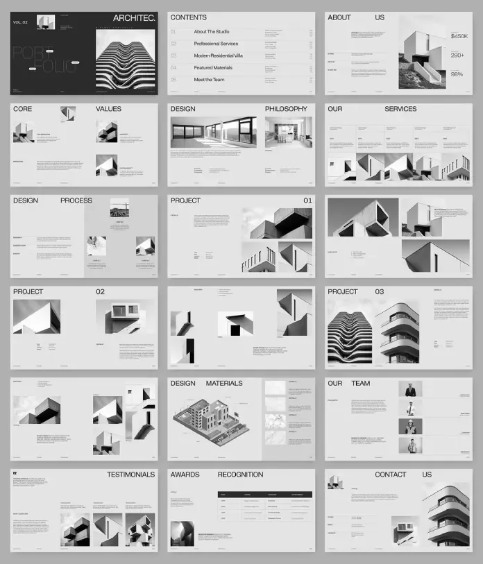
ARCHITEC suits client pitches, while PixWork gives applicants a story-led structure. Compare their layouts, limits and screen-ready formats.
A practical guide to 20 vector sets, with a closer look at editable files, modular shapes, poster styles, textures and infographic workflows.
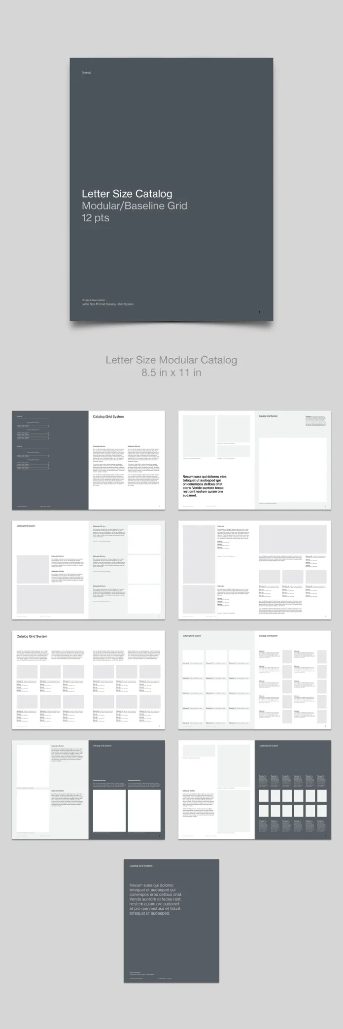
Juan ePrint Shop’s letter size catalog pairs a 12 pt baseline with repeatable product modules. Here’s where the system works—and what to check before printing.
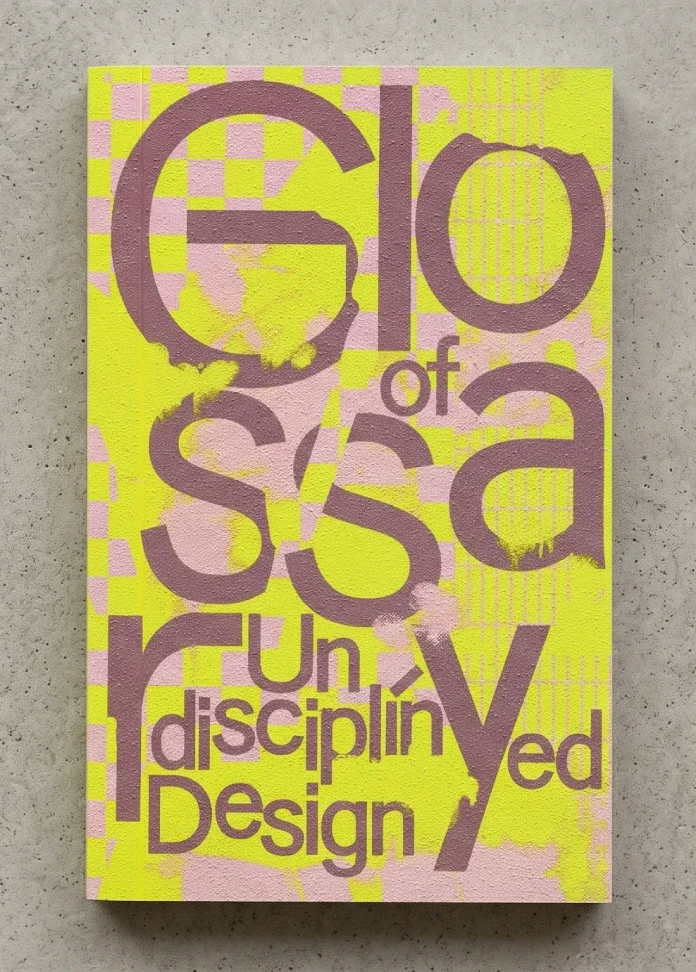
Anja Kaiser and Rebecca Stephany’s 312-page handbook pairs varied voices with an alphabetical structure to challenge design’s inherited rules.
The strongest 2027 design signals show how work was made and how identities adapt, from filmed materials to adjustable glass and variable type.
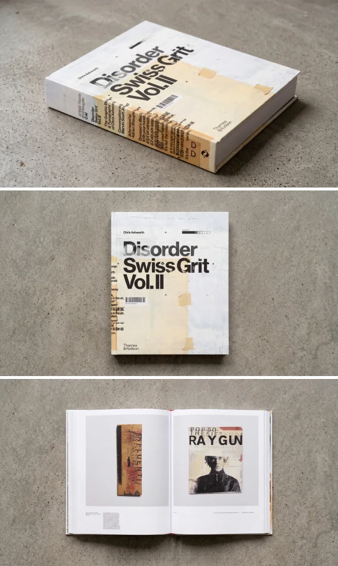
Chris Ashworth’s 488-page monograph pairs Swiss grids with street texture, revealing the proofs, sketches and personal work behind his design.
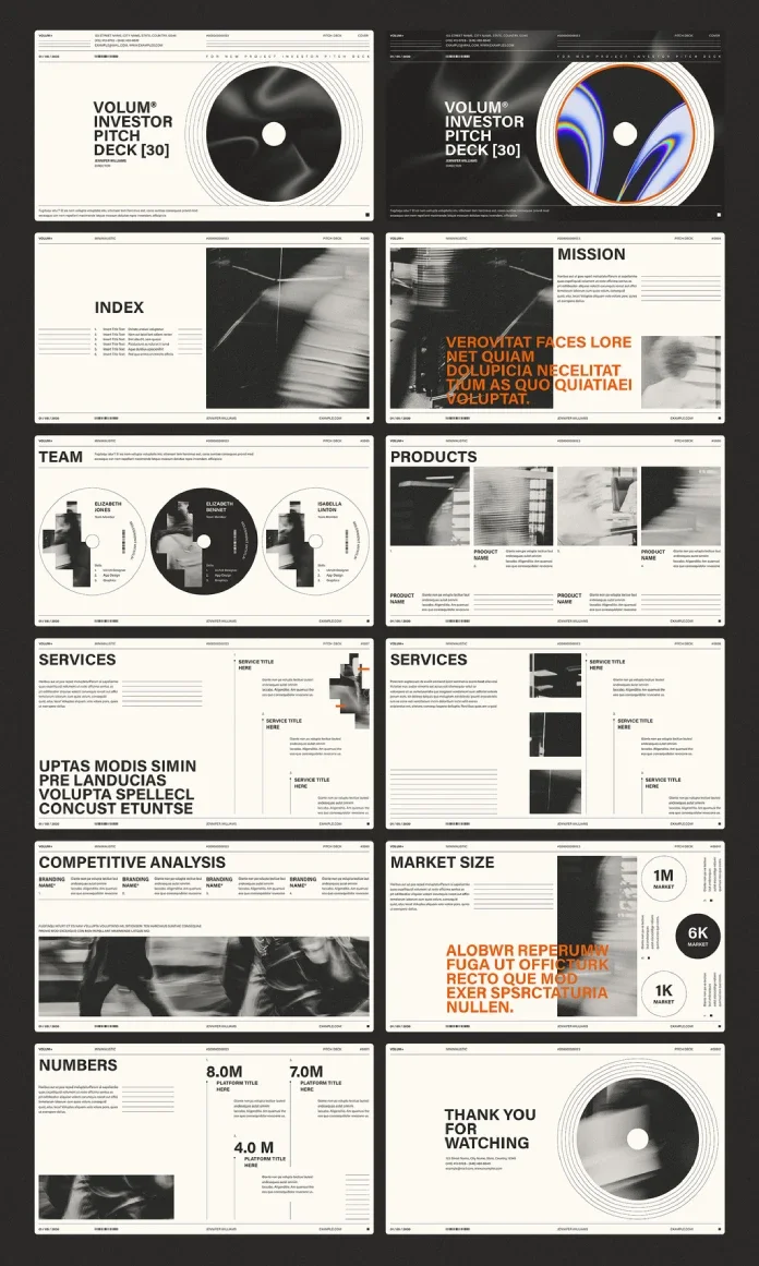
RedGiant’s 16:9 InDesign deck pairs a record-inspired layout with cream, black and orange. Its 12 editable pages need your own images.
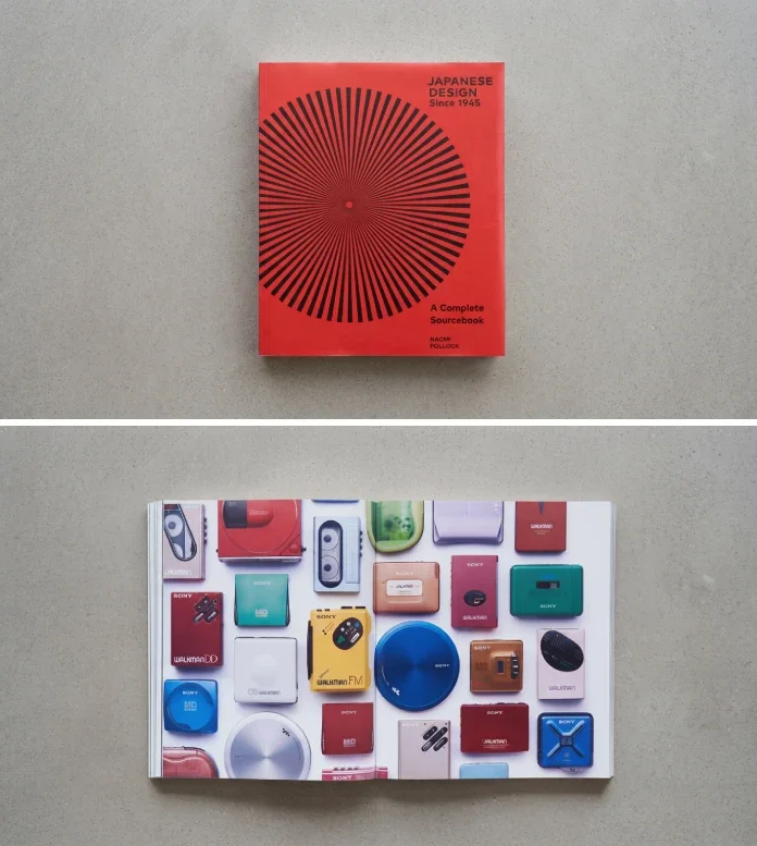
Naomi Pollock’s illustrated sourcebook links Japanese designers, objects and essays from 1945 to 2020. Its weight and fixed-length profiles are trade-offs.
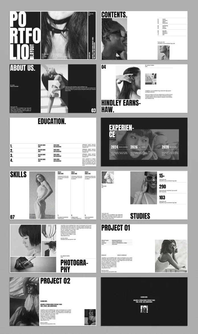
E-Type’s 16-page InDesign deck gives color work a stark frame, with generous image areas and practical fixes needed for type and navigation.
A four-layer color system puts one personal object in charge, balancing vivid accents with quiet space and room-by-room intensity.
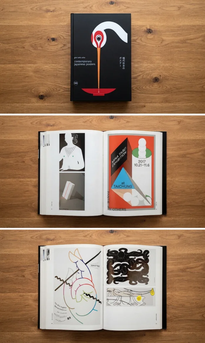
Giancarlo Calza’s Skira survey brings together 756 posters by 85 designers. Its breadth makes it a useful reference, though small reproductions limit close stud...
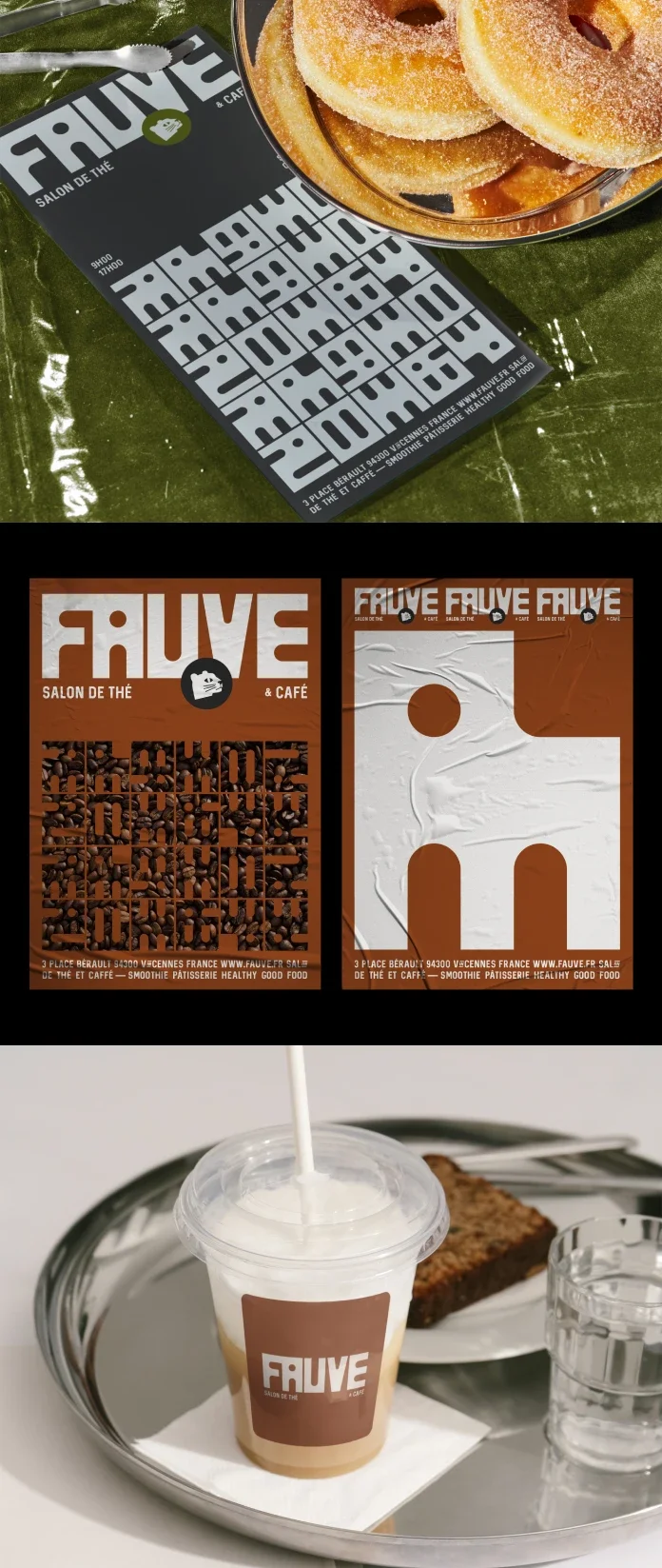
Custom grid lettering, a block with a feline gaze and earthy colors give Fauve a distinct identity for its tea and coffee offer.
Explore 86 hands-on tested InDesign templates across 11 categories, with practical notes on editing, strengths, and potential snags. ===END===
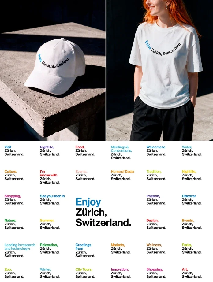
Studio Marcus Kraft extends Zurich Tourism’s established identity with a flexible wordmark, tram-inspired colours and a subtle smile.