Zurich Tourism’s New Brand Adds “Enjoy” to Its 2017 Identity
- Project
- Graphic Design
- Drawn by
- Dirk Petzold
- Issued
- Sheet
- A-21
Studio Marcus Kraft extends Zurich Tourism’s established identity with a flexible wordmark, tram-inspired colours and a subtle smile.
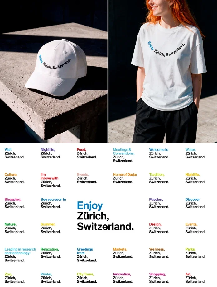
Zurich Tourism’s latest identity update starts with a useful design question: can a brand change its purpose without replacing its visual system? Studio Marcus Kraft’s answer is “Enjoy Zurich, Switzerland.” The new main brand, introduced in October 2026, builds on the organization’s 2017 identity and gives it a more welcoming voice.
The shift reflects a broader role for Zurich Tourism. It now presents the city as a place to visit, live and do business, with residents, leisure travelers and business travelers all part of the audience. The design response is deliberately compact: add a call to action, keep the established name, and let the existing identity carry more kinds of stories.
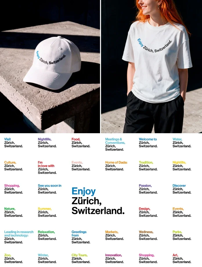
A new role for an established identity
Studio Marcus Kraft has worked with Zurich Tourism since the 2017 launch of its corporate identity. For the latest change, the studio provided consultancy and design while the organization moved from a traditional tourism body toward a destination brand. Its new name for the public-facing identity, “Enjoy Zurich, Switzerland.”, pairs an invitation with the established place name.
Janine Rupf, Head of Marketing at Zurich Tourism, described the existing design system as a fortunate foundation: the new content direction could fit within a proven identity, so a major redesign wasn’t needed. That decision makes the project relevant to teams managing long-running brands. A shift in strategy doesn’t always call for a new logo; sometimes the more useful task is finding out what the current system can already express.
The test is whether the identity can stretch to address new audiences and services while still feeling recognizably connected to the place. Here, the logo, typeface and colours remain in use as the organization broadens its remit. The wordmark adds a verbal cue, while the underlying design provides continuity.
A wordmark that can tell different stories
The existing “Zurich, Switzerland.” wordmark system was designed to work with changing content. That flexibility gives the destination brand a shared frame for different subjects and contexts. Instead of functioning only as a fixed signature, the name can take part in the communication.
“Enjoy” changes the tone in a small but direct way. It’s an active invitation, and it makes the identity feel more open without obscuring the location. The move also sets up an editorial principle for the system: keep the city name stable, then use surrounding language and content to show different sides of Zurich.
For designers, the practical question is how much variation a wordmark can handle before it stops feeling coherent. Flexible identities need boundaries as well as room to adapt. Zurich’s update points to a modest approach: preserve familiar core elements and use the new phrase to signal the changed role.
Helvetica, tram colours and a restrained smile
Typography anchors the system in Zurich’s design history. The identity uses a custom typeface based on the original Helvetica, designed by Max Miedinger in Zurich in 1956/57. That connection gives the type choice a specific local reference. The familiar starting point is adapted into a face tied to the city’s own story.
The colour palette also comes from everyday surroundings: Zurich’s tram lines. For residents, those colours are part of daily travel; for visitors, they offer a visual reference to the city. This is a practical way to make a palette feel grounded in place, rather than selecting colours that could belong to any destination.
The most playful detail is a minimalist smiley built into the wordmark’s line. The text curves slightly upward at both ends, creating a quiet expression that also appears on merchandise. The gesture is small enough to sit alongside the disciplined typography. Its restraint matters: the smile gives the identity a human note without turning the full system into a joke.
Designing for residents and visitors together
Zurich Tourism describes its role as destination marketing and brand profiling for the city and region. Its audience includes leisure and business travelers, while the visitor economy brings residents into the picture too. The underlying idea is that a place people enjoy living in can also offer a stronger experience to those arriving for a visit.
A visible example is the Visitor Information Center at Zurich Main Station. Its previous name, Tourist Information, addressed tourists directly. The new name broadens the invitation to include local residents as well as visitors. That change affects how the service presents itself: the place is no longer framed as a resource only for people passing through.
For designers, serving both groups means considering how the same sign, service or digital touchpoint reads to a local and a first-time visitor. The identity has to make room for different needs while keeping the experience connected. Naming is part of that design work, as it sets expectations before someone reaches the counter or opens a page.
A long collaboration across formats
Studio Marcus Kraft’s work with Zurich Tourism extends beyond the destination brand. In 2025, the studio rebranded the Zurich Card, adapting the existing identity to the organization’s core visitor offering. The studio also developed the corporate identity for Zürich Experience, an urban tourism conference held at The Circle at Zurich Airport. The conference has taken place annually since 2024 and brings together stakeholders exploring the future of urban tourism.
These projects show how a visual system can travel across different services and settings. The Zurich Card has a distinct function from the destination brand, while the conference identity speaks to a professional gathering. The challenge is to give each touchpoint enough character for its purpose without losing the connection to Zurich Tourism’s wider identity.
That kind of consistency comes from continued development over time. The studio has advised on brand development and designed applications across formats since the 2017 identity launch. The latest update adds a new role and a friendlier voice to that body of work, while the related projects demonstrate how the identity has been applied to specific offerings.
What designers can take from the update
Start by examining the existing system before proposing a replacement. Identify which elements still carry meaning, and where the new strategy asks them to work harder. Then look for details that can connect the identity to its location: Zurich’s type history and tram colours offer tangible references, while the rising curve gives the wordmark a distinct tone.
The update’s clearest lesson is that a brand’s voice can change through focused adjustments. A new phrase, a carefully drawn typeface and a small expressive gesture can support a wider organizational shift when the existing system has room to grow. For Zurich Tourism, the next test is how consistently that invitation works across the city’s services, visitor information and brand applications.
| Rev | Description | Date |
|---|---|---|
| A | Issued for reading | |
| B | Viewed 401 times | Current |


