Palantis Gives Vincennes Tea Room Fauve a Grid-Built Wordmark and Hidden Cat Mark
- Project
- Graphic Design
- Drawn by
- Dirk Petzold
- Issued
- Sheet
- A-23
Custom grid lettering, a block with a feline gaze and earthy colors give Fauve a distinct identity for its tea and coffee offer.
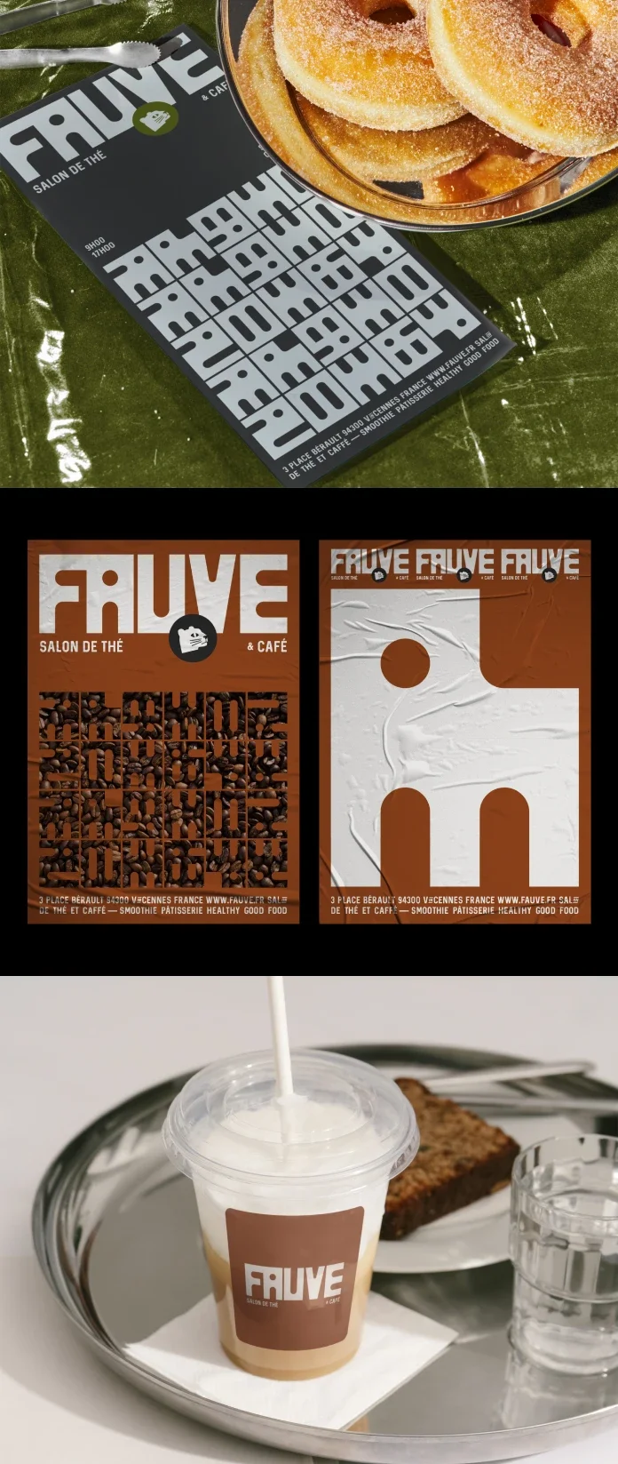
Fauve’s identity starts with a visual decision that’s easy to read from a distance: build the brand around a heavy graphic block, then let a feline gaze emerge from its empty space. Palantis, a branding studio based in Nantes, designed the system for a new tea room and coffee shop in Vincennes, just east of Paris. The founders wanted an identity that stepped away from familiar fast-casual dining cues.
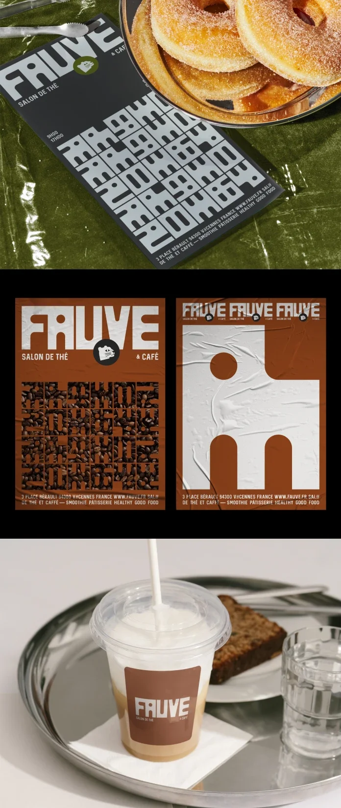
A tea room with a more structural identity
Many café identities rely on a familiar mix of script lettering, kraft paper and gentle illustration. Fauve takes another route. Its system depends on geometry and visual weight: custom lettering drawn from a modular grid, a compact block symbol, and a palette of deep brown, taupe and olive green.
That combination gives the brand a firmer character than the soft, decorative language often associated with tea rooms. The earthy colors relate to tea leaves and roasted coffee beans, while the block gives them a strong graphic frame. The result looks designed to hold its own across a sign, menu or other brand applications, though the source doesn’t specify those individual uses.
The name helps connect the parts. In French, “fauve” can mean a wild beast or big cat. It also calls to mind Fauvism, the early twentieth-century art movement whose painters were nicknamed “les fauves.” Palantis turns that association into a feline mark without drawing a literal cat.
Lettering built from a modular grid
The wordmark is custom drawn, with each letter shaped according to a modular grid. A shared set of units gives the alphabet a consistent rhythm and establishes rules for stroke widths, corners and proportions. Those limits reduce the number of available shapes, but they also help the lettering feel like a system rather than a collection of unrelated forms.
For a new venue without a long visual history, custom lettering can give the identity a recognizable signature. A licensed typeface is available to other businesses; a bespoke wordmark gives Fauve a distinct set of letterforms. The grid also offers a basis for extending the alphabet while keeping later additions consistent with the original design.
There’s a useful historical comparison in Wim Crouwel’s New Alphabet from 1967, which pushed grid-based letter construction much further. Fauve applies a related design logic to a wordmark that still needs to work in an everyday setting. Its letters have to communicate the name clearly, including at a glance from across the street.
A feline gaze hidden in a solid block
The symbol’s visual sequence is simple: first, a large, raw block; then, on closer inspection, the negative space that forms a feline gaze. This approach gives the mark a small moment of discovery. It also avoids the predictable move of illustrating the animal named by the brand.
Here, the empty space does the descriptive work. Because the surrounding shape remains bold and uncomplicated, the mark can read as a distinctive mass before the viewer notices the cat. A solid form with a carefully placed cut-out is also less dependent on fine lines or surface detail than a more literal illustration.
The source compares the hidden shape to the arrow in the FedEx identity, drawn by Lindon Leader in 1994. Both marks use subtraction to reward a closer look, though Fauve’s central effect is the feline gaze inside a graphic block. That solution answers the founders’ request for an identity with an enduring quality, while keeping the symbol tied to the name.
Earth tones give the system its atmosphere
Deep brown, taupe and olive green keep the palette close to the colors of tea leaves and roasted beans. The choice also distinguishes Fauve from the pastels and pure black often seen in specialty cafés. These colors give the identity a quieter register, while the weight of the symbol prevents the palette from feeling visually weak.
Earth tones can carry their own design challenge: brown may feel heavy, and taupe may lack contrast or energy. The block helps counter that risk by giving the colors a clear structure. The source doesn’t list color values or describe how the palette is distributed across different materials, so those practical details remain open.
Can the identity become a neighborhood landmark?
Palantis describes the identity as a way to establish Fauve as a new local destination. A logo can help make a venue recognizable, but it can’t create the experience inside. The symbol gives the business a memorable starting point; the room and the people who use it will determine whether that recognition grows into a wider reputation.
For designers, Fauve’s most applicable idea is the way its elements support one another. The name suggests the animal, the negative space reveals it, and the modular lettering gives the wordmark a related sense of order. The earth tones connect the identity to the drinks without relying on a generic café script. Together, those decisions give the venue a visual language that can be recognized before the details are read.
Fauve’s identity was designed by Palantis for a tea room and coffee shop in Vincennes. The source does not give a launch date, name individual designers, or specify typeface files, production materials or color codes. What it does show is a clear design position: a grid-built wordmark and a shape-led symbol can give a new café its own character, provided the system stays legible wherever customers encounter it.
Explore more in the Graphic Design and Branding categories.
Read the original Fauve identity feature or visit WE AND THE COLOR.
| Rev | Description | Date |
|---|---|---|
| A | Issued for reading | |
| B | Viewed 850 times | Current |


