Dopamine Decor Uses a 40/30/20/10 Color Stack to Give Rooms Focus
- Project
- Graphic Design
- Drawn by
- Dirk Petzold
- Issued
- Sheet
- A-25
A four-layer color system puts one personal object in charge, balancing vivid accents with quiet space and room-by-room intensity.
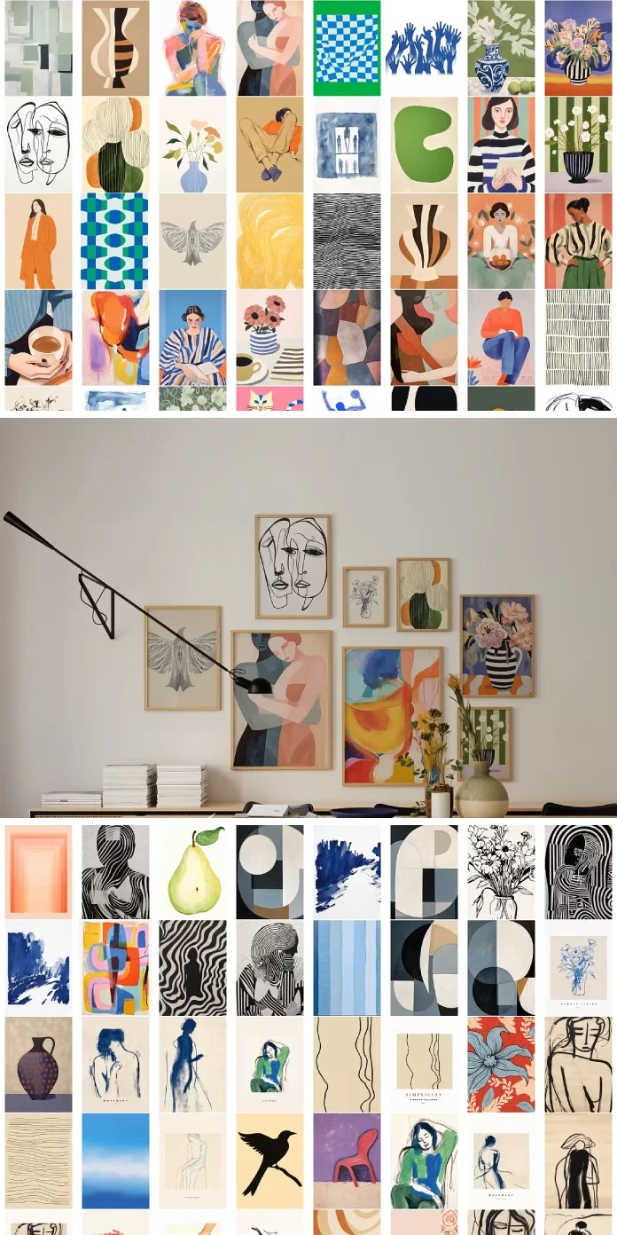
Dopamine decor works best when one object sets the direction for the room. The method starts with personal meaning, then builds a supporting palette around it. Without that hierarchy, a pile of bright accessories can read as clutter instead of lifting the mood.
The approach has kept spreading even as paint trends have swung toward restraint. Pantone named Cloud Dancer, a warm white, its color of the year for 2026; Benjamin Moore selected espresso brown and Sherwin-Williams chose khaki. Those quieter backdrops can give saturated objects more presence. The useful design question isn’t whether a room should be calm or colorful, but how the two can work together.
Mood comes before matching
Dopamine decor chooses colors and objects for the feeling they bring to a room. Coordinating every finish comes second. The name echoes dopamine dressing, the fashion idea that bright clothes can lift someone’s mood. The interior version spread on TikTok, where #dopamineroom gathered millions of views. By 2026, large retailers were also selling curated edits around the term.
It’s a different idea from maximalism, which describes how much a room contains. Dopamine decor asks why each piece belongs. A crowded interior can still feel flat, while a spare room can follow the method if one chosen object makes its owner happy every morning.
The name makes a stronger claim about brain chemistry than the evidence supports. Dopamine is associated with wanting and anticipation, but there’s no paint color known to trigger its release, and the source reports no study measuring a response to colored walls. Research connecting color and mood is mixed and shaped by personal associations. That uncertainty makes individual preference central to the method: there’s no universal chart that can choose a meaningful color for someone.
Build the room with the Joy Stack
The Joy Stack gives the palette a clear order: Field takes about 40 percent of the room’s visual weight, Rest 30 percent, Pulse 20 percent and Anchor 10 percent. These are estimates to judge by eye, not measurements to calculate. The proportions help a room hold vivid color without asking every surface to compete.
Field: one dominant color
Field is the largest area of color, often the walls, though a sofa or floor-to-ceiling curtains can take the lead. Choose one hue and let it carry that visual weight. Cobalt (#0047AB) and tangerine (#F28500) are examples; spreading several unrelated hues across the biggest surfaces can make the room feel like a toy aisle.
With saturated yellow or orange paint, preparation matters. Use a gray-tinted primer, then plan for three coats. Eggshell is a practical finish: flat paint marks easily, while gloss shows wall flaws. For a 12-by-14-foot room with eight-foot ceilings, the source estimates about two gallons for two coats.
Rest: space for the eye
Rest is the quieter layer, where the eye can pause. Warm white is the suggested choice. Cloud Dancer (#F0EEE9) is one option; close alternatives include Benjamin Moore Simply White OC-117 and Sherwin-Williams Alabaster SW 7008. Oak and linen can play this role too.
A calm layer makes the brighter parts easier to read. That’s why Cloud Dancer can sit alongside saturated color rather than cancel it out: the white gives a bold object room to register. In a room where every surface is loud, there’s nowhere for the eye to settle.
Pulse: repeat color and vary pattern scale
Pulse includes secondary colors and patterns in cushions, vases, lampshades and rugs. The Rule of Echo says each strong color should appear at least twice and at different heights. A cobalt vase on a shelf, for instance, can connect to a cobalt stripe near the floor.
Patterns need a similar rhythm. Pair one large-scale pattern with one small-scale pattern. If a third enters the mix, give it a middle scale. Two patterns that compete at the same size can make the composition feel accidental.
Anchor: the object with a story
Anchor is the personal object that leads the design. It might be a lacquered 1970s armchair or a shelf displaying ceramic faces. Choose it first and draw the Field color from it. Starting with a preselected wall color can leave the room looking like a catalog rather than a reflection of its owner.
Objects with a story often hold attention longer than newly bought accents. A secondhand Murano glass lamp carries the memory of where it came from and who sold it. A useful test: imagine moving with only what you can carry in your arms. If an object makes the cut, it may be your Anchor. If several do, choose the one you feel most strongly about.
Set the intensity to suit the room
The article’s Volume Dial runs from one, a whisper, to five, a shout. Treat it as a starting point: small rooms can handle stronger color, while rooms used for longer stretches may benefit from a gentler setting.
- Entry hall and bathroom: Volume 5.
- Kitchen and living room: Volume 4.
- Home office: Volume 3, with bright accents instead of a saturated wall behind the monitor.
- Bedroom: Volume 2, especially for light sleepers.
In a bedroom, put Pulse on bedding that’s easy to change. Keep the wall behind the bed deep and low in chroma, such as bottle green or plum, and avoid lemon or tangerine there. Warm 2700K bulbs support the softer evening mood the room calls for.
Adapt the palette for rentals and autumn light
Renters can establish a strong Field without painting. Start with the largest textile that can move with you: a 5-by-8-foot rug can define the palette quickly. Removable wallpaper can cover one wall; test a hidden area first, since results depend on the painted surface. Then consider changing curtains, lampshades and bulbs.
For color that reads clearly, choose 2700K LEDs with a CRI of 90 or higher. The source notes that cooler 4000K bulbs can flatten warm hues and make chartreuse harsh. In autumn, deeper shades such as burnt orange (#CC5500) and plum can replace spring’s lemon and hot pink. One small accent of chartreuse (#DFFF00), perhaps a chartreuse lamp, adds contrast without multiplying lime accessories. Bottle green and cobalt also hold up in lower autumn light.
Buy for meaning, not a short-lived spike
The method’s main risk is mistaking novelty for lasting pleasure. A neon cushion may feel exciting at first, then fade into the background within weeks as the eye adapts. Repeating that purchase cycle can fill a room with objects that no longer feel special.
Fewer, more personal pieces make a stronger Anchor. Try flea markets or look through what you already own before buying a coordinated set of accessories. A collection of eight neon pieces may deliver a consistent look, but it can also leave no single object in charge. The design test is whether the pieces still mean something after their color stops being new.
What may change next
The source’s 2027 predictions are forecasts, not established outcomes: single-hue rooms may become more common because they’re easier to compose; warm white may remain a default Rest layer; personal collections may take the place of ready-made kits; and the phrase “dopamine decor” may break into narrower labels. The Joy Stack’s logic could remain useful even if the name changes.
For a quick start, choose the object you care about most. Let its color guide one dominant surface, keep a warm neutral area for visual rest, and repeat accents at different heights. That sequence turns a mood-led room into a design with structure—and gives each new object a reason to be there.
Dopamine decor at a glance
| Layer | Share | Design rule | Example |
|---|---|---|---|
| Field | 40% | Choose one dominant hue | Tangerine #F28500 walls |
| Rest | 30% | Give the eye a quiet place | Cloud Dancer #F0EEE9 |
| Pulse | 20% | Echo strong colors twice at different heights | Cobalt vase and rug stripe |
| Anchor | 10% | Choose the personal object first | A lacquered 1970s armchair |
More interior design projects are collected in the Interior Design category.
| Rev | Description | Date |
|---|---|---|
| A | Issued for reading | |
| B | Viewed 744 times | Current |


