Disorder: Swiss Grit Vol. II Shows Chris Ashworth’s Handmade Design Process
- Project
- Graphic Design
- Drawn by
- Dirk Petzold
- Issued
- Sheet
- A-29
Chris Ashworth’s 488-page monograph pairs Swiss grids with street texture, revealing the proofs, sketches and personal work behind his design.
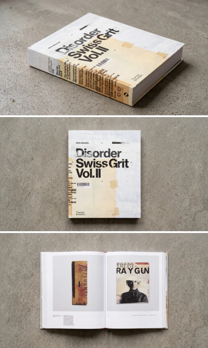
Chris Ashworth’s Disorder: Swiss Grit Vol. II makes its case through the evidence left on the page: pencil marks on flatplans, notes on proofs, discarded layouts and the textures of printed work. The 488-page book follows the designer’s work from 1997 to 2024, showing how a disciplined grid can hold the rough edges of street typography and chance. Its most useful idea is also its simplest: the finished spread matters, but so does the trail of decisions that got it there.
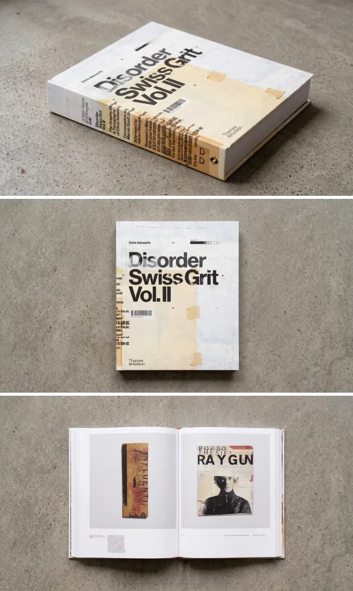
Thames & Hudson published the book on March 18, 2025, after a first UK edition from its Unit Editions imprint in 2024. It includes work from Ray Gun, other commissions and Ashworth’s personal projects, alongside his first-person captions. The book’s AI-free framing has attracted attention, but the archive makes a more tangible argument for hands-on design: it lets readers see the revisions and judgments that a polished final image can conceal.
A grid with room for wear
“Swiss Grit” is Ashworth’s name for a method that joins Swiss modernist structure with the visual residue of street culture. He studied the Swiss International Style at York College of Arts & Technology from 1988 to 1990, drawn particularly to Josef Müller-Brockmann, Armin Hofmann and Emil Ruder. His thesis focused on Ruder, and he still keeps a copy in his archive.
The second influence comes from the street: signage, peeling posters and type altered by weather and use. Ashworth treats those marks as more than decoration. They bring unpredictability and a personal quality to a layout built on order. The grid gives the work a frame; worn surfaces and accidents push against it.
The title describes that tension. Ashworth says “Disorder” captures the mix of rigor and serendipity within Swiss Grit, and also nods to Joy Division, whose music informs his working process. In the afterword, titled “Grit and Grunge vs. Digital Hygiene,” Adrian Shaughnessy compares Swiss Modernism to a boat moored at a harbor wall. Ashworth has loosened it and let it drift. The image makes a useful point about influence: a designer can unsettle a structure only after learning how to build one.
Inside the Ray Gun archive
Ashworth became known for replacing David Carson at Ray Gun. The book gathers published and unpublished work from issues 44 to 58, covering his time on the magazine in 1997 and 1998. It also includes diary entries, early layouts that didn’t make the cut and marked-up Cromalin proofs.
Several spreads reward a close read: David Bowie appears on pages 36 and 37, Goldie on pages 184 and 185, Radiohead on pages 192 and 193, and Pearl Jam on pages 232 and 233. Publisher Marvin Scott Jarrett gave Ashworth carte blanche, and the range of the layouts reflects that freedom. They don’t resolve into one repeatable look; they show a designer testing what the material and the brief could carry.
That variety is part of the book’s value for editorial designers. A magazine spread has to work within a sequence, so a flatplan reveals how a story or issue moves beyond any single page. The proofs, meanwhile, record specific adjustments between an initial layout and its printed form. Together, they make the work’s construction visible.
Commissions and work made for its own sake
Ashworth estimates that about 350 pages document paid work, including Ray Gun. The commissions range from a Getty Images book published by Laurence King and a Michael Stipe book from Little, Brown to music projects with Gavin Rossdale at Capitol Records and New Order at Mute Records. The selection also includes work for Nike and Adobe.
One anecdote gives a compact picture of collaboration. After Ashworth sent his first roughs for Bush frontman Gavin Rossdale, Rossdale replied by email with a few lines. A phrase in that message set the direction for the rest of the project. Ashworth’s account suggests that a useful client response doesn’t have to be a long brief; a precise observation can give a designer something to build on.
Pages 350 to 435 shift to personal projects: sound translated into print, typewriter poems and photographs of found typography. The images on pages 364 and 365 show type encountered in the street; pages 428 and 429 feature typewriter art. This section expands the book beyond a retrospective of assignments. It shows what Ashworth chooses to make without a client asking for it, and offers readers a prompt to look for material and ideas beyond commissioned work.
Process, captions and the question of finishing
Most design monographs favor polished outcomes. Here, the working material takes up much of the space. Steven Heller observes that many of the images show work in progress, while Eye reviewer Jeremy Leslie points to the sketches, flatplan diagrams and Cromalin proofs printed beside finished layouts. Ashworth’s archive is extensive: he describes moving 36 boxes of material across the Atlantic several times over 30 years.
The archive turns process into something readers can study. A flatplan can show the intended rhythm of a publication before the pages are designed. Marks on a Cromalin indicate what needed attention after a proof was made. For designers who work mainly on screens, these artifacts make revision physical and legible: they show which elements were questioned, changed or kept.
Ashworth’s rule for deciding when a project is done is less procedural. A piece is finished when it feels resolved and whole. He acknowledges that client feedback sometimes shaped the outcome. That openness carries the authority of experience: he spent more than two decades running in-house studios at Microsoft, Nokia and Getty Images.
His captions, written in a conversational first-person voice, add another layer of process. The book contains 47,360 words. Leslie finds the writing engaging but sometimes repetitive; Shaughnessy sees unusual candor in a designer explaining his own decisions so directly. Both responses fit the reading experience. The notes can circle back, but they also make the images feel like pages from a working diary rather than a silent portfolio.
Reading the book critically
For a way to describe the book’s emphasis, the reviewer proposes a Hand-Trace Index: a 10-point measure based on process exposure, variety of physical methods and candor in the captions. The scores are 9 for process exposure, 9 for material variety and 8 for caption candor, producing an average of 8.7. It’s a subjective measure, but it points toward what distinguishes the book: readers see drafts, proofs, diary entries, typewriter poems and found-type photography, along with explanations of the choices behind them.
A second proposed tool, the “Mooring Test,” asks whether a designer could trace a grid beneath a chaotic spread. If a structure remains visible, the disorder has something to work against. The Radiohead spread on pages 192 and 193 is one place to try the test: lay tracing paper over the spread and see whether a grid can be inferred. This turns looking into a small studio exercise and helps separate purposeful disruption from texture without an underlying plan.
The book has limits. Leslie’s point about repeated captions is fair over 488 pages. Its enthusiasm for analogue tools may also feel distant to designers who never used Letraset or a scalpel. The work’s material history speaks for itself, though younger readers may need context for some of those references.
Its physical scale carries a similar tension. The hardcover measures 9.2 by 11.2 inches, is 1.9 inches thick and weighs 5.34 pounds; Eye rounds that to 2.5 kilograms. The UK list price is £60. Shaughnessy raises the ecological cost of producing large books, a concern that sits awkwardly beside a volume arguing against screen dependency. This is a book built for a desk, and its weight is part of the experience and the trade-off.
Where it sits in Ashworth’s trilogy
Volume II begins in 1997, so it doesn’t include Ashworth’s earlier rave flyers, his collaboration with photographer John Holden under the name Interference, or his early Blah Blah Blah work. Those belong to Volume I, which covers 1990 to 1997 and was still in progress when Ashworth spoke with Print in March 2025. The first volume also includes MTV work with Tomato and Anton Corbijn, alongside Ray Gun: Out of Control.
Ashworth maps the trilogy to Depeche Mode albums. Volume I is the more claustrophobic Black Celebration period; Volume II is the expansive Music for the Masses chapter. He has left the third volume open, wondering whether he has a Violator or a Memento Mori left in him. Volume II stands alone, but the unfinished shape of the series gives future work a question to answer: whether the volumes will read as one developing argument or as separate records of a career.
Who will get the most from it
Editorial designers can study the flatplans and proofs as evidence of how pages and issues take shape. Students can compare finished layouts with abandoned drafts. Typographers will find a sustained interest in handmade letterforms and found type, while Ray Gun readers have an unusually detailed archive to spend time with.
Readers looking for a style recipe may be disappointed. Ashworth doesn’t offer a preset or a software lesson. The book is more valuable as an invitation to notice how your own decisions accumulate: where a grid holds, where an accident helps, and which marks still feel like yours.
For a focused reading session, start with Shaughnessy’s afterword, then turn to the personal work on pages 350 to 435. Choose a Ray Gun spread and try the Mooring Test with tracing paper. Finally, print one of your own layouts, annotate it by hand, scan it back and review which marks you kept. That small loop captures the book’s central lesson: the hand matters most when it leaves a record of judgment.
| Rev | Description | Date |
|---|---|---|
| A | Issued for reading | |
| B | Viewed 302 times | Current |


