Tropicana’s 2009 Packaging Redesign Erased Shelf Recognition
- Project
- Graphic Design
- Drawn by
- Peter Makeshoff
- Issued
- Sheet
- A-36
Tropicana’s stripped-back juice carton lost its orange-and-straw cue and cap colours, making familiar products harder to spot and distinguish.
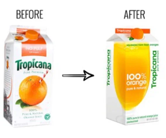
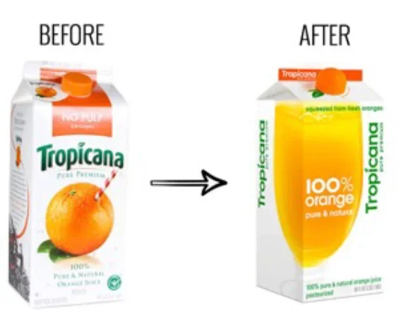
Tropicana’s 2009 packaging redesign shows how a cleaner-looking carton can make a familiar product harder to find. The company replaced the image of a straw in an orange with a glass of juice, while changing the coloured caps that helped shoppers tell its varieties apart. Within weeks, the new look was linked to a sharp sales drop, and Tropicana returned to its previous design before two months had passed.
A familiar signpost disappears
PepsiCo launched the redesign in January 2009 as part of a modernization effort. The work cost $35 million, according to the source account. On the previous package, a red straw pierced an orange: a direct visual shorthand for the drink’s fruit and a distinctive shape on a crowded supermarket shelf. The image had appeared on Tropicana packaging for decades.
The replacement showed a glass filled with pale orange juice. That choice shifted the package’s emphasis from the orange and straw to the product inside the glass. It may have read as simpler, but it also removed the cue that returning shoppers had learned to spot from a distance. When a package works as a recognition signal, changing its largest image affects more than its decorative style: it changes how quickly people can locate the brand.
The cap system changed too. Previously, blue identified added calcium, green marked pulp, and orange signalled the original variety. The redesign made every cap orange. That gave the range a more uniform appearance, but took away a compact piece of product information that shoppers could read at a glance.
Recognition and range clarity both took a hit
After the new packs reached stores, consumers said they struggled to find Tropicana among competing juices. Reactions quoted in the source described the design as resembling a store brand, looking cheap, or failing to stand out. Those responses point to two related problems: the brand’s main shelf cue had disappeared, and the remaining package system gave people less help choosing between varieties.
For shoppers in a hurry, colour and imagery act as quick navigation. A person who regularly buys the pulp version may look for its green cap before reading the label. Someone seeking the original product may recognise the orange. Replacing all three colours with one made the range more consistent in appearance, while reducing the usefulness of that visual distinction.
The figures arrived quickly. From late December 2008 to February 2009, sales of Tropicana Pure Premium fell 20% year over year, according to the source. By the end of February, Tropicana said it would abandon the redesign and restore the previous packaging. A study in an academic journal estimated the redesign’s cost to the company at up to $27 million. The source also cites $35 million spent on design and promotion, a separate outlay that the rollback could not recover.
Why a familiar detail can carry brand value
The straw in the orange was more than an illustration. It joined product meaning with brand recognition in one compact image: the orange suggested fruit, while the straw made the connection to drinking immediate. Repetition over decades had also taught shoppers to associate that image with Tropicana. Removing it meant asking consumers to learn a new package at the same time as the brand was trying to present itself as more modern.
That’s the tension designers face when updating a package with established recognition. A visual element can appear old-fashioned in a design review and still do important work in the store. Before removing it, teams need to understand whether customers use it to locate the product, distinguish a variant, or reassure themselves they have picked the familiar brand. The source’s account of Tropicana suggests the straw image served the first and third roles, while the cap colours handled the second.
Modernization also depends on what changes together. A new central image, a revised layout, and a uniform cap colour can each seem manageable on its own. Combined, they may remove several cues that previously made the pack easy to recognise. If the redesign also asks shoppers to adjust to new product labels or a different visual hierarchy, the total shift can be greater than the individual design decisions suggest.
Test the package as a shopping tool
Tropicana’s experience offers a practical way to review packaging work. Start by listing the cues customers already use, then identify the job each one performs: brand recognition, flavour or product selection, or navigation across the range. That inventory makes it easier to tell which elements are merely familiar and which are functional.
Next, assess the revised pack at the scale and speed of an actual shopping decision. Can someone who knows the old package still spot the brand among neighbouring products? Can they distinguish the varieties without stopping to inspect every label? These questions put the design in the setting where it has to work, rather than relying only on a close-up view or a presentation mock-up.
Where a redesign removes familiar signals, teams can compare the new system with the existing one before committing to a full rollout. The source doesn’t describe Tropicana’s research process, so it’s not possible to say what testing took place. The outcome does make the design stakes plain: recognition and clear variant information are part of the package’s function, not secondary details to consider after the visual refresh.
Familiarity is a design asset
The source also points to Gap’s 2010 logo change, which was reversed within a week after public criticism. Both examples show how a visual identity can become part of a customer’s routine. For designers, familiarity isn’t a reason to freeze a brand in place; it’s a resource to understand before changing the system around it.
Tropicana’s redesigned glass may have communicated juice, but the removed orange and straw had helped communicate Tropicana. Its coloured caps had helped communicate which Tropicana product to buy. A package refresh works best when its visual improvements preserve those quick decisions—or replace them with cues that are just as easy to read.
| Rev | Description | Date |
|---|---|---|
| A | Issued for reading | |
| B | Viewed 786 times | Current |


