Lucy Truman’s Venice Sketchbook Turns Canal Light into Illustration
- Project
- UX & UI Design
- Drawn by
- Marika Lind
- Issued
- Sheet
- A-79
UK illustrator Lucy Truman builds a quiet portrait of Venice from reflected light, loose observational drawing and scenes of everyday life.

Venice comes into focus between its landmarks
Lucy Truman’s Venice drawings look for the city’s quieter tempo: reflected light on the canals, softened architectural tones and pauses between the crowds. The UK-based illustrator started with on-location sketching, then carried those observations into a collection shaped by loose lines and a limited colour palette.
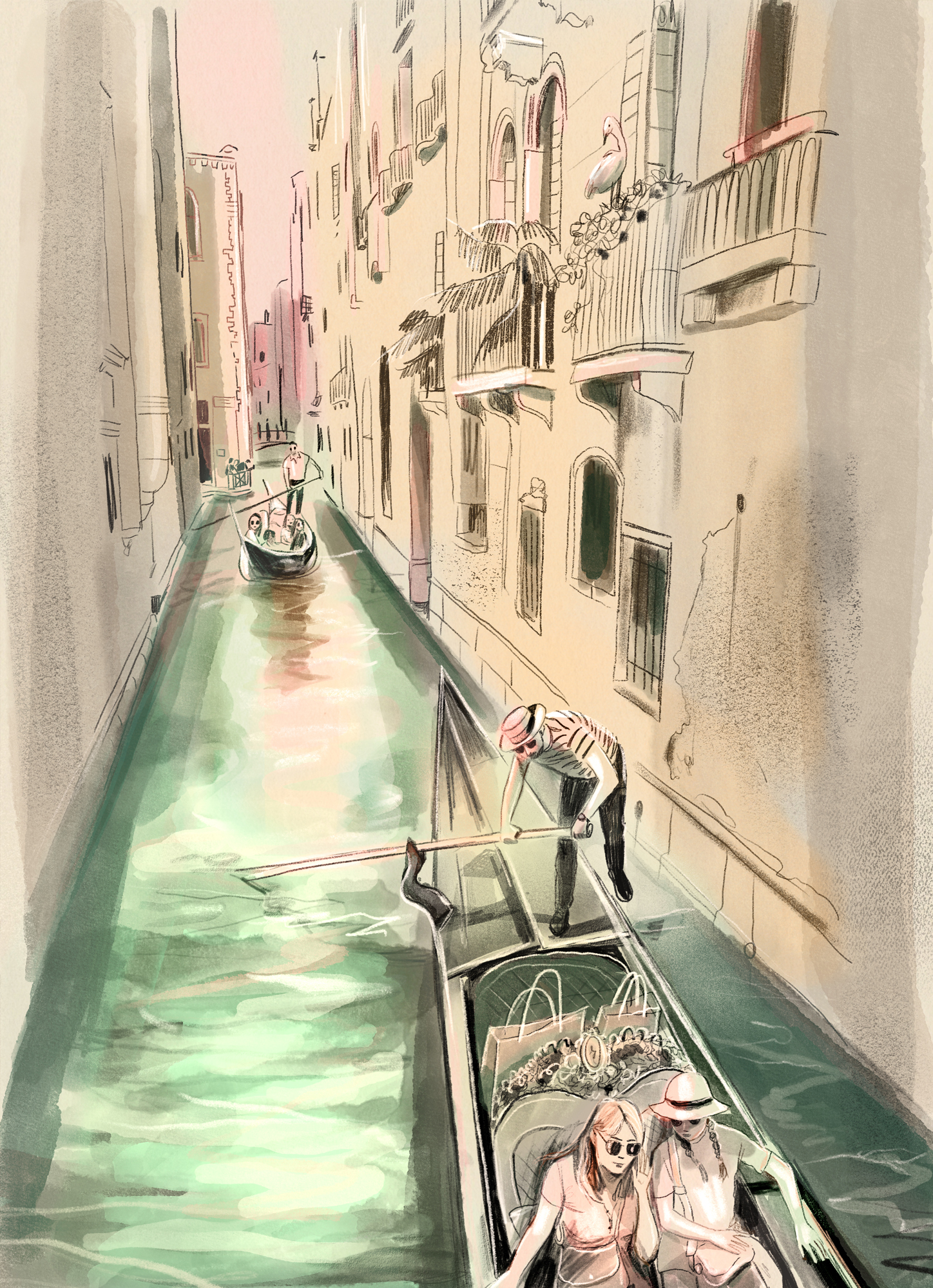
That approach gives the work its point of view. Rather than relying on a checklist of famous sights, Truman draws on the small details that make a place feel inhabited: a gondola moving through a waterway, diners looking out from a restaurant balcony, or a calm stretch of midday. The result is a travel illustration practice built around attention as much as subject matter.
Truman describes the aim as capturing the city’s architecture alongside “the quieter mood” and moments of stillness. Her drawings balance observational marks with composed scenes, allowing the canal rhythm and changing light to shape the image. It’s a useful distinction for illustrators working from travel: recording what a place looks like can be only the first step; choosing what to leave quiet helps convey how it feels.
A sketchbook as a working method
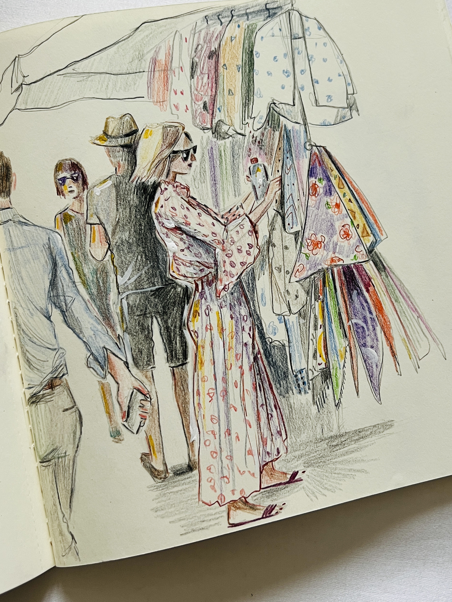
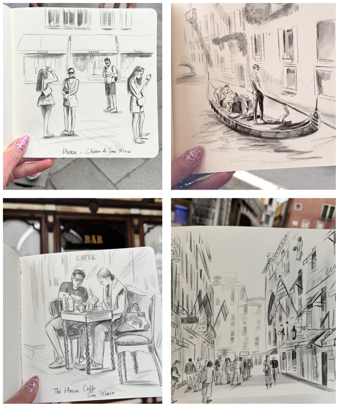
Visual note-taking sits at the centre of Truman’s practice. Drawing on location gives her a chance to observe the specific conditions of a scene: the tones of old buildings, the way light shifts across water, and how people use a space. Those notes become source material for editorial, publishing and hospitality illustration, where a sense of place needs to survive beyond the original moment.
For a designer or illustrator adapting this method, the value lies in gathering varied observations before settling on a polished composition. A sketchbook can hold quick studies of architecture, figures, movement and colour alongside slower drawings of a particular view. Back in the studio, those fragments can be recombined while retaining details that came from direct observation. Truman’s description of loose drawing and a limited palette points to a practical balance: keep the marks responsive, then use colour choices to bring the finished image together.
This way of working also changes what counts as a subject. A landmark can establish where a scene takes place, but a quieter detail may carry more of its atmosphere. In Venice, water, reflected light and the pace of people at a table can work together to make the setting legible without asking every drawing to function as a grand view.
Scenes gathered from streets and canals
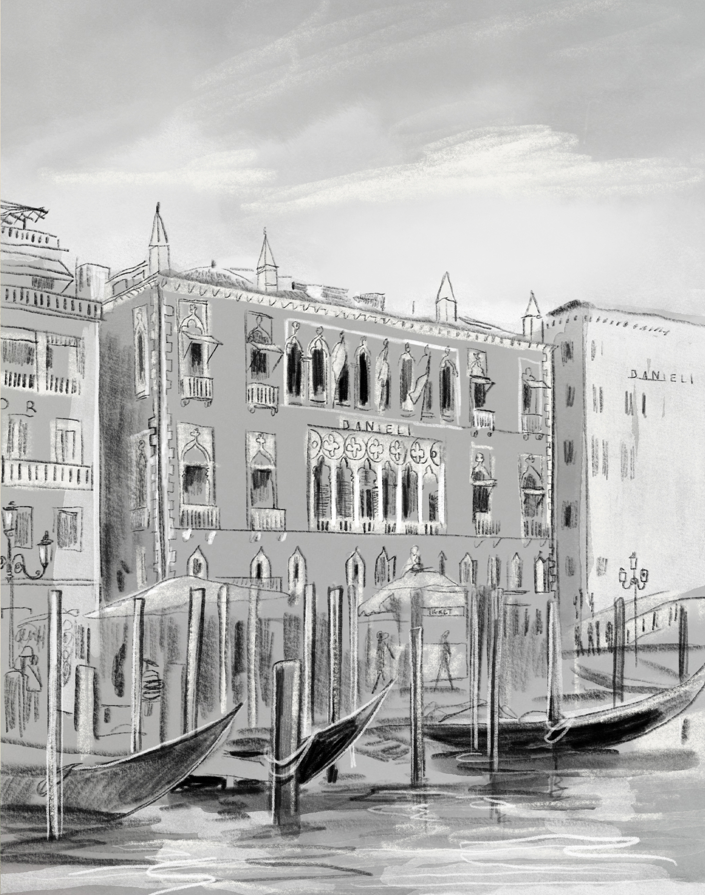
The collection moves between different kinds of observation. Canal scenes show visitors taking in the view from gondolas, with gondoliers steering from the rear. Restaurant balconies bring people and the water into the same frame, while sketches of the Hotel Danieli record its architecture along the Main Canal. These subjects give Truman room to vary the scale of her attention, from a broad city view to people inhabiting a particular spot.
Caffè Florian, in Piazza San Marco, was another favourite place to draw. Truman recalls the people-watching and sketching opportunities there, as well as the gelato. That detail makes the location more than a backdrop: the café becomes part of the experience being recorded. For travel illustration, such personal observations can help a familiar destination feel specific, rather than interchangeable with another picturesque city.
From observation to a finished image
Truman’s process suggests a clear sequence for turning location notes into a considered illustration: first, look for the conditions that define the scene; then record the architecture, people and movement in quick studies; finally, edit those observations into a composition with a consistent colour range. The aim isn’t to reproduce every visible detail. It’s to choose the details that give the image a recognizable mood and sense of place.
That edit matters when the work is intended for publishing, editorial or hospitality projects. A viewer may encounter the finished illustration without knowing the original street or canal. Carefully selected landmarks provide context, while the loose drawing and restrained palette can preserve the immediacy of the artist’s own observation. Together, those choices let the image work as both a depiction of Venice and a record of being there.
About Lucy Truman
Lucy Truman is an international illustrator based in the UK, working across fashion, lifestyle, portraiture and commercial publishing. Her clients and publishing credits include Ralph Lauren, LVMH, Estée Lauder, Penguin Random House and Vanity Fair. She has also illustrated the Unicorn Academy series for Nosy Crow/Penguin, which has made her a New York Times bestselling illustrator.
Across more than two decades of work, Truman has developed a practice that connects on-location sketching with finished illustration. Her portfolio includes selections by American Illustration, the International Motion Art Awards and the Society of Illustrators Los Angeles for animated work. The Venice drawings show how that observational foundation can turn a familiar destination into a personal visual account: start with what the light, buildings and people are doing, then let those particulars guide the composition.


| Rev | Description | Date |
|---|---|---|
| A | Issued for reading | |
| B | Viewed 437 times | Current |


