Sue Todd’s Digital Linocut Illustrations Bring *Blue Boat Home* to Life
- Project
- Graphic Design
- Drawn by
- Marika Lind
- Issued
- Sheet
- A-73
Sue Todd pairs digital ink with linocut textures in *Blue Boat Home*, translating Peter Mayer’s song into visual rhythms for young readers.

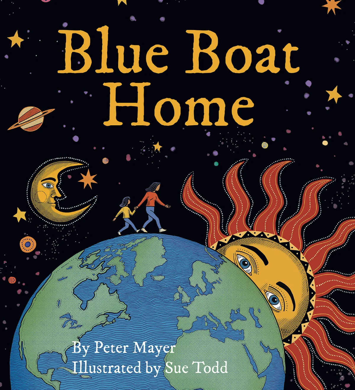

Sue Todd’s illustrations for Blue Boat Home make a useful case study in adapting a song’s movement and imagery for a picture book. The pages draw on the contrast and texture of relief printing, yet Todd made the work digitally on an iPad. That combination gives the book a hand-worked visual character while letting its scenes move between earthly water and open sky.
Published by Skinner House Books, Blue Boat Home pairs Todd’s images with lyrics by musician Peter Mayer, whose song shares the book’s title. Its central image treats the planet as a vessel traveling through space. Todd turns that broad, lyrical idea into scenes that young readers can follow: flowing water, starry skies and shifts in scale that connect familiar surroundings to a larger setting.
The book received a Silver Nautilus Book Award in Children’s Picture Books Fiction and a Merit Award in the 3×3 Illustration Annual, Professional Show No. 22. Those honors recognize the project in two different contexts: children’s publishing and illustration. The source credits Todd as illustrator and Skinner House Books as publisher.
Building a visual rhythm from lyrics
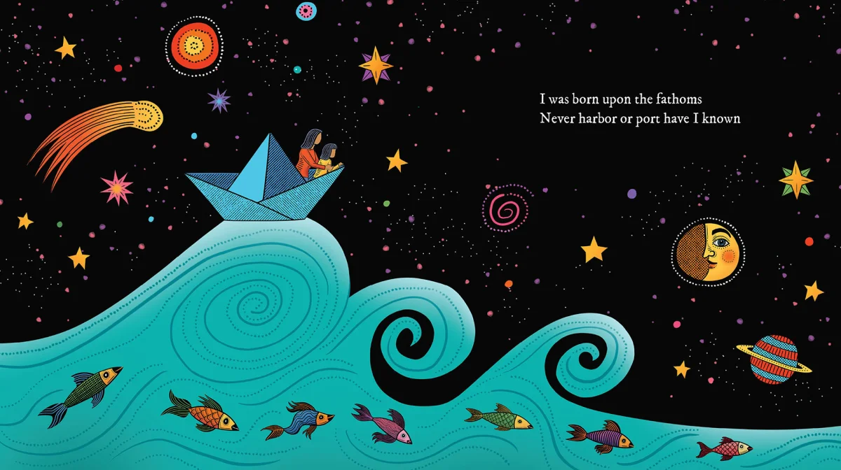
A picture book based on a song has to make time visible. Music can sustain a phrase, repeat a motif or shift its energy; a sequence of illustrations has to translate those qualities into composition and page turns. Todd’s approach uses changes between water and sky to give the lyrical imagery room to unfold. The scenes carry readers across the book rather than treating each spread as an isolated picture.
That kind of translation depends on choosing what to show and when. A page turn can reveal a new setting, extend a movement or give an image space to settle. Todd’s flowing forms and textured surfaces provide continuity, while the movement from earthly waters to starry skies gives the sequence a change in scale. For illustrators working from lyrics or other text with a strong rhythm, the practical question is how each image advances the experience: what does the reader see now, and what can the next page reveal?
The source describes Todd’s palette as rich and her compositions as expressive, but doesn’t identify specific colors or a page-by-page layout. The visual strategy it does outline is clear: texture and movement make abstract ideas tangible, while a recurring sense of travel helps join the scenes. That balance gives children an entry point into the book’s larger metaphor without requiring the imagery to explain every line.

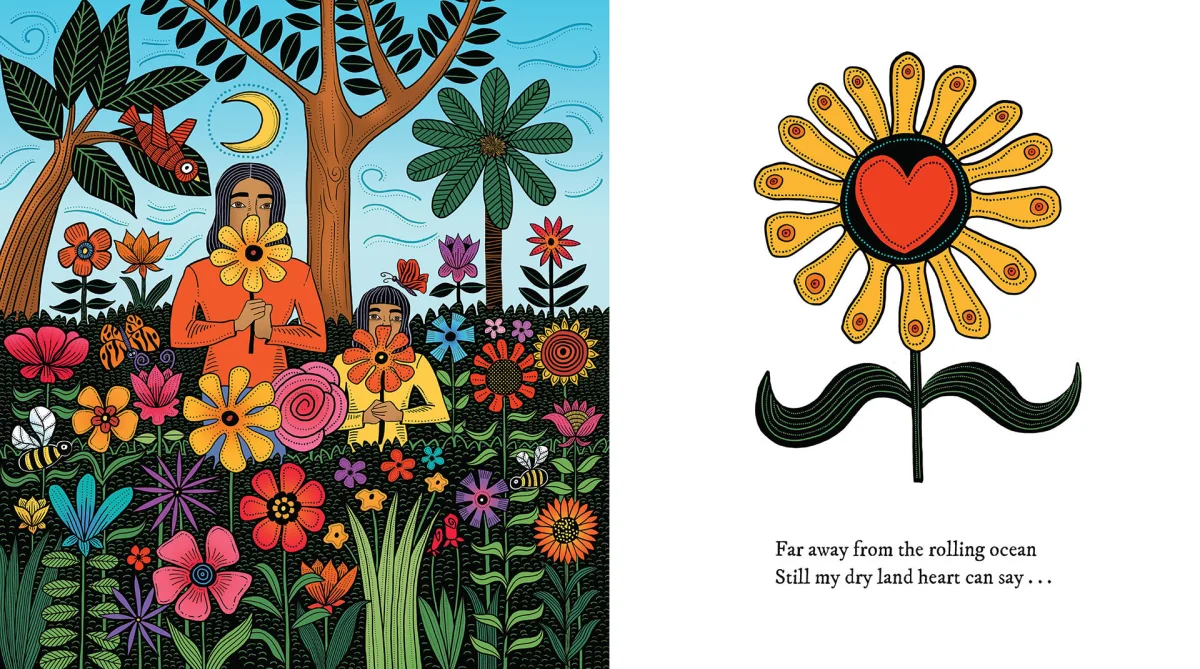
Digital ink with the character of relief printing
At first glance, Todd’s illustrations evoke woodcut and linocut printmaking: bold lines, crisp edges and visible texture. The process described for Blue Boat Home, however, was entirely digital, using an iPad and Todd’s digital ink technique. The distinction matters to illustrators because the effect of a medium and the tools used to make it aren’t the same thing. A digital workflow can preserve marks that feel irregular and tactile when the artist makes deliberate choices about line, texture and color.
Todd’s wider practice moves between analog and digital methods. Her artist biography describes her as carving linocuts and then coloring them digitally; for this book, the account specifically identifies an iPad-based process. Both descriptions point to an interest in combining relief-print qualities with digital color, though they refer to different ways of working. The source doesn’t name the software or provide a step-by-step account of how the book’s images were made.
The visual ingredients offer a practical way to think about the result. Bold graphic lines give forms a strong outline and keep the compositions legible. Organic variation in those marks can soften the precision of a clean digital edge. Layered color adds depth and recalls ink on paper, while texture keeps large areas from feeling mechanically flat. These are useful considerations for anyone aiming for a print-inspired finish on a screen: the character comes from how marks, edges and color layers relate, not simply from applying a texture effect.
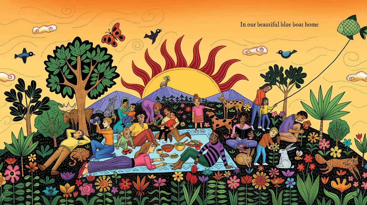
A practice shaped by print and image making
Todd is a Toronto-based illustrator who works across analog and digital media. Her stated influences include medieval woodcuts, Jim Flora, Frans Masereel and Jose Francisco Borges. That list places her work in conversation with print traditions and distinctive graphic illustration, while her own practice moves across books, magazines, posters, T-shirts, a television commercial and a bus.
Her clients include Barnes and Noble, Crown Publishing, Pearson Education, Klutz Press, Andrews McMeel Accord, The Wall Street Journal, the American Bar Association, Houghton Mifflin Harcourt and Walmart Canada. The range suggests how a strong print-inspired style can adapt to different formats. In editorial work, graphic shapes can establish an image’s focus; on a poster or product, high-contrast forms can remain readable at a glance. Each application still calls for choices suited to its audience and scale.
For art directors considering this kind of illustration, the useful question is how the technique supports the content. A tactile finish may help a story feel warm and immediate, but texture alone can’t supply narrative rhythm. In Blue Boat Home, the stated aim is to connect lyrical imagery with a sequence children can inhabit. Todd’s combination of graphic marks, layered color and shifting scenes gives that aim a visual structure.
What the project offers illustrators
The clearest lesson in Todd’s work is that digital tools can support a deliberately handmade look when the artist makes the mark-making part of the composition. For illustrators, that means planning the visual system early: decide how line weight will distinguish forms, where texture will carry atmosphere, and how color layers will guide attention. Then consider how those choices change across a sequence, especially when page turns need to carry a song or a lyrical text forward.
Todd is also writing and illustrating stories of her own, described as works in progress. That makes Blue Boat Home part of a broader exploration of children’s publishing, alongside a career spanning several kinds of visual commissions. The book’s strongest design idea is the fit between medium and meaning: relief-print character lends physical presence to a story that reaches from water toward the stars.
Explore Sue Todd’s portfolio and website for more examples of her work.
| Rev | Description | Date |
|---|---|---|
| A | Issued for reading | |
| B | Viewed 895 times | Current |