Sara Tyson’s Symbolic Illustrations Bring Under the Volcano to Suntup Editions
- Project
- UX & UI Design
- Drawn by
- Marika Lind
- Issued
- Sheet
- A-76
Sara Tyson uses geometric forms, earthy colours and tactile textures to interpret the psychological tension in Malcolm Lowry’s classic.
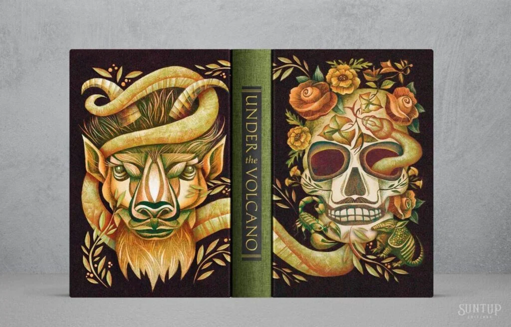
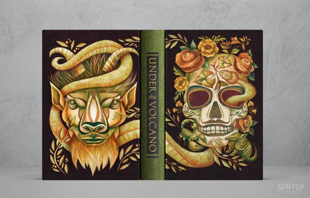
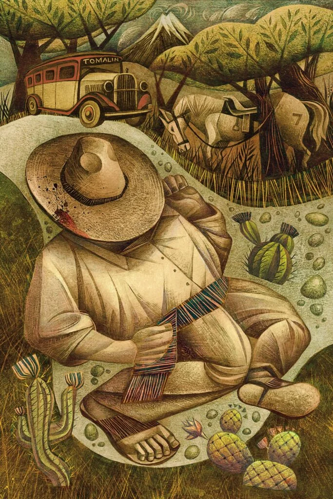
Sara Tyson’s illustrations for Suntup Editions’ edition of Malcolm Lowry’s Under the Volcano approach the novel as a psychological landscape rather than a sequence of scenes to depict. Geometric forms, earthy colours and pronounced textures give the work a visual weight suited to a story shaped by memory, dread and a protagonist in crisis. Suntup Editions commissioned Tyson for the edition; the source does not specify when it was released.
Working with the novel’s atmosphere
First published in 1947, Under the Volcano follows Geoffrey Firmin, a disgraced British consul struggling with alcoholism over a single day in Quauhnahuac, Mexico, on the Day of the Dead. Lowry’s dense, lyrical prose puts pressure on both the character’s inner life and the world around him. Tyson’s art meets that density through mood and symbol instead of trying to illustrate every plot beat literally.
The visual language described for the edition rests on a useful tension: stylized, geometric shapes meet deep, earthy colour and richly worked surfaces. Geometry can bring order to an image, while texture makes that order feel worn or unstable. Set together, those qualities suggest a world that has structure but is difficult to hold onto—an apt visual approach for a story about a man whose sense of control is breaking down.
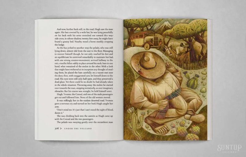
Symbols instead of scene-by-scene illustration
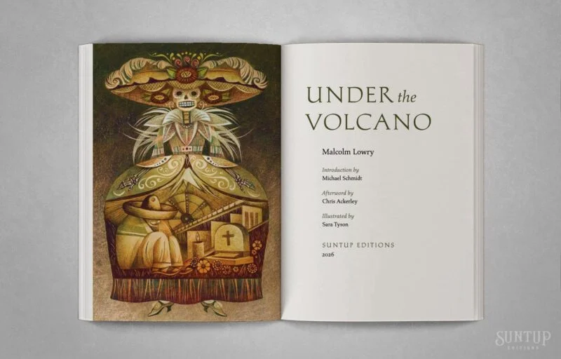
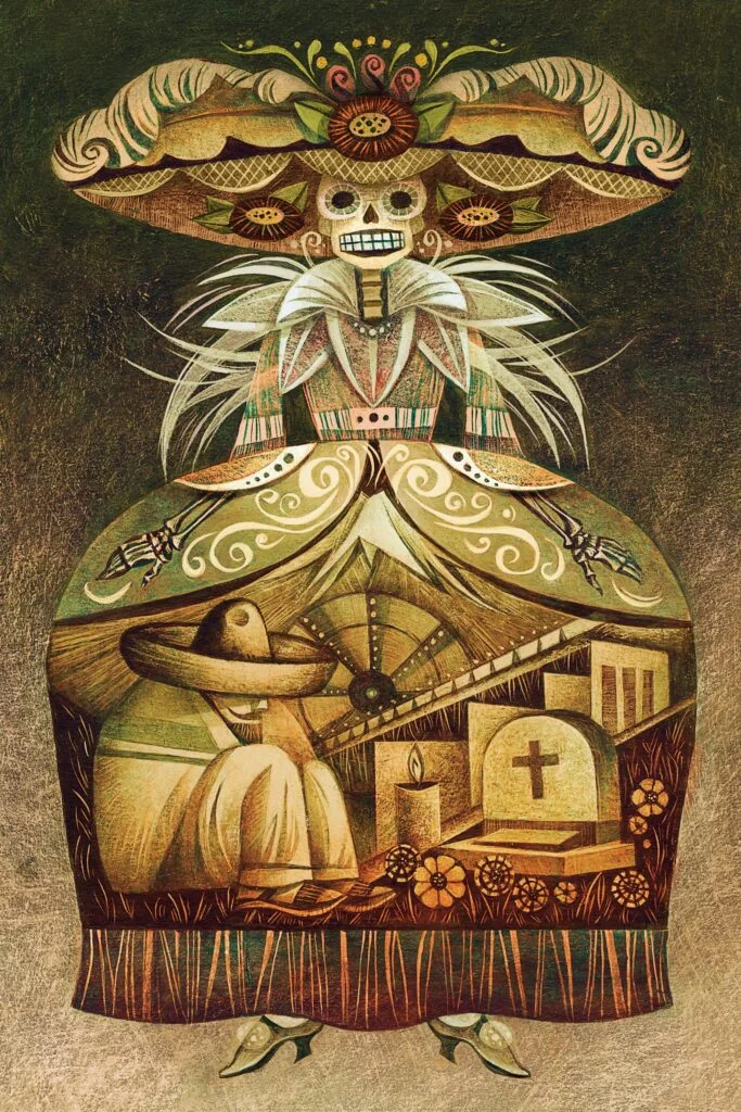
The choice to avoid straightforward depictions matters for a book whose main action unfolds through a character’s fractured perspective. Tyson’s illustrations are described as symbolic views into Firmin’s troubled state and the vivid, ominous setting around him. That leaves room for the images to echo the prose without pinning each passage to a single visual explanation.
Mexican folkloric motifs connect the artwork to the novel’s setting and the Day of the Dead, while the earthy palette and tactile surfaces reinforce its heavy atmosphere. These elements give the illustrations several jobs at once: they can locate the reader in a particular cultural and physical world, carry the story’s emotional tone, and keep the character’s inner struggle in view. For an illustrated edition of a canonical novel, that balance helps images sit alongside the writing as interpretation rather than decoration.
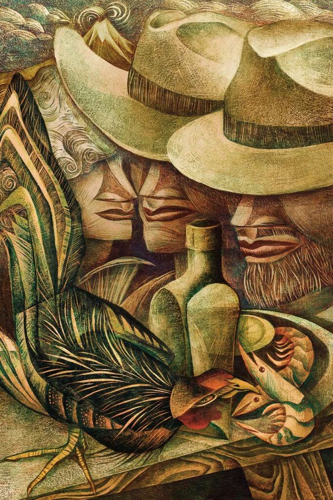
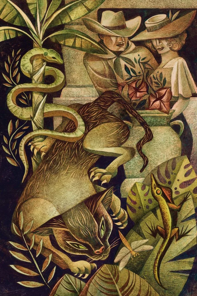
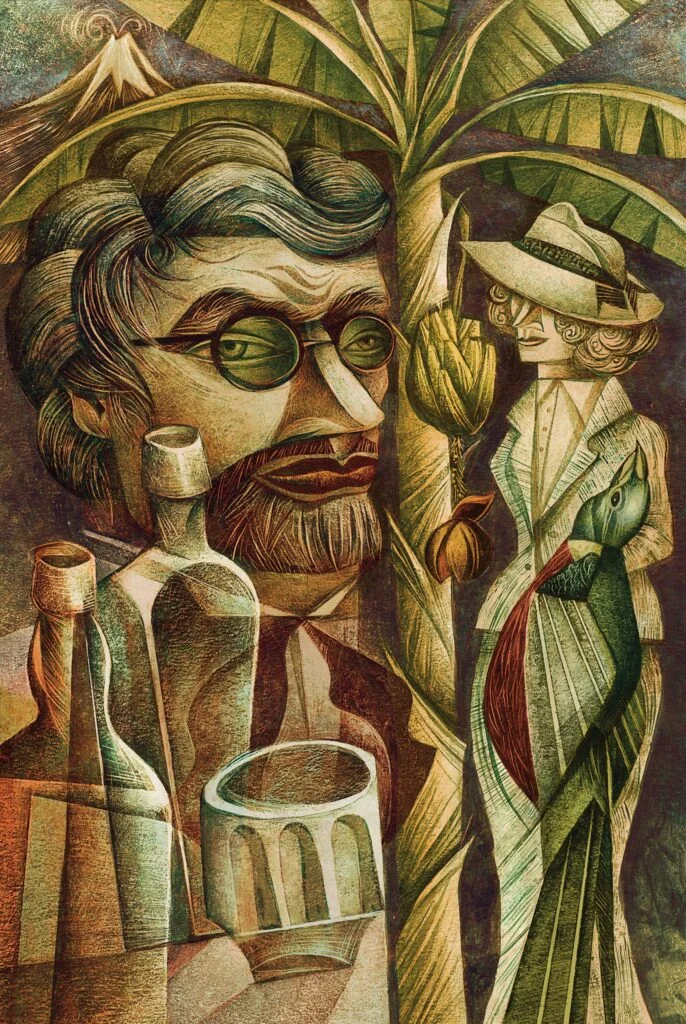
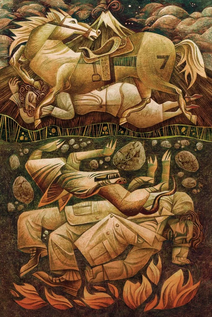
Illustration as part of the book object
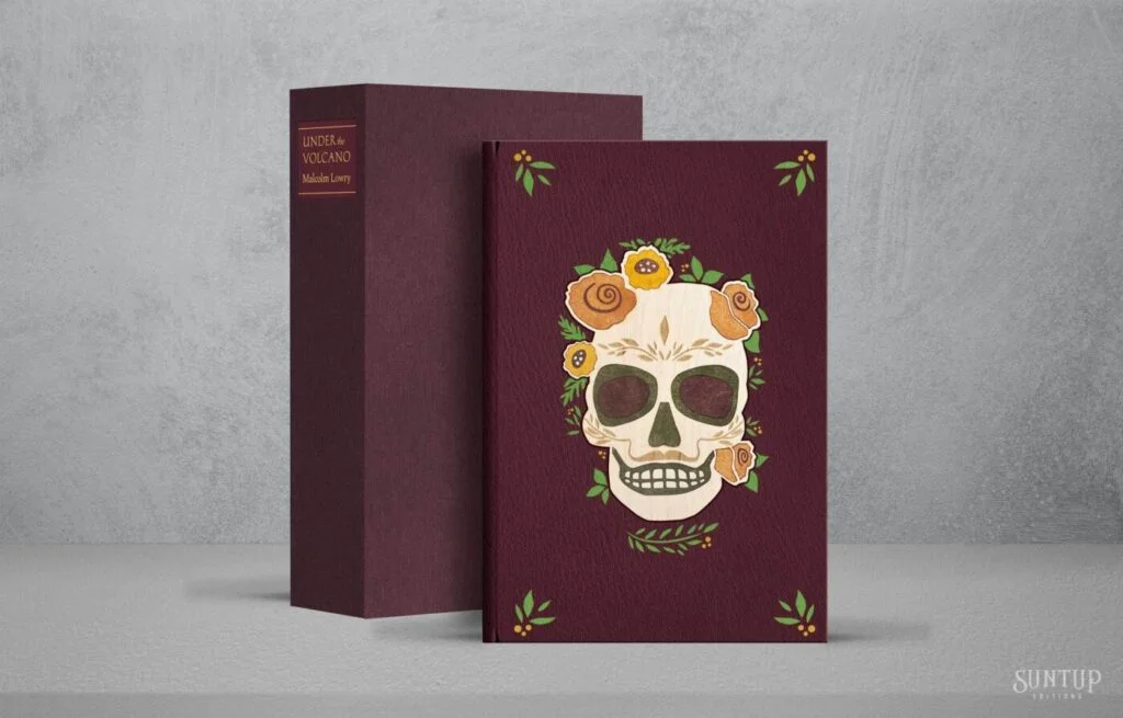
Suntup Editions is known for finely made limited editions, combining materials, typography and illustration to shape a physical reading experience. In that context, Tyson’s work contributes to more than the book’s visual identity: its texture and colour can be experienced on the page, in sequence with Lowry’s prose. The source describes luxury materials and fine typography as part of the publisher’s approach, though it does not name the typefaces, printing methods, materials or edition specifications used for this book.
That distinction is useful for designers looking at illustrated publishing. A visual concept can begin with an artist’s response to the text, but its effect also depends on how images meet typography, paper and pacing. The available details point to the conceptual fit between Tyson’s mark-making and Lowry’s novel; they don’t provide production notes that would support a closer account of the book’s layout or print treatment.
 Explore the full edition at Suntup Editions.
About Sara Tyson
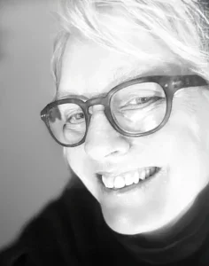
Tyson is a Canadian illustrator educated at OCAD University in Toronto. Her editorial and commercial work has appeared in publications including Harvard Business Review and Smithsonian Magazine, as well as work associated with the National Endowment for the Humanities. The source also credits her with recognition from Communication Arts, the Society of Illustrators in New York, and the Society of Illustrators of Los Angeles.
Her interests span nature and culture, with canoeing, swimming, cooking, film and city exploration among her stated sources of inspiration. That range resonates with the edition’s visual premise: the images need to hold both the physical character of a place and the instability of a person moving through it.
Links
Portfolio · Website · Instagram
Tyson’s approach offers a practical reference for illustrating literary work: start with the text’s emotional structure, then choose visual elements that can carry several layers of meaning. Here, geometry, earthy colour, texture and folkloric references give the edition a vocabulary for Lowry’s atmosphere while leaving the reader room to form their own image of the story.
| Rev | Description | Date |
|---|---|---|
| A | Issued for reading | |
| B | Viewed 970 times | Current |


