CJ Hendry and Jeni’s Turn Ice Cream Into a Monochrome Sensory Experience
- Project
- Graphic Design
- Drawn by
- Amelia Nash
- Issued
- Sheet
- A-70
OPAQUE pairs jet-black ice cream with a three-day SoHo installation, shifting attention from color to flavor, texture and touch.
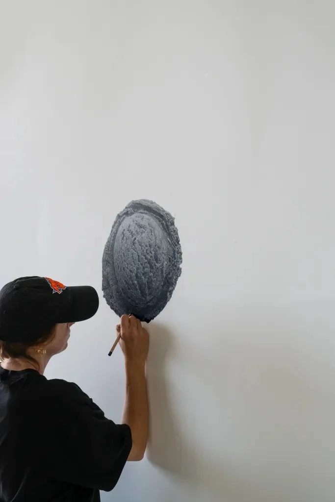
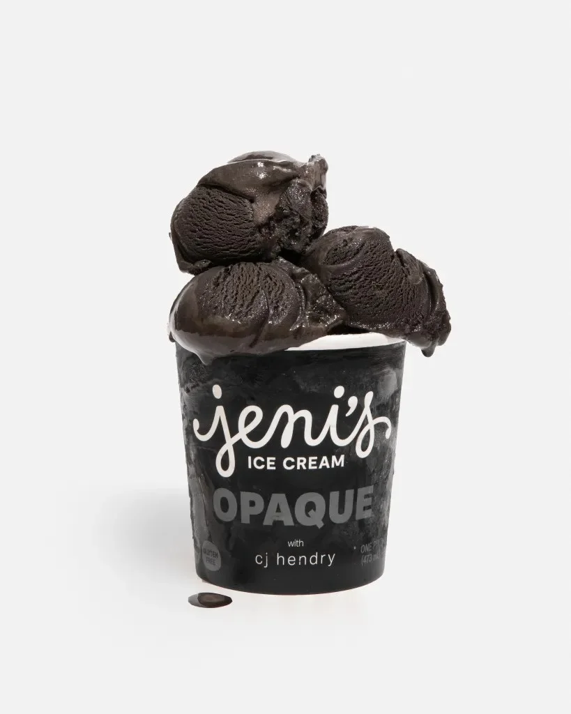
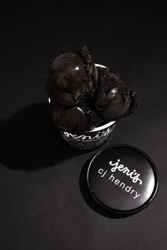
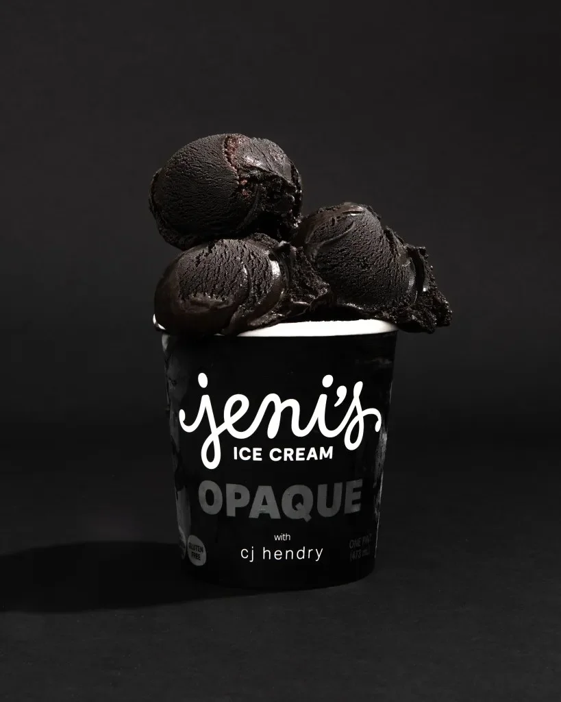
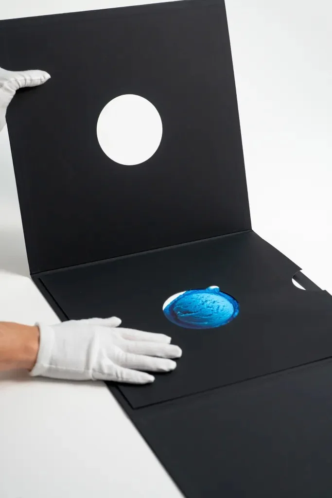
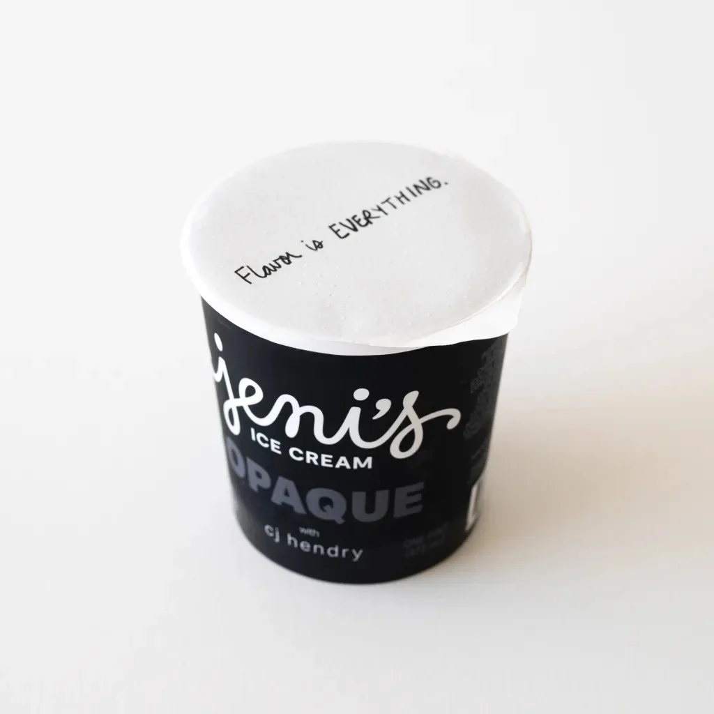
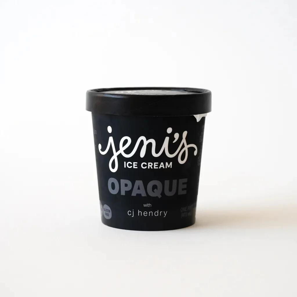
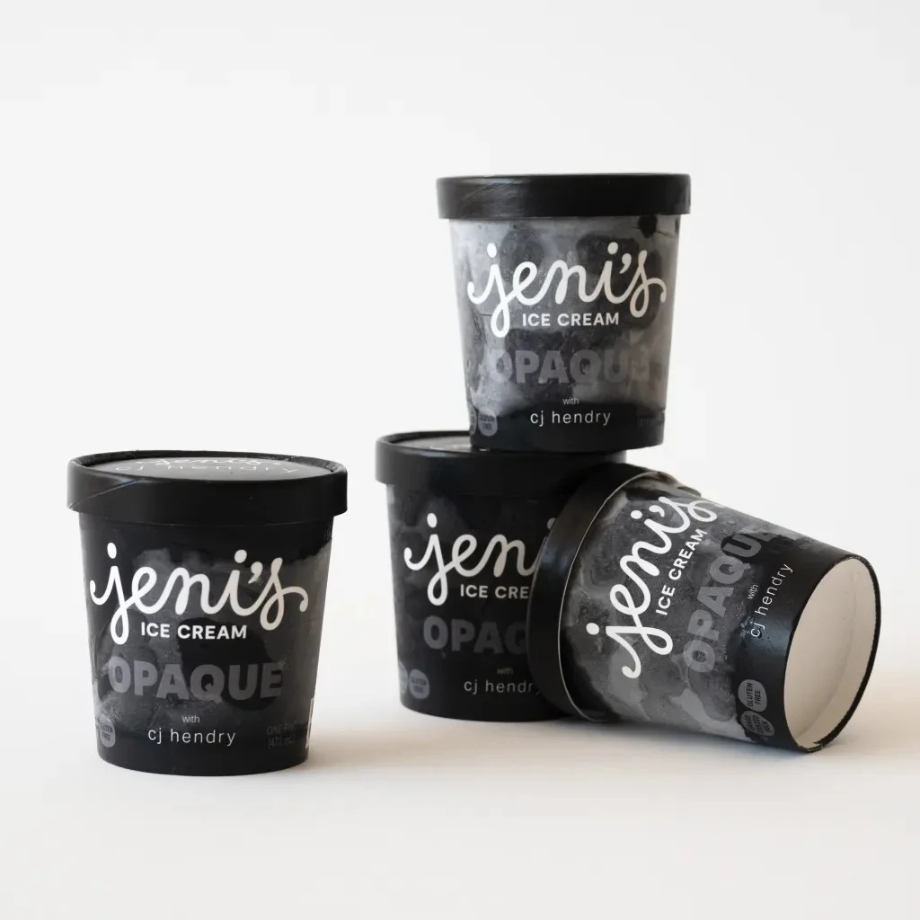
Jet-black ice cream changes the way a familiar treat reads before anyone takes a bite. With OPAQUE, artist Cj Hendry and Jeni’s Splendid Ice Creams build that visual interruption into both a limited-edition flavor and a three-day installation in SoHo, New York City. The project’s central design decision is simple and specific: remove the color cues people usually use to anticipate taste, then let texture, flavor and setting carry more of the experience.
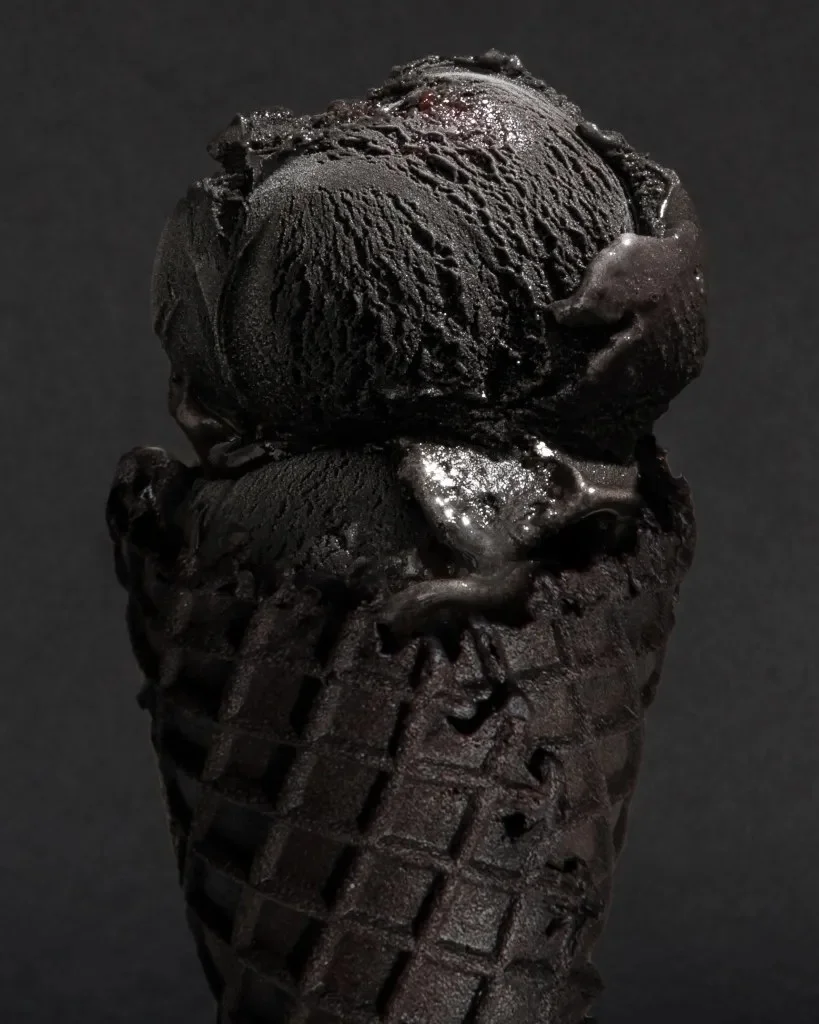
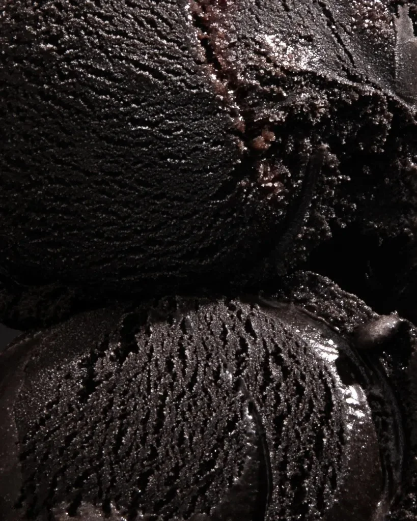
The scoop’s dark appearance comes from a combination of cocoa, espresso fudge and balsamic cherry. Those ingredients suggest depth and contrast, while the near-black color withholds the usual signals of sweetness and fruit. A viewer can’t read the flavor from a bright cherry red or a coffee-brown swirl. Instead, the first impression comes from the scoop’s shape and surface; tasting supplies the information that color normally previews.
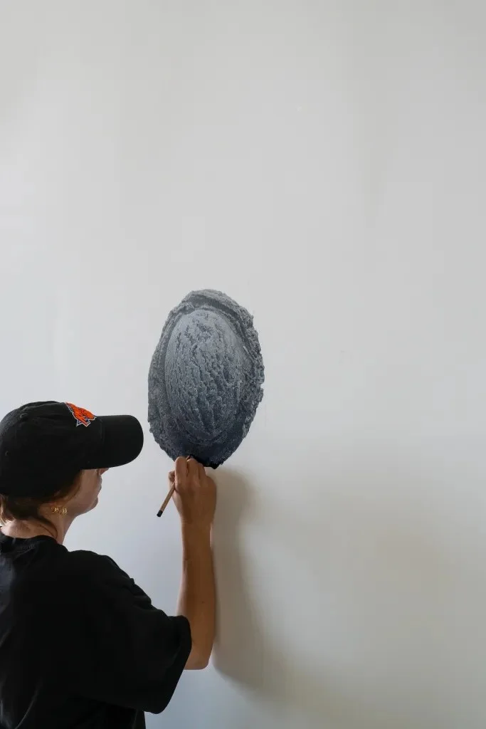
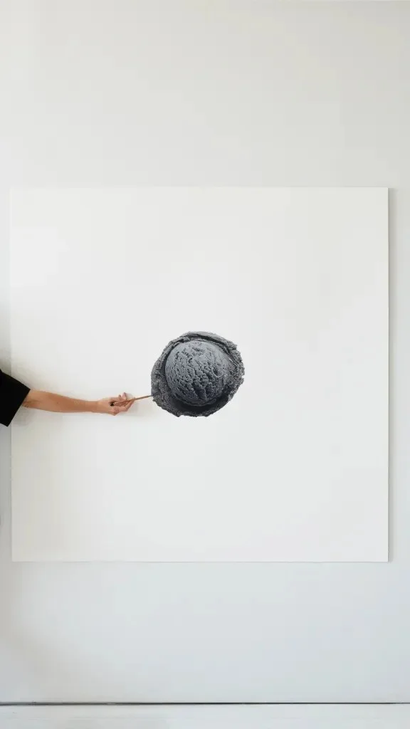
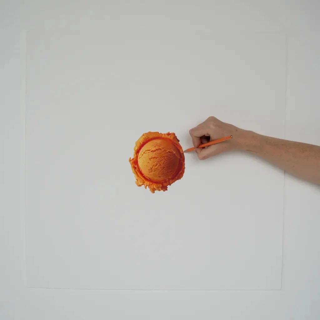
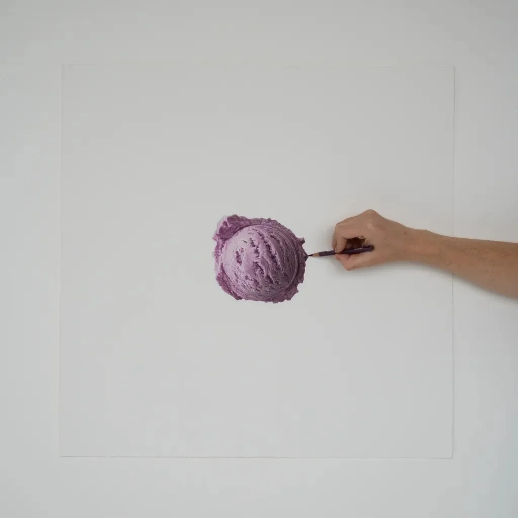
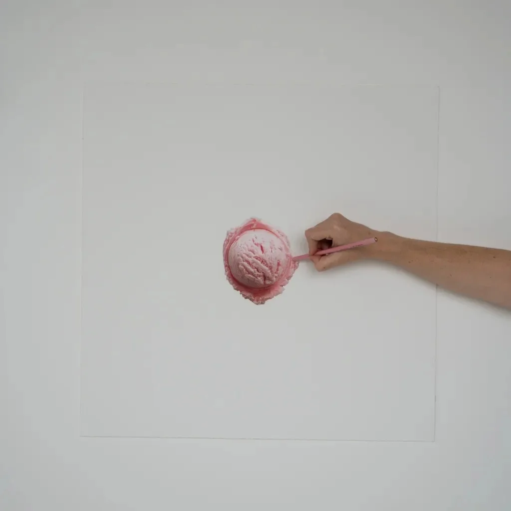
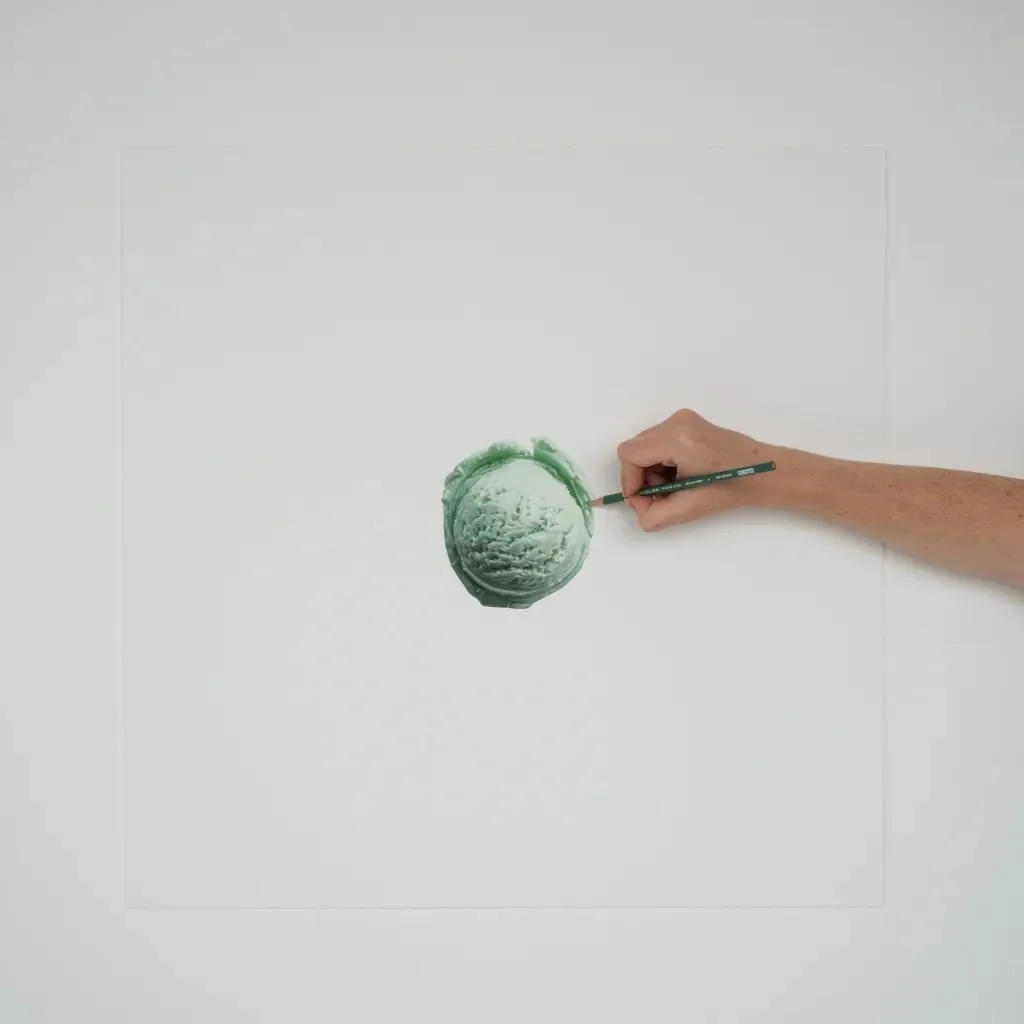
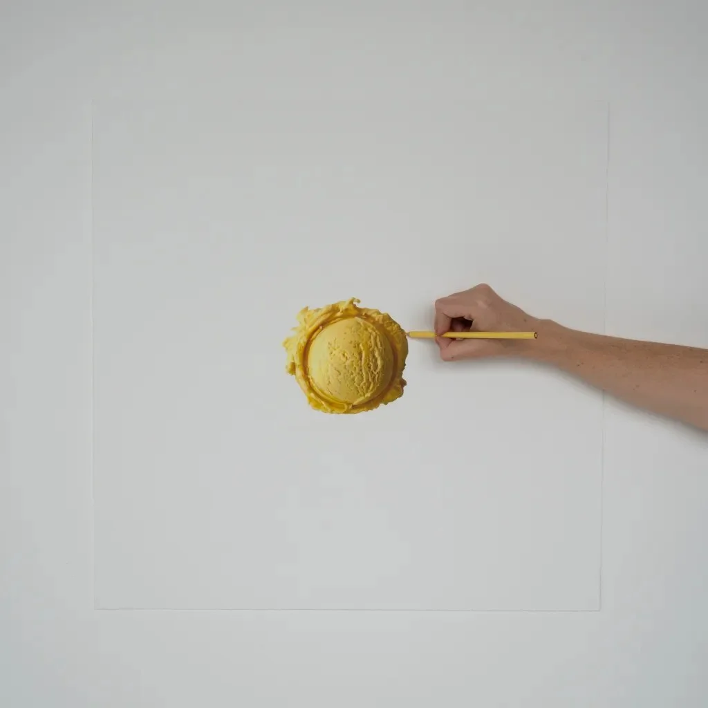
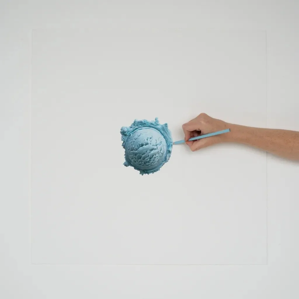
That gap between expectation and experience connects OPAQUE to Hendry’s wider practice. She first drew attention for painstaking black-and-white pen drawings, then moved through colored pencil and into immersive environments. Across those formats, her work has shifted from close attention to an object’s surface toward shaping how people encounter it. OPAQUE carries that progression into food: the artwork isn’t only something to look at, but something people taste and handle.
Hendry’s earlier hyper-realistic drawings made everyday objects, including a crumpled Hermès bag and candy wrappers, feel newly strange through careful rendering. Here, she reaches a similar effect by altering an object’s context. Ice cream is already loaded with visual memories: pastel scoops, toppings, bright packaging and the familiar colors of flavor. Make the scoop black, and that visual shorthand stops working. The treat remains recognizable, but the viewer has to reconsider what they expect from it.

A shop designed around one color
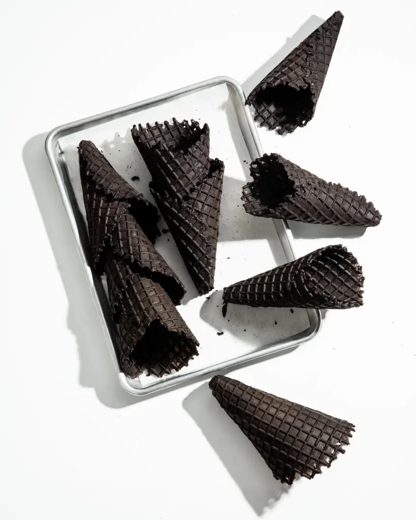
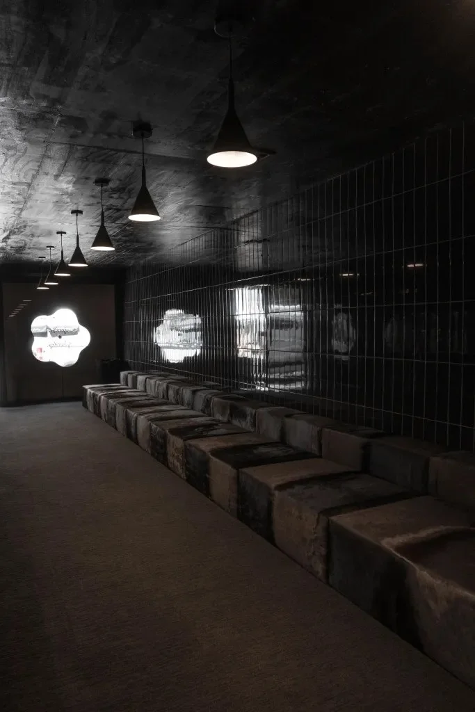
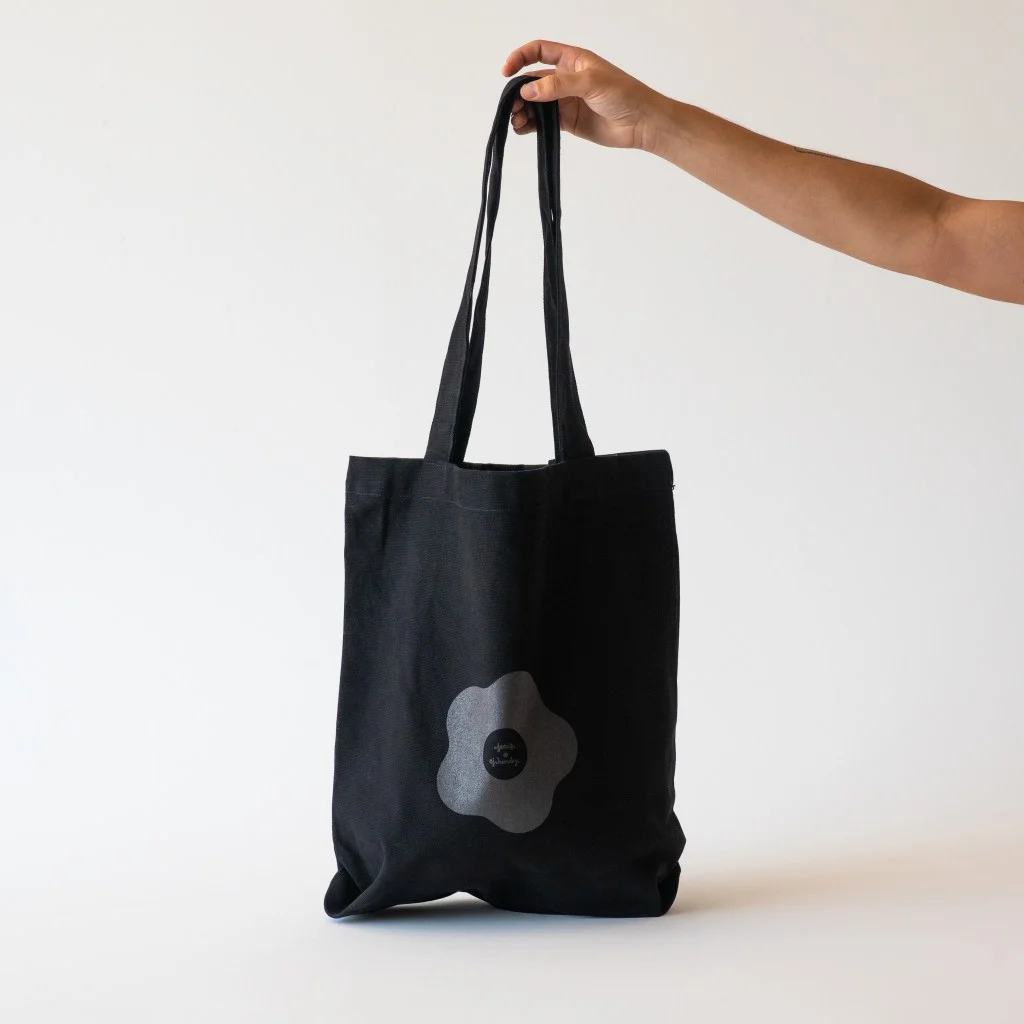
For three days, Hendry and Jeni’s brought the idea into a monochrome ice cream shop in SoHo. The walls and waffle cones were black, extending the flavor’s palette from the product into its surroundings. In this setting, the scoop doesn’t sit as a dark accent against a colorful shop; the whole environment limits competing visual information. That gives visitors room to notice the ice cream’s form, its surface and the sensations that arrive while eating it.
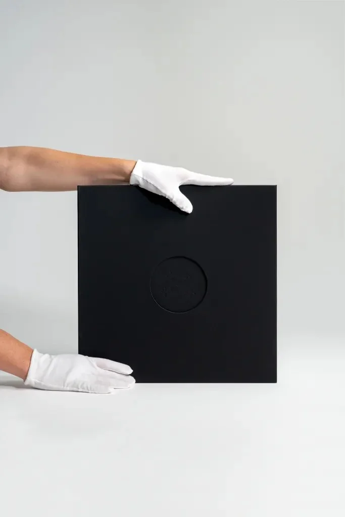
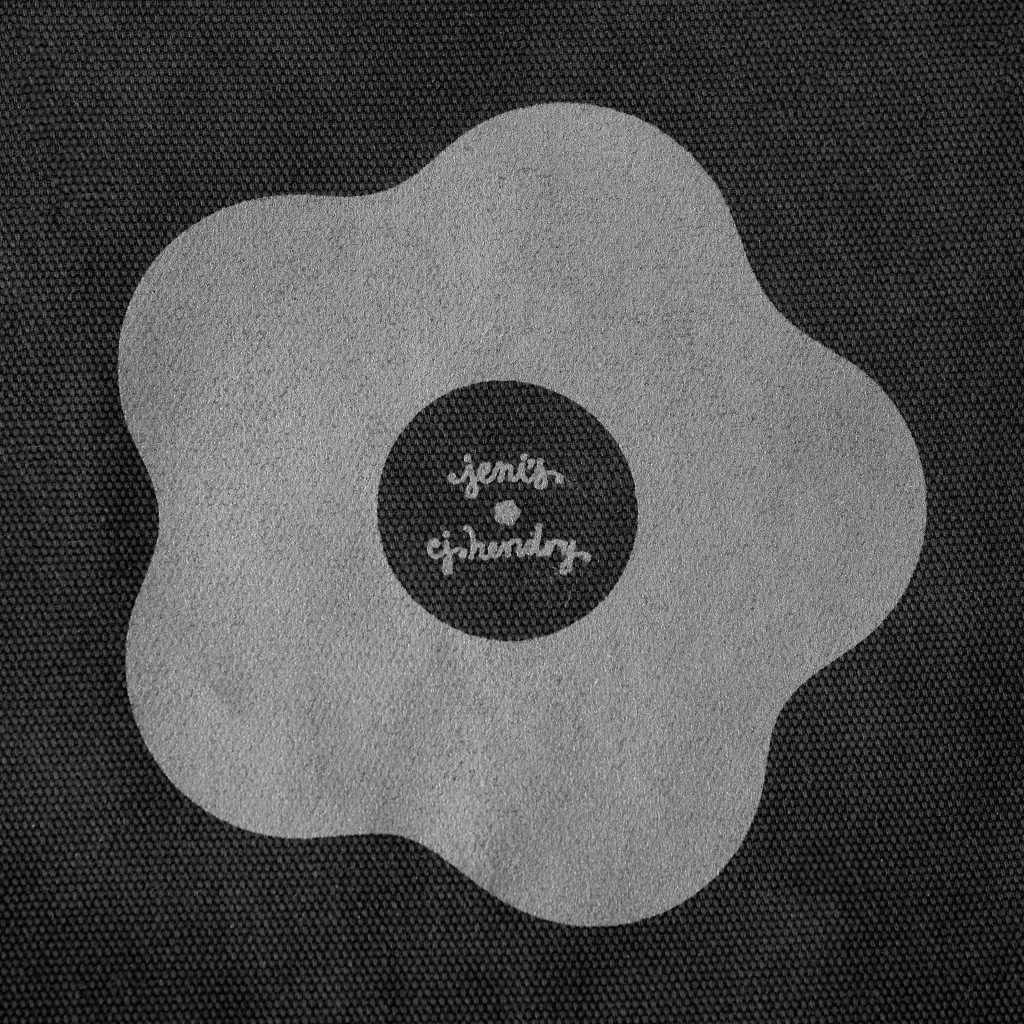
Hendry also presented seven new works made for the project. The shared black palette ties the art, food and shop together without requiring the pieces to depict the product literally. Instead, the color acts as a common visual rule. It makes the installation feel like one composed environment, while the reduced palette directs attention toward differences in texture and shape.
For designers, the useful move here is the way a constraint reaches across touchpoints. The black isn’t confined to a package or a hero image; it appears in the food, the cone, the walls and the artworks. That repetition gives the pop-up a clear identity, while the absence of color keeps each material’s physical qualities in view. It’s a practical example of how one visual decision can organize a space and influence how people use it.

Attention becomes the interaction
The collaboration treats tasting as part of the visitor journey. A typical flavor’s appearance can set expectations before the first spoonful; OPAQUE delays that reading. People encounter the black scoop, try it, and then connect the ingredients to what they taste. Color removal doesn’t erase sensory information. It changes the order in which people receive it.
Beth Stallings, Jeni’s director of innovation, describes the flavor as “layers deep…an excavation of flavor.” The phrase suits both the recipe and the installation’s approach: visitors have to spend time with the experience to discover what lies beneath its first impression. Jeni’s has a history of taking a painterly approach to ice cream, making the collaboration a natural fit for Hendry’s interest in consumption as an experience.
Hendry describes the intent directly: We wanted to create an experience that pushes sensory boundaries. Removing color makes you feel everything else more deeply—the texture, the taste, the emotion.
That statement also clarifies what the project asks of its audience. The black palette isn’t merely an attention-grabbing look; it’s a prompt to notice sensations that might otherwise sit behind visual expectation.
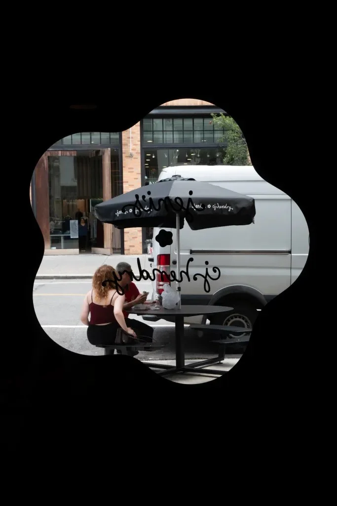
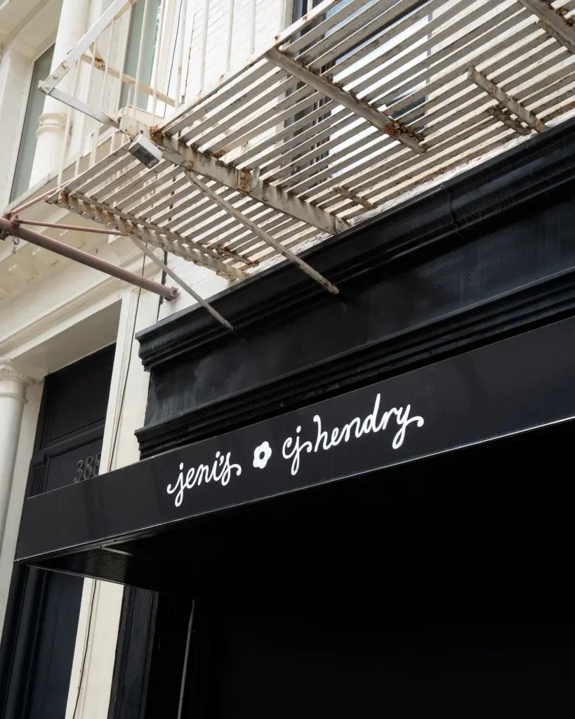
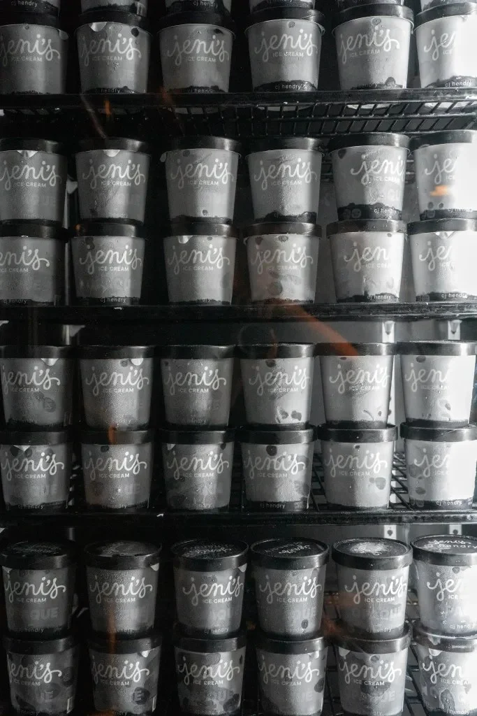
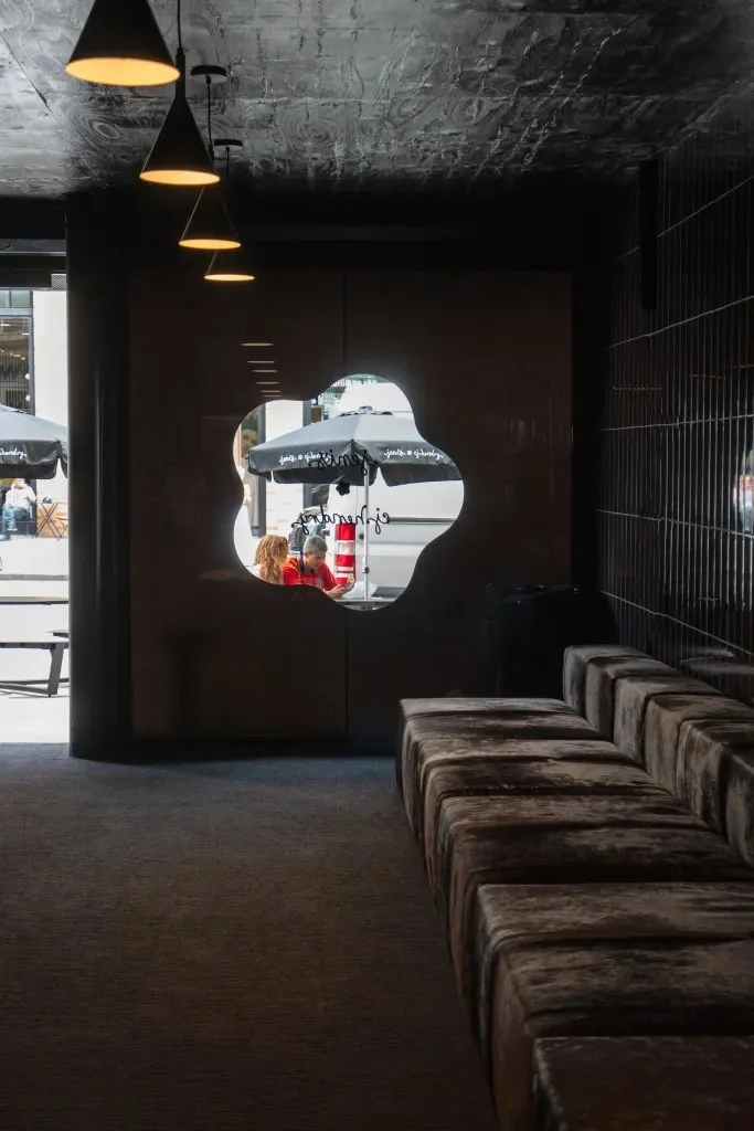
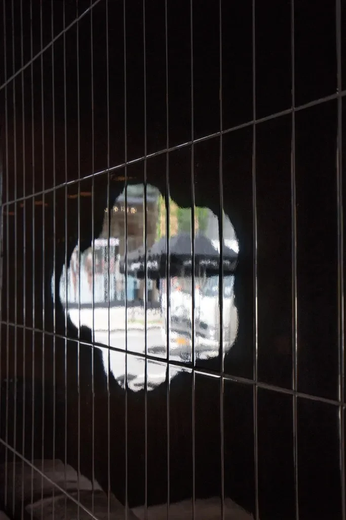
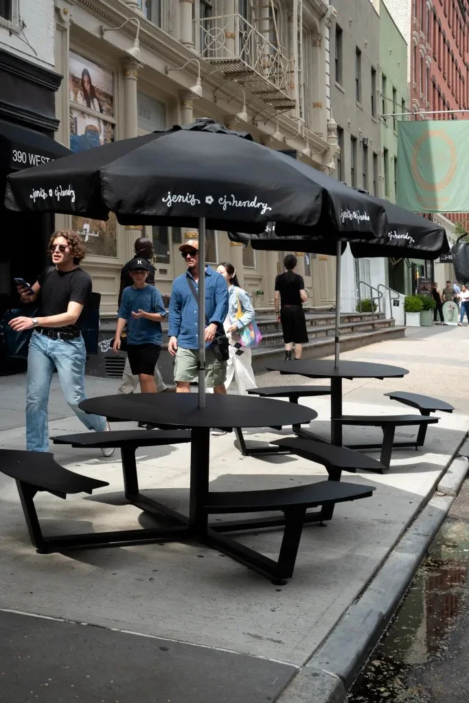
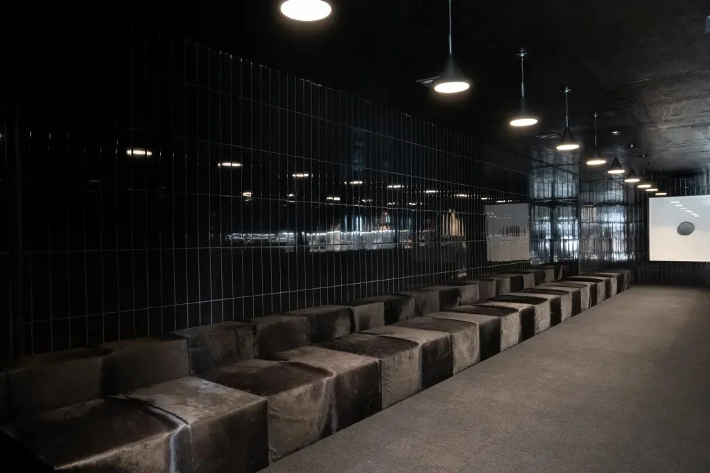
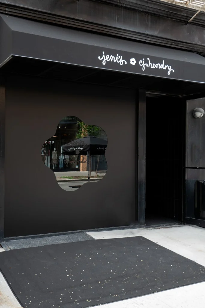
Hendry’s interest in consumer culture comes through as close observation rather than scolding. Ice cream is an everyday pleasure, and the installation makes its visual conventions visible by changing them. The result is a product launch shaped as a sensory performance: a limited flavor, seven artworks and a temporary shop, all organized around the same question of what color tells us to expect.
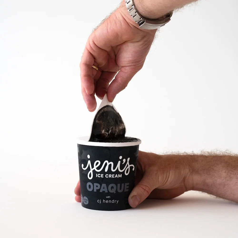
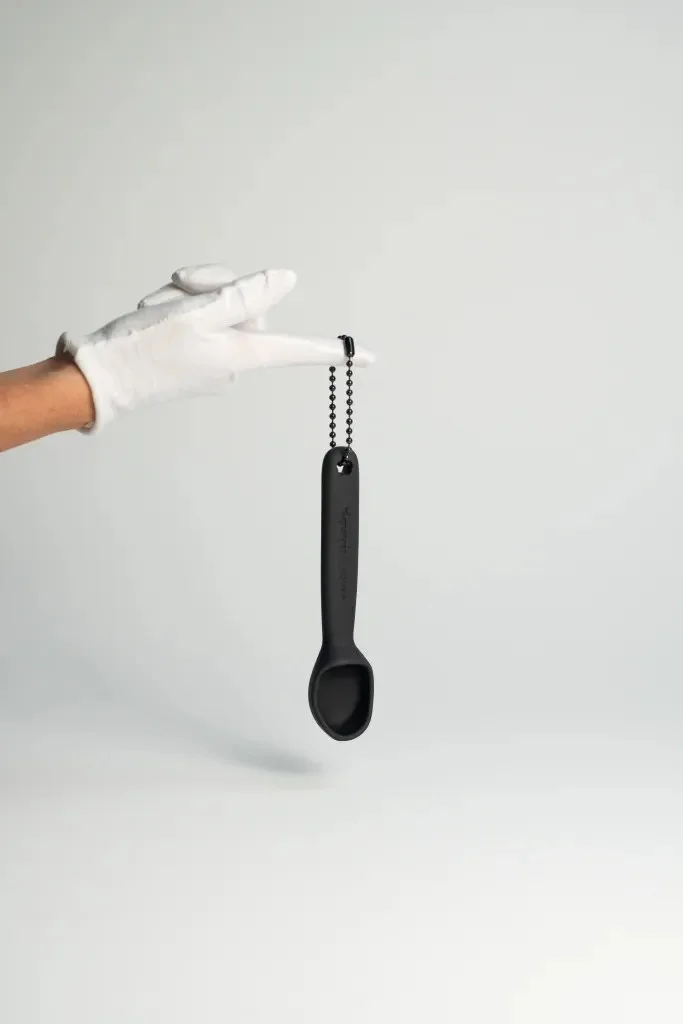
OPAQUE’s strongest design lesson is how a visual limitation can redirect attention without stripping an experience of richness. Black gives the project a consistent frame; the changing sensations inside that frame supply its variety. For creative teams, the takeaway is to consider what a familiar visual cue is doing before adding more detail. Sometimes removing that cue gives people a reason to look, taste and pay attention in a different order.
The post Jeni’s Ice Cream X Cj Hendry Explore the Art of Absence appeared first on PRINT Magazine.
| Rev | Description | Date |
|---|---|---|
| A | Issued for reading | |
| B | Viewed 450 times | Current |


