Milano Cortina 2026 Posters Pair Bold Olympic Rings With Expressive Paralympic Illustration
- Project
- Graphic Design
- Drawn by
- Charlotte Beach
- Issued
- Sheet
- A-66
Olimpia Zagnoli and Carolina Altavilla shape distinct poster identities for Milano Cortina 2026, bringing sport, place and inclusion into focus.
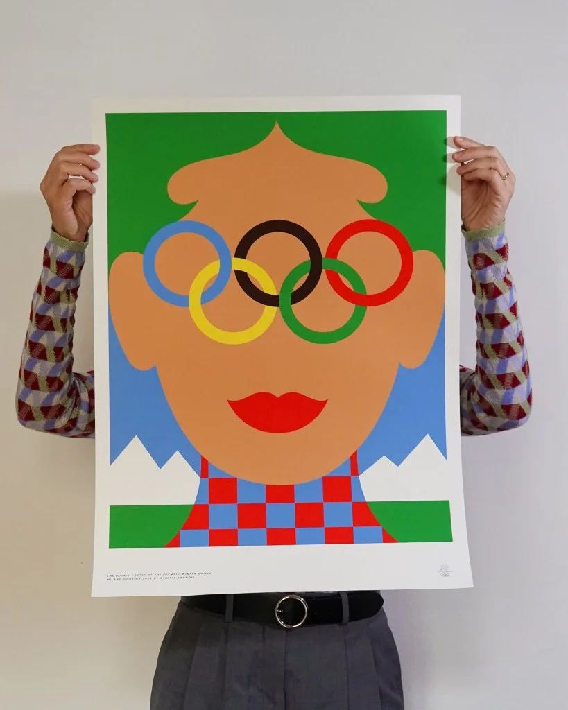
Two posters give Milano Cortina 2026 distinct visual voices: Olimpia Zagnoli reworks the Olympic rings in a bold graphic composition, while Carolina Altavilla brings a fluid, retro inflection to her Paralympic design. Together, they frame the Games through contrasting approaches to illustration and symbol-making, with both works connecting sport to the people and places around it.
The designs are part of the “Iconic Posters” project for the Olympic Winter Games and Paralympic Winter Games. Their unveiling follows the “Art Posters of Milano Cortina 2026,” a separate project in which 10 Italian artists interpreted the Games in 10 posters. The two bodies of work offer different ways to picture the event: one through individual artistic responses, the other through a pair of designs intended to express a shared identity.
Two illustration styles, one event identity
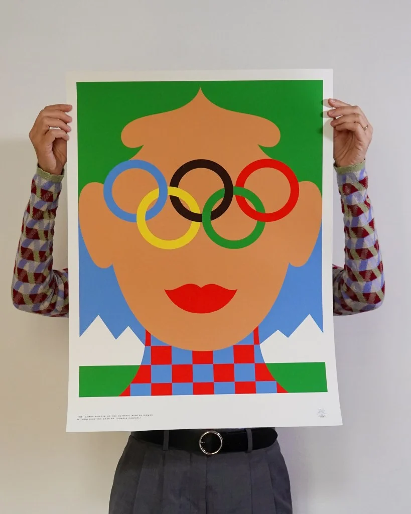
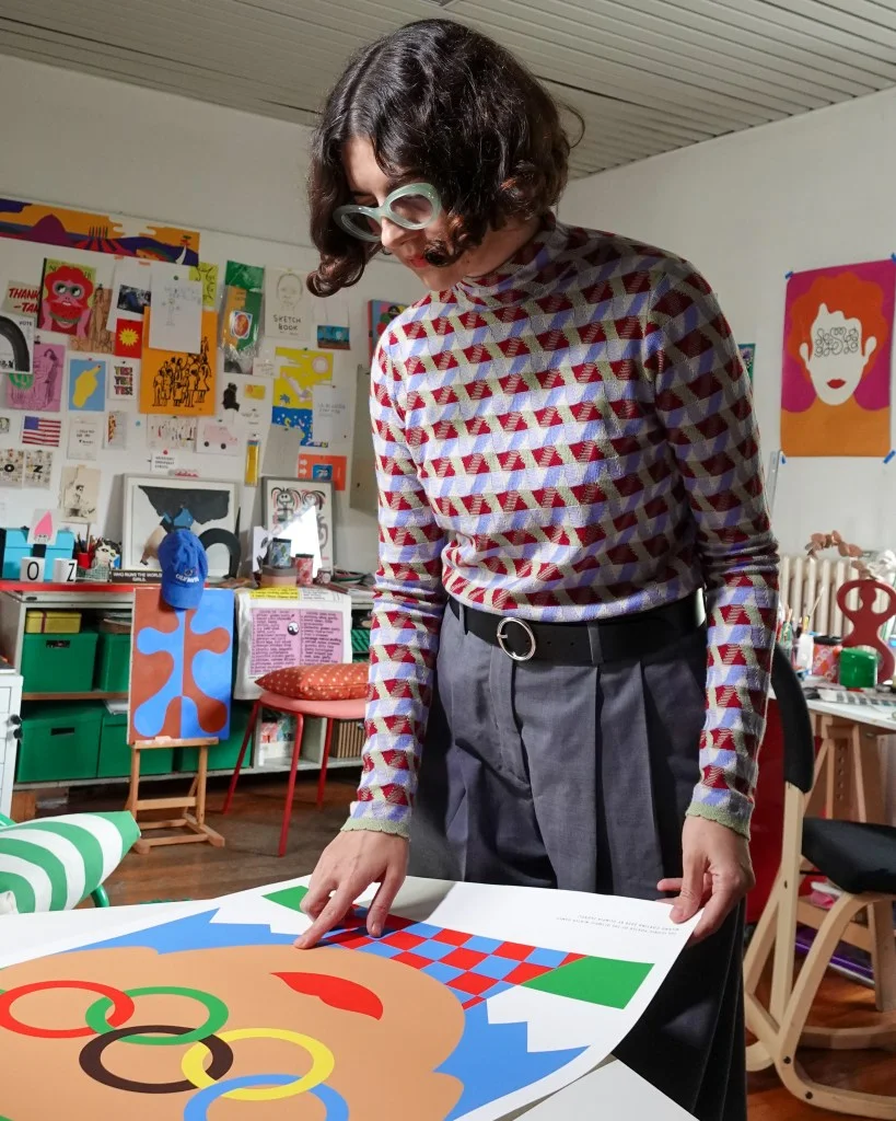
Zagnoli’s poster puts the Olympic rings at its centre, using the Games’ most recognizable symbol as the anchor for a fresh composition. The design is described as bold, direct and vibrant, with the rings given new life through her graphic treatment. That choice makes the symbol do more than identify the event: it becomes the main visual material, carrying the energy and personality associated with the Games and the people who take part in them.
For designers, the approach shows how a familiar mark can remain legible while being recast as the focus of an artwork. Here, recognition and reinterpretation work together. The rings give viewers an immediate point of entry, while Zagnoli’s treatment lends the image its own character. The source doesn’t specify the poster’s typefaces, palette values or grid, so the design’s stated emphasis rests on its strong central symbol and lively visual language.
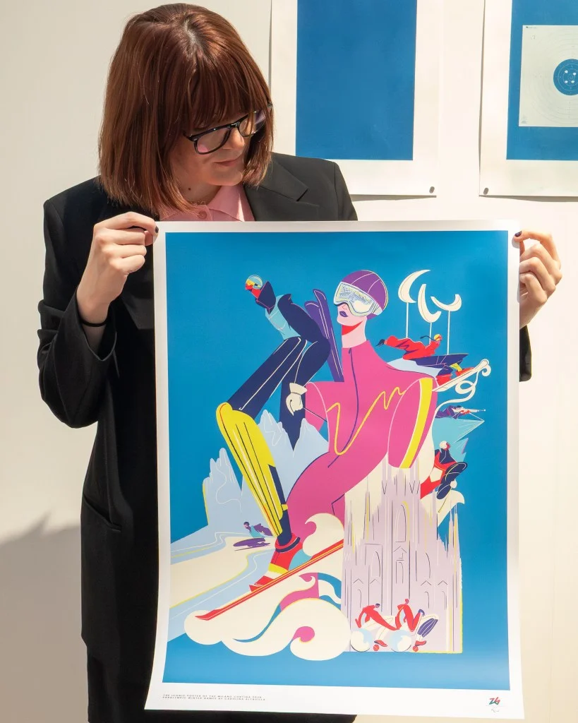
Altavilla takes a different route for the Paralympic poster. Her fluid, sketch-like contemporary illustration has a retro twist, bringing a looser, more expressive quality to the image. The stated intent is to reflect the Games’ many dimensions and their inclusive force, while conveying sport as a source of connection, support and inspiration. Belonging and solidarity are central themes.
That contrast gives the pair a useful visual relationship. Zagnoli builds from a concise, established symbol; Altavilla’s illustration points toward movement, multiplicity and human connection. Both are presented as expressions of the “Italian Spirit,” but each translates that idea through a different mode of image-making. Their shared purpose doesn’t require identical styles.
Designed to represent place as well as sport
The posters were developed through a collaboration between the Organizing Committee and Triennale Milano, with Damiano Gullì as curator. The brief connects competition and enthusiasm with the host territories. That gives the designs a broader role than event promotion: they are meant to link the experience of sport to the identity of the places hosting it.
Raffaella Paniè, Director of Brand, Identity and Look of the Games, called the posters “the visual heart of our identity.” She said they interpret the motto “It’s Your Vibe” and translate the project’s values of inclusion, territory and contemporaneity into images. Paniè also described the works as part of the event’s artistic and cultural heritage, alongside its torches, medals and mascots.
Milano Cortina 2026 CEO Andrea Varnier described the posters as a balance between sport and society, tradition and innovation, Milan and Cortina. Domenico De Maio, Education & Culture Director of Fondazione Milano Cortina 2026, said the aim was to create a legacy that could cross generations and remain shared heritage. Their comments place the posters within a long-term visual identity, with the designs expected to accompany audiences on the journey to 2026 and beyond.
What the pairing makes visible
For a design team working across a large event identity, these posters offer a clear example of how a shared message can hold two distinct visual languages. A recurring symbol can provide continuity; illustration can add texture and emotional range. The balance depends on what each image needs to communicate, and on how much room the broader identity gives its designers to interpret the brief.
Here, the stated values—belonging, inclusion, territory and contemporary culture—are carried by different visual means rather than repeated as a single graphic formula. The rings make Zagnoli’s poster immediately recognizable, while Altavilla’s line and retro character offer a more personal, expressive reading of the Paralympic Games. The pair’s identity comes from their relationship as much as from either image alone.
The practical question to watch is how these two styles appear across the wider visual system as Milano Cortina 2026 approaches. The posters establish a strong starting point: one composition built around a known emblem, another around expressive illustration, both tied to the event’s host places and its stated values.
Read more about the earlier Art Posters of Milano Cortina 2026 project, and see the work of Olimpia Zagnoli and Carolina Altavilla.
| Rev | Description | Date |
|---|---|---|
| A | Issued for reading | |
| B | Viewed 557 times | Current |


