Lynne Rennie’s “Drawn to Canada” Maps Identity Through Everyday Symbols
- Project
- Graphic Design
- Drawn by
- PRINT Editorial Team
- Issued
- Sheet
- A-63
For SVA’s 100 Days project, designer Lynne Rennie draws objects, brands and customs to show how Canadian identity takes shape through shared recognition.
Canadian identity can be hard to pin to a single emblem. Lynne Rennie’s “Drawn to Canada” makes that difficulty its subject: over 100 days, the graphic designer and design educator drew and wrote about symbols that help people recognize a shared, distinctly varied culture.
Rennie created the project for 100 Days, an annual initiative at New York City’s School of Visual Arts. Founded by Michael Bierut, the project asks students in the school’s Masters in Branding Program to document a creative endeavor for 100 days. PRINT is presenting a selection of ten days from each student’s work; the wider collection is available in the SVA 100 Days projects gallery.
Rennie’s work brings a brand designer’s eye to a question that has no tidy visual answer. Her subjects range from snacks and hardware to regional customs and wildlife. Together, they suggest that identity forms through accumulated details people recognize, debate and pass along.
A living index of Canadian symbols
Rennie describes the project as a “semiotic study of Canadian identity.” She started with a daily drawing and short piece of writing, then built a spreadsheet to track the symbols. The index grew from her research as well as suggestions from people following the project.
That spreadsheet functions like a flexible brand system. Each new entry adds to a framework without closing it off. Rennie connects that process to identity itself: meaning gathers through repetition, revision and recognition shared among people. The drawings make individual symbols visible; the index shows how they accumulate into a broader picture.
Her starting assumption was that Canada often defines itself by comparison with other countries. But the project led her toward a different reading. Its identity, she writes, rests on “many small affirmations” and remains layered, regional and plural. The result is an open-ended portrait: a sketch that keeps being remade.
“It reflects how national identity, like branding, takes shape through an accumulation of symbols, iteration, and shared recognition.”
Lynne Rennie
Brands, foods and familiar objects
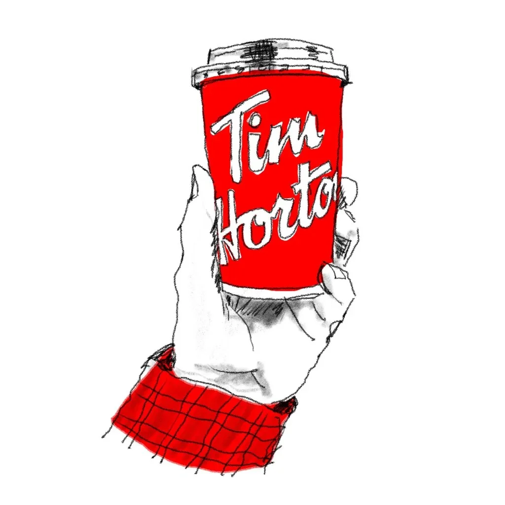
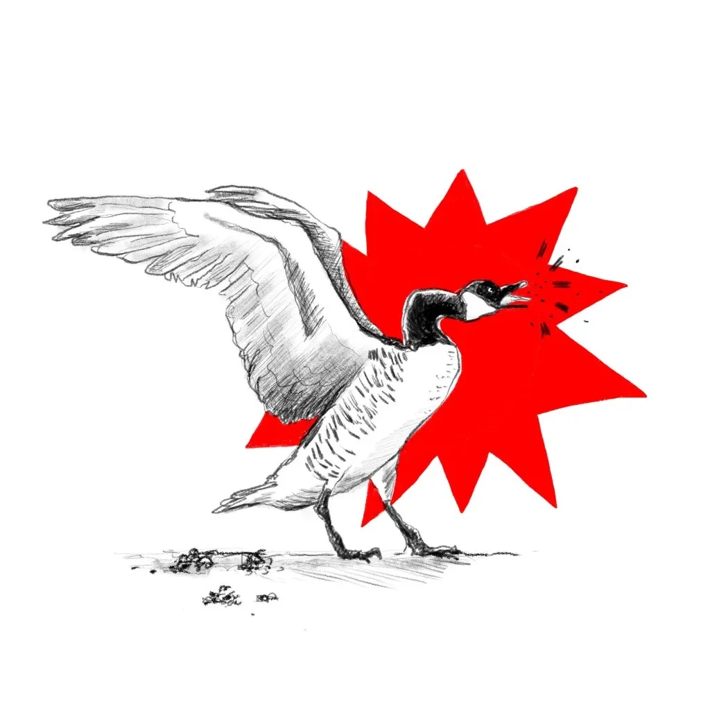
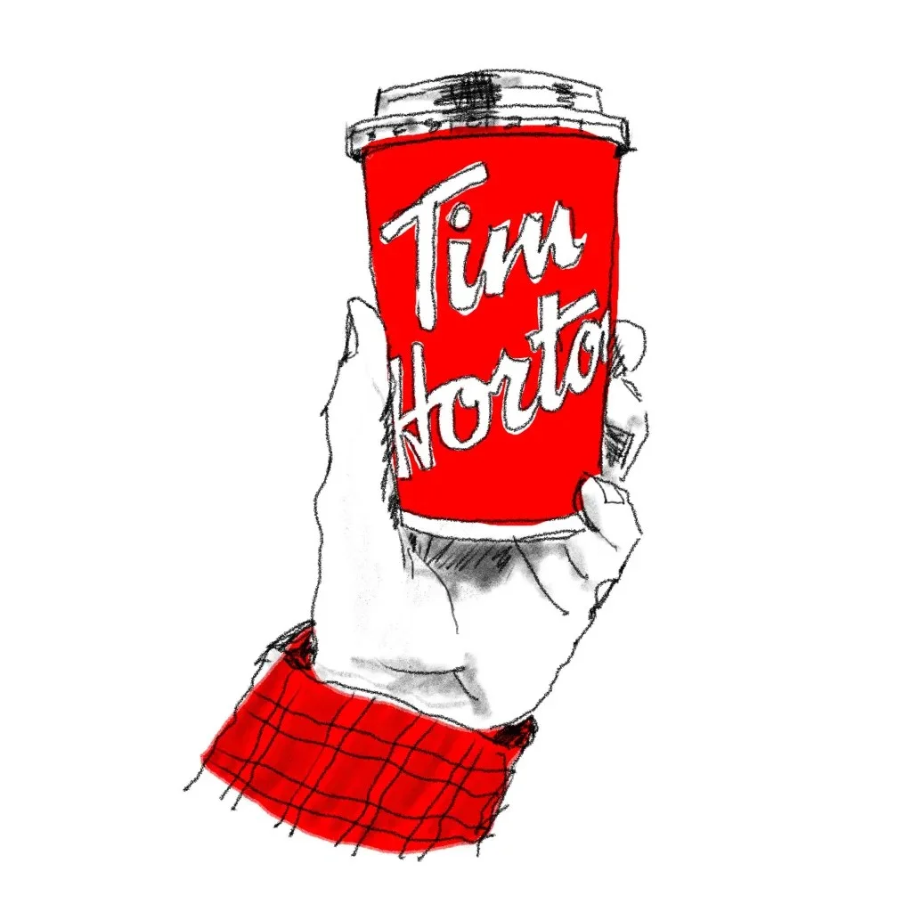
Tim Hortons’ association with hockey, small towns and youth sports has helped make the brand a national institution since its founding in Canada more than 50 years ago. The Canada goose offers a less polished emblem: Rennie points to its resilience, adaptability and unpredictability as qualities that echo the country’s contradictions.

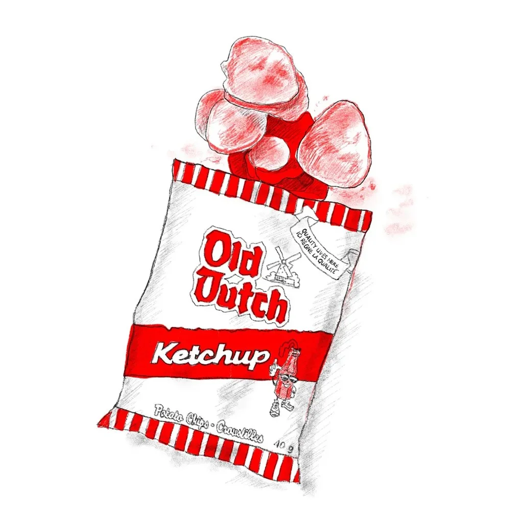
Language and food carry their own histories. “Canuck,” once outsider slang in the 19th century, became an informal and affectionate term for a Canadian. Ketchup chips stand out less because of an unusual flavour than because generations of popularity have tied the snack to Canadian culture.
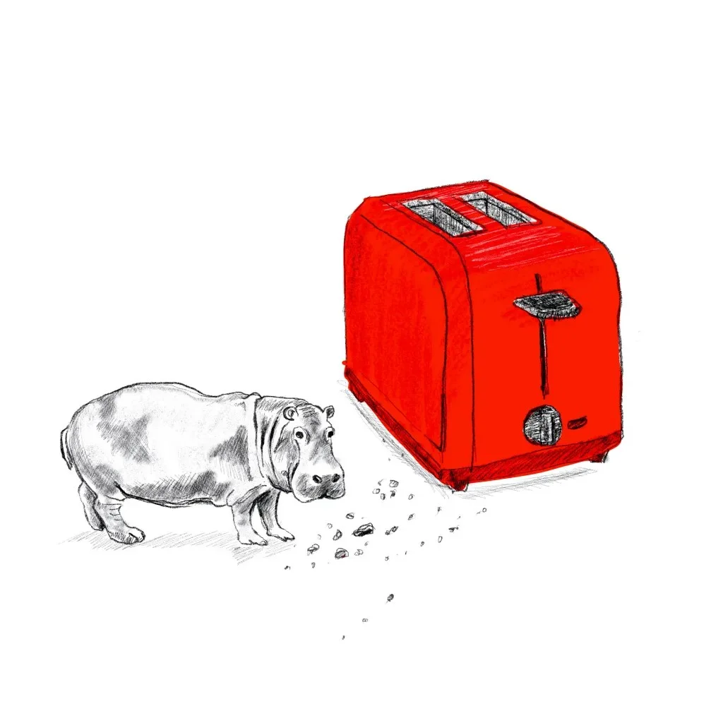
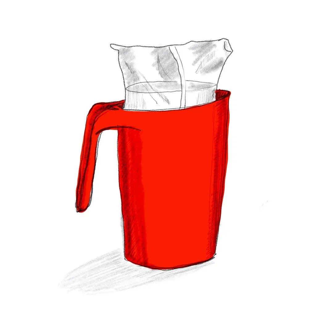
The North American House Hippo began as a 1999 public service announcement. Presented like a nature documentary, the fictional creature was designed to teach Canadian children to question what they see in media. Bagged milk, by contrast, grew from a practical change: it arrived during Canada’s shift to the metric system in the 1970s. Its use is regional, especially in Eastern and Atlantic Canada, where the format is familiar and elsewhere often perplexing.
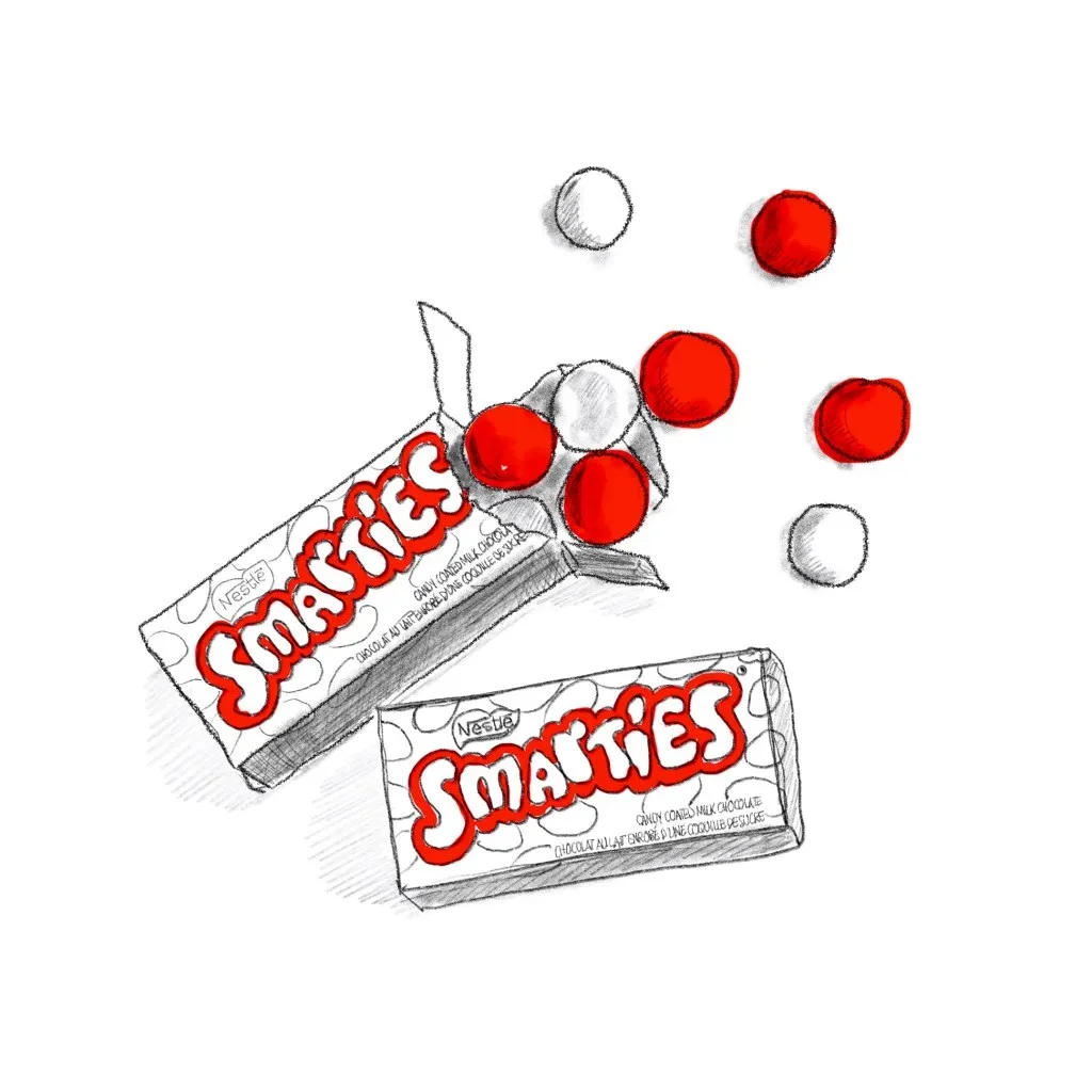

Packaging and engineering also become cultural markers. Canadian Smarties are bright, crunchy, candy-coated chocolates, distinct from the American candy that shares their name. Their familiar box and style reflect a longstanding preference for UK-style confectionery. The Robertson screw, a Canadian invention, is valued for its self-centering fit and resistance to slipping, particularly in woodworking and construction.
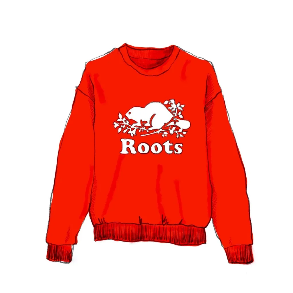
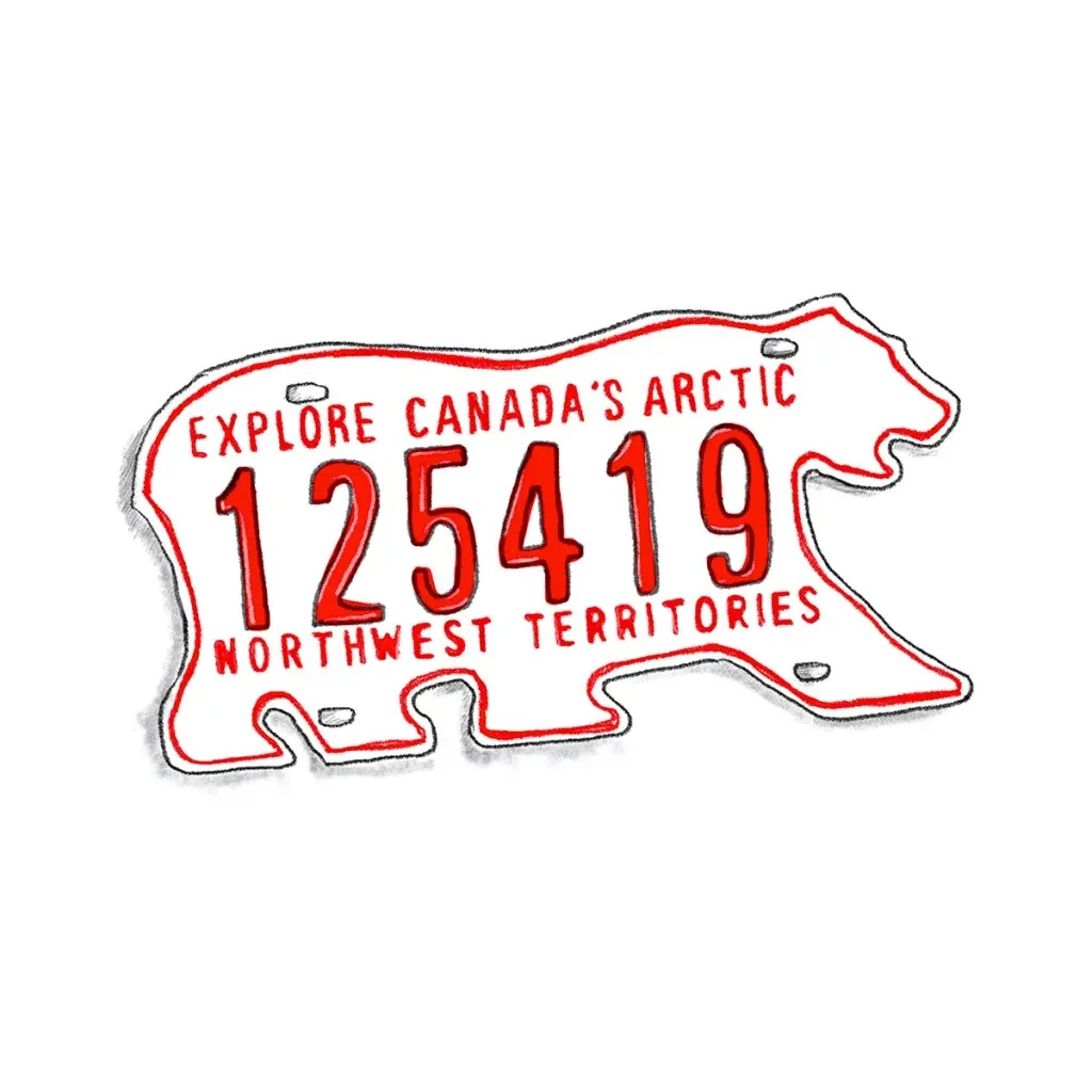
Roots built its brand around Canadian nature and craftsmanship, combining athletic style with wilderness imagery. Its beaver emblem draws on a national symbol, while the brand itself has become both a domestic fixture and a wider expression of Canadiana. The Northwest Territories’ polar bear-shaped licence plate compresses a distant region into a recognizable silhouette, linking the North with ideas of strength and wilderness.
Identity stays open
The range of Rennie’s subjects is the point. Some symbols come from deliberate brand choices; others gain meaning through use, regional habits or shared memories. Their visual forms are easy to recognize, but their significance comes from the stories people attach to them.
For designers, the project offers a useful way to study identity as a system in motion. Start with specific objects and customs, then look at who recognizes them, where they belong and how their meanings change. Rennie’s daily practice makes that process tangible: each drawing adds a mark, while the evolving index keeps the larger picture unfinished.
Rennie’s project can be followed on Instagram at @DrawntoCanada.
| Rev | Description | Date |
|---|---|---|
| A | Issued for reading | |
| B | Viewed 573 times | Current |


