Balbusso Twins Bring Classical Research and Painterly Illustration to New York
- Project
- Graphic Design
- Drawn by
- Steven Heller
- Issued
- Sheet
- A-52
Anna and Elena Balbusso discuss their shared process, classical influences and belief that beauty can bring viewers closer to complex subjects.
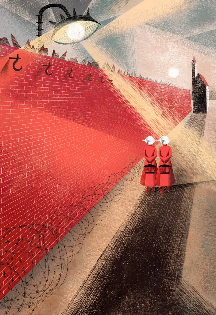
Anna and Elena Balbusso build images from research, historical references and a close exchange between two artists. Known professionally as the Balbusso Twins, the identical sisters describe their practice as a shared creative identity, while emphasizing that they remain distinct people. Their first New York exhibition, Balbusso Twins: Illustrating With Two Souls, is on view at the Society of Illustrators, the organization founded in 1901.
The exhibition brings their fluid geometric compositions into a gallery setting. Their work has appeared in American exhibitions and publications, and the show gives visitors a chance to consider how the images operate beyond the printed page. The twins’ approach pairs decorative richness with subjects that can be difficult or unsettling. For them, visual beauty is a way to invite attention and sustain reflection, rather than soften the meaning of a subject.
A shared signature, shaped over time
The sisters did not begin by making work together. They drew separately as children and students, and each had work experience before they became illustrators. Their early education at the “G. Sello” Art High School in Udine focused on graphics and photography. At first, they imagined themselves working as graphic designers in a studio.
After earning painting degrees at the Brera Academy and completing two years of theoretical study at the State University of Milan in modern literature and art history, they wanted greater independence. Illustration gave them a way to bring drawing and painting into finished work. Early in their careers, they chose to work as an artistic duo under one name, partly to avoid competing with each other.
The Balbusso Twins signature took formal shape in 2000, when they launched their first website and created a logo. That mark has changed over the years; its latest version dates to 2023. The name represents a way of working in which neither artist’s contribution stops at the initial idea. They describe a continuous back-and-forth: one sister may start a project, but the other brings in a detail or another point of view, and both stay involved from the first stage through completion.
That shared authorship doesn’t mean they aim for one fixed look. They say they discuss the direction of their work constantly, but want to remain free to change its visual language to suit each communication problem. Instead of repeating a recognizable formula, they combine methods and references from different fields, using research to find an image that fits the subject and the client’s aims.
Research before style
Their process begins with investigation into a subject and its visual history. The twins describe studying literature, history and art history, as well as the topic itself, to develop an appropriate image. They compare this work to academic research, but stress that it has a practical purpose: the findings guide a visual strategy for a particular assignment.
For designers, their account offers an alternative to the idea that professional recognition depends on a single, consistent style. The Balbussos define their identity through the relevance and quality of the problems they choose to address. That approach asks for self-criticism and a willingness to decline work that doesn’t fit their direction. They don’t claim to know exactly where the practice will go; they do have a clear sense of what they won’t take on. Their own shorthand is “Multidisciplinary research + Versatility = Creative Freedom.”

Economist’s 1843 magazine, 2020.
The subject matter matters as much as the method. The twins favor commissions that allow them to take a critical position and work through complexity. They resist assignments that rely on a light or fresh appearance to make a subject seem simpler than it is. They’re interested in experimentation and change, and look for opportunities to move beyond recurring types of work, including across different sectors.
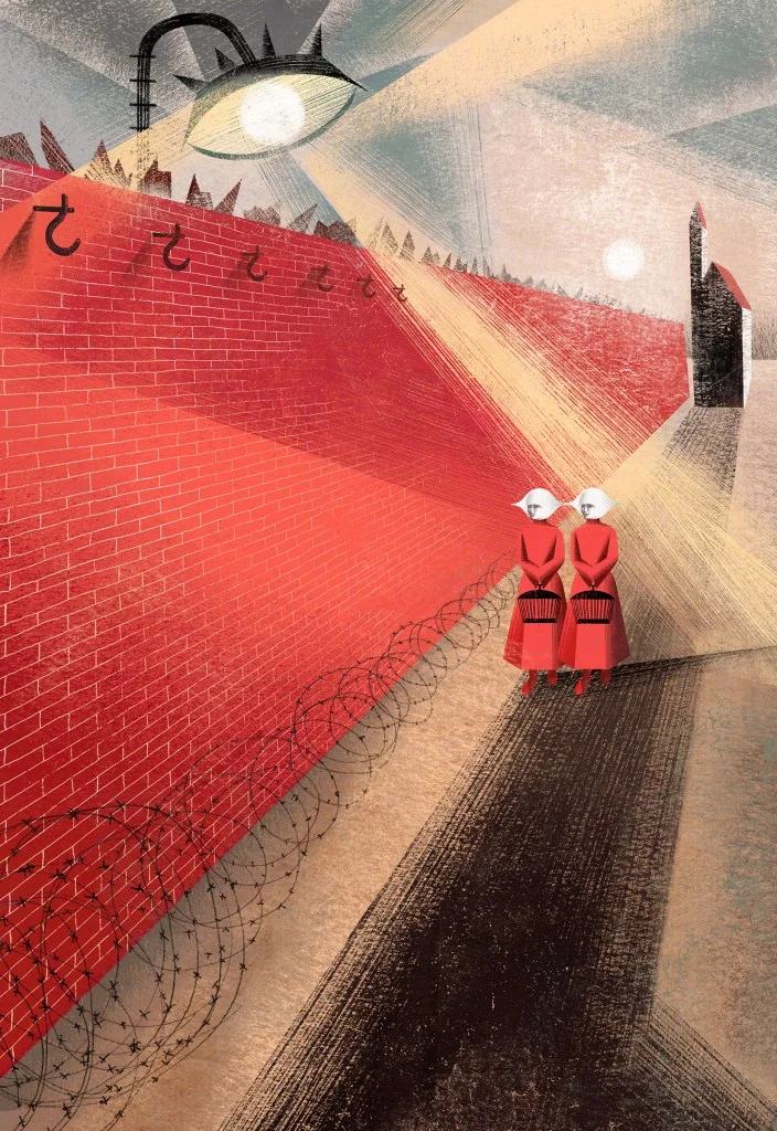
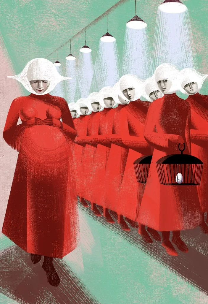
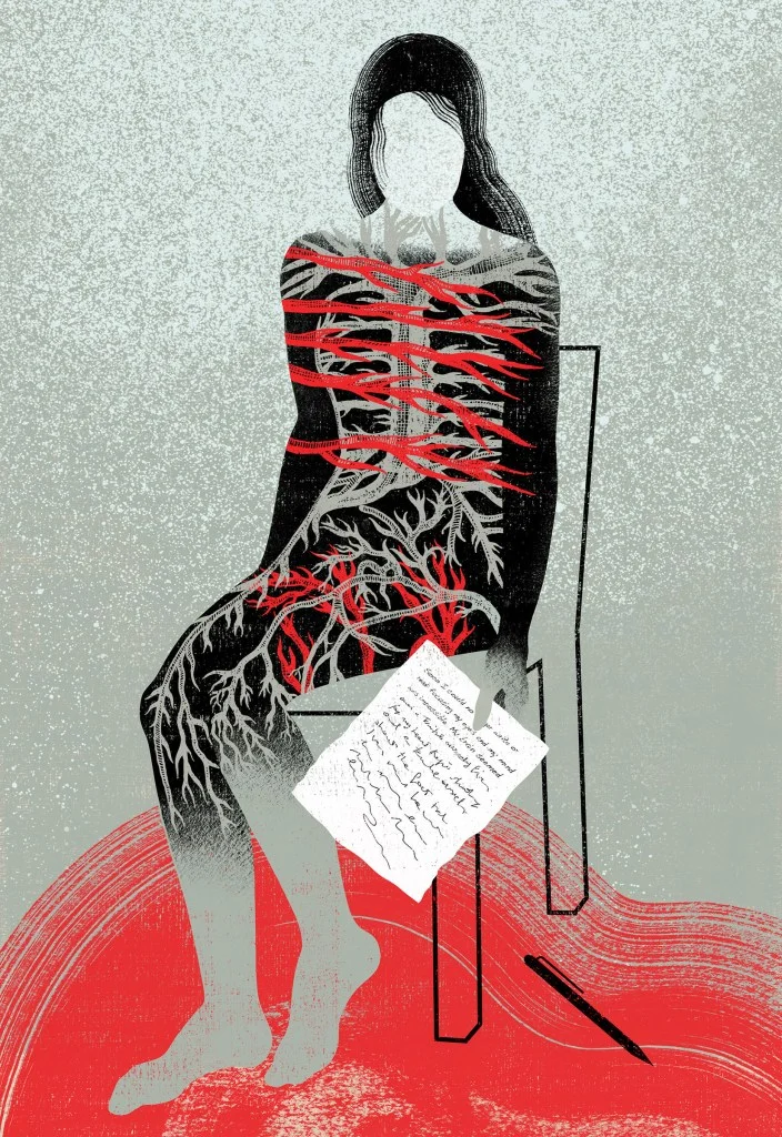
Posters are one area they especially want to develop. The sisters have made posters as part of their independent practice, including a 2018 screenprint series for Dark City Gallery inspired by The Handmaid’s Tale. They would like to design theater posters, where large-scale presentation could reveal the layered, painterly qualities of their images. They see the image as a stage for communication: scale can give the work room to hold complexity and make its details more present.

Harmony with room for tension
Their shared background draws on painting, graphic design, architecture, photography and cinema. Classical art and the Renaissance are central references. The twins describe an interest in idealization, balance and harmony, alongside figures that feel timeless. Frontal faces, often looking directly at the viewer, recall Roman portraiture. Symmetry is a recurring tool, though they’ll break it when the narrative calls for a different balance.
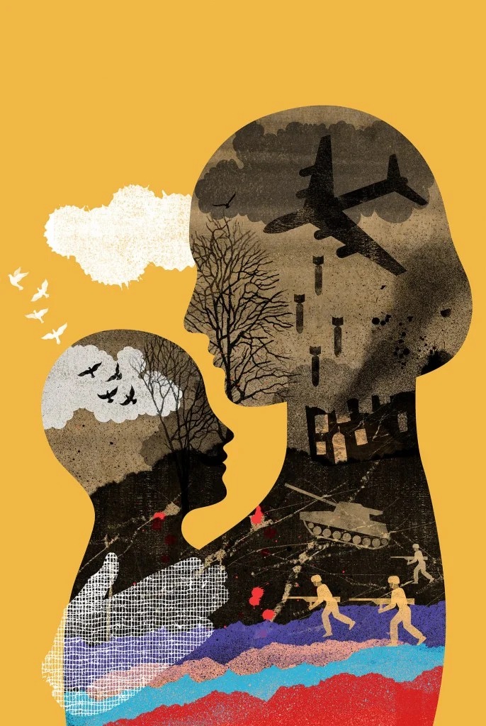
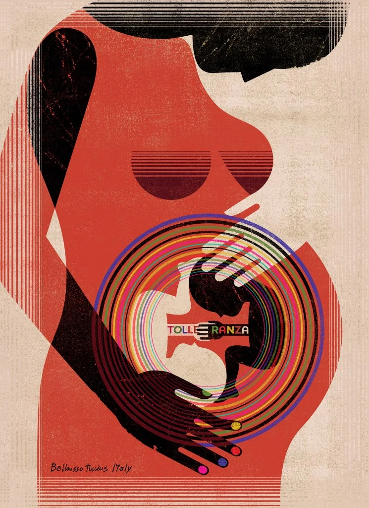
That pursuit of elegance coexists with socially charged subjects, including civil rights, abortion and violence against women. The artists believe beauty carries ethical value because it can engage viewers with difficult material. A visually composed image, in their view, doesn’t have to reduce the urgency of its subject. It can offer a form of care for the viewer while keeping the topic in focus.
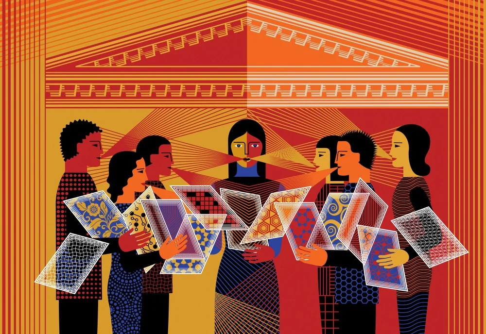
Their visual references range across periods and movements. Alongside classical and Renaissance art, they draw on 20th-century avant-gardes including Futurism, Constructivism and Bauhaus, as well as Art Deco and contemporary kinetic and conceptual art. The twins also return to a book they call their “magic book”: Domus: Wall Painting in the Roman House. When they’re stuck, they open it for a spark.
That habit reflects a larger commitment to depth. The sisters say their work needs time, study and reflection; they don’t see illustration as a quick styling exercise. Their research also draws on a collection of 1980s issues of FMR, the magazine founded by Franco Maria Ricci. Its coverage, from Byzantine mosaics to contemporary architecture, gives them a broad field of visual material to revisit.
Images made for a broad audience
The twins hope viewers pause and reflect, even if they bring no specialist knowledge. They want an image to speak to different people in different ways, with empathy and emotion present alongside a strong idea. Their aim is to make work that feels accessible without flattening its subject or sacrificing expressive force.
They recall staff at the Bologna Children’s Book Fair telling them they were deeply moved while setting up one of their exhibitions. For the artists, that response captures what the work is meant to do: make contact with a viewer. Their New York show puts that ambition in a new setting, while their process points to a practical takeaway for creative teams: let research shape the image, and let the subject determine how the visual language changes.
The post The Daily Heller: Four Eyes With One Vision appeared first on PRINT Magazine.
| Rev | Description | Date |
|---|---|---|
| A | Issued for reading | |
| B | Viewed 520 times | Current |


