Guy Billout’s Quiet Catastrophes Bring Geometric Illustration to the Gallery
- Project
- Graphic Design
- Drawn by
- Steven Heller
- Issued
- Sheet
- A-49
A solo exhibition at Philippe Labaune Gallery revisits Guy Billout’s precise, quietly comic approach to surreal illustration.
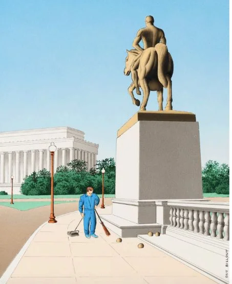
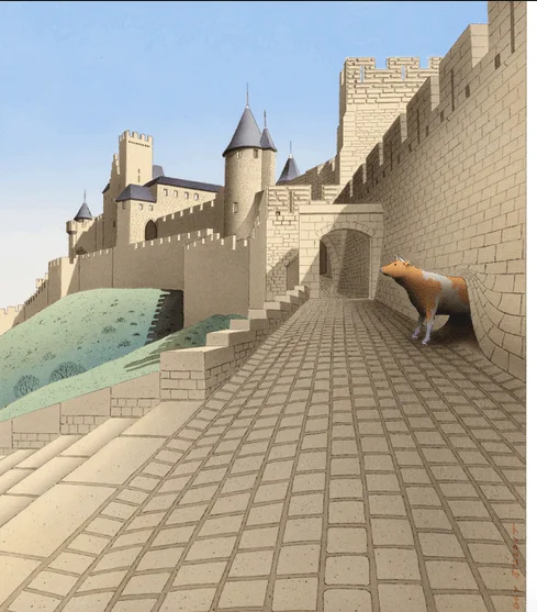
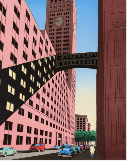
Guy Billout’s illustrations make tension look composed. Strict geometry, flat gradients and clean linework give his images an orderly surface, while subtle humor lets the strange or unsettling sit inside that order without fanfare. A solo exhibition, Quiet Catastrophes, at Philippe Labaune Gallery offers a chance to see that visual language in person.
Billout became a foundational figure in conceptual illustration from the late 1970s through the 1990s. His work is known for precise rendering and a particular kind of restraint: disaster, in his visual universe, arrives without a bang. The effect is closer to an ironic silence, where the image’s careful construction makes the disruption feel all the more pointed.
That combination gives the work its lasting design interest. Geometry can create a strong sense of control, and precise lines make objects and spaces feel legible. Billout’s subtle humor unsettles that clarity. The viewer is given a world that appears carefully arranged, then has to reckon with the quiet mismatch or disturbance within it. The joke doesn’t need an exaggerated gesture to register; the composure is part of the punchline.
A measured visual language
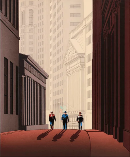
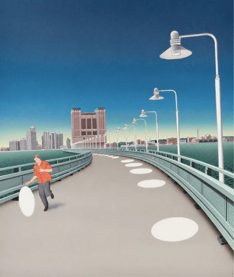
The ingredients described in Billout’s work are economical, but they leave room for considerable control. A clear line can define a scene without clutter. Flat gradients offer shifts in tone while keeping the image’s surfaces calm. Strict geometry can organize the composition and establish a sense of order. Together, those choices create a visual system in which a small change in scale, placement or expectation can carry weight.
For illustrators and art directors, that restraint is a useful reminder: an image doesn’t have to announce its idea through visual noise. When the underlying structure is clear, a carefully chosen contradiction can hold attention. The balance depends on the whole composition. If the geometry establishes calm, a disruption can feel more surprising; if the rendering stays precise, the humor can remain dry rather than turning into caricature.
That approach also asks the viewer to spend time with the image. The work’s humor is subtle, and its unsettling moments don’t arrive as spectacle. A first read may settle on the orderly construction; a second can reveal why that order feels odd. In this way, precision isn’t just a finish. It helps set the conditions for the image’s meaning.
Why the exhibition matters
The source of the exhibition announcement describes Billout as an important presence in late twentieth-century conceptual illustration, while observing that new work by him has been hard to encounter. It points to the shrinking number of viable outlets for illustration and the growing number of illustrators competing for attention as part of that context. Billout did not disappear, but the conditions for seeing illustration have changed.
A gallery survey offers a different way to meet the work: viewers can experience the drawings firsthand, rather than only through the formats in which illustration typically circulates. Philippe Labaune writes that the survey provides a rare opportunity to encounter Billout’s “fineness, wit and distinctive approach” in person. Those qualities are closely tied to the physical experience of looking: the crispness of a line, the measured finish of a form and the balance between composure and surprise.
The exhibition’s title, Quiet Catastrophes, names that tension. The wording pairs a sense of disruption with a subdued delivery, echoing the description of Billout’s images as places where disaster unfolds in silence. It points toward a viewing experience shaped by restraint: look closely at how a scene is built, then notice what its careful order makes possible.
Looking closely
For designers studying the work, a practical starting point is to separate its effects. First, look at how geometry organizes the image. Then consider how the line style keeps that structure readable, and how flat gradients contribute to the atmosphere. Finally, ask where the humor or unease enters. This kind of close reading can help illustrators see how formal choices support an idea without relying on a written explanation.
The exhibition is at Philippe Labaune Gallery, with an opening reception scheduled from 6 to 8 p.m. on May 20; the source does not specify a year. Its central appeal is clear: Billout’s work rewards attention to how a composed image can hold a quiet surprise. For anyone interested in conceptual illustration, the useful takeaway is not a formula to copy, but a way to think about restraint—as a means of making precision, humor and unease work together.
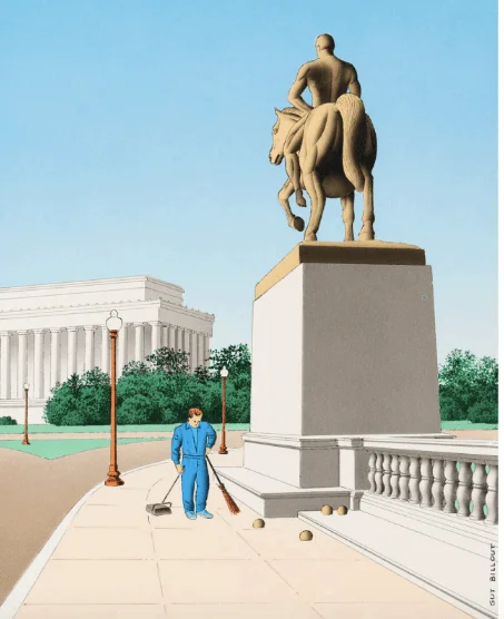
Visit the Philippe Labaune Gallery exhibition page for details. The original post appeared on PRINT Magazine.
| Rev | Description | Date |
|---|---|---|
| A | Issued for reading | |
| B | Viewed 484 times | Current |


