Custom Neon Signs as Storefront Branding: Type, Color and Material
- Project
- Graphic Design
- Drawn by
- Peter Makeshoff
- Issued
- Sheet
- A-43
A storefront neon sign works as branding when its typography, color and material carry the business’s identity clearly from the street.
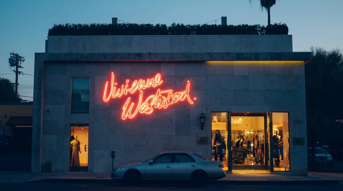
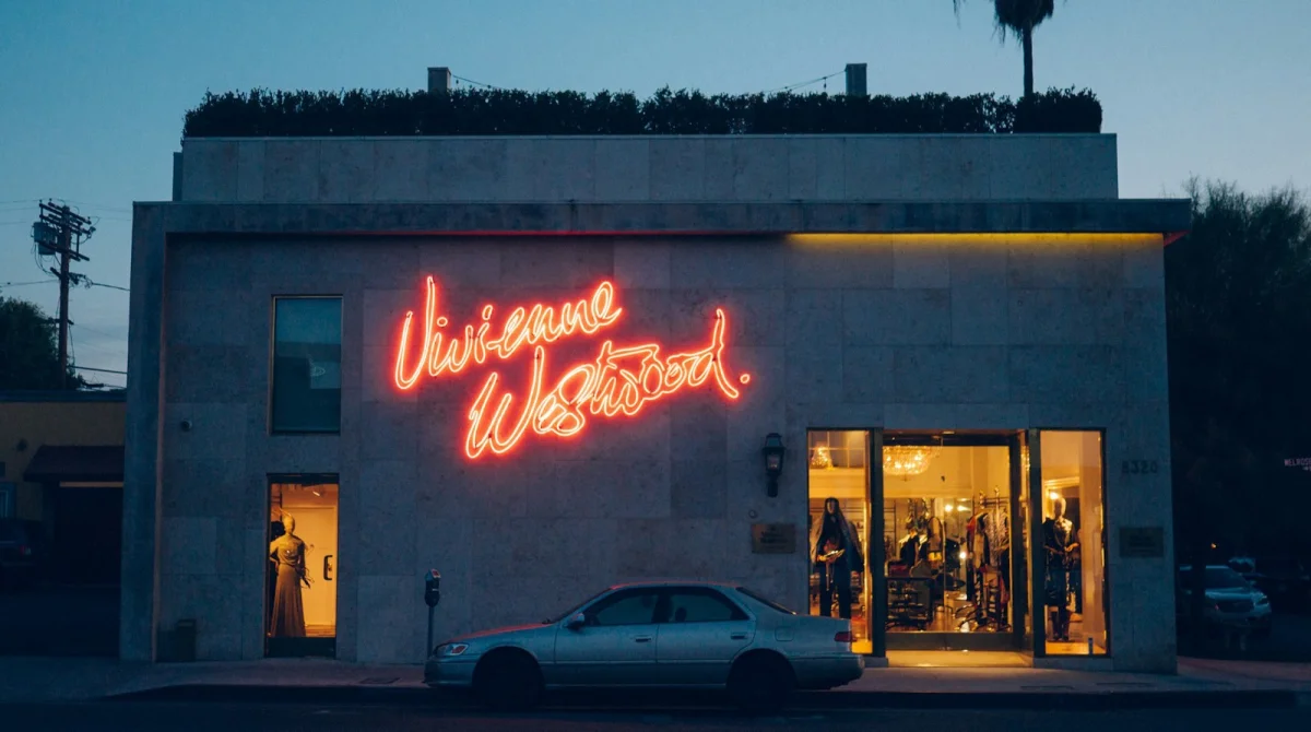
A storefront sign keeps representing a business after its doors close. At night, its lettering and color may be the clearest part of the shop visible from the street. That makes a custom neon sign more than a decorative flourish: it can put a brand’s identity in front of passersby when other parts of the storefront fade from view.
The distinction is practical. A generic glowing motif may make a window feel lively, but it could belong to many businesses. A sign that uses a recognizable name, lettering and palette gives people something specific to remember. It extends the identity into the physical space, at a scale where type and color must work from a distance and under changing light.
That’s why choosing a custom neon sign starts with the existing identity. The central design task is to carry its recognizable features into a medium with different constraints. Letterforms have to bend into tubing; bright colors behave differently from their screen versions; and the message has to read quickly. A sign can look attractive up close yet fail to identify the business from across the road.
Start with the identity, not a motif
A decorative image can suit a space, but decoration alone doesn’t tell people which business they’re looking at. A pink heart in a café window, for instance, has little identifying value if similar imagery appears elsewhere. The name and visual language are what connect the sign to a particular business.
That connection matters across touchpoints. When a company has already established a logo, palette and tone, a storefront sign gives that system a public, illuminated form. A generic script sign can interrupt the visual identity, even if it looks appealing on its own. The result is a storefront element that doesn’t match the other materials people may recognize.
Think of the sign as part of the identity system from the start. That choice affects what gets emphasized, how much of the name can fit, and whether the design needs to adapt for visibility. A strong result should make the business easier to recognize and recall after someone has passed the window.
Adapt the lettering for light
Typography carries much of the recognition, but a typeface designed for print or a screen may not translate directly into a glowing sign. Narrow strokes can disappear at a distance. Closely spaced letters may merge visually, while delicate serifs can be difficult to reproduce cleanly in bent tubing or LED flex.
The answer is usually adaptation, not abandoning the brand’s type style. A designer can retain its character while adjusting the weight, width and spacing so the letters remain distinct when illuminated. Removing details that the material can’t reproduce also helps preserve the wordmark’s shape. The aim is for the sign to feel like the same identity in a different medium, rather than a dim or distorted version.
Test the wording at the distance where people will encounter it. If a message takes more than a glance to decipher, passersby may not have time to read it. Short text, open spacing and clear contrast make the sign easier to scan. One recognizable word can do more work than a longer phrase that turns into a blur.
Choose color for its surroundings
A brand color doesn’t necessarily look the same when it emits light. A warm pink that feels gentle in a printed logo can appear much brighter when illuminated. A cool blue that looks crisp on a screen can cast a more clinical mood on a wall after dark. The glow changes both the apparent intensity and the atmosphere of a color.
That shift can help the design when it suits the business. Soft white, peach and amber tend to create a warmer impression, which may fit food, beauty and hospitality spaces. Blue, green and bright white often feel cooler and cleaner, qualities that can support a technology, fitness or clinical setting. These are broad associations, not fixed rules; the important question is whether the sign’s mood supports the brand’s existing promise.
Check the proposed color in the conditions where the sign will appear. Daylight and evening can change how it reads, as can the wall behind it. A bright shade may stand out against a pale surface but lose definition against a dark one. Ask to see how the color looks both lit and unlit before making a choice. The surrounding wall is part of the composition.
Select material for the experience
Traditional glass neon uses hand-bent tubes filled with gas. Its glow has warmth and depth that some businesses may want, especially when a vintage character is part of the intended look. The tradeoffs are practical: glass is fragile, can become hot, uses more power, and may be difficult to repair when a section fails.
LED neon flex produces a similar visual effect with flexible tubing and small LEDs. It is lighter and more durable, runs cooler and uses less energy. Many versions include a dimmer, allowing the brightness to be adjusted to the room or storefront. For a sign that faces regular daily use, those qualities may make LED flex a practical fit.
Neither material is the right choice for every identity. A vintage bar might prefer the appearance of glass and accept the maintenance it requires. A boutique looking for a durable, lower-maintenance sign may favor LED flex. The material contributes to the impression as much as the lettering does, so choose it as part of the design decision.
Make visibility serve the storefront
A well-positioned sign can support recognition and help a passerby decide whether to enter. People often make that decision quickly, based on what they can see from the sidewalk. A legible name gives them a clear cue; after dark, illumination can make the storefront easier to notice among neighboring windows.
Placement, wording and brightness should work together. A sign that is hidden from the main approach has limited reach, while one that is hard to read may attract a glance without leaving a memorable name. The practical details of how signage drives foot traffic can help inform those choices before commissioning a design.
A custom neon sign earns its place when the design decisions support the same identity: lettering that remains recognizable, color that holds up against its setting, and a material suited to the desired look and upkeep. Plan those details together, and the sign can keep communicating the business long after the shop has closed.
The post What Makes a Custom Neon Sign an Effective Storefront Branding appeared first on Designer Daily: graphic and web design blog.
| Rev | Description | Date |
|---|---|---|
| A | Issued for reading | |
| B | Viewed 319 times | Current |


