Forgotten Island Turns Filipino Memory into Color, Character Design and Animation
- Project
- UX & UI Design
- Drawn by
- Roma Murphy
- Issued
- Sheet
- A-206
DreamWorks’ Forgotten Island uses photo effects, Filipino references and shifting animation styles to make memory visible on screen.
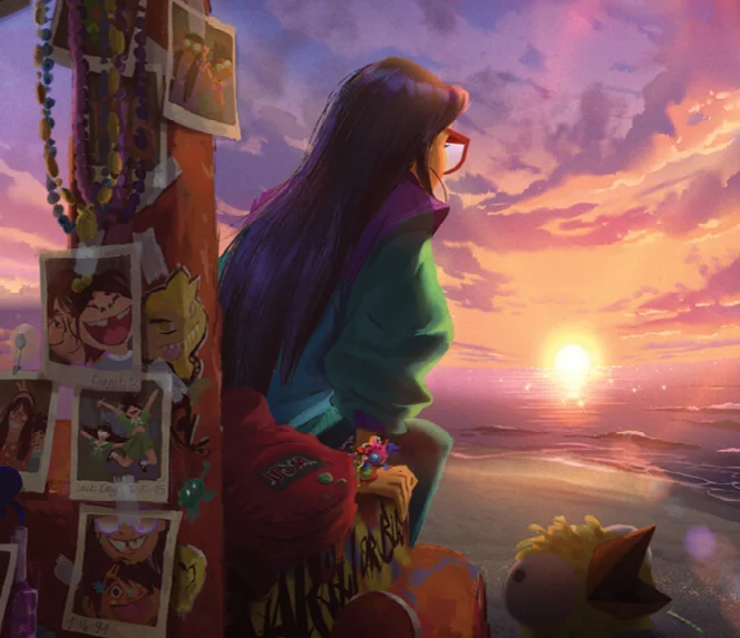
Forgotten Island makes memory a design problem with many answers. The feature moves between a 1990s Filipino setting and a fantasy island where recollections become unstable, personal and sometimes contradictory. Its visual language shifts with each change in perspective, connecting color, character design, effects and animation to the story’s central question: what remains of a friendship when its memories are at risk?
Writers and directors Joel Crawford and Januel P. Mercado built the film around Jo and Raissa, two teenagers facing a separation. Raissa is preparing to leave the Philippines for college in America, and the friends spend their last night together before she goes. They find themselves on Nakali, a strange island where returning home may mean forgetting each other. The setting draws on Filipino culture and folklore, while the 1990s period gives the story a particular relationship to remembering: a photograph was scarce enough to be chosen with care.
“When cameras had room for just 13 pictures, you were very purposeful with each photo,” Mercado says. “Now we have phones that can take thousands of pictures that you’ll never look at again.” The distinction shapes the film’s visual approach. Jo and Raissa’s shared history is held in photographs and in a friendship bracelet, so memory has both an image and a physical object to carry its meaning.

Giving photographs a point of view
The filmmakers wanted the remembered images to feel like photographs and home videos rather than polished windows onto the past. They worked with VFX Supervisor Betsy Nofsinger on light leaks, lens flare and the soft haze that humidity can leave at a frame’s edge. These effects bring the physical imperfections of older images into the film’s digital world.
The team also adapted a chromatic aberration effect used on 2022’s Puss in Boots: The Last Wish. In a physical camera, a lens may misalign color at the borders of high-contrast shapes, creating a colored fringe. In Forgotten Island, the effect unsettles the image and makes it feel dreamlike, as if the viewer is entering a memory rather than watching a neutral record.
Art Director Christopher Gun says the artists tested how strongly they could apply the effect while keeping the image legible. That balance matters: too little distortion risks making the sequence feel ordinary, while too much can obscure the action. The opening scenes use the effect as Jo and Raissa’s friendship develops, signaling that the audience is seeing the past. Crawford describes the sequence as letting viewers experience “the past, present, and future at the same time.”

Small objects, lived-in settings
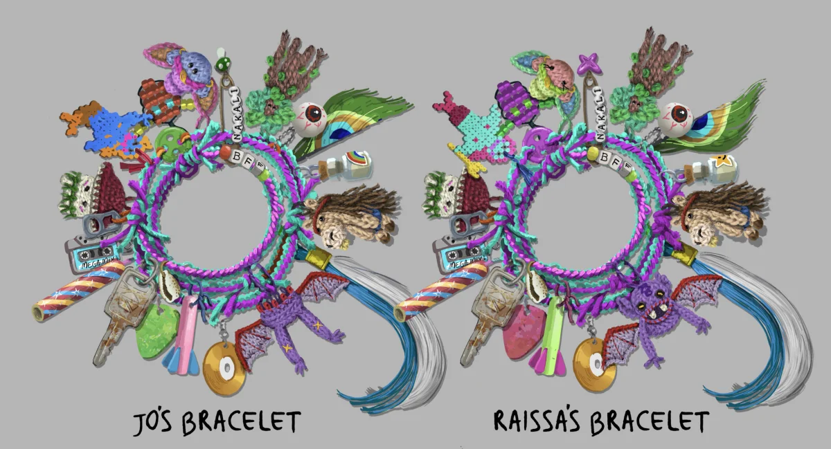
The bracelet turns shared memories into a sequence of charms, each tied to the girls’ personalities and interests. Visual Development Artist Christine Bian began by asking how the objects might have been made and what history they could suggest. For the Manang charm, which appears in a growing-up montage, the team considered a vending-machine toy cut in half, a miniature made by Jo from Fimo clay, or something crocheted with help from Raissa’s grandmother, Lola. The crocheted version moved forward.
From there, Bian developed a color version and compared it with the other charms. Their arrangement needed to work across size, color and shape, while each piece still carried its own story. The jeepney key went through several designs before becoming rusty and scratched, suggesting an object that had been carried and used for years. Bian says the everyday quality helped the bracelet feel personal instead of carefully assembled for display. Its details make the girls’ history visible without turning their keepsake into a collection of pristine symbols.
A 26-person crew of Filipino descent brought cultural knowledge and personal reference to the production. Mercado shared photo albums from his childhood trips to the Philippines in the 1990s with Production Designer Ryan Carlson, who used them to guide choices such as wall colors, home decor and the snacks in a kitchen. For Raissa’s celebratory barbecue, Story Artist Tiffany Ford drew on childhood parties with her Filipino immigrant family: crowded tables, relatives asking whether everyone had eaten, and food being passed around.

Geometry built for motion
Character Designer Shreya Devarkonda studied photographs of Filipino faces to develop the cast’s likenesses. The film’s character style called for sharp, geometric shapes with an edgy, modern feel. Devarkonda observed that the facial features she was referencing tended to be rounder and softer, so she set those forms against structured clothing and graphic, pointed hairstyles. The contrast helps the characters fit the film’s visual system while keeping their faces grounded in specific reference.
Translating that design into animation demanded careful technical work. Raissa’s rig had more than 8,000 controls, including systems for her glasses, long hair, wings and jacket. Computer-generated geometry tends to smooth out forms, while this design relied on corners and clear angles. Those shapes had to be built into the rig and preserved through movement, adding complexity to the animators’ work.
Nofsinger and the character effects team developed a tool that generated model references for folds in clothing and hair across different poses. Artists could then style those folds on top of the animation. Linework provided another way to hold the graphic shapes together: lines offset from a jacket’s edges could shift, appear or disappear during action, emphasizing a sharp contour as a character moved. Together, the fold references and changing lines let the characters keep their angular look through comedy and adventure sequences.


One story, many visual styles
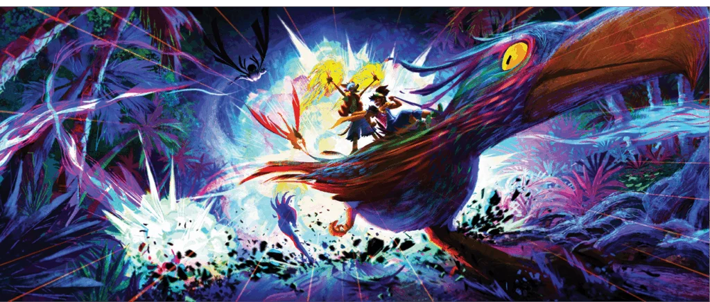
Nakali marks a sharp change from the Philippines’ warm, familiar interiors. Its neon palette, squiggly lines and triangles draw on 1990s graphic design. Carlson describes it as a rave party: a heightened setting for the girls’ final night together. Once Jo and Raissa lose their memories of that night, the film changes style again as new characters recount what happened.
Each recollection reflects its teller, both in visual form and in the events it describes. Raww, who wants to seem cool and muscular, gets a sequence shaped by Street Fighter. Prince Mermahn’s glamorous, romantic self-image points toward Sailor Moon. Bungi, a devoted son, turns his account into something like a woven tapestry. None of these versions is fully reliable. The film lets their differences sit side by side, with the fragments together offering a path toward what actually happened.

The climactic fight gives the artists several ways to show memories disappearing: breaking like glass, scattering as Polaroids or washing away with the surf. The team settled on a watercolor effect in which pigment drains from an image. Carlson says they studied how water carries color across paper, then considered how to reverse that action on screen. The process makes forgetting visible as a gradual change in the image, rather than a simple cut to black.

Manang, the memory-feeding antagonist, draws on the Manananggal, a shape-shifting monster in Filipino folklore that can split its body in two. That ability connects the character’s physical form to the story’s recurring separations. Manang required three rigs so she could work as a whole, divide into separate parts and use detachable wings. Her split also carries an emotional meaning: part of her has been cut off from her own memories.

Crawford and Mercado considered dementia while shaping Manang’s story. Mercado describes how losing access to shared knowledge can leave someone feeling isolated, with anger and paranoia following that separation. The idea gives the fantasy conflict a human dimension: memory helps anchor a person’s sense of self and their connections to others.
Forgotten Island makes that idea tangible through its changing images. Photographic flaws mark the past, charms give ordinary keepsakes emotional weight, and shifts in line, color and style show how memories change with the person recalling them. The film’s design choices keep returning to the same practical insight: a memory feels most convincing when its smallest details belong to someone.
| Rev | Description | Date |
|---|---|---|
| A | Issued for reading | |
| B | Viewed 642 times | Current |