The Alabama Solution: Balancing Investigative Design With Restraint
- Project
- UX & UI Design
- Drawn by
- Anastasiia Lutsenko
- Issued
- Sheet
- A-180
Zealous and its design partner built an investigative site for HBO’s documentary, keeping key visual stories while narrowing the design under a tight deadline.
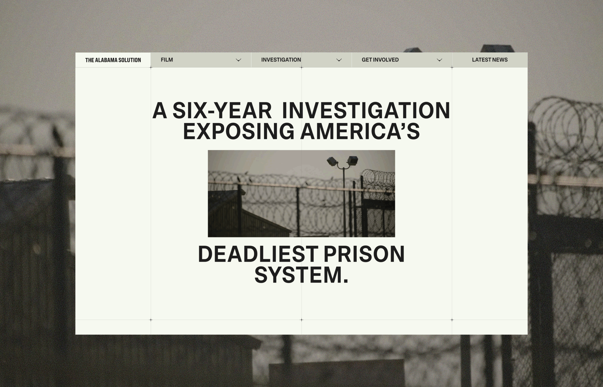
The Alabama Solution’s website had to make difficult evidence accessible without turning tragedy into spectacle. That tension shaped the work from the first visual experiments to the final, more restrained experience: a design built to support an investigation and let its material carry weight.
Zealous, a creative agency with an established relationship with the design team, brought them in to create an investigative subdomain for HBO’s documentary The Alabama Solution, directed by Andrew Jarecki. The site needed to stand on its own, so visitors could explore the reporting without first seeing the film. Its source material included court records, medical examiner reports and a private database of more than 1,000 cases involving people who died inside Alabama’s prison system. The project had roughly a month to reach launch.
Two paths through the investigation
The planned experience centered on an Overview of the investigation and Findings pages focused on specific causes of death. Those sections had different jobs: one needed to communicate the investigation’s scope, while the others had to organize complex evidence into distinct stories. Both had to be ready in time for the documentary’s premiere.
The design brief called for impact and seriousness, while leaving room to define the site’s visual language. The team’s first response was deliberately unconventional. They explored collaged imagery, scrolling that moved both vertically and horizontally, animated typography and a “Death Wall”: a large grid that gave each person in the database an individual place on screen. A zoom-out animation would reveal the full grid from a single photograph.
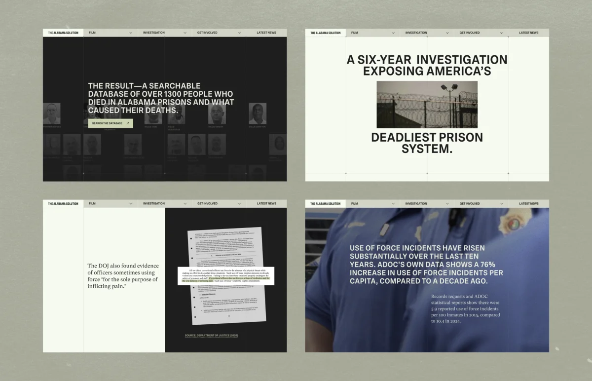
Zealous responded strongly to this direction and began adapting its primary domain to match. Development started before the design was settled, with the short schedule requiring the team to build while decisions were still in motion. Over about four weeks, they developed a first version with scroll-triggered charts, video in the hero section and layered interactions intended to make the reporting feel active rather than archived.
Restraint changes the brief
After seeing the first version, Jarecki asked for a simpler, more restrained approach. The concern was that a visually forceful site might compete with the film or make the subject feel aestheticized. That feedback changed the design direction, but the team still had to decide which details could carry through without disrupting the quieter tone.
The answer was selective reduction. The broader visual system became simpler, while a few interactions stayed because they supported the material itself. The hero animation remained: video footage divides the headline, bringing the film and the site’s central subject together through type and moving image. The Death Wall also survived. Its zoom-out reveal moves from one photograph to the full grid, making the scale of the database legible through a change in perspective.
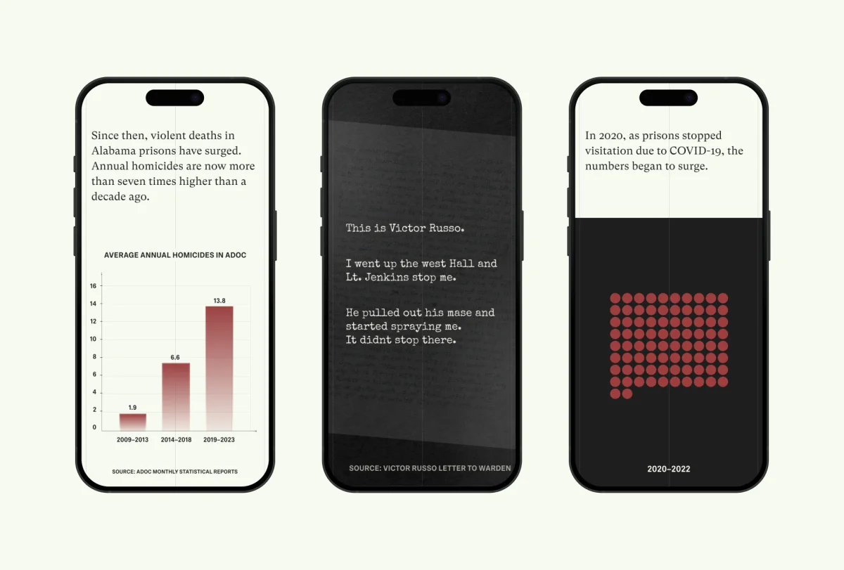
On the Findings pages, scroll-triggered charts stayed in place. The page about deaths from suicide uses an animated dialogue sequence to reconstruct a real exchange as visitors scroll. The page about deaths from officer violence brings fragments of a handwritten letter into view, preserving the writer’s original hand. These choices add motion where it has a clear storytelling role; they aren’t there simply to make the pages feel more active.
A shared structure with distinct stories
The four Findings pages were built over roughly one to two weeks each. Shared page structures gave the team a faster starting point, while changes in how information and interaction appeared helped each page retain its own character. That balance matters in a set of related stories: repeated navigation and layout can help visitors understand where they are, but identical presentation can flatten material that calls for different treatment.
Collaboration also extended beyond the original design scope. A developer on Zealous’s team ran into issues with their part of the build, so the design team held an informal review to help work through them. It was an unplanned contribution, but it reflected the close working relationship behind the project.
The site launched before the film’s premiere, with one Finding live instead of the six originally anticipated. The source describes four Findings pages being built, so the planned, built and launched counts were not the same. Given the schedule, the team treated the reduced launch scope as a deliberate constraint.
What the final design protects
The project’s clearest lesson is that restraint doesn’t have to mean removing every expressive idea. It can mean asking each element to justify its presence. Here, the surviving animations help visitors understand scale, follow a record or encounter a document in its original form. The more elaborate first direction gave way, but the final site kept interactions that connect directly to the investigation.
The film and the broader investigation later received Oscar nominations and recognition across award circuits. The site remains part of that record. For designers working with sensitive material, the practical takeaway is to test visual ambition against the story’s needs, then protect the few decisions that help people engage with the evidence thoughtfully.
Malloy Banks Case Study: Clarity Over Compliance
Immediate Case Study: Rethinking Payday
FarmSense Case Study: Fields, Sensors, and System Thinking
| Rev | Description | Date |
|---|---|---|
| A | Issued for reading | |
| B | Viewed 777 times | Current |


