NestEgg Health Uses Personal Targets and Team Progress to Reframe Workplace Wellness
- Project
- Graphic Design
- Drawn by
- Anastasiia Lutsenko
- Issued
- Sheet
- A-179
NestEgg Health pairs individual goals with team challenges, using high contrast cards and shared design patterns to make workplace activity feel more approachable.
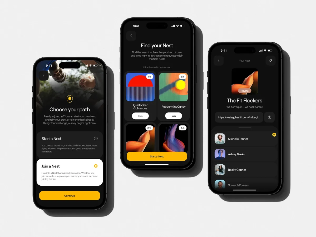
NestEgg Health’s central design choice is a fairness rule: employees pursue progress against personal targets, while taking part in a shared team experience. That structure shapes a virtual workplace wellness platform built to help people with sedentary routines add activity to daily life. The goal isn’t simply to display health data. It’s to make the next step feel attainable for people with different starting points.
Tubik Studio describes the work as a response to a familiar weakness in workplace wellness products: individual scorekeeping can turn activity into a private test of discipline. Isolated leaderboards may spotlight performance, but they can leave less active participants feeling behind. NestEgg’s design shifts attention toward teams and shared encouragement, while still giving each person a way to see their own progress.
One measure of progress, set for each person
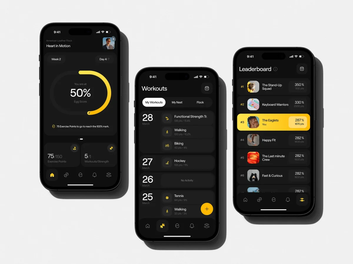
On joining, users complete a short survey that assigns them a level and a corresponding points target. The interface then frames success as reaching 100% of that personal goal. A new participant and a regular runner can work toward the same percentage while being measured against different baselines.
That approach makes the target itself part of the product’s motivational design. Instead of asking everyone to meet a single performance threshold, NestEgg gives each user a defined next step. The design describes level progressions as close enough to feel reachable, turning a longer fitness journey into a sequence of smaller milestones.
Effort and standout moments appear in pop-ups and social feeds. The intended tone is supportive and dependable, rather than demanding. An AI coach also fits into this model, offering personalized help as another point of support. The source doesn’t specify how the coach works or what data it uses, so its role is best understood here as a feature within the product’s encouragement system.
Cards make the data easier to scan
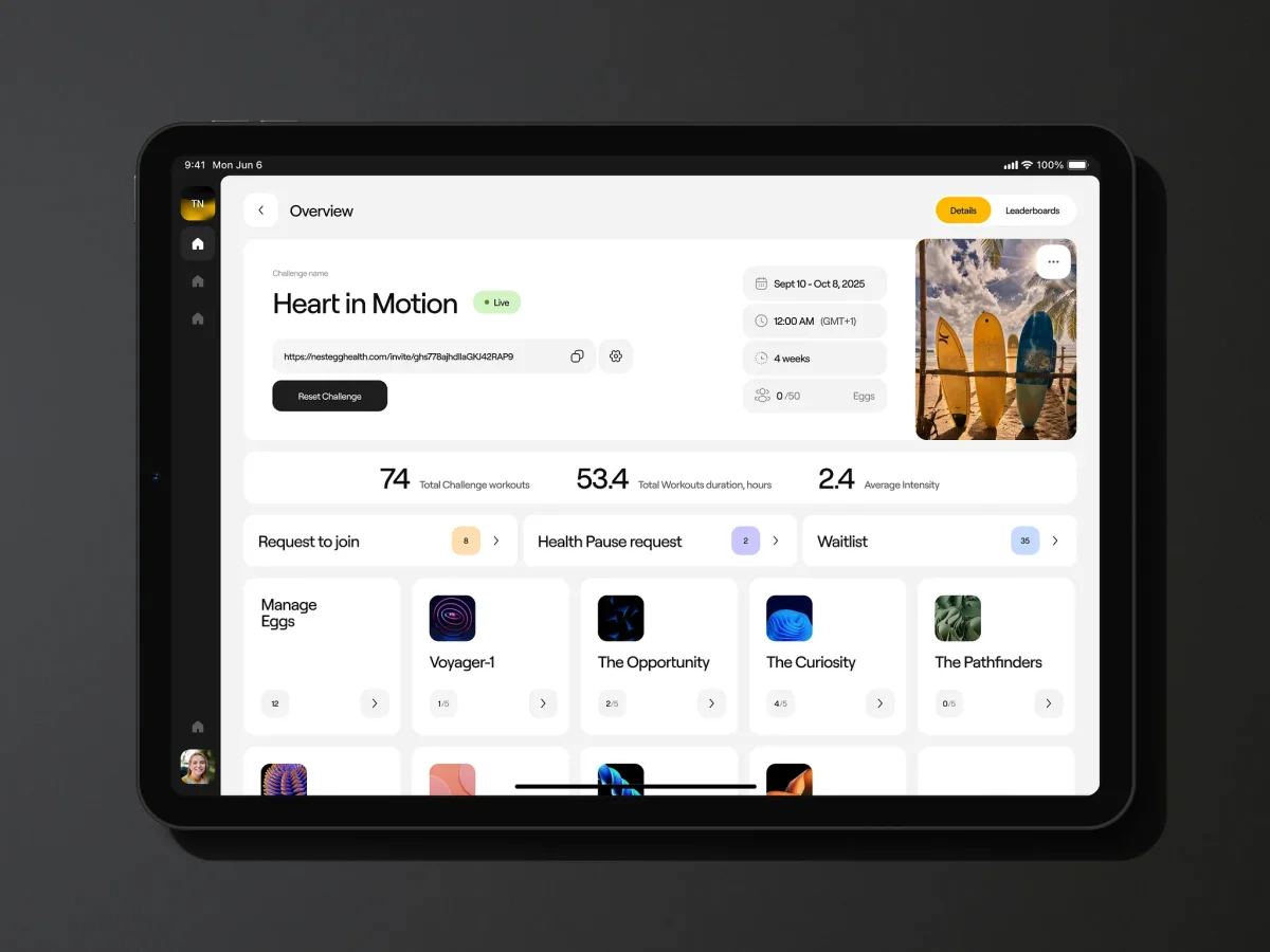
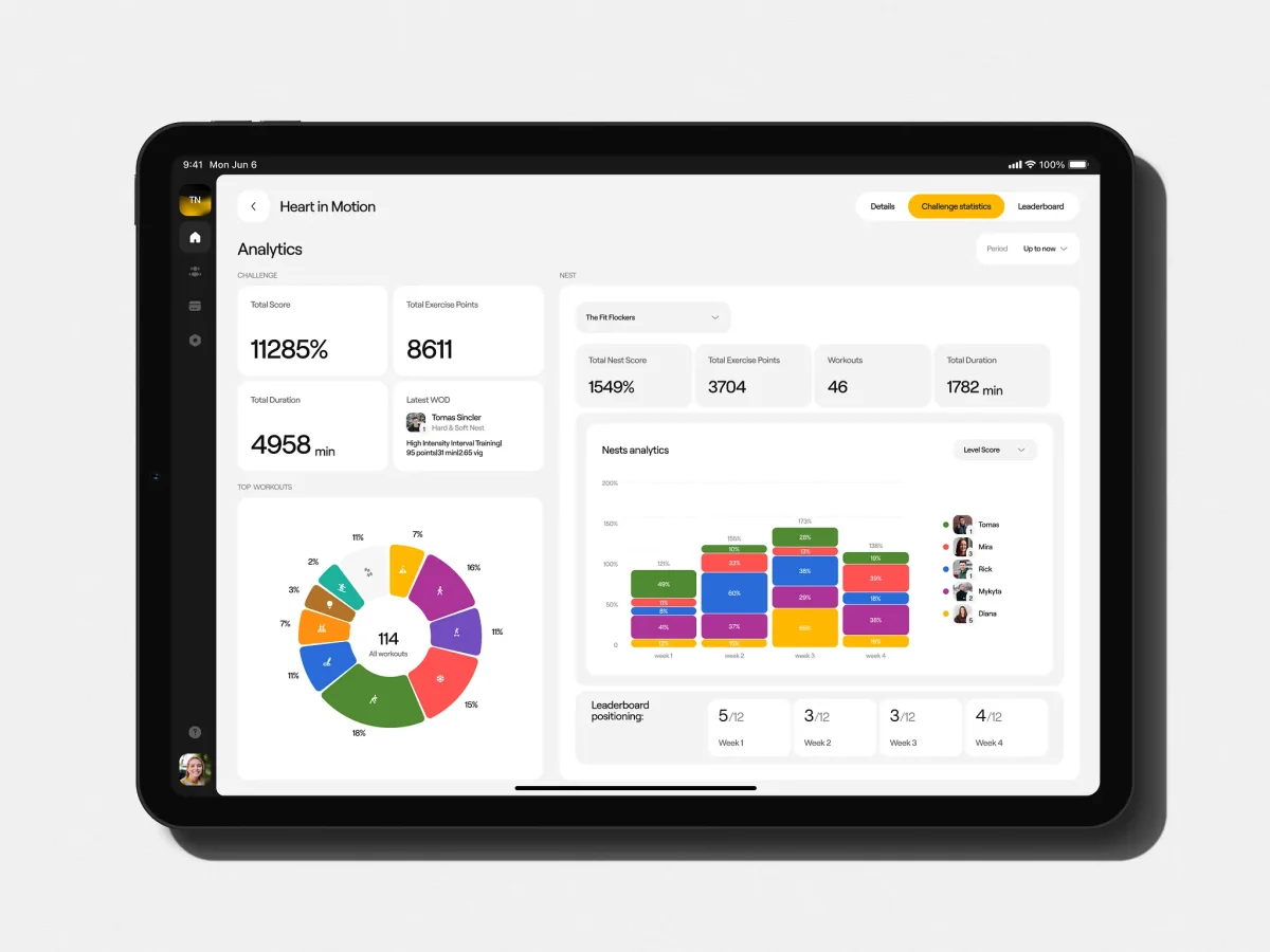
Health products can accumulate metrics quickly, and a dense dashboard can make users work to find the information they need. NestEgg uses a card-based interface to bring personal results, progress charts and current team standing forward. Larger cards establish the main reading order, reducing the need to search through menus.
A bright yellow accent marks primary actions and important performance figures. One example shown in the design is a “467% Nest Score.” Reserving the accent for a limited set of elements gives that figure and key controls visual emphasis against the dark interface. The design also uses progress bars and badges to make activity levels and weekly targets visible as achievements.
The “Nest” team experience balances belonging with competition. Rounded avatars and card-based requests make joining a team a direct action, while the team standing keeps a competitive dimension in view. The interface’s social layer is therefore built into the same visual system as individual progress, rather than treated as a separate destination.
One design foundation for two audiences
NestEgg comprises a mobile app for employees and a web-based admin dashboard for HR managers. The two surfaces serve different tasks, but Tubik says they share underlying logic and UI patterns. That common foundation gives the product a consistent visual language without requiring both audiences to use the same screens.
The color system centers on a high-energy yellow accent, chosen to support an optimistic, active brand character. Light and dark themes were considered at the system level, using variables and an atomic design approach. This makes theme changes part of the product’s underlying structure, helping the interface preserve contrast and readability across modes.
That decision has practical consequences for teams maintaining products across multiple surfaces. When colors and components are defined as shared system values, a theme can be applied more consistently than if each screen is styled in isolation. NestEgg’s case also points to a broader design lesson: coherence across audiences comes from shared rules and product logic, as well as visual resemblance.
Accessibility depends on the everyday details
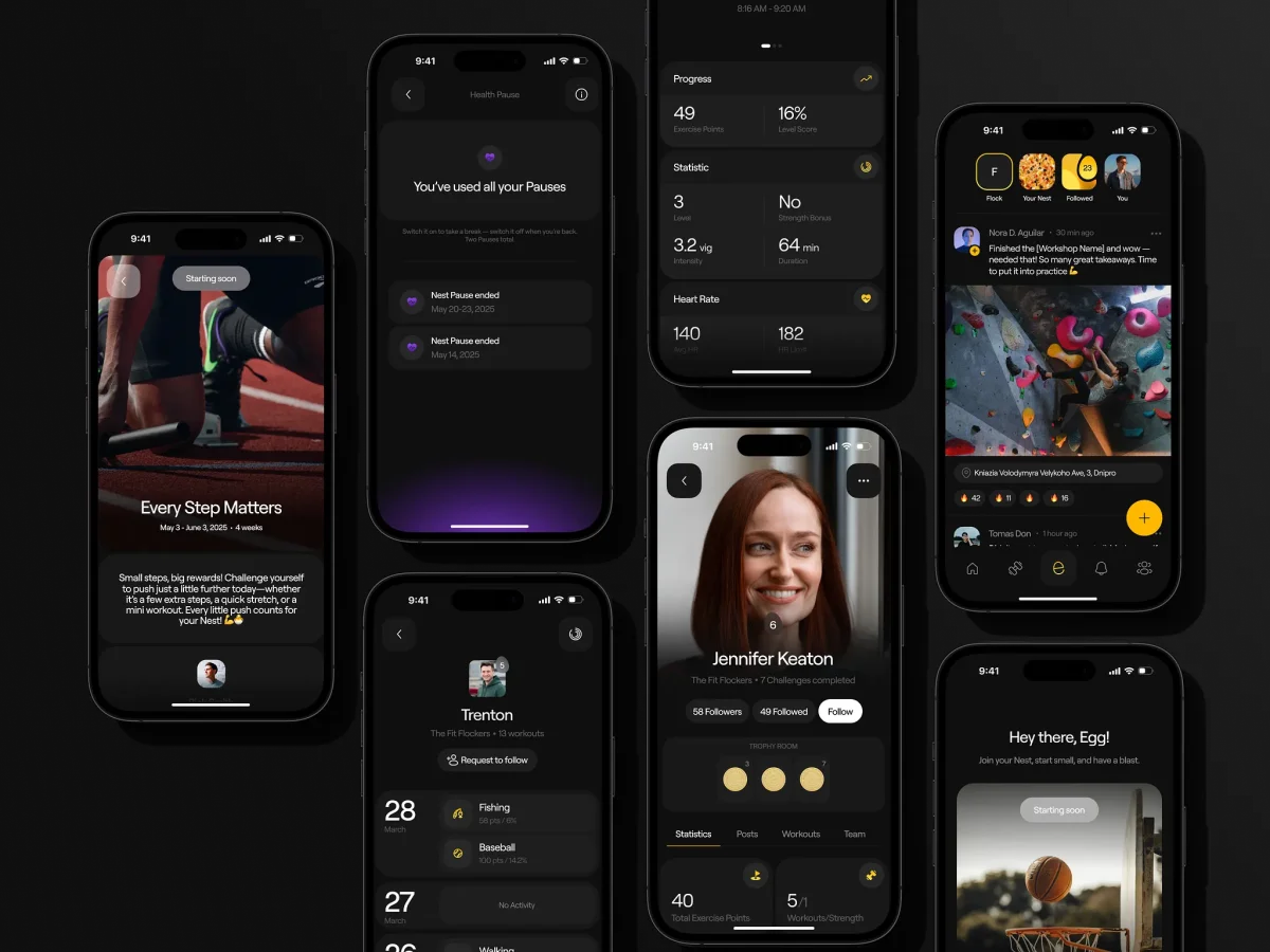
The project’s stated accessibility lessons are concrete: clear hierarchy and generous touch targets help make an interface easier to use. In NestEgg’s visual system, large cards help establish hierarchy, while prominent actions give users clearer places to tap. These decisions matter across the employee app and the manager dashboard, where different tasks still depend on legible information and predictable controls.
The project also shows why theme support is easier to handle when planned early. Building light and dark modes into the component system gives designers a place to check contrast and readability across the interface, instead of treating the alternate theme as a late visual treatment. The source doesn’t name specific accessibility standards or testing methods, but it connects accessible behavior to the same foundations that support a polished product.
Design intent carried through development
Tubik says it remained involved through two years of development. That continuity helped the team carry design intent into the product as it took shape. For a platform with employee and manager experiences, several activity states, and light and dark modes, that ongoing involvement can help keep interface decisions aligned across components and screens.
The project’s strongest idea is its pairing of personal measures with team participation. Personal targets give people a manageable way to track progress; the Nest layer adds a social setting for that progress. The interface reinforces both with cards, restrained use of yellow, and milestones that make activity legible at a glance. For designers working on behavior change, the useful takeaway is to make the next action feel specific and achievable, then give people a clear way to see their effort accumulate.
| Rev | Description | Date |
|---|---|---|
| A | Issued for reading | |
| B | Viewed 735 times | Current |


