A Biotech Brand System Built for Web, Print and Everyday Use
- Project
- Graphic Design
- Drawn by
- Anastasiia Lutsenko
- Issued
- Sheet
- A-177
An amyris flower rendered in 3D and dithering anchors a biotech identity designed to work across a Webflow site, presentations, social assets and print.
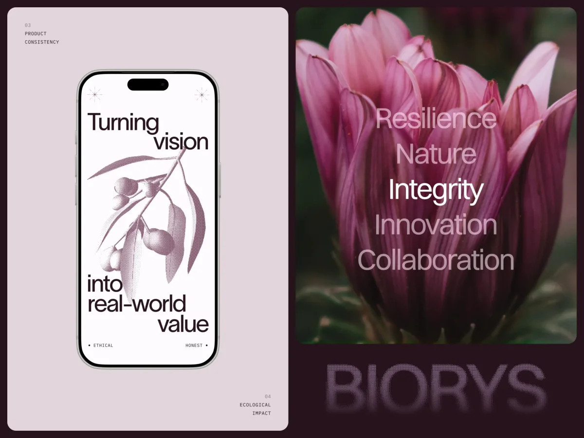
A biotech identity has to make a difficult idea visible: the work can be rooted in natural materials and shaped by scientific processes. For this client, the answer was a visual system that carries that tension across a website, sales materials, social assets and print. Its most distinctive cue is an amyris flower translated into a 3D image and treated with a digital dithering effect.
The project began with a company whose market presence and scientific work had moved ahead of its brand. The brief was to bring the public-facing identity into line with the business. That meant tackling the full set of places where the brand appears, rather than treating the website as a standalone redesign.
One system across every format
The deliverables covered the website, social media assets, printed brochures, presentation templates, business cards, roll-up banners and digital display banners. That range put a practical test at the centre of the work: could the same visual idea hold up on screen, in a deck and on printed materials?
Working across formats makes a design system’s underlying logic visible. A screen layout can rely on interaction or precise display conditions; a printed brochure cannot. A template needs to be easy to adapt; a large banner has to communicate at a glance. The team’s task was to find visual rules flexible enough to meet those different needs while keeping the brand recognisable.
Research set the direction. The team reviewed competitors, positioning benchmarks and established visual conventions in biotech, looking for ways to express scientific credibility without making the company feel distant. That balance shaped both the site’s structure and the identity’s nature-led imagery. The project did not treat trust as a colour or logo choice alone: the way information is organised also had to help visitors understand the business.
Designing the route through the website
Before settling the visual direction, the team mapped user flows, page architecture and content hierarchy. The intended visitor was a B2B buyer arriving with limited time and specific questions. The site needed to make relevant information easy to find and give that visitor a clear next step.
This structural work is easy to overlook because it sits behind the finished interface. Yet it determines whether the visual design helps people move through the site or merely decorates it. For a company asking new visitors to take its science seriously, a clear path through the content is part of the credibility story: people can assess what the business does without having to guess where key information lives.
A botanical image with a digital edge
The client asked for nature to inform the art direction, with a specific connection to its work with synthesized compounds derived from natural sources. The team chose the amyris flower as a visual starting point, built a 3D model, then applied a dithering filter to the rendered image.
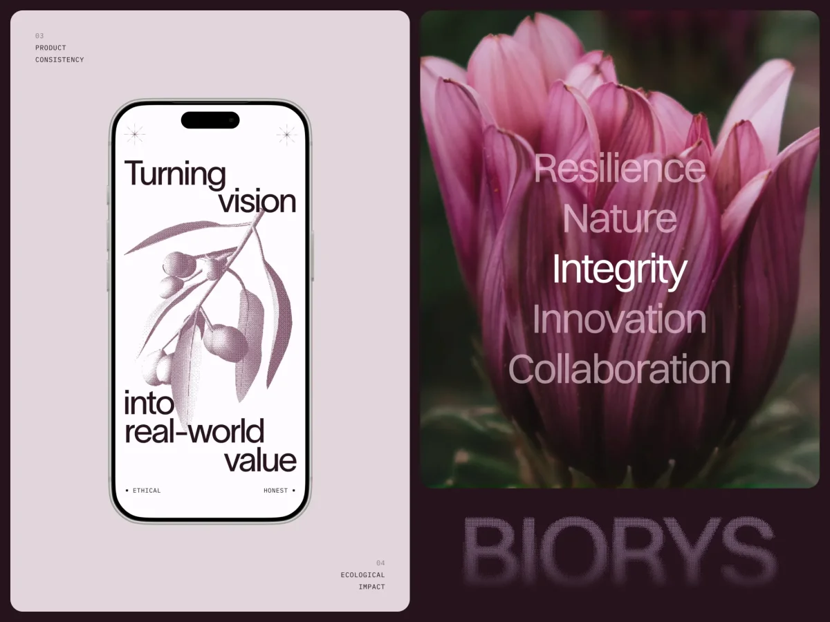
The treatment gives the flower a recognisably digital texture while retaining its organic form. It’s a compact way to connect the company’s natural source materials with the engineered processes behind its work. The palette follows the same direction: greens and earthy neutrals bring botanical warmth, while restrained application keeps the identity suited to a B2B audience.
That combination gives the brand a point of view without asking every format to repeat the same image. The flower, colour and broader visual rules can carry meaning across the system; each piece can still respond to its own content and dimensions.
Templates designed for real teams
Brand guidelines can describe a system, but people inside a company still need to use it under ordinary working conditions. Presentation and social templates therefore had to be practical for staff without design training. The team built options that let users add their content or image while the template handles much of the visual arrangement.
That requires attention to common mistakes. An image may be too dark, a headline may run long, or someone may select a colour that sits outside the intended palette. The team designed the templates to make consistent choices easier, rather than relying on every user to remember a set of rules. The balance matters: too little flexibility makes templates awkward; too much can weaken the identity with each new execution.
A site the client can maintain
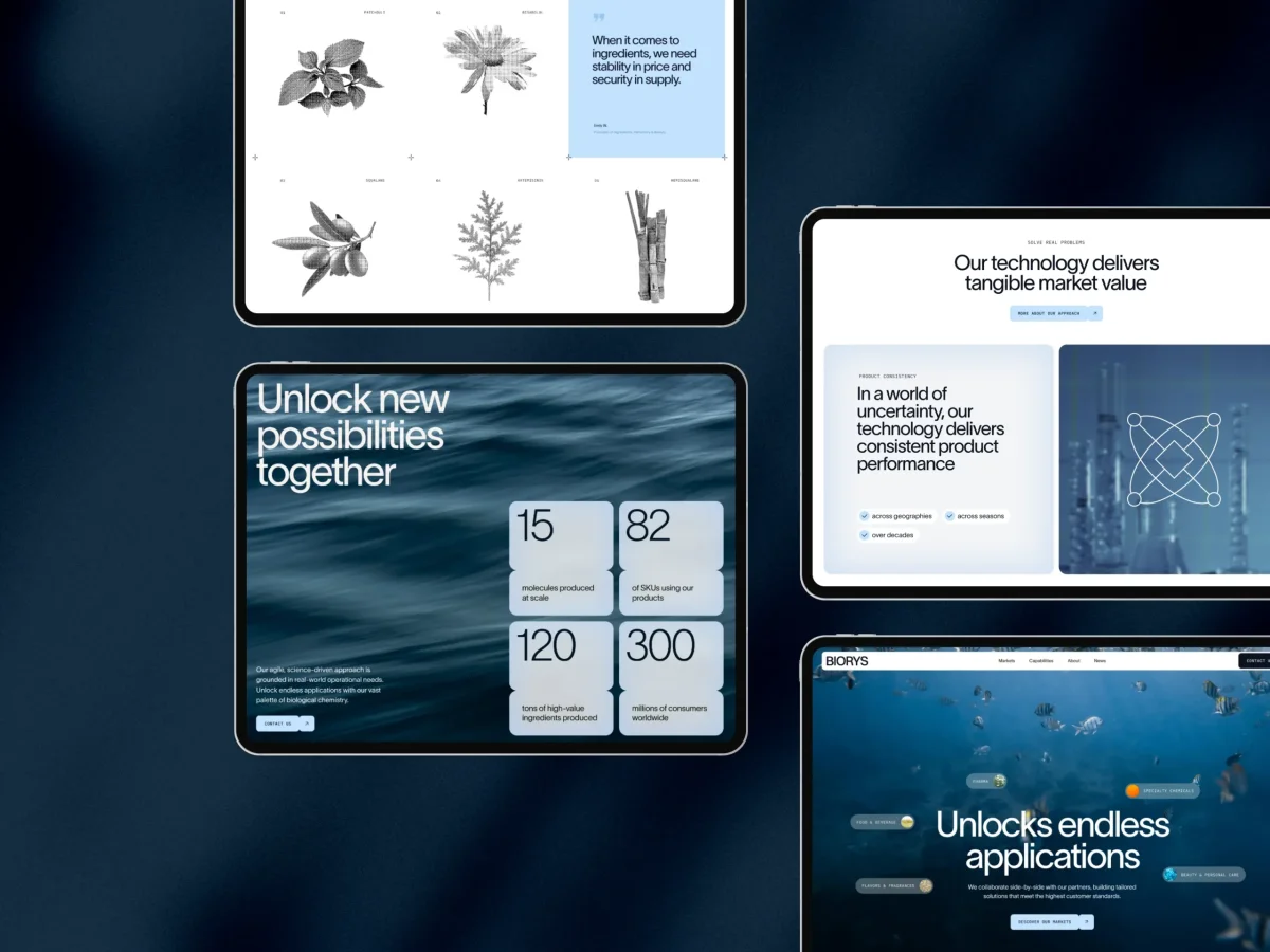
The website was developed in Webflow. Because the visual system and structure were resolved before development, the build could follow consistent rules for components and spacing. The finished site was handed over so the client can update content, add pages and make routine changes independently.
Motion supports the identity without taking over the page. The site uses four animated icons made in Lottie, alongside a rotation sequence for the 3D amyris flower. Those details add movement and point back to the visual concept while leaving the content in focus.
The project’s wider lesson is practical: when the core visual idea is clear, extending it to a deck, banner or business card becomes easier to manage. A broad scope also tests whether that idea works beyond a single screen. Here, the natural and digital cues, flexible templates and maintainable site all serve the same purpose: give the company a coherent identity its team can keep using as the business grows.
| Rev | Description | Date |
|---|---|---|
| A | Issued for reading | |
| B | Viewed 839 times | Current |


