Preezy’s Pixel-Art UI Turns Loyalty Challenges Into a Clear, Playful Progression
- Project
- UX & UI Design
- Drawn by
- Anastasiia Lutsenko
- Issued
- Sheet
- A-174
GamerG’s Preezy app pairs prize-linked challenges with pixel-art screens and avatar items, balancing clear progress tracking with a sense of play.
A loyalty app built around visible progress
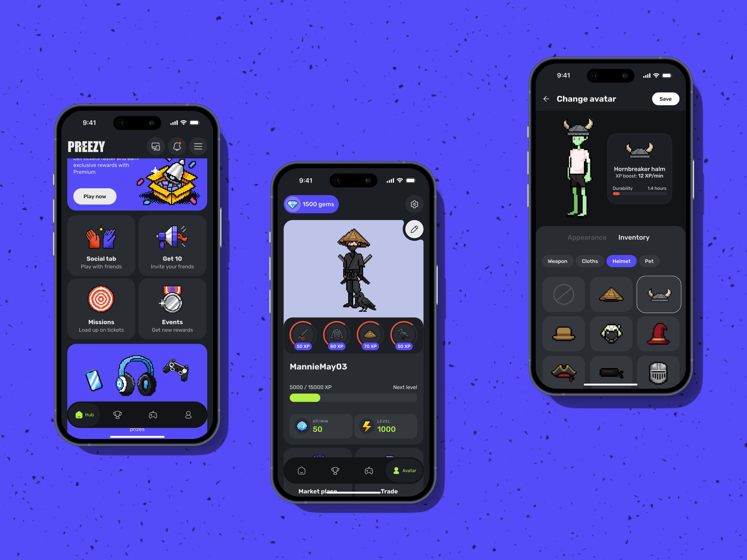
Preezy’s design challenge was to make a loyalty system feel like an experience people choose to return to. Built by GamerG, the mobile app lets users select challenges tied to real prizes, earn points through engagement and gameplay, track their standing, and customize an in-app avatar. The interface had to make each step legible while giving progress a personal, playful quality.
GamerG came to the project with an established color system, a pixel-art style, and mock-ups of key screens. Tubik’s role was to extend that foundation across important screens, flows, illustrations, and icons. The source doesn’t give a launch date or name individual designers, so the case is best read as a design account of the work rather than a dated product release.
Pixel art set a specific visual bar. Screens, icons, and avatar accessories all needed to feel like parts of the same world. That constraint shaped the work: new elements had to fit an existing visual language instead of introducing a competing style.
Four screens carry the user journey
The team mapped the journey from opening the app through challenge selection, participation, progress tracking, and results. It concentrated on four moments where users need either to understand the system or feel its payoff.
- Main screen: Available challenges had to be understandable at a glance. Users needed to see what they could do, what was at stake, and where to go next, without relying on a tutorial.
- Challenge selection: Each challenge connects to a particular prize. The screen needed to help users choose based on what they wanted, with the reward relationship clear enough to guide a decision.
- Active participation: Point totals, eligible games, and leaderboard position give users a view of their current standing. The design had to keep that information easy to follow while sustaining attention during play.
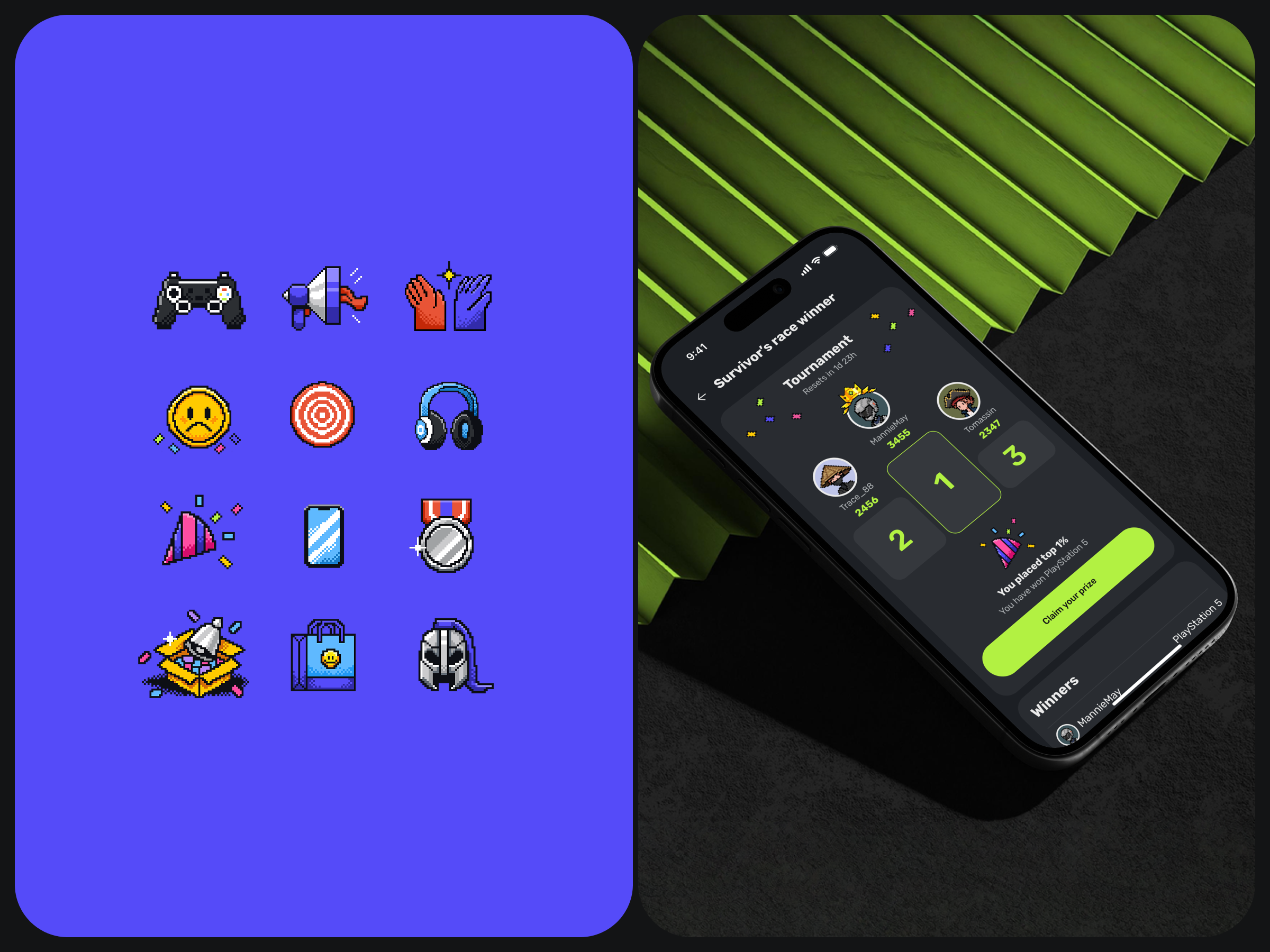
- Results: The winners screen is the emotional payoff. It needed enough structure to make rankings and results easy to scan, with enough visual energy to mark completion and make another challenge appealing.
That last screen shows why small parts of an app can carry outsized weight. A results view may occupy little space in the overall product, yet it determines how the effort leading up to it feels. Clear ranking, readable outcomes, and a celebratory tone can make achievement feel earned. If the screen is hard to parse or emotionally flat, the rest of the journey loses force.
Pixel assets that belong in the same system
Avatar customization gave the team another way to connect participation with personal investment. Tubik created pixel-style accessories, clothing, and wearable items for users to add to their avatars. The details let users shape how their in-app identity looks, extending the pixel-art approach beyond interface decoration.
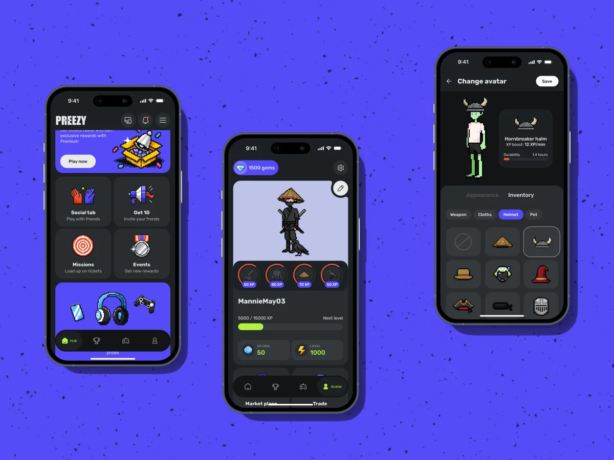
Matching the existing avatar style required a repeatable method. The team made a custom brush to reproduce the texture and pixel treatment already in the system, then used it to build new icons and accessories. This is a practical production choice as much as an aesthetic one: a shared tool makes it easier to keep assets consistent as the set grows.
Clarity, motivation, and restraint
Prize-linked challenges can be difficult to present well. The interface has to communicate rules and competition without becoming visually overbearing or making the system difficult to understand. Preezy’s brief called for clarity and momentum, with a light tone that still gave the rewards weight.
The design process began with a collaborative session to align on visual direction and interaction principles. The team then studied GamerG’s colors, graphic elements, and pixel style before shaping the core journey. That early alignment established a shared reference for decisions throughout the work, from screen composition to the smallest icon.
The central design tension is between structure and motivation. Users need enough information to know what they’re doing, but the experience also needs to encourage continued participation. Too much emphasis on instructions can make challenges feel like administration; too little can leave users unsure how progress works. Here, the key screens carry both jobs: they explain the next action and make the reward visible.
Preezy also shows how an established brand system can focus creative work. The pixel-art constraint called for precision across every new asset, and the custom brush turned that requirement into part of the workflow. For teams extending a visual system, the useful takeaway is to align on the rules early, then build tools that help new components follow them.
When a loyalty app connects actions to meaningful rewards, each screen has a role in maintaining that connection. Preezy’s flow moves from choosing a prize-linked challenge to tracking progress and seeing results, while avatar customization adds a personal thread. The next challenge for this kind of design is to keep that path understandable as the product adds more choices and assets.
Related reading
Show and Tell: Video Content As a Part of User Experience
Drawing Attention: The Real Power of Illustrations in UI Design
Form-Over-Function Mistakes, or How Not to Harm Your Business With a Pretty Interface.
Alphane Labs: Our First Real Shot at Getting Weird
Der Baukasten: From Sketch to Scroll
Zealous × TAS Case Study: Design Meets Purpose
The Glass Is Half Empty: How Apple’s Boldest Redesign Missed the Point
The post Preezy: Designing a Gamified Loyalty App That Earns Every Tap appeared first on Tubik Blog: Articles About Design.
| Rev | Description | Date |
|---|---|---|
| A | Issued for reading | |
| B | Viewed 970 times | Current |


