Transform9’s Healthcare AI Brand Uses Warm Typography, Subtle Gradients and Purposeful Motion
- Project
- Graphic Design
- Drawn by
- Anastasiia Lutsenko
- Issued
- Sheet
- A-173
Tubik built Transform9’s identity and Webflow site around a practical design challenge: making clinic automation feel capable, clear and human.
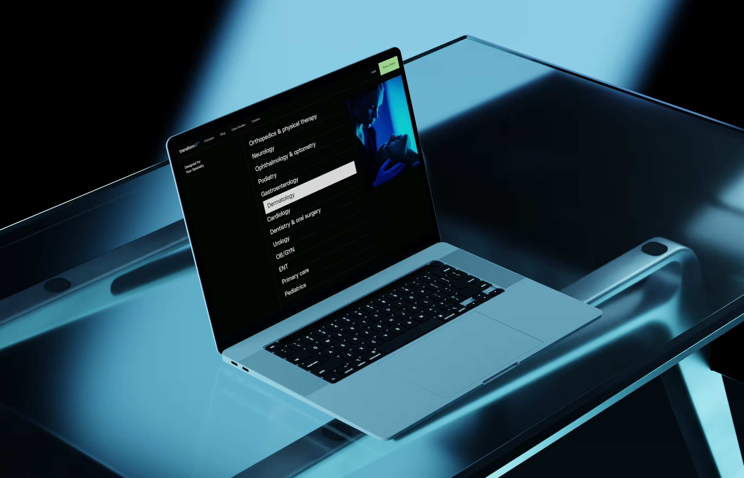
For a healthcare platform that automates patient communication, trust begins before anyone sees the product in action. Transform9 needed its identity and website to make AI feel credible to clinic decision-makers and comfortable for the people whose requests it handles. Tubik’s response was a visual system built on restraint: gentle gradients, considered typography, custom imagery and motion with a clear purpose.
That choice matters because Transform9’s work sits between two expectations. Clinics need tools that can manage appointment booking, routine requests and administrative exchanges, reducing the time staff spend on logistics. Patients need to feel that their questions will receive a useful response. The platform uses AI to handle those interactions, but the design challenge was human perception: how to communicate automation without making care feel impersonal.
A visual identity built for trust
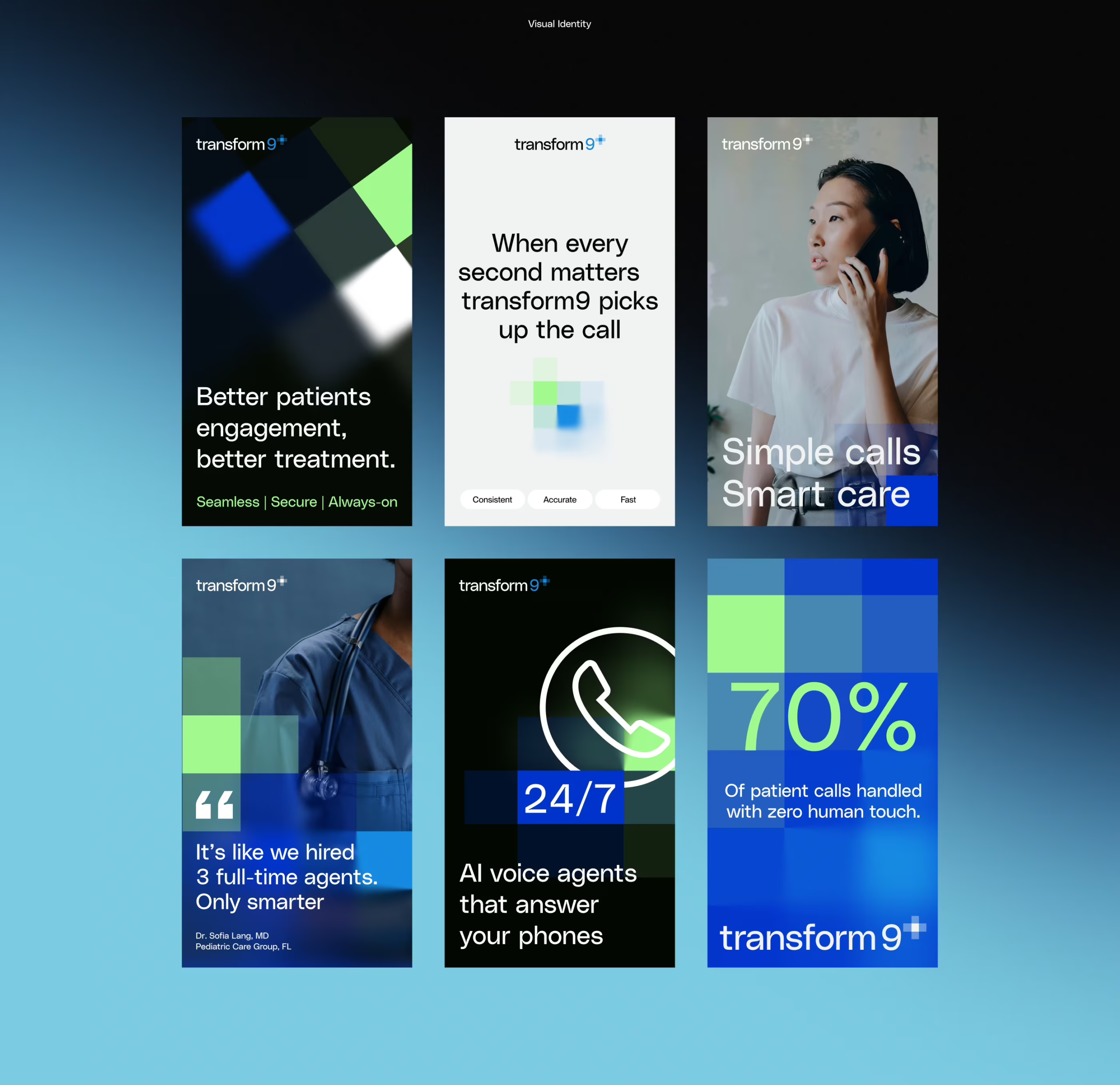
Tubik developed the logo, visual identity and design language from scratch. That gave the team room to define how the brand should behave across a full website, rather than styling a single landing page and leaving later touchpoints to drift. The stated aim was to bring confidence and care together through execution, not by blending two contrasting aesthetics into a generic middle ground.
Gradients provide depth, but stay quiet. The team describes them as slow shifts that suggest light through a window, rather than high contrast effects that demand attention. That restraint gives the identity a sense of movement without making the technology itself the spectacle. Refined interface details support the same tone.
The typography follows a similar balance. Tubik chose type that feels legible and authoritative while retaining warmth. The source doesn’t name the typeface, so there’s no model or family to point to; the useful takeaway is the criterion behind the choice. In a healthcare interface, text has to convey confidence without taking on the cold, impersonal character of a form.
Color, type and visual tone were treated as parts of one system. That approach is practical for a brand with multiple page types: each component needs to work on its own, and still feel related when assembled across the site. A visual identity that only holds up in one hero image won’t help a team maintain consistency on inner pages, articles or case studies.
Custom imagery helped keep the brand specific to Transform9. The team avoided relying on familiar stock scenes of smiling patients and pristine exam rooms, which can feel disconnected from the actual experience of using a service. Instead, the project’s imagery was made to support the identity’s tone. The source doesn’t give a production method or image specifications, but makes the intention clear: visual assets should add to the brand’s credibility rather than borrow it from generic healthcare cues.
Structure before surface
Before designing the website’s polished screens, Tubik mapped its sitemap, wireframes and user flow. The intended audience included clinic decision-makers with limited time and responsibility for evaluating a purchase. That shaped the information architecture: visitors needed to understand what Transform9 does, find answers to their questions and see a clear next step without having to decode the site.
This structural work connected page content to the questions a prospective customer might ask. What should the visitor learn first? What information will help them assess the product? At what point is there enough context to continue? Wireframes make those choices visible while there’s still room to adjust page hierarchy and flow. They also give the design team a foundation for carrying the identity across different kinds of content.
From page designs to a working site
Once the structure was established, Tubik developed high fidelity designs for full pages and supporting templates, including inner pages, a blog layout and case study pages. Extending the design system across these formats is a way to check whether it works beyond the homepage. A consistent base gives teams a clearer path to adding content while keeping the site visually coherent.
The site was developed in Webflow, with GSAP animations used throughout. Tubik describes the motion as subtle, adding depth and polish without turning the pages into a display of effects. That calibration is central to the project’s tone: movement should make the site feel active, but keep attention on the product and its message. The source doesn’t specify individual animations or accessibility settings, so the precise motion patterns can’t be assessed from the case study alone.
For teams working on similar products, the useful test is whether an animation supports comprehension or simply decorates a transition. The same principle applies to color and type: every choice has to carry its share of the communication, especially when a brand is asking people to trust automation with a personal service.
What the project makes clear
Transform9’s identity treats trust as a design responsibility. In a high stakes context, people form impressions from the visual tone as well as the copy. Warmth doesn’t require playful graphics or exaggerated friendliness; here, it comes through restrained color, careful typography, specific imagery and enough space for content to breathe.
The project also shows why a system matters more than a collection of attractive pages. A brand needs to hold together across templates and touchpoints, including places that get less attention than the homepage. Starting with the identity and information structure gives those later decisions a shared reference point.
AI products don’t have to announce themselves with familiar sci-fi signals. Transform9’s design focuses on the people and decisions around the software: clinic staff assessing a workflow, and patients seeking a timely response. That’s a concrete direction for teams designing automation in sensitive settings. Make the product’s role understandable, give the interface a human tone, and let motion and visual effects support the experience instead of competing with it.
Related reading
These Tubik pieces explore other identity and interface design projects, as well as illustration and motion:
NestEgg: Designing a Wellness Platform Where Everyone Wins
Zealous × TAS Case Study: Design Meets Purpose
The Glass Is Half Empty: How Apple’s Boldest Redesign Missed the Point
Drawing Attention: The Real Power of Illustrations in UI Design
Case Study: Manatee Energy. Designing Warmth
SPYLT Case Study: Delicious by Design
Motion with Intent: How Animation Earns Its Place in Mobile UI
The project appeared on Tubik Blog: Articles About Design.
| Rev | Description | Date |
|---|---|---|
| A | Issued for reading | |
| B | Viewed 889 times | Current |


