After Flat Design: Why Digital Interfaces Are Bringing Back Texture and Personality
- Project
- UX & UI Design
- Drawn by
- Ernest Asanov
- Issued
- Sheet
- A-172
A decade of minimalism taught designers to build clear interfaces. The next step is adding texture, motion and character without losing that structure.
Minimalism gave interface design a useful question: what’s essential? After years of decoration obscuring navigation and purpose, that question helped designers bring hierarchy, space and information structure into focus. But restraint became a default look, and clarity started to blur into sameness. The emerging post-flat turn suggests a more interesting question: what should this interface feel like to use?
The shift isn’t a call to restore every glossy button or textured panel from the past. It’s a chance to use depth, color, illustration and motion with intent, supported by the structural thinking designers developed during the flat-design era. The challenge is to make a product feel distinctive while keeping its content and controls easy to understand.
From expressive skins to interface discipline
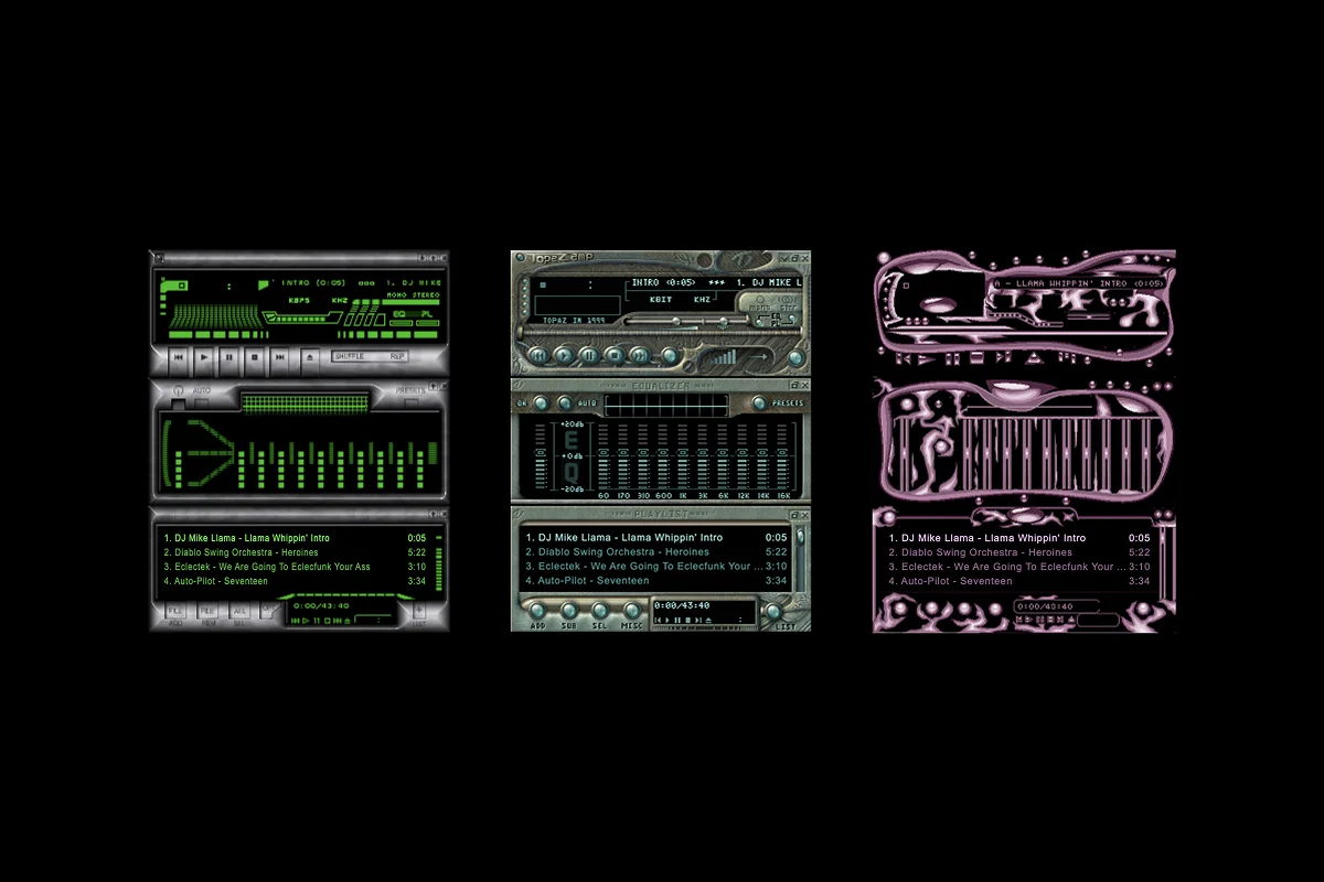
Digital interfaces have always swung between personal expression and shared rules. In the late 1990s and early 2000s, Winamp skins made that tension visible: music players took the form of Zelda cartridges, snack packaging, anime characters and polished metal. The results could be exuberant, but their visual invention didn’t necessarily reflect a coherent system for organizing information.
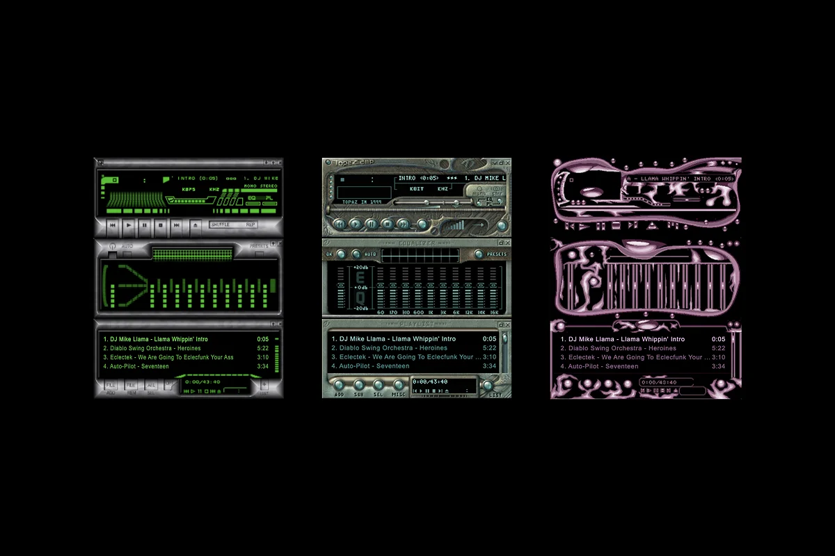
The wild, skeuomorphic interfaces of 2000s Winamp skins
By the early 2010s, skeuomorphic cues had become common in mainstream software. Calendar interfaces borrowed stitched leather; podcast players resembled reel-to-reel machines. These visual metaphors made digital tools feel familiar, but they could also disguise the actual structure of an app. A convincing surface didn’t guarantee that the underlying content was organized or that the next action was clear.
Apple’s iOS 7, released in 2013, made a decisive break with that approach. Its stripped-back interface prompted designers to examine what remained when texture, shadows and bevels fell away. Google’s Material Design then offered a shared framework for thinking about interface elements and their relationships. At its strongest, flat design wasn’t simply a preference for plain surfaces. It was a way to make hierarchy, spacing and navigation carry the work that decoration had been doing.
That period left a lasting foundation. Designers became more practiced at information architecture, affordance, negative space and density. The problem came when an approach meant to sharpen judgment hardened into an aesthetic template.
When restraint turned into a template
By around 2016, “clean” could signal quick polish as easily as careful design. A white background, a single typeface, a quiet button and a sunlit hero photograph became a familiar recipe for digital products. The parts could be individually reasonable, yet the finished page often said little about the character of the service or the needs of its audience.
Corporate Memphis made the sameness especially visible in illustration. Its flat, friendly figures, bright muted colors and floating geometric shapes appeared across software, finance and workplace products. The style had roots in good intentions: make illustration approachable and show people in a broad, inclusive way. As the same visual language spread across brands, though, its signals of friendliness became less specific. A company could look human without expressing much of a personality.
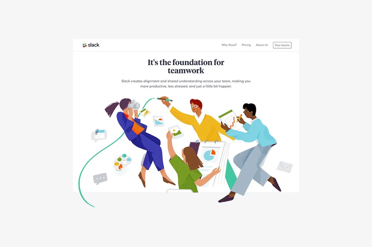
Slack’s 2017 website and the explosion of Corporate Memphis
Design systems brought another tradeoff. An eight-point grid and reusable components can help a team keep layouts consistent. They can also make it tempting to treat the library as a substitute for judgment: if every page follows the same components and spacing, the product may be orderly without being memorable.
That points to a distinction worth keeping in view. Minimalism asks what can be removed while preserving the experience’s essential structure. A design that simply removes detail can look just as spare, but it hasn’t necessarily made the same decisions. By the end of the 2010s, many interfaces had converged on a polished, unobtrusive look that was easy to scan and hard to distinguish.
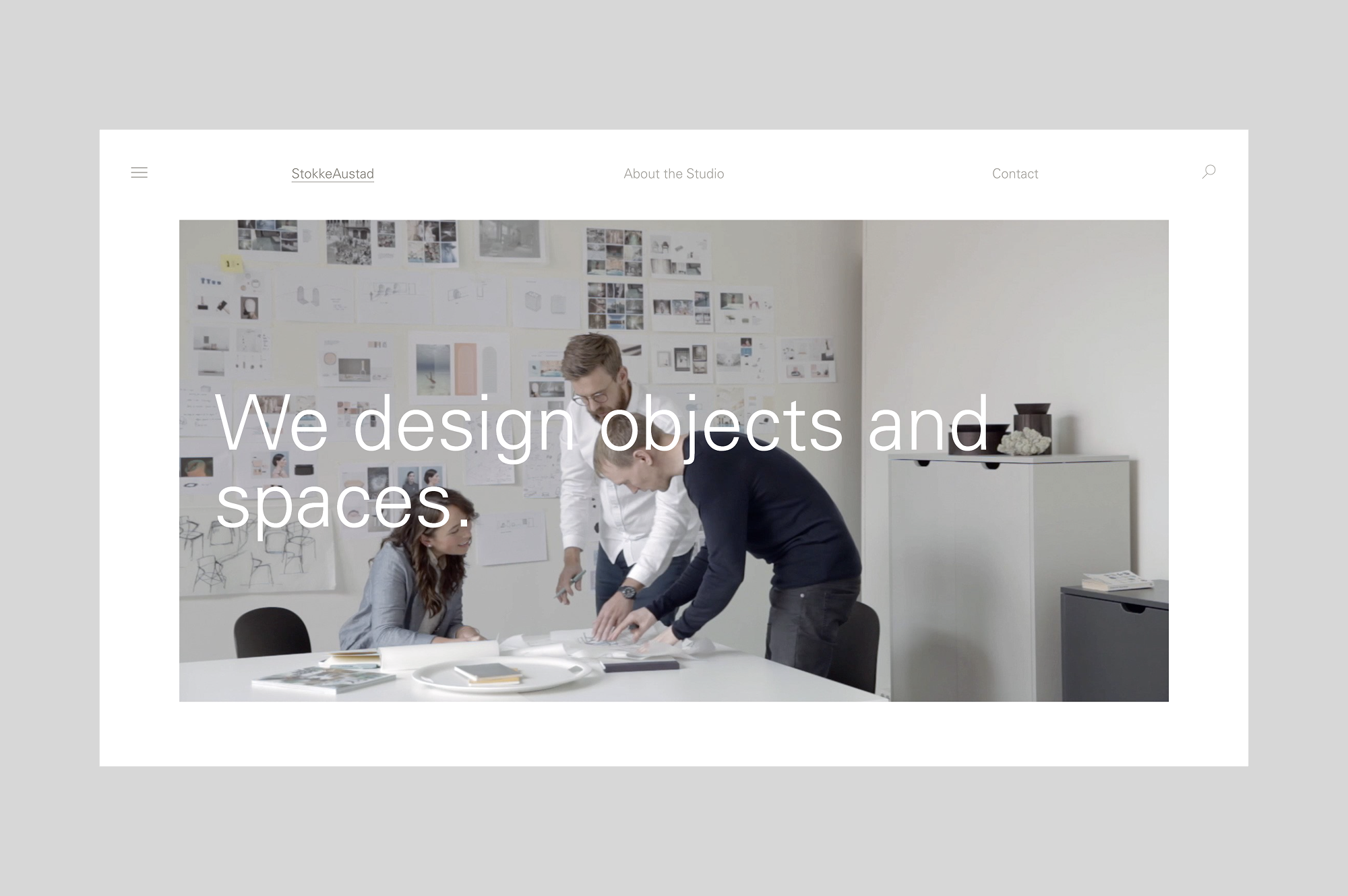
StokkeAustad — a minimalist furniture studio website from 2016
Texture returns with a different purpose
New visual directions have started testing the limits of that restraint. Neumorphism, with its soft shadows and surfaces that seem pressed or raised, brought a physical quality back to digital controls. The experiments could be hard to read when contrast was weak, and accessibility suffered in some examples. Still, the style drew attention because it gave flat rectangles a tactile character.
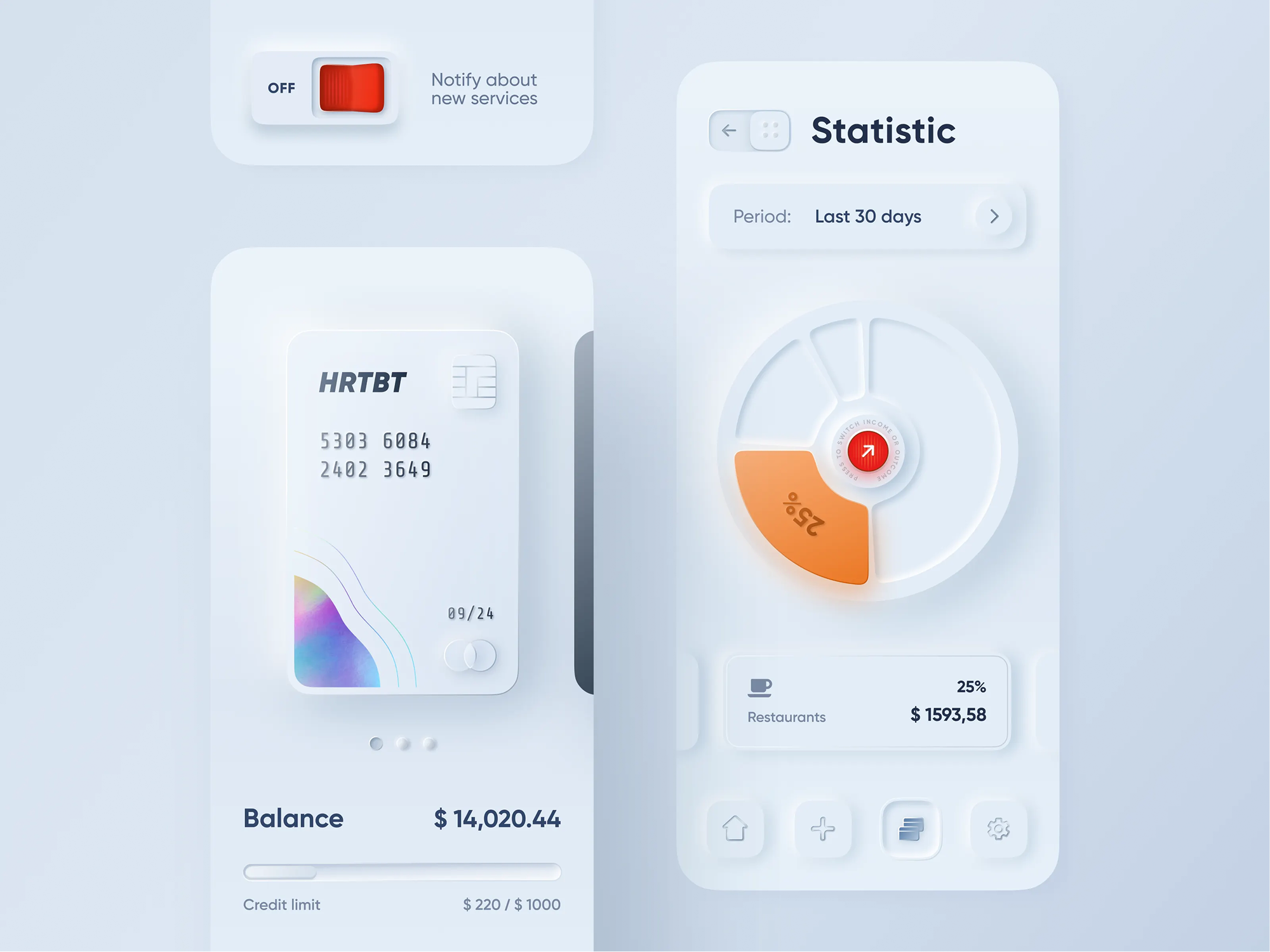
Experiments in Neumorphism by Oleksandr Plyuto (2019)
More recent references to physical objects work differently from early skeuomorphism. A cassette, vinyl record or instant photograph can appear as a deliberate visual reference, rather than as an attempt to convince someone that a digital control is a physical object. The distinction matters: a metaphor can contribute mood and recognition while leaving the interface’s actual behavior legible.
Brutalist web design offers another route away from polished sameness. Raw grids, assertive typography and exposed structure make the layout itself part of the experience. At the same time, editorial and digital design have begun to overlap in work that uses asymmetric composition, collaged photography, type that pushes against its containers, and motion with a recognizable character.
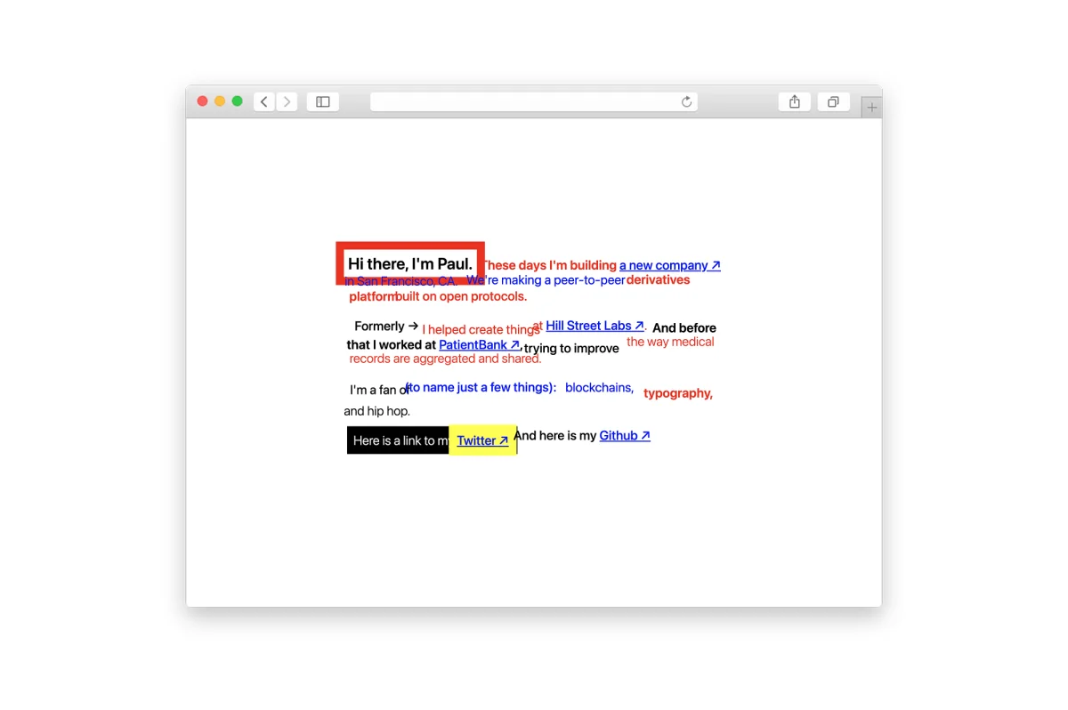
Paul Fletcher-Hill’s 2020 website: An exercise in Brutalist design
These directions don’t prove that every interface needs more ornament. They show that visual expression can carry meaning when it grows out of a clear idea. A textured surface can establish atmosphere; a bold type choice can create hierarchy; a loose layout can set an editorial tone. The design has to give those choices a job.
Give the structure a personality
The useful legacy of minimalism is the discipline it taught, not one fixed appearance. Designers learned to see the underlying structure: how content is grouped, where attention should go, how people move through a product, and which details support those actions. With that structure in place, expressive choices can add character without concealing the interface’s workings.
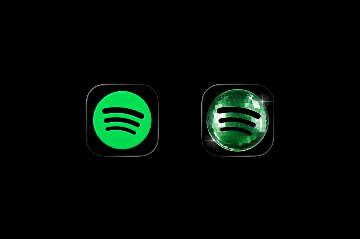
Spotify’s temporary disco ball icon
There’s a practical case for considering emotional response alongside efficiency. Don Norman’s work on emotional design treats the way an object makes people feel as part of the design problem. Delight, personality and recognition can influence whether an experience feels worth returning to. That doesn’t make every flourish useful; it means feeling belongs in the brief alongside task completion and clarity.
For a team considering a richer visual direction, the decision can start with a few concrete questions. Does this shadow clarify a surface or action? Does this texture express something about the product? Does the motion tell users what changed, or reveal the product’s character while doing so? Would an Easter egg reward attention in a way that fits the experience? If an effect has no clear purpose, it may be decoration added for its own sake.
A post-flat design question
The question “What can I remove?” helped a generation of designers find the structure beneath visual clutter. The next question is what that structure should feel like from the inside. Answering it may mean using layers, intentional shadows, gradients, expressive color, movement or a less symmetrical layout. Each choice should support the experience rather than merely announce that the design is different.
This return to visual richness doesn’t need to copy the interfaces of the early 2000s. Its strongest examples build from the knowledge gained through years of attention to hierarchy and navigation. They can borrow the tactile cues of physical objects, the directness of brutalist layouts or the energy of editorial composition while remaining clear about how the product works.
The practical takeaway is simple: establish the hierarchy first, then decide what kind of personality belongs on top of it. Minimalism taught designers to understand the skeleton. The work now is to make it expressive, without making people guess how to move.
Recommended reading
Zealous × TAS Case Study: Design Meets Purpose
The Glass Is Half Empty: How Apple’s Boldest Redesign Missed the Point
Drawing Attention: The Real Power of Illustrations in UI Design
| Rev | Description | Date |
|---|---|---|
| A | Issued for reading | |
| B | Viewed 957 times | Current |


