GrowV Educational Tablet Case Builds Sukey, Dewey and Wiz Into Its Design
- Project
- Graphic Design
- Drawn by
- TheFuture
- Issued
- Sheet
- A-166
VLND Studio gives GrowV’s characters a tactile role as sculptural supports, while a foldable handle and child-sized stylus keep the case practical.
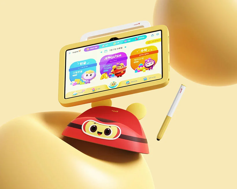
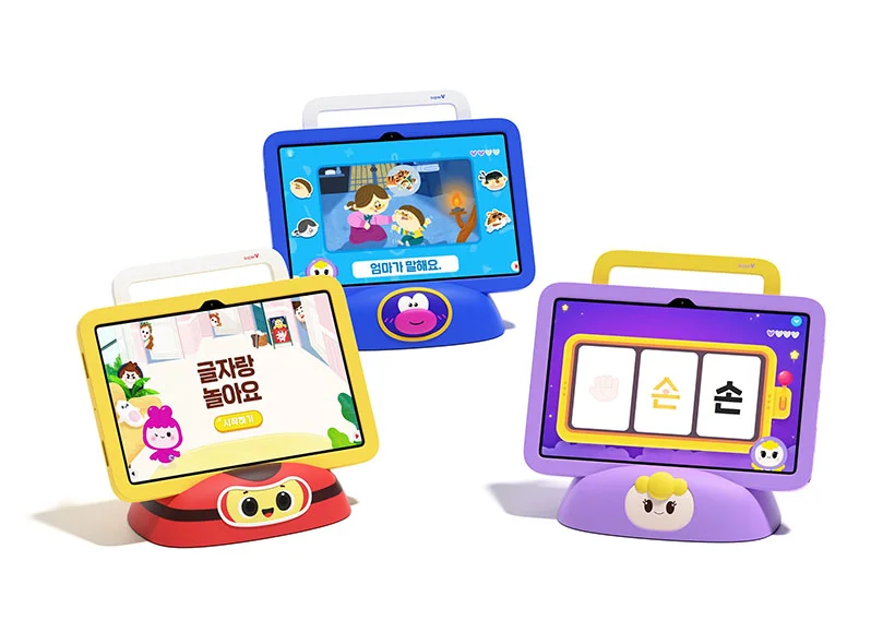
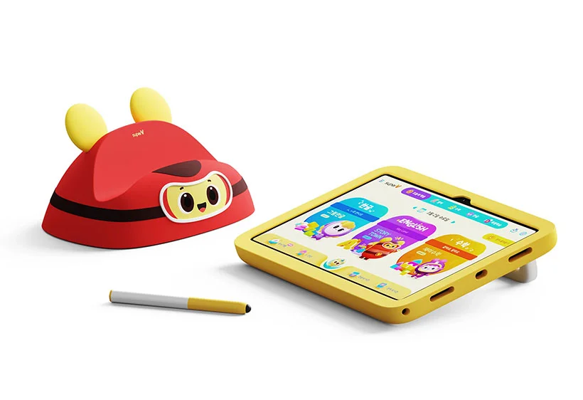
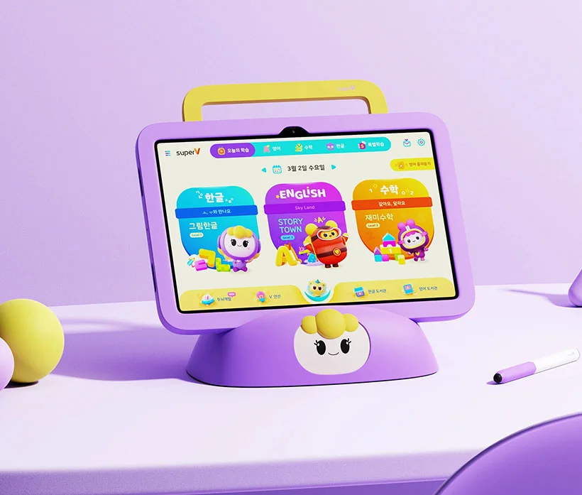
GrowV’s educational tablet case treats character design as part of the product’s structure. Sukey, Dewey and Wiz aren’t simply printed on the outside: the figures become three-dimensional elements that children can touch and recognize, and they also serve as the case’s kickstand supports. That connection between identity and use gives the characters a purpose beyond decoration.
Designed by VLND Studio, the case brings together a soft, rounded silhouette, a foldable handle and a stylus sized for small hands. The available source doesn’t give a launch date, material specifications or tablet compatibility details, so the design is best understood through the features it describes and shows. Its central idea is clear: make the protective accessory feel like an extension of the educational experience.
Characters with a job to do
Turning the cast into sculptural supports makes the case’s most expressive detail functional. The characters help hold the tablet at an angle, while their distinct forms keep them recognizable as physical objects. This is a useful design move for products built around familiar figures: character identity can guide how a part is shaped and used, instead of being added as surface graphics after the product form is settled.
There’s also a change in how the characters meet the user. A printed illustration is something to look at; a raised, tactile figure invites handling. For children, that physical presence may help connect the characters on the device with the object in their hands. The source describes the figures as touchable and recognizable, though it doesn’t specify their exact dimensions, texture or construction.
As supports, the figures also have to work within the case’s practical needs. A kickstand needs to keep the tablet stable enough for viewing, and its placement affects how the device sits on a surface. Here, the character forms carry both visual identity and structural responsibility. That pairing gives the case a coherent concept, while putting more demands on the shapes than a decorative print would.
A handle integrated into the silhouette
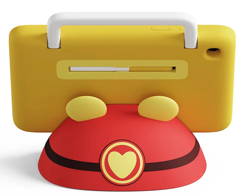
The foldable handle is another feature that appears to be designed into the overall form. The source describes it as blending naturally into the case rather than reading as a separate attachment. That matters for a product likely to be picked up and carried: a handle needs to be easy to find and use, but its size and position can also affect the object’s balance and appearance.
The rounded outer shape supports the same child-focused direction. It softens the tablet’s hard rectangular outline and gives the case a more approachable profile. The source characterizes the materials as protective without making the case bulky, but doesn’t identify what those materials are or provide drop-test results. The design’s stated balance is therefore one of form and perceived protection, rather than a quantified performance claim.
Small details that support use
The stylus follows the case’s emphasis on joined-up product thinking. It slots into the back, where it has a defined storage place rather than becoming a loose accessory. Its anti-roll shape is intended to stop it from easily rolling away when set down, and its size is tailored to small hands. Those decisions address common points of friction: keeping a tool close to the screen and making it easier for its intended users to hold.
Together, the storage slot, anti-roll profile and child-sized proportions make the stylus part of the product system. Each feature is modest on its own, but each answers a practical question about where the tool goes, how it behaves on a table and who will use it. The source doesn’t specify the stylus’s materials or whether it works with particular tablet models.
One concept across the whole object
The case’s strongest design choice is the way its features share a common logic. The characters provide recognition and support; the handle makes the case easier to carry; the stylus has a dedicated place and a shape intended for small hands. The rounded form helps these pieces read as one object rather than a collection of add-ons. That consistency is what makes the product feel considered.
For designers working on character-led products, the project offers a practical prompt: look for moments when a mascot can contribute to the object’s use. A figure might guide a grip, mark a control or, as here, take on a supporting role. The opportunity comes with a constraint: the character must remain legible while the part performs its job. GrowV’s case makes that relationship visible, giving its cast a place in the product’s physical design as well as its screen-based world.
The post GrowV Educational Table Case Turns Educational Characters Become Part of the Product Design appeared first on Tuvie Design.
| Rev | Description | Date |
|---|---|---|
| A | Issued for reading | |
| B | Viewed 505 times | Current |


