Christian Dellavedova Turns Rome’s Bookshop Closures into Colorful Editorial Illustration
- Project
- Graphic Design
- Drawn by
- Jessica Rydman
- Issued
- Sheet
- A-146
Milan-based illustrator Christian Dellavedova uses a compact palette and textured details to translate a story about Rome’s independent bookstores into lively images.

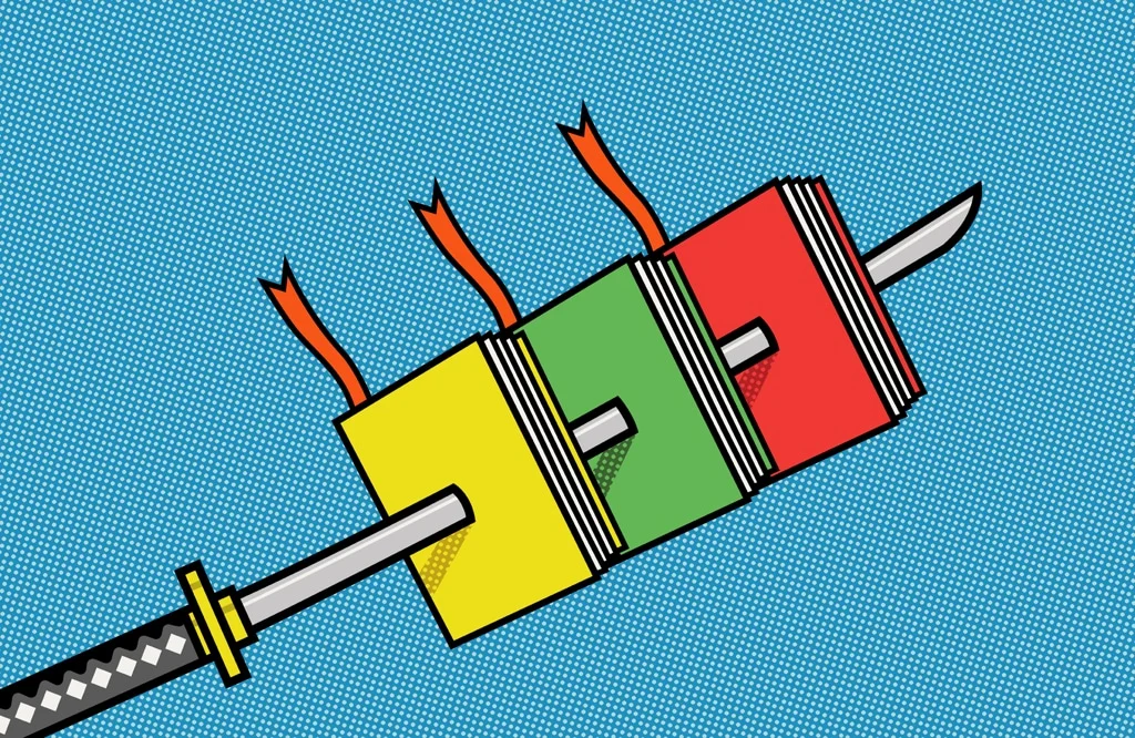
Christian Dellavedova’s illustration for Internazionale had to hold a complicated story inside a single image: independent bookstores in Rome were closing amid competition from larger shops, online distribution and short-sighted decisions by some booksellers. The brief called for a colorful, funny concept. Dellavedova made the images in Adobe Illustrator, using a simple color palette and adding texture. That combination gives the work a clear practical premise: keep the visual idea easy to read, then use color and surface detail to bring it to life. The constraint is familiar to editorial illustrators: a story can have several causes, but the image has only a moment to establish what it’s about. The result has to invite attention without pretending that a complex business problem has one simple explanation.
Based in Milan, Dellavedova specializes in editorial and conceptual illustration. He describes his choice of career as “the deepest call of my life,” and says that translating a story into one image has always been the most exciting challenge. The Internazionale assignment puts that approach to work on a subject with several causes, asking the illustration to condense the article’s argument rather than simply decorate it. That distinction matters in editorial work: a picture can echo a topic, or it can offer readers a point of view on how the topic is structured. Here, the brief’s humor and color set a tone, while the subject asks for enough clarity to keep the illustration connected to the article’s argument.
Making a multi-part story legible
The article identifies three pressures on Rome’s independent bookstores: competition from bigger stores, web distribution and the booksellers’ own limited foresight. Those factors don’t naturally fit into one tidy visual. A successful editorial concept has to establish a point of entry, then make the subject understandable without reproducing the article’s full explanation. It also has to avoid flattening the issue into a single villain or cause. That’s a demanding balance for an image that must work quickly: readers should recognize the subject, but the illustration shouldn’t imply that the underlying problem is simpler than the reporting makes it.
Internazionale asked for an image that was both colorful and funny. That tone matters: humor can make a difficult subject approachable, while color helps the illustration attract attention on a web page. Dellavedova’s simple palette also gives the image a useful constraint. With fewer colors in play, the main forms and relationships can carry more of the meaning; texture adds variation without requiring a more complicated palette. This is more significant than it looks. Limiting color can help an image hold together at a glance, while texture gives the surface enough character to feel authored rather than mechanically clean. The trick is knowing where to stop, since detail can easily compete with the idea it’s meant to support.
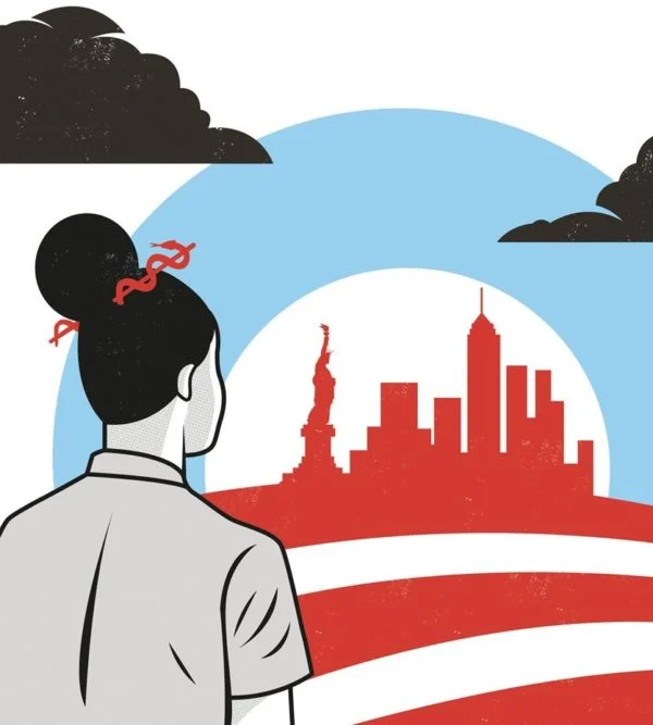
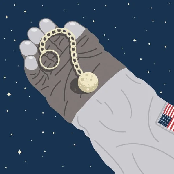
The source doesn’t describe the specific objects, characters or layout in the illustrations, so the visual details are best left to the images themselves. What it does establish is a clear working method: interpret the story as a concept, choose a limited color range, build the artwork in Illustrator, and add textured elements to temper the clean digital finish. For editorial illustrators, that’s a compact set of decisions to consider when a brief calls for both clarity and personality. It’s also a reminder that software is only one part of the process; the more consequential choice is how to translate reported details into a visual relationship that readers can grasp. A clean premise, with room for texture.


An editorial practice across formats
Dellavedova has worked with publications and agencies around the world. The source names Scientific American, The Boston Globe, Men’s Health and Wired UK among his international clients, alongside his regular contributions to Internazionale. That range places his work in different editorial settings, where an illustrator may need to make a subject recognizable quickly and give a publication’s story a distinct visual voice. The same broad skill can take different forms depending on the assignment: some subjects ask for immediate recognition, while others need a more interpretive image that sets a mood or frames an argument. In either case, the illustration has to belong to the story and to the publication carrying it.
Here, the web format makes the brief especially direct: the image needs to work alongside an article about a local retail issue, with enough character to engage readers and enough focus to support the story. The limited palette and texture are not merely finishing choices; they are part of how the illustration balances a readable idea with an expressive surface. On a web page, readers may encounter the image before they commit to the article, so its first job is to create a clear invitation. That doesn’t mean every editorial image should explain the story at a glance. It means its visual choices should point toward the subject rather than distract from it. And yet, an image that only summarizes can feel interchangeable; a distinct tone gives the work a reason to stay in memory.
Dellavedova’s account of illustration as translating a story into one image offers a useful measure for this kind of assignment. The image doesn’t need to carry every detail in the article. It needs to give readers a visual route into the subject, while its tone and execution make the interpretation memorable. If you’re working in this space, the useful question is what the image can clarify that a headline or photograph can’t. The answer may be a relationship between causes, a particular attitude, or simply a way to make a reader pause. See more of his work in the portfolio.
What the brief suggests for editorial illustration
The assignment points to a practical tension in editorial illustration: the work has to be legible at a glance and specific enough to feel connected to the story. A limited palette and a textured finish can help manage that tension, but they don’t solve it on their own. The concept still has to do the central work of selection: deciding which parts of the article can be brought together in one image, and which details should remain for the text to explain. That process calls for restraint as much as invention.
For creative teams, the brief also shows why tone is a working decision, not a decorative layer added at the end. Humor can shift how a reader approaches a difficult subject, and color can shape the image’s presence on a page. Neither choice guarantees clarity. They have to serve the same underlying idea, or the illustration risks becoming lively but vague. That said, the source doesn’t show how readers responded to the work, so its impact can’t be measured from the description alone. What can be seen is a considered approach to the problem: simplify the visual language, retain room for expressive detail, and let the article carry the fuller account.

| Rev | Description | Date |
|---|---|---|
| A | Issued for reading | |
| B | Viewed 711 times | Current |


