Julia Kerschbaumer’s Award-Winning Lettering and Editorial Illustration
- Project
- Graphic Design
- Drawn by
- Ian Carradine
- Issued
- Sheet
- A-125
Julia Kerschbaumer’s American Illustration 40 selection highlights lettering for a public information project and a full-page whisky magazine illustration.
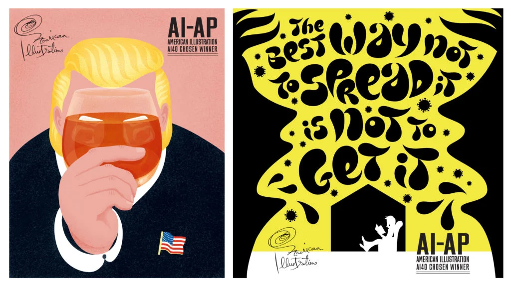
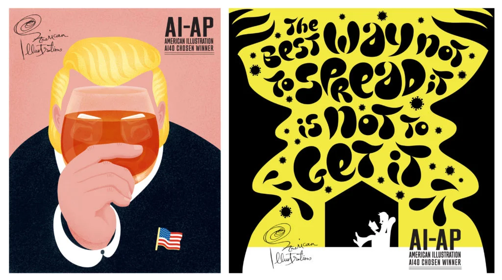
Julia Kerschbaumer’s two selected illustrations show how a single practice can serve very different kinds of communication. One uses lettering to carry a public information message; the other fills a magazine page for an editorial story. Both were named “Chosen Winner” in American Illustration 40, in the advertising and editorial categories respectively.
The recognition offers a useful look at the range of Kerschbaumer’s commissioned work. The supplied credits identify the illustrator, clients and art directors, but don’t describe the images’ palettes, type references, materials or production process. That leaves the briefs themselves as the clearest guide to the decisions each project had to support.
Lettering built around a public message
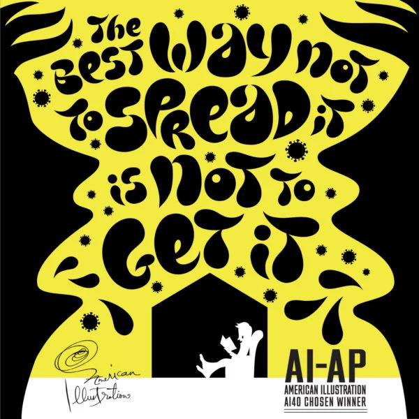
“We are the countervirus” appears in the advertising category. Kerschbaumer created the lettering illustration for a project intended to inform people about COVID-19 and help fight its spread. The client credits name Madwell and DPAA Global, and Chris Sojka is listed as art director.
Here, lettering has a job beyond naming the piece or adding a decorative finish: it is part of how the message is presented. That makes legibility and emphasis central considerations. In a lettering-led commission, the illustrator’s drawing can give words a distinct voice, while the words still need to read clearly enough to carry the information. The source doesn’t specify how Kerschbaumer balanced those demands, so the practical point is in the brief: the visual treatment had to support a public-facing message.
For designers developing similar work, it helps to start by separating the communication task from the stylistic one. Identify the phrase or information that must register first, then consider how the lettering can establish tone without making that content harder to read. The format and viewing context also matter: a design encountered briefly may call for a different reading order from one people can study at length. These are useful questions for this kind of assignment, though the source doesn’t say which methods Kerschbaumer used.
A magazine illustration with a layered subject
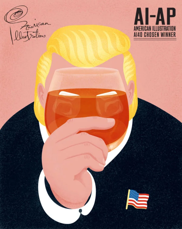
The editorial selection is titled “Collateral dramage,” matching the spelling in the supplied credit. It is a full-page illustration for an article of the same title in Whiskeria, a Scottish whisky magazine. The article addresses Donald Trump’s trade sanctions on Scottish whisky and their negative effect on the US bourbon industry. Emlyn Firth of a visual agency is credited as art director, and Whiskeria is the client.
The subject links two products and two industries through the consequences described in the story. A full-page format gives an illustrator room to build a visual interpretation around that relationship. It can hold a central image, supporting details and a deliberate reading path, though the source doesn’t identify any particular objects, composition, colours or visual metaphors in Kerschbaumer’s artwork. Those details shouldn’t be inferred from the title alone.
For an editorial team, the useful design question is how an illustration can make a story’s central tension visible without simply repeating the headline. The brief points toward consequences that cross from Scottish whisky to American bourbon. An illustrator might explore how to make that connection legible at a glance while leaving room for the article’s fuller account. That’s a general consideration for a story with linked effects, not a description of the specific image.
Two briefs, two roles for illustration
The pair suggests a practical distinction between illustration that helps deliver a message and illustration that frames an editorial subject. In the advertising work, the credited purpose is to inform; the lettering is the named visual approach. In the magazine piece, the full page belongs to a specific article and its subject. Each brief sets different priorities, even though the source does not give enough detail to compare the finished compositions closely.
That difference can help creative teams shape a commission. Before settling on a visual direction, clarify what readers need to understand, how much time they are likely to give the image, and whether words or imagery should lead. For a lettering illustration, test whether the key wording remains readable at its intended size. For a full-page editorial image, check that its main idea holds together on the page and relates clearly to the article. These are working checks for comparable briefs, rather than claims about Kerschbaumer’s own workflow.
Kerschbaumer is represented by Salzman International. The Directory of Illustration’s showcase credits both pieces as award-winning work selected for American Illustration 40. Together, they point to a practice spanning lettering and editorial illustration, with each commission shaped by the communication task at hand. The portfolio is the place to see more of her work and assess the visual choices directly.
View Julia Kerschbaumer’s portfolio · Agency profile at Salzman International
| Rev | Description | Date |
|---|---|---|
| A | Issued for reading | |
| B | Viewed 574 times | Current |


