Fridtjof Kirste’s Environmental Posters Turn Pollution into Isometric Worlds
- Project
- Graphic Design
- Drawn by
- Ian Carradine
- Issued
- Sheet
- A-126
Berlin illustrator Fridtjof Kirste uses poster design and personal projects to picture fossil fuels, pollution and climate change.
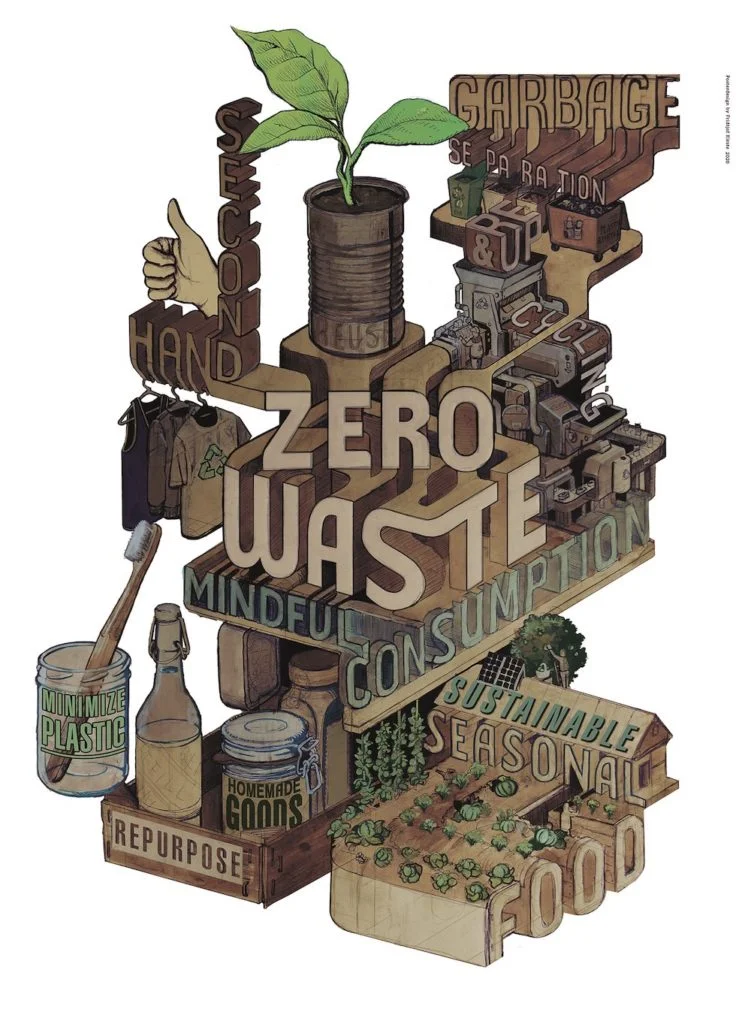
Fridtjof Kirste’s environmental illustrations make large, connected problems visible through distinct poster worlds. Fossil fuels, pollution and climate change appear in a three-part series about causes of flight; personal work turns attention to waste and urban trash in Berlin. The images give designers a useful look at how illustration can organize a complex subject into a memorable visual idea.
Kirste is a freelance illustrator and graphic designer based in Berlin. He has worked independently since 2018, according to the Directory of Illustration, which featured his work ahead of Earth Day. His sustainability-themed poster work has earned first place in several design competitions, though the feature does not name those competitions beyond the projects identified in its gallery.
© Fridtjof Kirste
Three posters connect environmental damage and displacement
The featured series was made for the Germanwatch e.V. design contest in 2018. Its three illustrations depict fossil fuels, pollution and climate change as causes for flight. The works are titled “Exploited,” “Wastelands” and “Waterworld.” Together, those names suggest a sequence of pressure on land and resources, while the series’ stated subject links environmental change with human displacement.
That framing gives the posters a clear job: hold several related ideas in view without reducing them to a single symbol. A series can build meaning through repetition and variation. Each image gets its own title and subject, while the shared context connects them. For designers working with layered topics, that structure offers a practical way to keep individual pieces legible and still make their relationship apparent.
The source does not describe the illustrations’ palettes, type choices or production process, so those details are best left to the images. The titles, however, establish a strong verbal framework. “Exploited” points toward extraction; “Wastelands” names a damaged environment; “Waterworld” shifts attention to water and its role in a changed climate. Read together, the words help viewers approach the subjects before they inspect each composition.


Personal work brings the subject closer to home
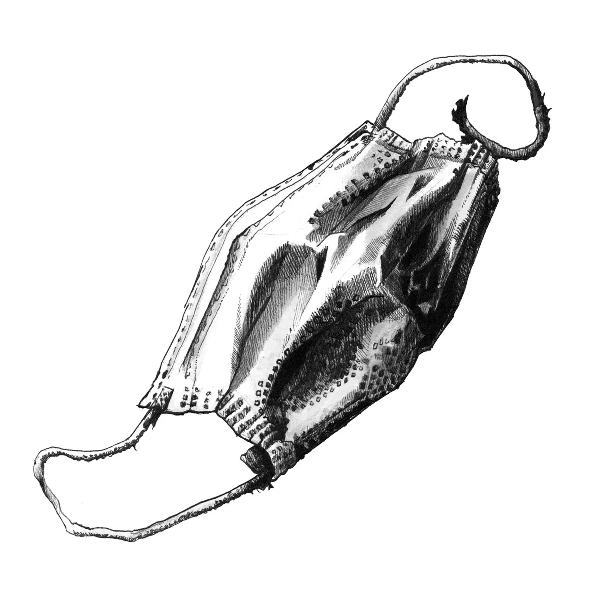
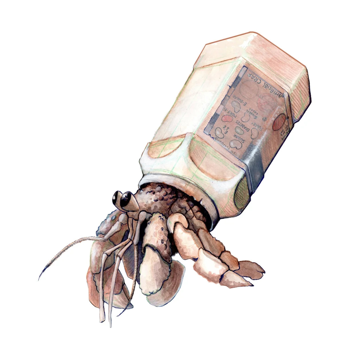
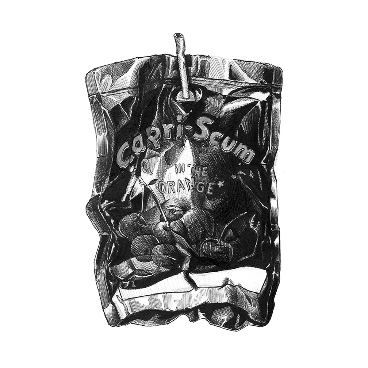
Kirste’s personal projects turn to growing pollution and urban trash in Berlin. The gallery includes “Waste Mask,” “MTV Crabs” and “Capri-Scum.” The titles use different registers: one is direct, another playful, and the third bends a familiar name into a word about refuse. That range can make environmental subject matter feel less like a single repeated message and more like territory open to visual experimentation.
Personal work also lets an illustrator test approaches outside a named client brief. Here, the stated subject stays grounded in the city and its waste. That local scale complements the earlier poster series: one set addresses broad environmental forces and their human consequences, while the other takes pollution and discarded material as everyday surroundings. The shift in scale gives the portfolio room to move between public-facing themes and a more personal visual voice.
For a designer building a related body of work, the useful lesson is structural. A portfolio can connect projects through a shared concern while letting each piece take a different angle. Titles, subject matter and series groupings can do part of that organizing work before a viewer reads any supporting text. Kirste’s gallery makes those connections visible through its sequence of environmental posters and Berlin-focused personal projects.
Isometric posters for public design briefs
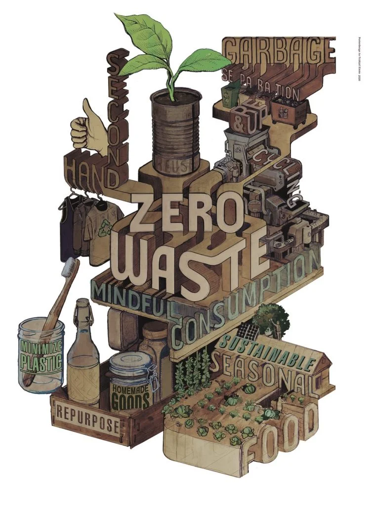
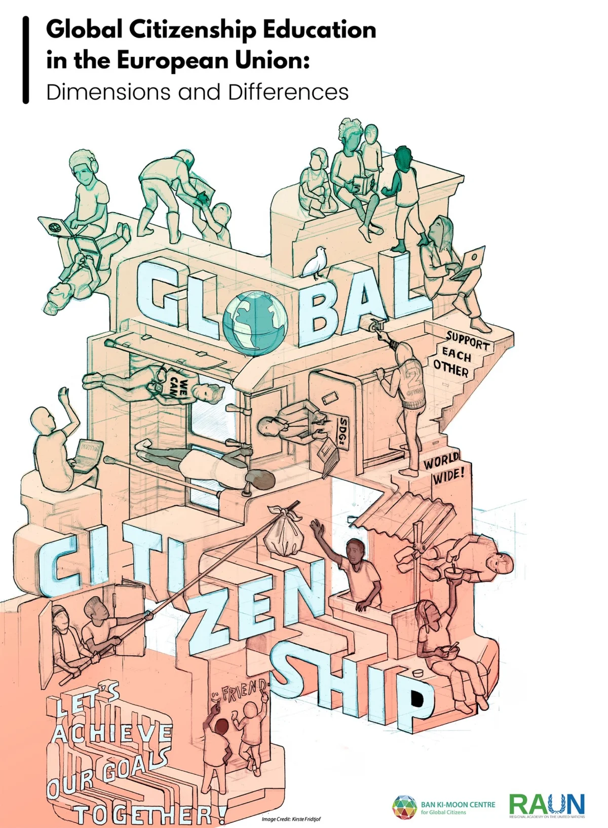
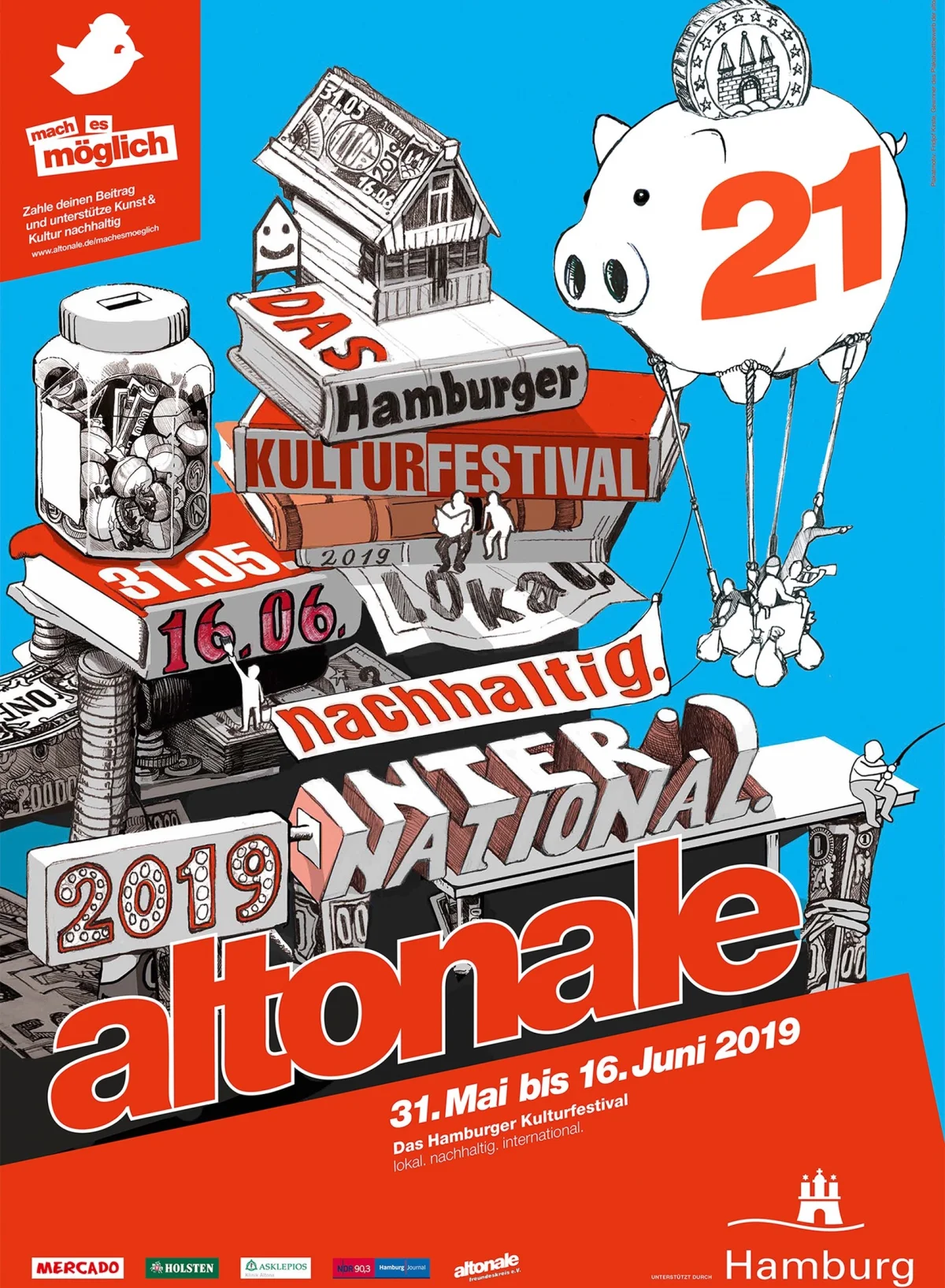
A third gallery section groups Kirste’s isometric poster designs. Its captions identify a Global Citizenship poster design competition of the Ban Ki-moon Centre in 2020 and an Altonale 2019 poster design. A further image appears alongside them, though the feature supplies no additional project detail for it. The named examples show Kirste applying a spatial illustration style to different public design briefs.
Isometric drawing gives an image a sense of depth while keeping objects organized on a consistent viewing plane. That makes it a useful format for posters that need to bring multiple elements into one composition. The source labels these pieces as isometric but does not specify the tools, grid, colours or design rationale, so the images themselves remain the reference for those choices. For designers studying the work, comparing the examples is a way to consider how a repeated spatial method can adapt to separate briefs.

Kirste’s featured work moves between named poster briefs, a connected three-image series and personal responses to waste in Berlin. That mix offers a concrete way to study how one illustrator can keep an environmental focus while changing the scale and structure of each project. More examples are available through his portfolio and website; he also has profiles on Instagram, YouTube and LinkedIn.
| Rev | Description | Date |
|---|---|---|
| A | Issued for reading | |
| B | Viewed 372 times | Current |


