Steven Noble’s Scratchboard Illustrations Span Wine Labels, Whiskey and Footwear
- Project
- Graphic Design
- Drawn by
- Marika Lind
- Issued
- Sheet
- A-115
Steven Noble marks 31 years and more than 4,000 illustrations with a portfolio built on etched linework, from beverage labels to Nike Air Max 95.
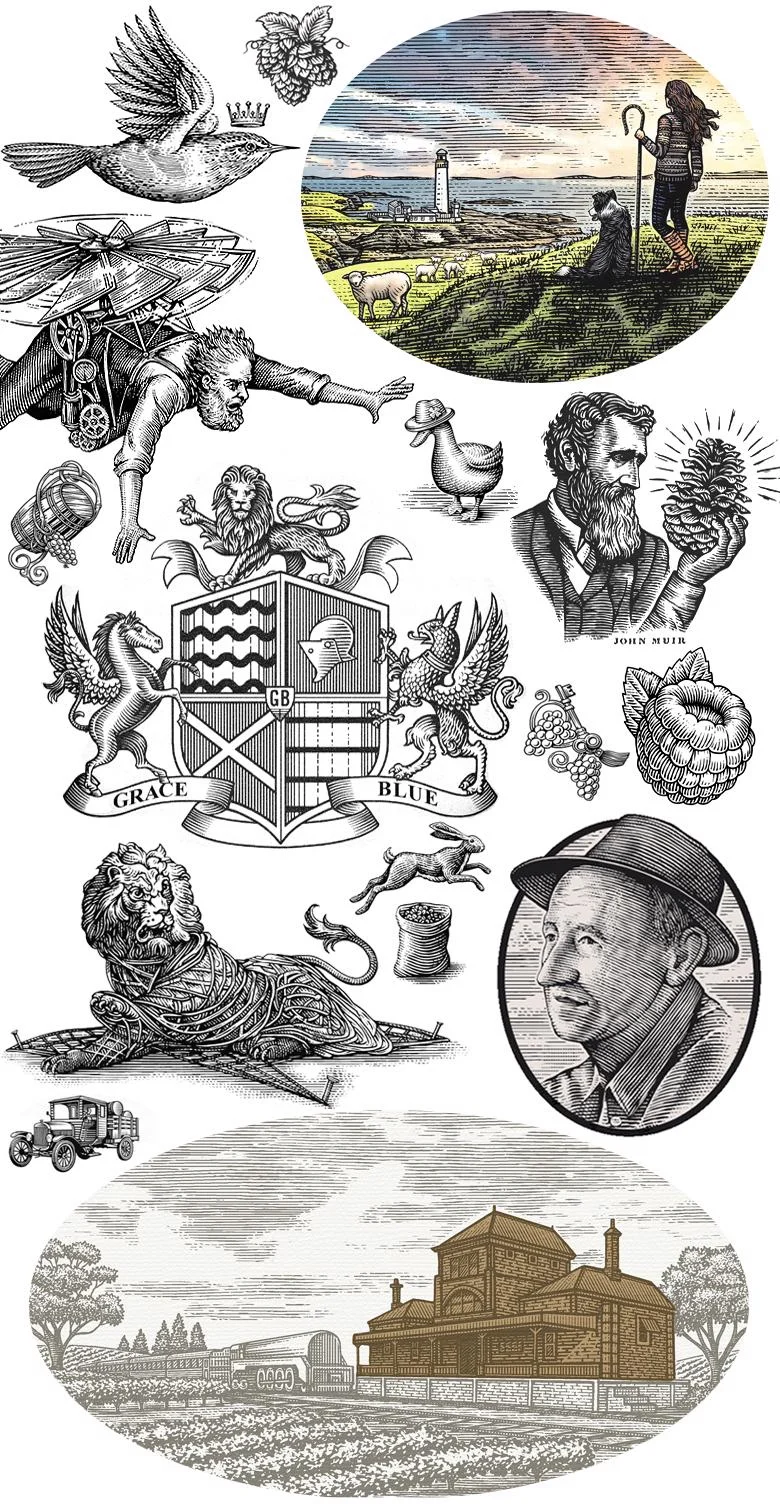
Steven Noble’s work makes an old printmaking vocabulary do a lot of jobs: tell a wine’s origin, give a spirits label a sense of lineage, or translate a running shoe’s construction into an image. Across 31 years and more than 4,000 illustrations, he has developed a meticulous scratchboard practice that can shift from dense historical detail to a playful character. The projects gathered here show how that hand-drawn language adapts to very different brand stories.
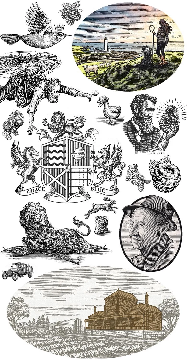
Noble works in scratchboard, line art, woodcut and engraving. His method starts with a pre-inked clay board, which he carves with X-Acto precision knives. The resulting marks can build the heavy contrast associated with woodcuts or the fine detail of traditional 19th-century steel engraving. That range is central to the work: the same close control can describe a figure, an architectural façade or the layered forms of a shoe.
The Directory of Illustration credits Noble with an international profile and inclusion in Lürzer’s 200 Best Illustrators Worldwide (18/19). His clients have included Coors, Exxon-Mobil, JP Morgan, Mercedes-Benz, Wet Seal, Beaulieu Vineyards, Cracker Barrel and Old Spice. The source also lists a Meade Show Award for Excellence, Addy Awards and a Communication Arts feature for a best advertising image. His specialties include logo design, annual reports, illustrations and engravings.
Character and place on beverage labels
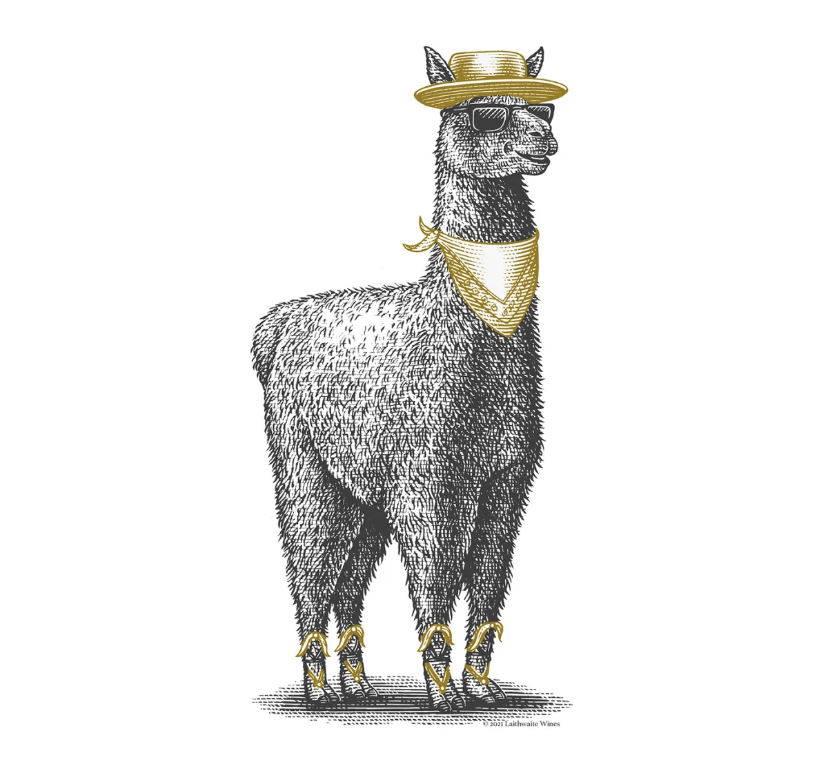
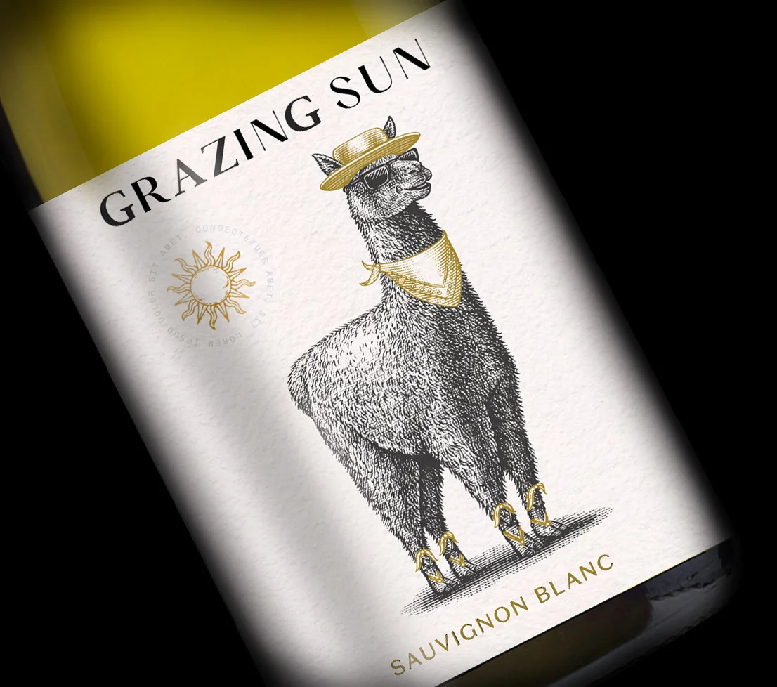
For Laithwaites, Noble illustrated a llama from Chile’s Elqui Valley. The brief’s story gives the animal an unusually specific setting: a high, sunny valley where local llamas are said to wear sunglasses against the intense light. That detail connects the character to the region’s conditions and its winemaking. Noble rendered the scene in a woodcut style, using the medium’s bold shapes to make the local tale legible as label art.
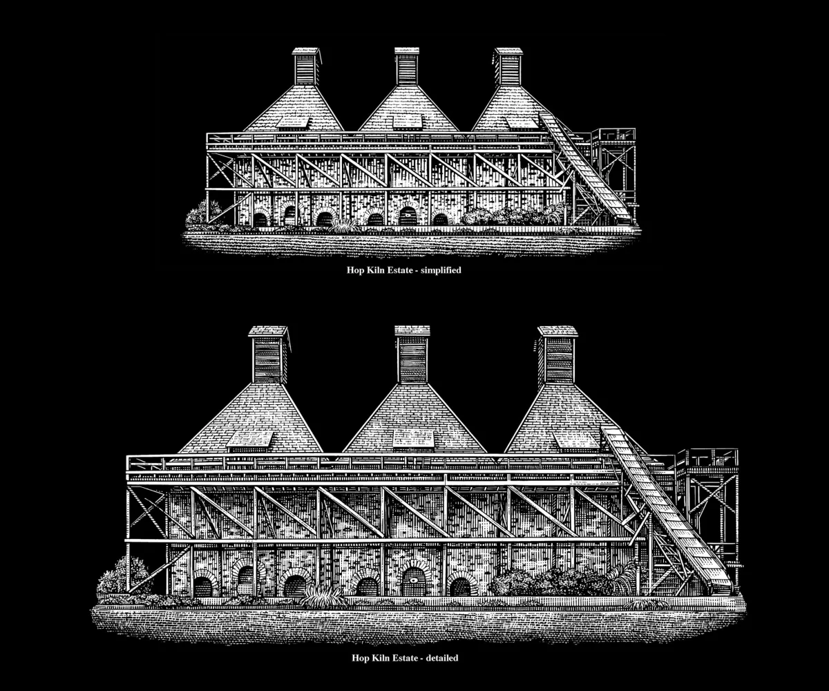
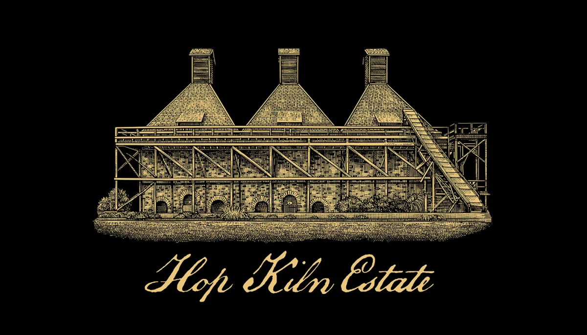
At Hop Kiln Estate, the subject is a historic building rather than a character. Wonderful commissioned Noble to draw the Hop Kiln for Landmark Vineyards. The source dates the building to 1095 and describes it as a registered California Historical Landmark and a significant surviving stone hop kiln in the North Coast region. Scratchboard etching suits the architectural brief: fine cuts can distinguish the masonry and structure while the overall image retains the contrast of a print.
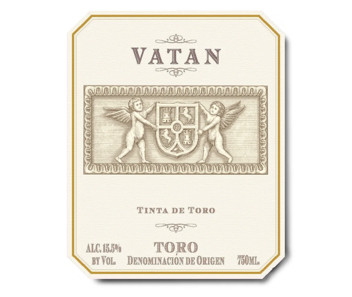
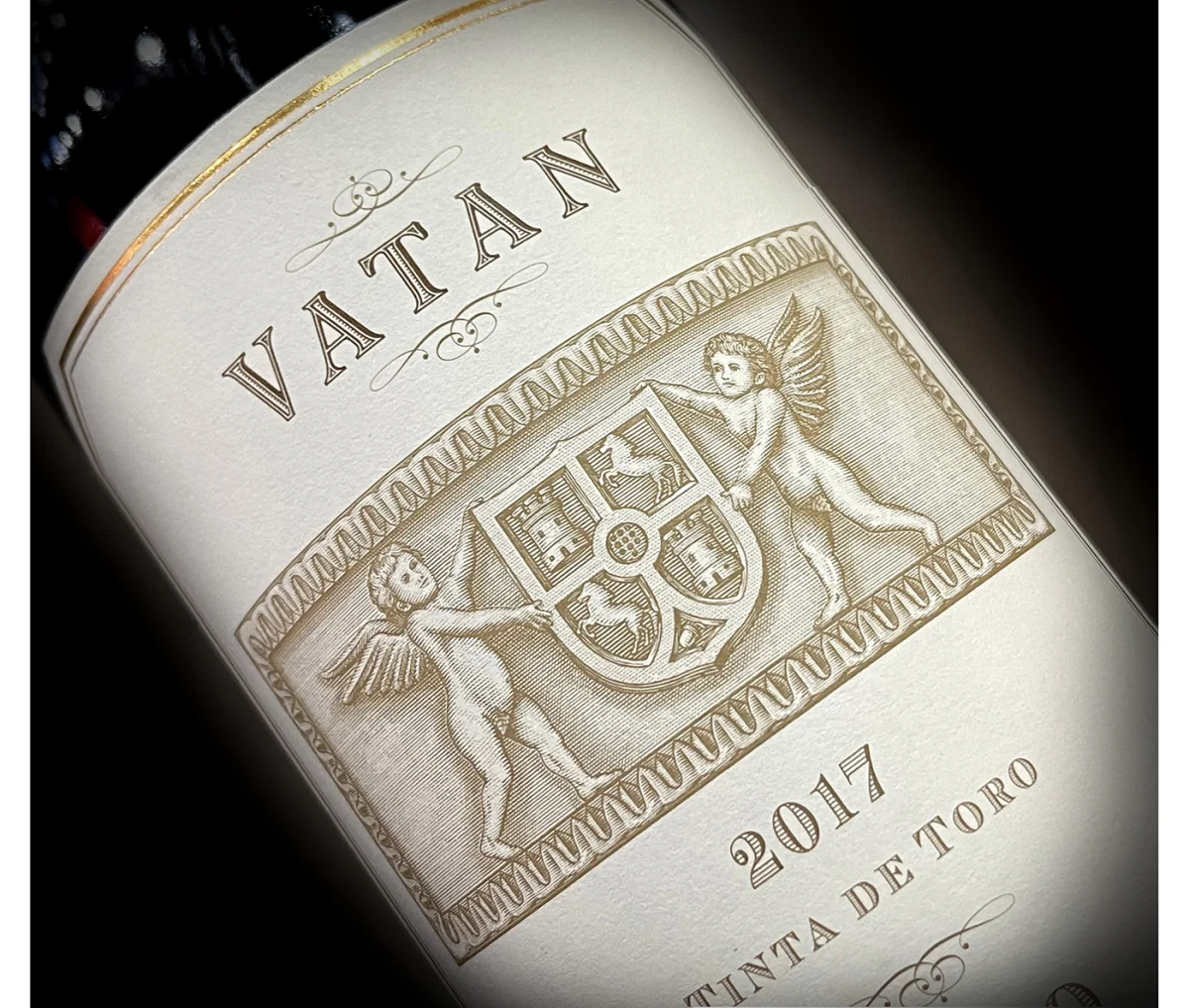
Bodegas Vatan’s label takes a heraldic direction. Commissioned for Jorge Ordenez, the illustration places two angels beside a symbolic crest based on the winery’s coat of arms, whose history reaches back to the Middle Ages. Noble hand-etched the image into a scratchboard woodcut surface. The winery’s Tempranillo comes from old, ungrafted vines in Spain; the label’s emblem and engraving give that history a visual form without relying on a contemporary, photographic treatment.
Heritage, built one mark at a time
For Booker’s Bourbon, Jim Beam commissioned a series of custom scratchboard illustrations, each made to fit a different batch label. Booker introduced small-batch bourbon in 1992 and his signature Booker’s True Barrel Bourbon followed. The series’ individually crafted images give each label room for its own treatment while holding to a shared hand-rendered language. This is a useful distinction for identity work: consistency can come from a common technique, even when each package needs a separate illustration.
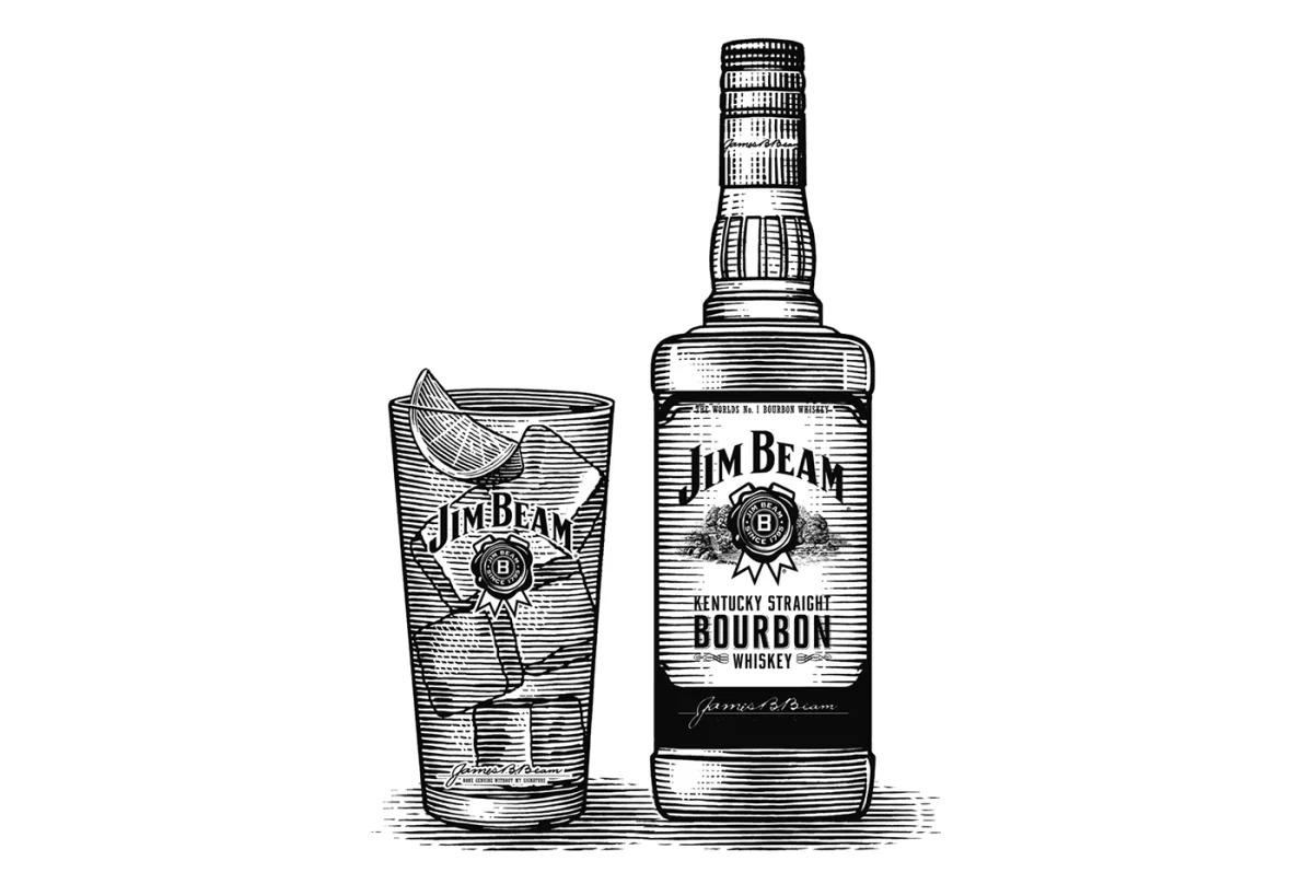
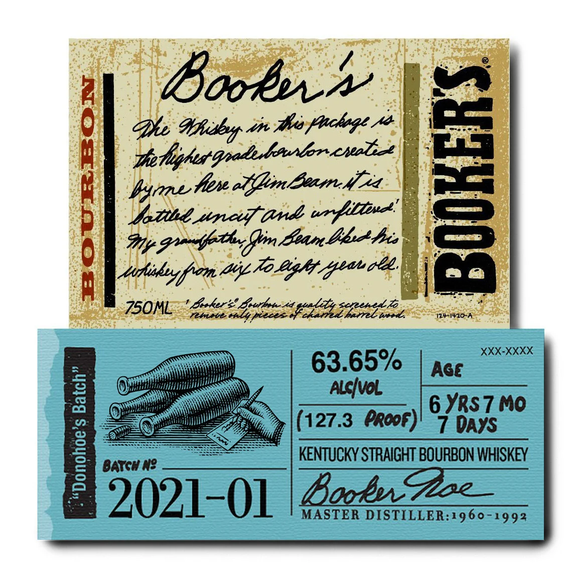
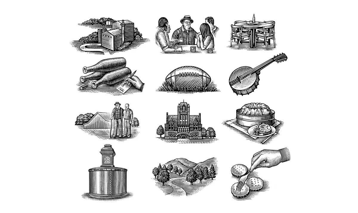
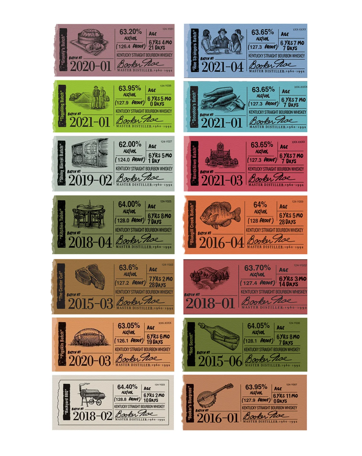
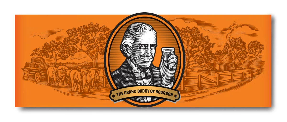
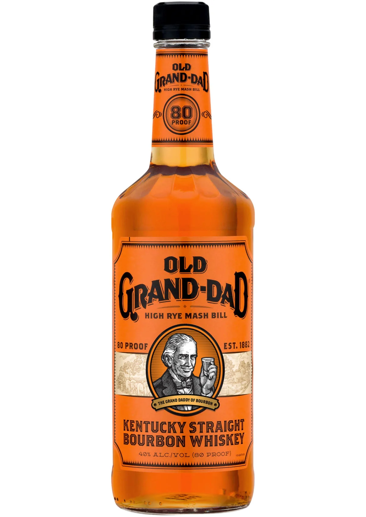
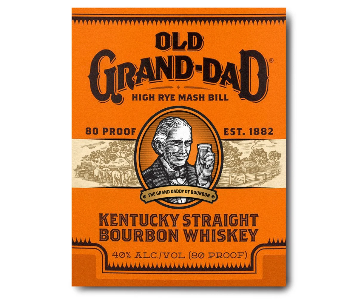
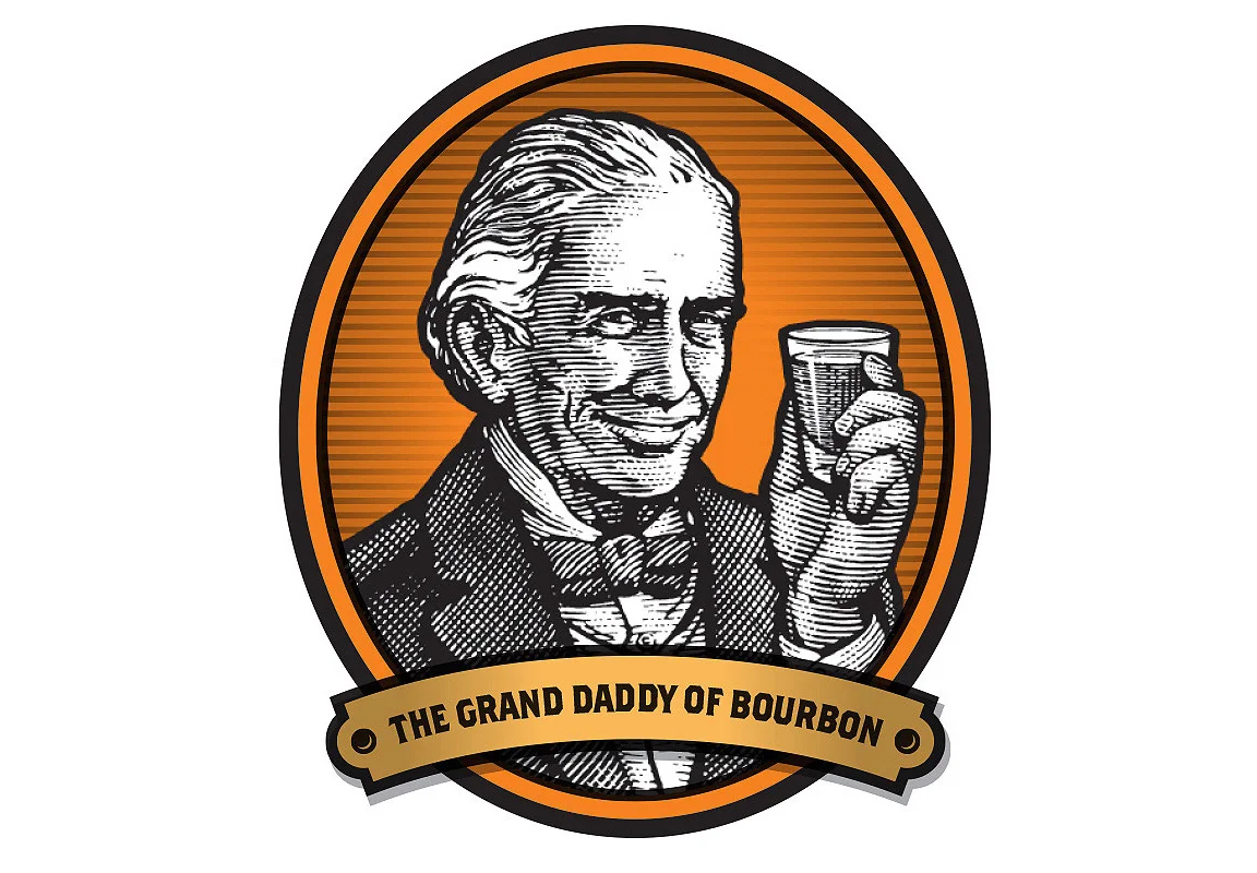
Coho Creative brought Noble into the Old Grand-Dad bourbon rebrand, which features a portrait of Meredith Basil Hayden Sr. and a Kentucky landscape. The Hayden family’s first commercial distillery dates to 1840, and the whiskey has remained in production since then. Here, woodcut imagery carries the brand’s heritage through two complementary subjects: a founder’s portrait and the place associated with the whiskey.
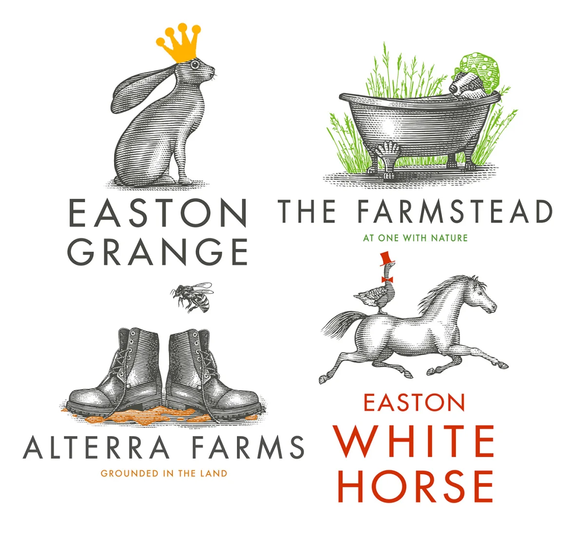
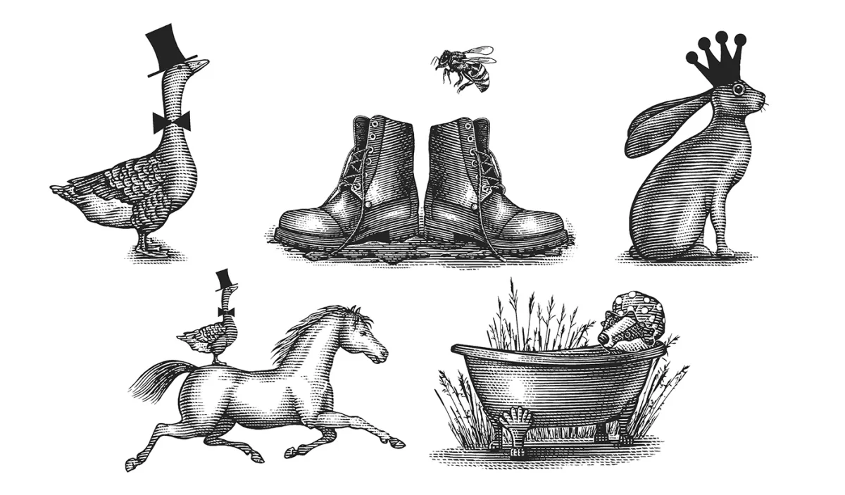
Easton Grange asked Noble to create a family of illustrated brandmarks for its wedding venue in Suffolk, UK. The concepts include Alterra Farms, The Farmstead, Snooty Goose, Easton White Horse and Easton Grange, with playful characters linking the names. The woodcut-style illustrations were supplied as digital files. That hand-to-digital path lets a distinctive drawn mark carry across different brand applications.
When the subject is a product’s construction
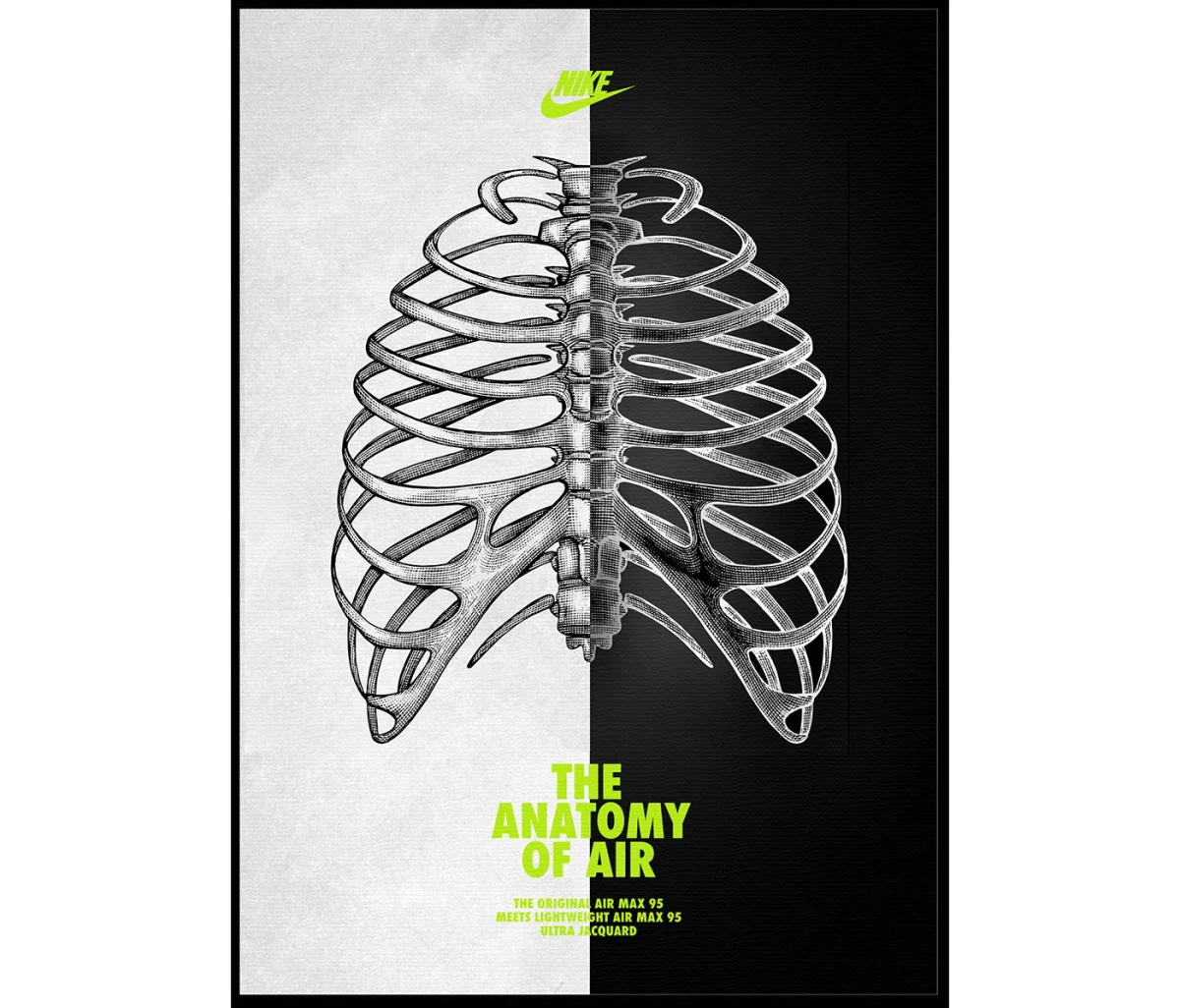
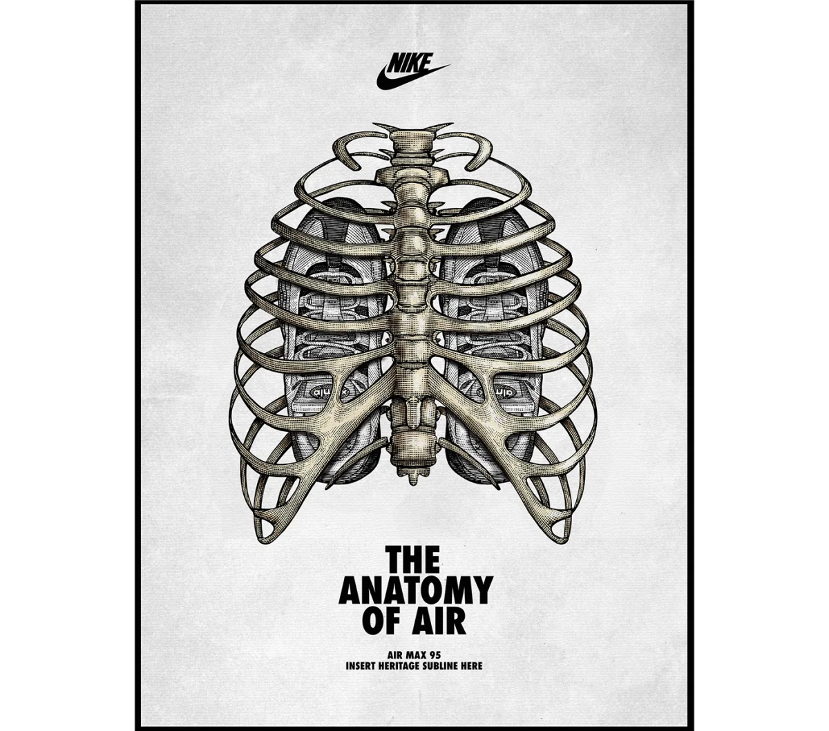
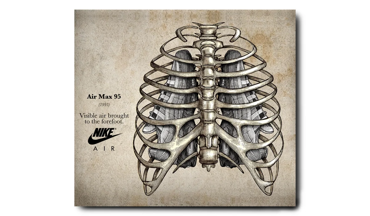
Nike’s “The Anatomy of Air” moves the technique into footwear storytelling. Designer Sergio Lozano drew on human anatomy for the Air Max 95: the spine informed the sole, ribs the lace straps, skin the mesh and muscle fibers the graduated upper. Nike commissioned Noble to interpret those connections as a fully rendered scratchboard illustration, with the look of classical anatomical plates and a modern conceptual approach. The method makes the design references visible as a system of related forms.
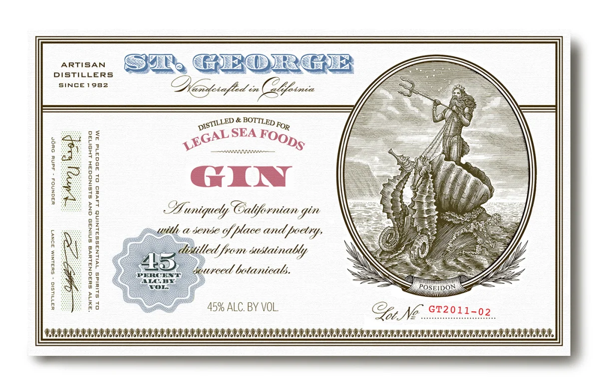
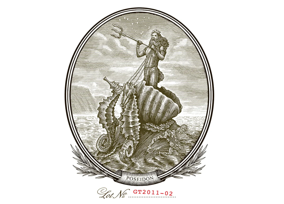
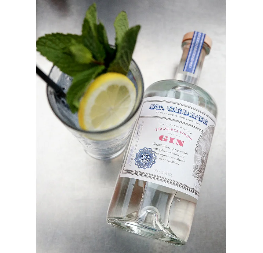
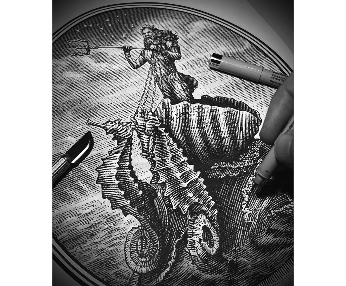
Legal Sea Foods’ gin label shifts from anatomy to mythology. The gin, made with St. George Spirits, highlights lemon, dill and tarragon, botanicals chosen to pair with seafood. Noble’s commissioned image shows Poseidon holding a trident and riding a wave inside a clam shell, pulled by two seahorses. Scratchboard engraving gives the crowded composition a clear hierarchy of forms, making the central figure and supporting details part of one emblem.
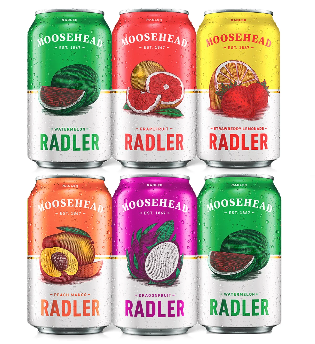
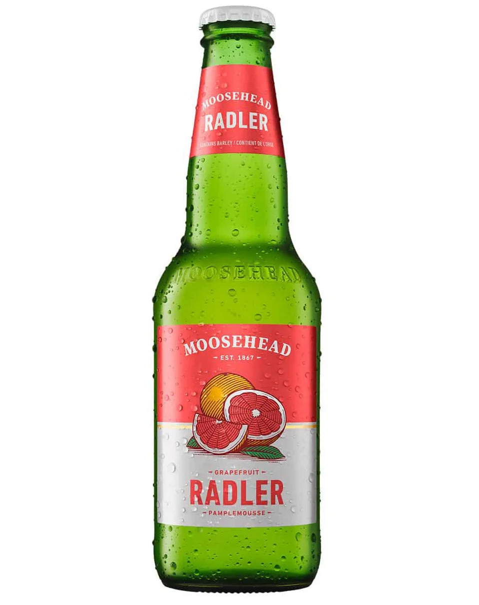
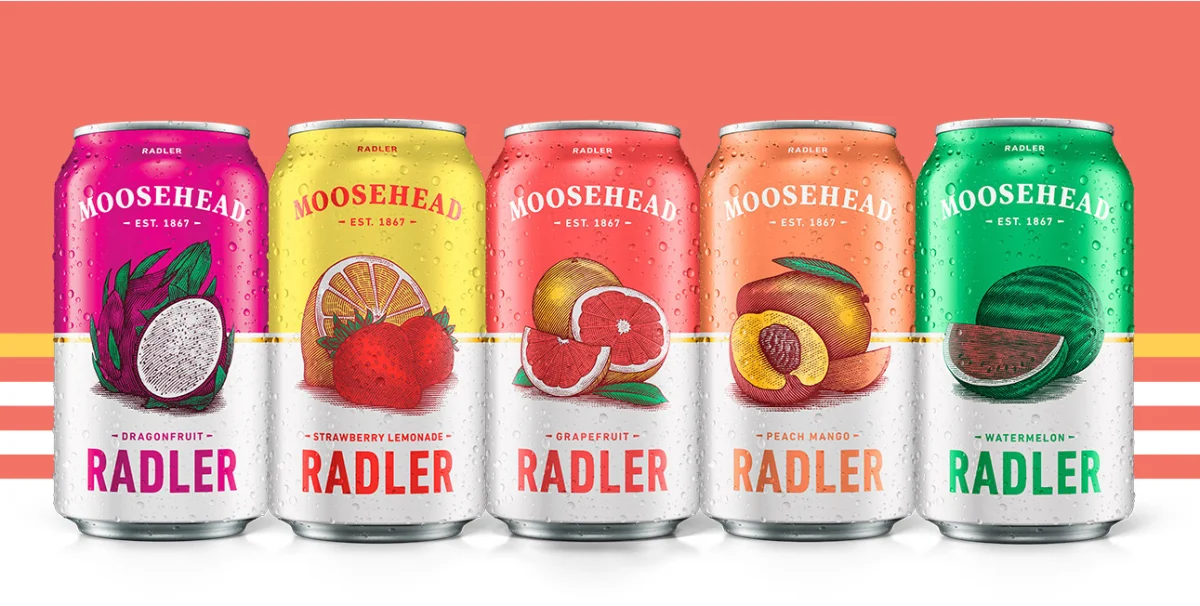
Moosehead’s radler labels show another adaptation: Noble drew the fruit imagery by hand in scratchboard, then added colour digitally. The flavours include dragonfruit, grapefruit, strawberry lemonade and watermelon. Keeping the underlying marks consistent while applying colour digitally gives the set a common illustrated character and a way to distinguish the individual varieties.
Across these commissions, the notable constant is not a single subject or layout, but a way of drawing. Noble’s cut line can describe folklore, architecture, product anatomy or brand history, with the level of detail adjusted to the brief. For designers working with illustrated identities, that’s the practical lesson: a strong visual method can flex across categories while giving each piece a recognizable surface and a story viewers can read.
Images and text courtesy of Steven Noble. Explore his Directory of Illustration portfolio and website.
| Rev | Description | Date |
|---|---|---|
| A | Issued for reading | |
| B | Viewed 461 times | Current |


