Fatinha Ramos on Building the Directory of Illustration No. 38 Cover
- Project
- Graphic Design
- Drawn by
- Marika Lind
- Issued
- Sheet
- A-114
Fatinha Ramos explains the symbolism, colour choices and layered painting process behind the “Lead With Love” cover for Directory of Illustration No. 38.
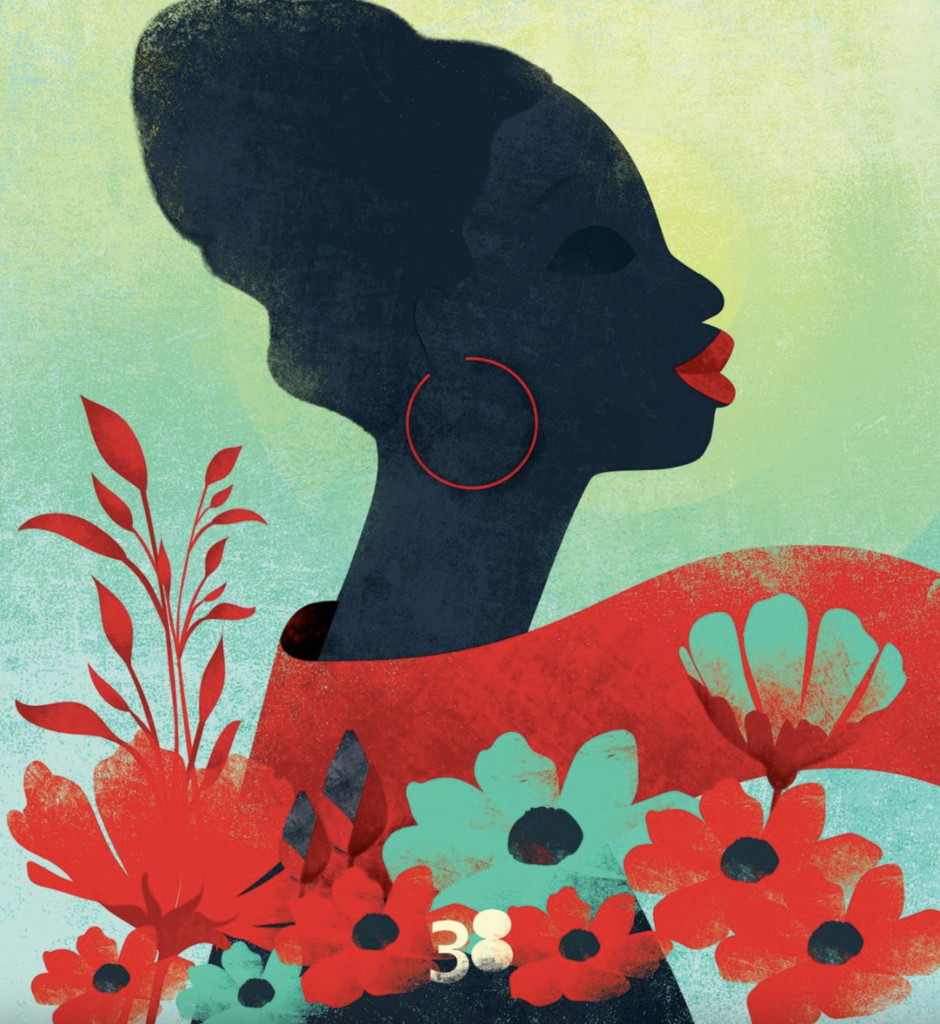
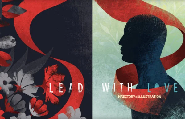
Fatinha Ramos’s cover for Directory of Illustration No. 38 turns “Lead With Love” into a scene of movement, contrast and shared visibility. A woman faces the reader, her scarf drawing the eye into the book. Around her, colour and varied figures give shape to the directory’s themes of inclusion, diversity and a brighter future. Ramos’s choices connect the image’s message to its composition: who leads, who is seen and where the viewer’s attention travels.
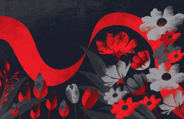
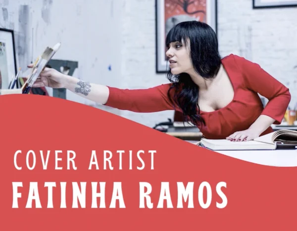
Ramos, an award-winning illustrator and visual artist based in Antwerp, created the cover and end sheets. Originally from Portugal, she spent twelve years working in art direction and design before becoming a full-time illustrator. Her work has appeared internationally. Her awards include the overall win at the World Illustration Awards 2021, recognition from the Society of Illustrators in New York, 3×3 Magazine, Communication Arts, the Global Illustration Award and White Ravens. She is represented by Rapp Art.
The directory’s creative director was Tamra Dempsey, and Lisa Wiant handled book design and art direction. Ramos thanked both for their teamwork, describing her invitation as an honour and the collection of covers as a project she admired.
A cover built around a figure who leads
Ramos accepted the assignment quickly, even though her schedule was already full. The theme mattered to her: “Lead With Love” aligned with her belief in diversity and inclusion. She wanted the cover to express those ideas through a person with presence, rather than rely on a slogan alone.
The central woman represents women in their variety, as well as minorities and, more broadly, people who should see themselves within the book. She looks forward with confidence and enjoyment, like a flower turning toward light. Ramos describes her as a hero, a figure of strength and resilience after a difficult period. Her scarf invites the reader into the directory and gives the composition a visual route to follow.
The image also carries a sense of historical struggle and progress. Ramos connects the woman to resistance against racism, the pursuit of people’s rights and a movement from darkness into light. For her, choosing a woman was a deliberate celebration of women’s power and endurance. She describes feminism as equal rights for women and men: the same level, neither more nor less.
Inside the book, the representation extends beyond the cover. Ramos says it was challenging to depict diversity without falling into clichés. Her aim was to make individual characters distinct while allowing them to stand for a wider community. She also wanted to include a person with a disability, an aspect of representation she felt still needed greater attention.
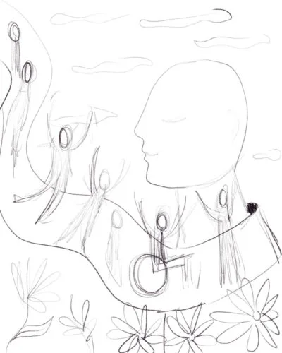
The woman using a wheelchair is placed prominently and links the other figures. Ramos made her especially visible because people with disabilities can feel unseen. Position mattered too: on the right-hand page, where readers in that part of the world move from left to right, the woman takes the lead and looks toward the others. Ramos wanted the figure to be recognizable across cultures.
Colour as a meeting of contrasts
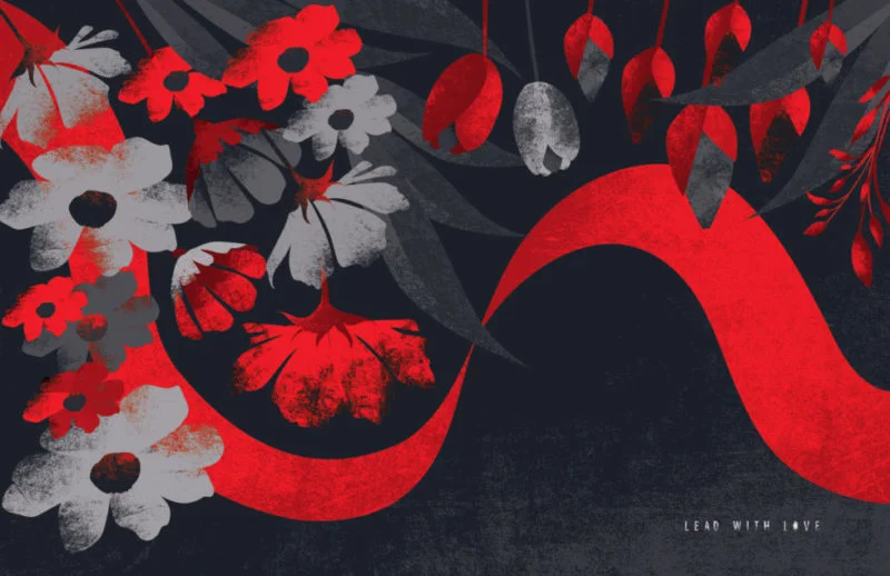
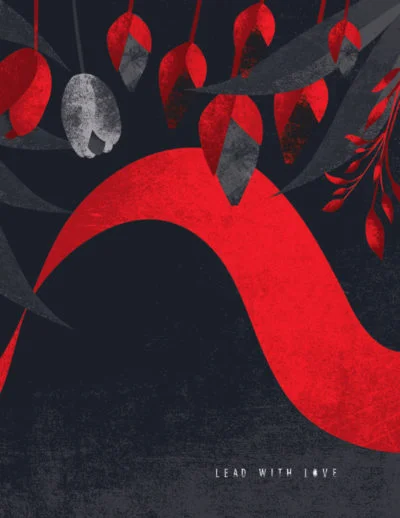
The end sheets helped set the cover’s palette. Their two colours gave Ramos a starting point: she wanted a hue that would work with red while introducing contrast. Blue and yellow became the cover’s bright counterpoints. The relationship between those colours supports the theme itself, bringing difference together within one composition.
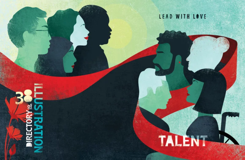
Ramos describes the palette as something that developed through the process. That matters to the image’s overall effect: the colour is not simply decoration, but part of how the cover balances contrast with connection. The bold shapes, light and dark areas, and dynamic arrangement all help the scene carry warmth without losing its visual force.
From rough sketch to layered surface
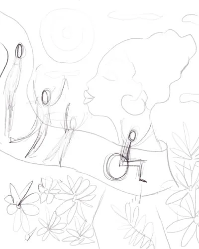
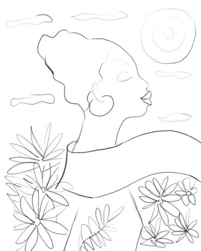
Ramos begins with a loose black-and-white drawing, made in pencil or Procreate, or with whatever drawing tool is available. At this stage, polish is secondary. The sketch lets her test the concept and see where the elements sit on the page. For her, the central question is what the image needs to communicate.
Once the arrangement works, she paints in acrylic or gouache and scans the result. She develops the image in Photoshop, prints it on ordinary paper and paints over the print, sometimes with acrylic again. Coloured pencils add further marks; sandpaper creates texture. She scans the work once more and repeats parts of the sequence as needed.
It is a deliberately layered process, with digital editing and physical materials feeding into each other. The scan gives Ramos room to adjust the composition; the print becomes a new surface for paint, pencil and abrasion. Repeating that loop takes time, and Ramos calls the method unusual and labour-intensive. Its value is the tactile variation that builds up across the final image.
Experimentation, persistence and a better idea
Ramos sees technique as ongoing work rather than a destination. She developed through trial and error, including many failed attempts, and says those experiences helped her reach her current practice. Her advice to herself is to keep experimenting, do her best and measure progress against her own standards instead of competing with other artists.
That approach shaped the cover’s development. Ramos made initial drawings while already committed to a full schedule. Around the same time, she became very ill after receiving one of her first or second COVID shots and spent time in hospital. She says she cannot be sure whether that experience affected her ideas, but it became part of the circumstances in which new possibilities emerged.
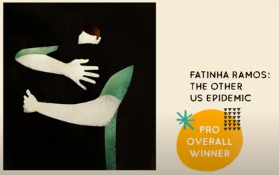
Although she liked the early sketches, she felt the cover could go further. She kept drawing as ideas arrived, at a pace that seemed faster than her hands could manage. Eventually, stepping away from the problem helped. When she was in a different situation, a new direction came to her suddenly; she had her sketch materials with her and began drawing at once.
Ramos sent the new sketch promptly, believing it would make a stronger cover. That choice created more work for her, but she accepted responsibility for the extra effort and felt it was worthwhile. The process reflects a useful tension for illustrators: sustained attention can reveal what needs improvement, while a pause can give an idea room to surface.
Drawing as a way to tell stories
Ramos describes herself as a storyteller who communicates through images. Drawing has been part of her life since childhood, and she says the key was never stopping. She spent considerable time in hospital as a child and often drew from bed; her first exhibition took place there when she was eight.
That personal history helps explain why she talks about illustration as both a practice and a purpose. She wants to illuminate subjects she believes deserve attention and make them legible to others. The cover’s emphasis on representation follows that same impulse: its figures and visual hierarchy are designed to make people visible within the book.
Personal work and future experiments
Alongside commissioned projects, Ramos is working on personal work, including a children’s book based on her own story, and continuing to paint. She also has other projects underway that she was not ready to discuss. What excites her is the chance to move beyond her comfort zone, make more time for experimentation and keep pushing herself.
When asked about future work, she joked that another Directory of Illustration cover would be welcome—perhaps for the hundredth edition, by which time she imagined she might be 100. The joke points back to the project’s central pleasure: a cover can be a single commission, but its ideas continue through the pages and through the people who encounter it.
Recognition and the finished book
In 2021, Ramos was the overall winner of the World Illustration Awards. She also received a gold award in the illustrations market from the Society of Illustrators, Los Angeles, the Patrick Nagel Award and two Communication Arts excellence prizes. Asked what recognition means to her, she said that moving people emotionally is among the best rewards her work can offer.
For Directory of Illustration No. 38, the cover and end sheets are by Fatinha Ramos, represented by Rapp Art. Tamra Dempsey was creative director; Lisa Wiant was responsible for book design and art direction. Ramos’s image makes the theme tangible through its bright palette, layered textures and a central figure who guides the viewer’s eye. The process behind it offers a practical reminder: a strong concept can lead the work, while sketching, revision and material experimentation give that idea its final form.
Fatinha Ramos · Rapp Art · Browse Directory of Illustration No. 38
| Rev | Description | Date |
|---|---|---|
| A | Issued for reading | |
| B | Viewed 724 times | Current |


