Fatinha Ramos Illustrates Asian-Inspired Folktales in The Boy Who Liked to Draw Cats
- Project
- Web Design
- Drawn by
- Marika Lind
- Issued
- Sheet
- A-113
Fatinha Ramos brings ancient Asian-inspired stories to life with bold shapes, expressive compositions and a personal visual voice.

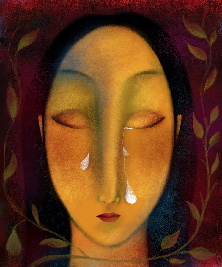
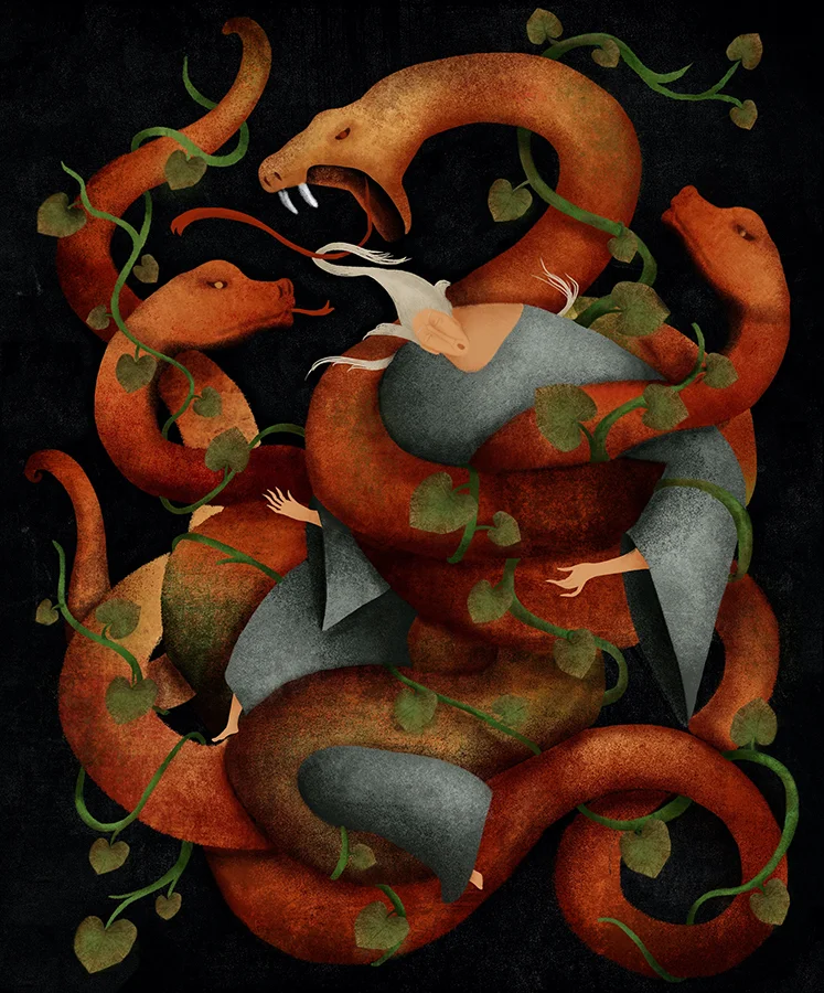
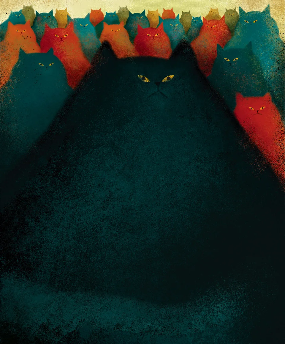
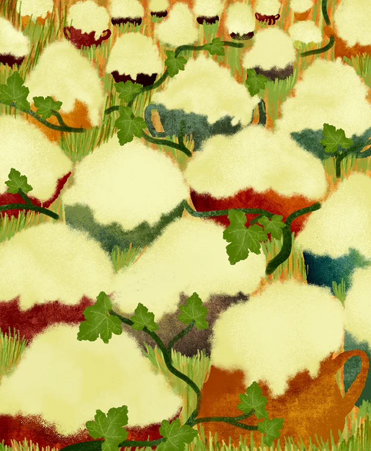
Fatinha Ramos approaches The Boy Who Liked to Draw Cats as a meeting point between stories that travel across generations and an illustration style that remains distinctly her own. The children’s book, written by Michael de Cock and published by Standaard Uitgeverij in Belgium, brings together fairy tales inspired by ancient Asian stories. Ramos says her images draw on Asian culture while retaining her personal artistic voice.
That balance gives the project its central visual challenge: evoke the sources of the tales without making the pictures feel like a generic period setting. Ramos’s description points to a useful distinction for illustrators working with inherited stories. Cultural reference can inform the visual language, while choices of shape, composition and image making keep the work specific to the artist and the book.
Stories that keep changing hands
The project’s accompanying text describes old stories as things carried through time and place. Their appeal, it suggests, comes from familiar human concerns: dreams, desire, passion and fear. The world around a story may change, but those motives remain recognizable. That idea offers a strong foundation for a picture book: the images can establish a particular cultural and imaginative setting while giving readers emotional points of entry that don’t depend on knowing the tale’s history.
For a designer or illustrator, this kind of brief asks for more than historical atmosphere. Each image has to help a story feel rooted and immediate at once. Ramos’s stated approach—drawing inspiration from Asian culture while maintaining her own voice—makes that tension explicit. It also leaves room for a visual interpretation that serves the book as a whole, rather than treating every tale as an isolated exercise in reference gathering.

Making the illustration serve the tale
The images reproduced with the feature give readers a way into Ramos’s work across the book. Rather than reducing the project to a single cover or character, the selection presents several interior illustrations together. That matters in a collection of fairy tales: the images need to carry the reader from one story to another while making each scene legible on its own. The available material doesn’t specify the book’s typefaces, palette, page grid or production process, so those details can’t be attributed to the project. What it does foreground is the relationship between story, cultural inspiration and an individual illustrator’s approach.
When a book brings together tales with long histories, visual consistency can help hold the reading experience together. At the same time, repeated compositions or overly uniform scenes can flatten the differences between stories. Ramos’s emphasis on her own artistic voice suggests a way to hold both needs in view: a coherent sensibility across the book, with illustrations that respond to the particular material in front of them.
From art direction to illustration
Ramos is based in Antwerp and originally from Portugal. Before working full-time as an illustrator, she spent twelve years in art direction and design. That experience gives context to a practice that moves between image making and the needs of a commissioned project: an illustrator must shape a personal visual language while responding to a story, its audience and the way pictures work on the page.
Her work has appeared internationally, and the feature lists recognition from the Society of Illustrators NY, 3×3 Magazine, Communication Arts, the Global Illustration Award and White Ravens. It also identifies her as the overall winner of the World Illustration Awards 2021. Ramos is represented by Rapp Art.

A related cover project
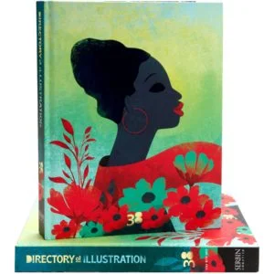
Ramos also created the cover art for Directory of Illustration No. 38. The issue’s theme, “Lead With Love,” centers on inclusivity, diversity and a brighter future. The feature describes her cover in terms of rich colour, contrasts between light and dark, bold shapes and dynamic compositions. Those are concrete visual tools for giving an abstract theme energy: contrast can set up a clear focal point, while emphatic shapes and movement can make a still image feel active.
The cover is a separate project from The Boy Who Liked to Draw Cats, but both features show the range of contexts in which Ramos’s illustration work appears. One responds to a collection of tales; the other interprets a theme for a design directory. The source’s interview about the cover is available here.
To see more of Ramos’s work, visit her Directory of Illustration portfolio, website or agency page. For illustrators, the book’s clearest prompt is to study how a visual voice can acknowledge the roots of a story and still make its interpretation feel personal.
| Rev | Description | Date |
|---|---|---|
| A | Issued for reading | |
| B | Viewed 591 times | Current |


