Sue Todd’s “City in a Forest” Brings Linocut Illustration to Toronto’s Streets
- Project
- Web Design
- Drawn by
- Marika Lind
- Issued
- Sheet
- A-112
Sue Todd combines carved linocut imagery and digital colour for a four-panel Toronto artwork, repeated across a 188-foot construction hoarding.
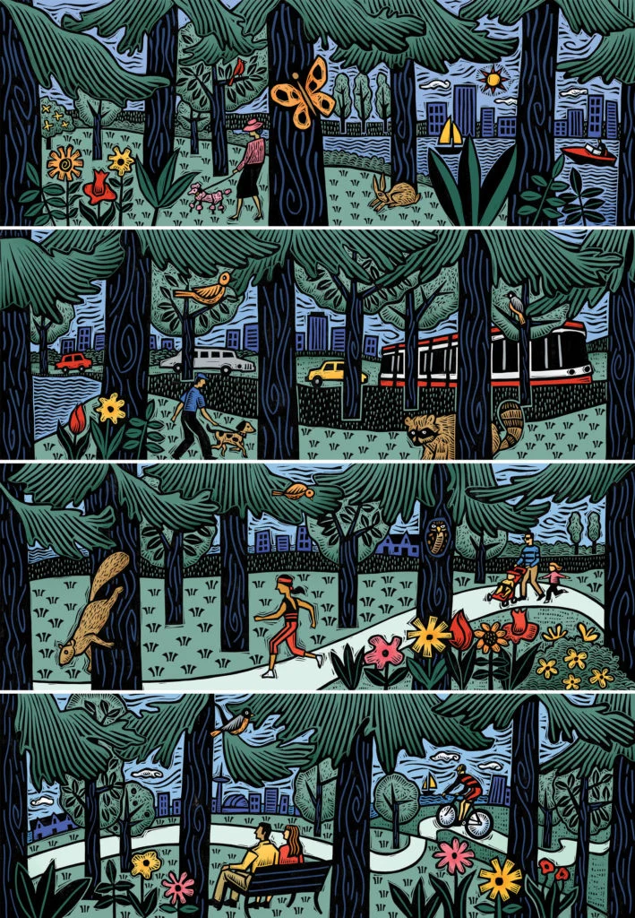
A hand-carved image, scaled to a city block
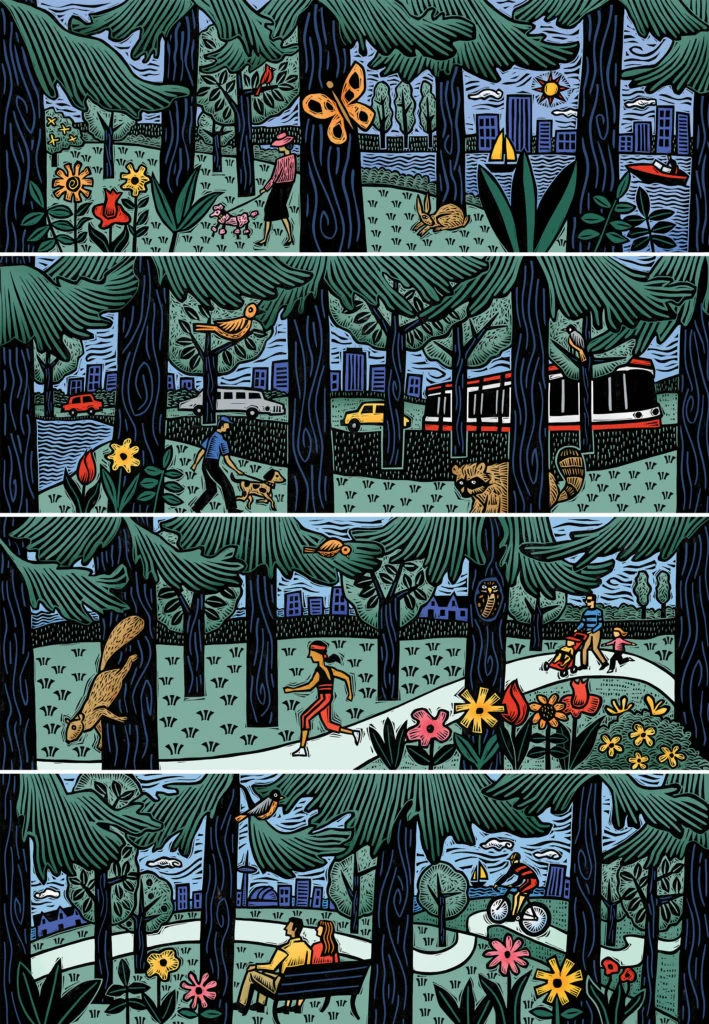
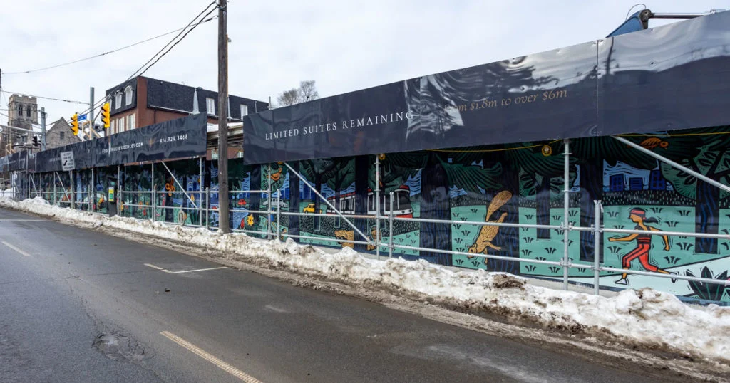
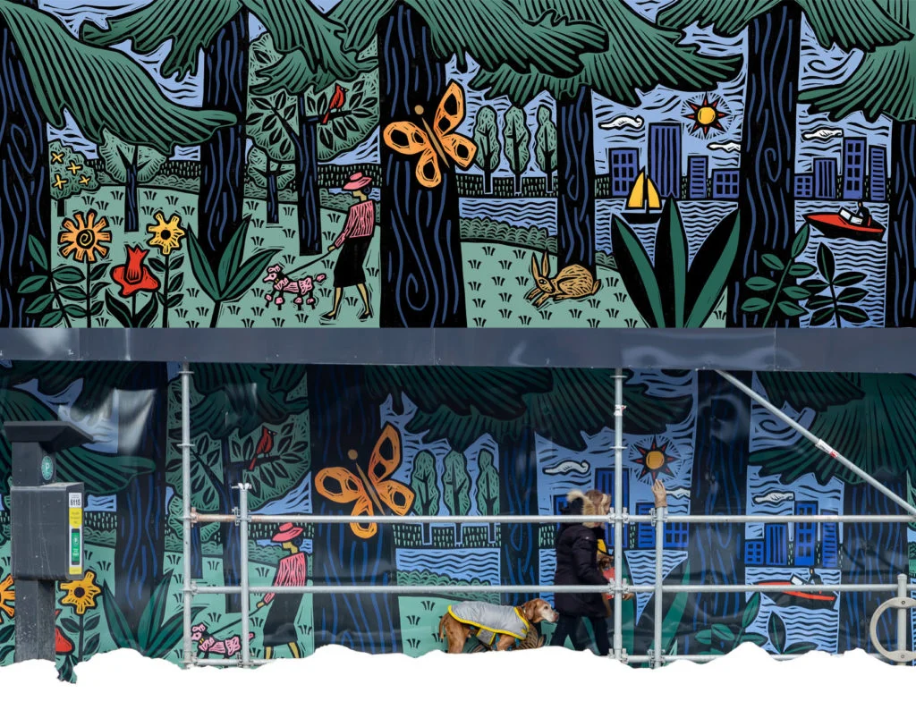
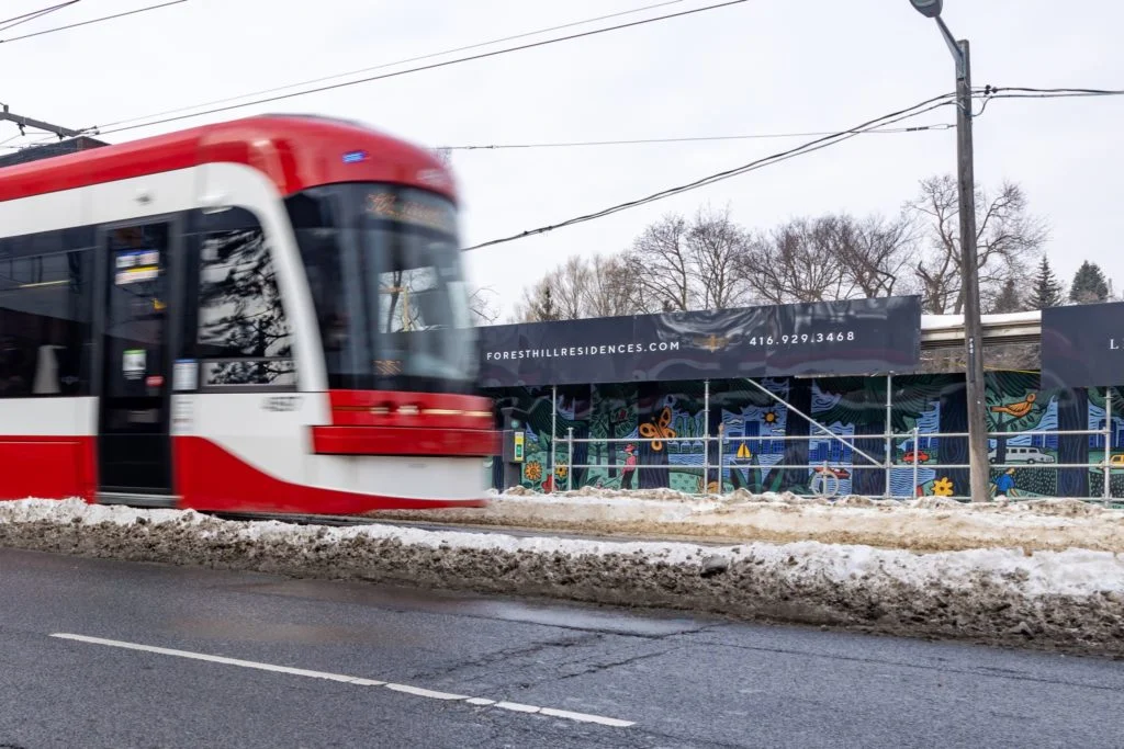
Sue Todd’s “City in a Forest” takes an illustration practice that joins carved linocut with digital colour and stretches it across a long construction hoarding in mid-town Toronto. The project was commissioned for a condo site at the corner of St. Clair Ave and Forest Hill Rd. Its four illustrated panels were duplicated to cover a structure measuring 188 feet by 8 feet, where they are expected to remain for a couple of years.
That scale changes the job. A panel made for a page or poster can be read at close range; a work running along a city street has to hold together as both a sequence and a repeated image. Todd’s account identifies the practical answer: four original panels, reproduced to fit the full span. The source doesn’t describe the individual scenes or explain how the panels connect, so the particulars of the image are best left to the work itself. What is clear is the format: a commissioned illustration designed for a temporary, highly visible public setting.
From linocut to digital colour
Todd describes her practice as occupying two worlds: analog and digital. She carves her images as linocuts, then colours them digitally. The combination gives the work a physical starting point and a flexible finishing stage. Carving asks the illustrator to build an image through the material and marks of the block; digital colouring offers another way to develop its palette after that image has been made.
For designers thinking about a similar workflow, the useful detail is the division of labour between methods. Todd’s description doesn’t specify software, colour settings or production steps, so there’s no basis for prescribing a technical recipe. But the approach itself suggests a clear sequence: make the image through a tactile process, then use digital tools to explore colour. That structure can keep the character of a hand-worked image while allowing colour decisions to be adjusted for a particular format.
Her stated influences offer further context for that visual language. They include medieval woodcuts, Jim Flora, and the woodcuts of Frans Masereel and Jose Francisco Borges. Todd links those references to an illustration practice built around imagery and problem solving. Rather than treating printmaking as a surface effect, she uses carving as part of how she develops a picture.
Designed for a changing street
The project brings together Altree Developments, STEPS Public Art and The PATCH Project, which collaborated to commission Todd. Its support structure is a condo construction hoarding, a boundary that sits in the everyday view of people passing the site. The artwork’s planned presence for a couple of years gives it a different rhythm from a gallery installation or a printed edition: it will accompany a location while construction is under way, then its role will end with that temporary setting.
That context makes repetition part of the design brief. The four panels were duplicated to fit the stated dimensions, meaning the artwork had to work across a broad run rather than as a single framed image. For illustrators approaching comparable large-format work, it’s useful to think early about what happens when an image becomes a sequence: how separate panels can be read along a route, how a repeat affects visual pacing, and what details remain legible when viewers encounter the work at different distances. The source doesn’t say which of these considerations guided Todd’s decisions, but they follow from the scale and installation format she describes.
An illustration practice across formats
Toronto-based Todd has worked across books, magazines, posters, T-shirts, a television commercial and a bus. Her client list includes Barnes and Noble, Crown Publishing, Pearson Education, Klutz Press, Andrews McMeel Accord, The Wall Street Journal, the American Bar Association, Houghton Mifflin Harcourt and Walmart Canada. That range places her image-making in settings with different sizes and uses, from editorial and publishing work to objects and public-facing applications.
She is also exploring children’s publishing through stories she is writing and illustrating, described as works in progress. Away from illustration assignments, she paints oil portraits in both analog and digital forms. Todd is an associate of the Ontario College of Art, now OCADU. These details point to a practice that keeps moving between media while returning to the same underlying interest: solving visual problems through images.
“City in a Forest” makes that flexibility visible at architectural scale. Its linocut-and-digital method connects a hand-built image to a large, temporary urban surface, while the repeated panels give the work room to occupy an unusually long format. The project’s clearest takeaway for illustrators is to treat production and placement as part of the image-making brief: medium, scale and duration shape how the work will be encountered.
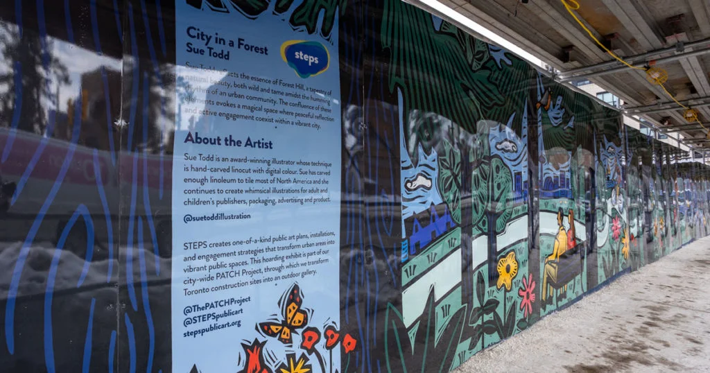
Explore Sue Todd’s portfolio and website for more examples of her work.
| Rev | Description | Date |
|---|---|---|
| A | Issued for reading | |
| B | Viewed 974 times | Current |


