Nathan Smith’s Directory of Illustration No. 39 Cover Turns Industrial History Into a Sustainable Future
- Project
- UX & UI Design
- Drawn by
- Marika Lind
- Issued
- Sheet
- A-109
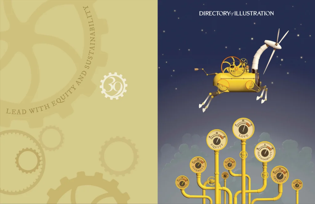
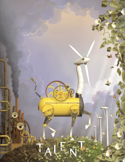
Nathan Smith’s DI39 cover follows Sebastian, a horse, steam engine and wind turbine hybrid, through a visual story about equity and sustainability.
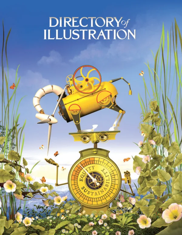
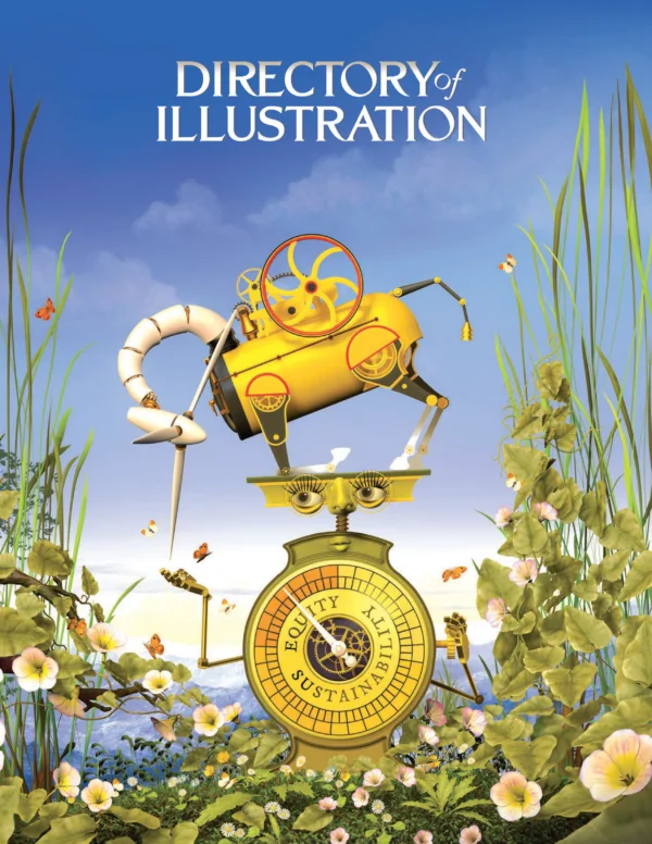
For the 39th Directory of Illustration, Nathan Smith made a cover about change you can see. Sebastian, an invented character combining a horse, a steam engine and a wind turbine, carries the publication’s theme of “Equity and Sustainability” across the book. His journey links successive sources of power, from horse-drawn agriculture to steam, electricity and wind energy, and gives a complex subject a clear visual thread.
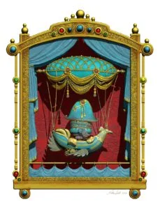
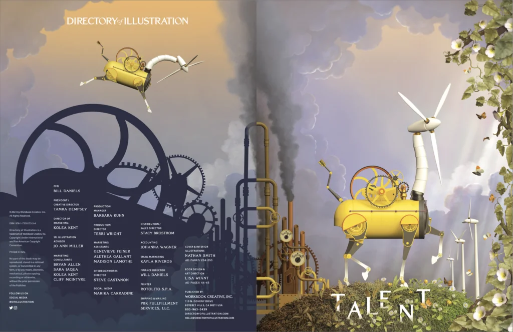
Smith’s approach brings his theatrical background into a digital illustration workflow. Rather than treating the cover as a standalone image, he extended Sebastian’s story through the inside cover and credits spread. The result connects the character, the book’s theme and its supporting graphics in one sequence. Smith created the cover and end sheets; Lisa Wiant handled book design and art direction, with Tamra Dempsey as creative director.
From scenic painting to illustration
Smith is a British artist, illustrator and designer who has worked in the creative industries for nearly 30 years. He first trained and worked in London as a theatre designer and scenic artist, recreating other designers’ work on backcloths. Illustration had been his ambition all along: he wanted the freedom to express his own ideas.
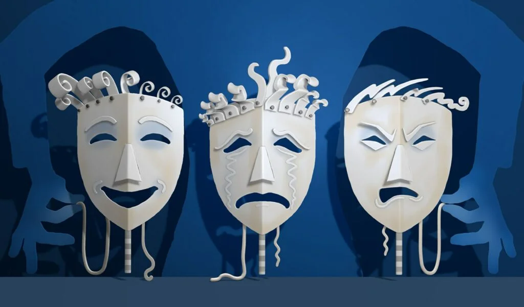
That theatre experience still shows in work described as quirky, playful, visually intriguing and informal. Smith says fantasy art and the magical realism of illustrators Patrick Woodroffe and William Heath Robinson shaped his visual imagination. He also absorbed the atmosphere of English repertory theatre. Early acrylic paintings and illustrations often included stylised backdrops, paint frames and ladders, making the setting feel like part of the performance.
His imagery often pairs nautical or aeronautical machines with anthropomorphic details. In surreal settings, characters and machines follow their own physical logic. The scenes’ oddness gives the work its pull, while an illustrative quality carries through into his digital practice. His digital work has appeared internationally.
Smith’s client list includes the Financial Times, Newfoundland Labrador tourist board in Canada, Target Brand Architecture in Canada, the Science Museum in London, 3MS Music, 7us Media Group in Germany, Wonkypix Games & Apps, Wild in Art, Silverstone motor racing, The Air Ambulance Service, Frobisher’s Fruits, Colchester & Winchester Zoo, Park Inn Hotels, London 2012 Olympics and the Imperial War Museum. He is represented by AAARep. His portfolio is available at Nathan Smith’s website, with representation details at António Adrião Artist Rep.
A shift in tools and process
Smith began with traditional media, developing an approach based on acrylic paint and collage. In 2010, he started drawing on an iPad, a change that reshaped how he wanted to work. He taught himself Photoshop, then ZBrush, whose digital clay felt familiar after making ceramic sculptures by hand.
For DI39, he began with several sketches on paper, then moved directly into 3D. He blocked out the major forms and developed the characters, paying close attention to silhouette. His preferred way to present a concept is as a nearly finished greyscale illustration, with background elements suggested subtly. That sequence lets him establish the image’s overall read before colour and finer details take over.

Smith built the cover in ZBrush, then composed the illustration in Affinity Photo and Photoshop. The combination reflects his movement between modelling forms in a digital sculpting space and assembling the finished image in two-dimensional tools. He was delighted to receive the cover commission; his agent, Antonio Adriao of AAARep, had been presenting his work in the Directory since 2016.
Building Sebastian’s visual story
The character’s design joins three eras of industrial power. Smith imagined Sebastian as a composite figure with a horse’s body, a steam engine’s machinery and a wind turbine’s form. The hybrid gives the book’s broad theme a protagonist whose physical design can carry the story from one kind of energy to another.
Steam power provided a specific visual cue: Stephenson’s Rocket. Its white, yellow and black colours informed Sebastian’s palette, while the Rocket’s white chimney suggested the turbine head. Smith also wanted to avoid repeating the colours of earlier Directory covers. For the scales, he drew on the natural colours of the rural setting. Across the image, those choices make the transition from machinery to renewable energy legible without separating the character from his surroundings.
Scales represent equity as balance and judgement. Cogs across the inside pages suggest both interconnection and machinery driven by power. Together, these recurring elements let the cover and interior spread function as parts of the same visual argument. Sebastian’s journey becomes a way to consider how earlier technologies shaped the present and what a cleaner future might require.
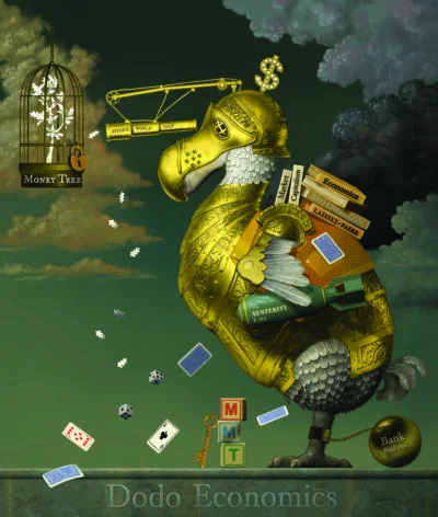
Smith describes the image’s message as one of hope: people need to change their ways, care for the planet and take responsibility for past actions. His own interests span many subjects. Aviation and flight have long informed his illustration, while the financial crash prompted him to explore economics and politics. “Dodo Economics,” one of his illustrations, appears on his pages in DI39.
For Smith, the continuing impulse is to make work and learn new skills. That restlessness helps explain the move from scenic painting and ceramics to digital drawing, 3D modelling and image composition. DI39 brings those experiences together: theatre’s sense of staging, the tactility of sculpted form and a carefully structured visual narrative. The practical lesson for illustrators is to let a character carry the idea, then reinforce its meaning through silhouette, colour and details that recur across the page.


| Rev | Description | Date |
|---|---|---|
| A | Issued for reading | |
| B | Viewed 949 times | Current |


