Jason Raish’s “Croquet & Ink” Reframes 1950s Imagery Through Illustration
- Project
- Web Design
- Drawn by
- Marika Lind
- Issued
- Sheet
- A-108
Jason Raish’s award-winning series pairs 1950s visual references with people of color, challenging the era’s narrow representation through carefully staged contrasts.

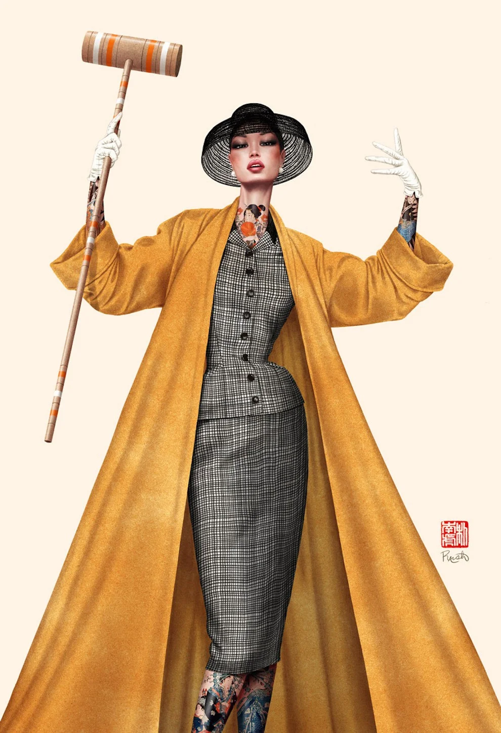
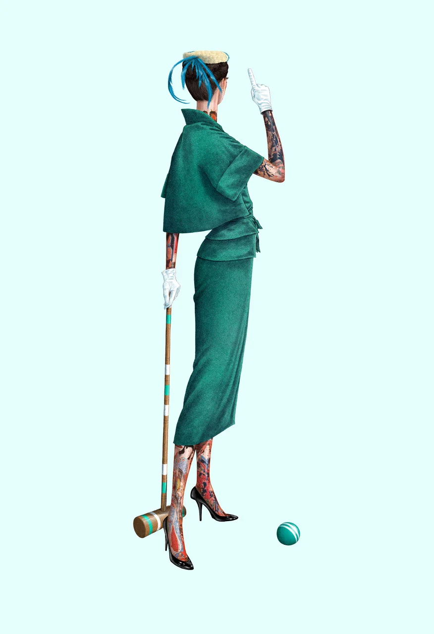
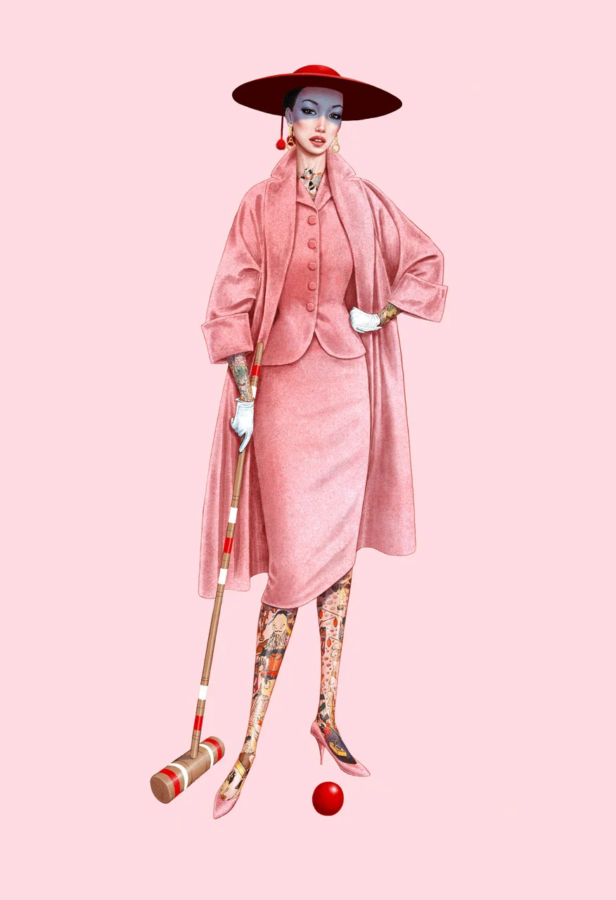
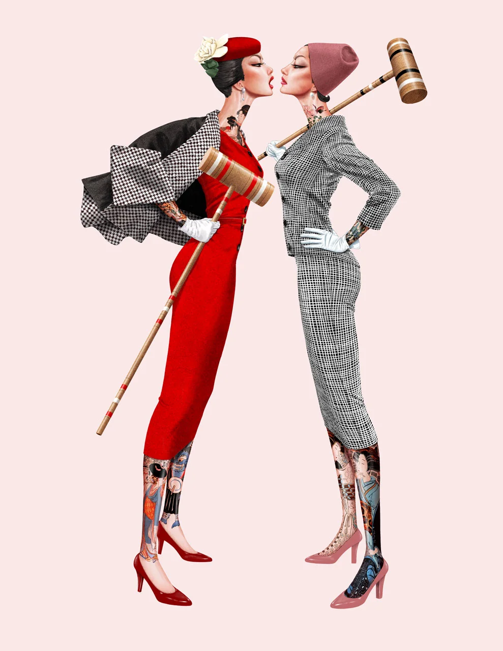
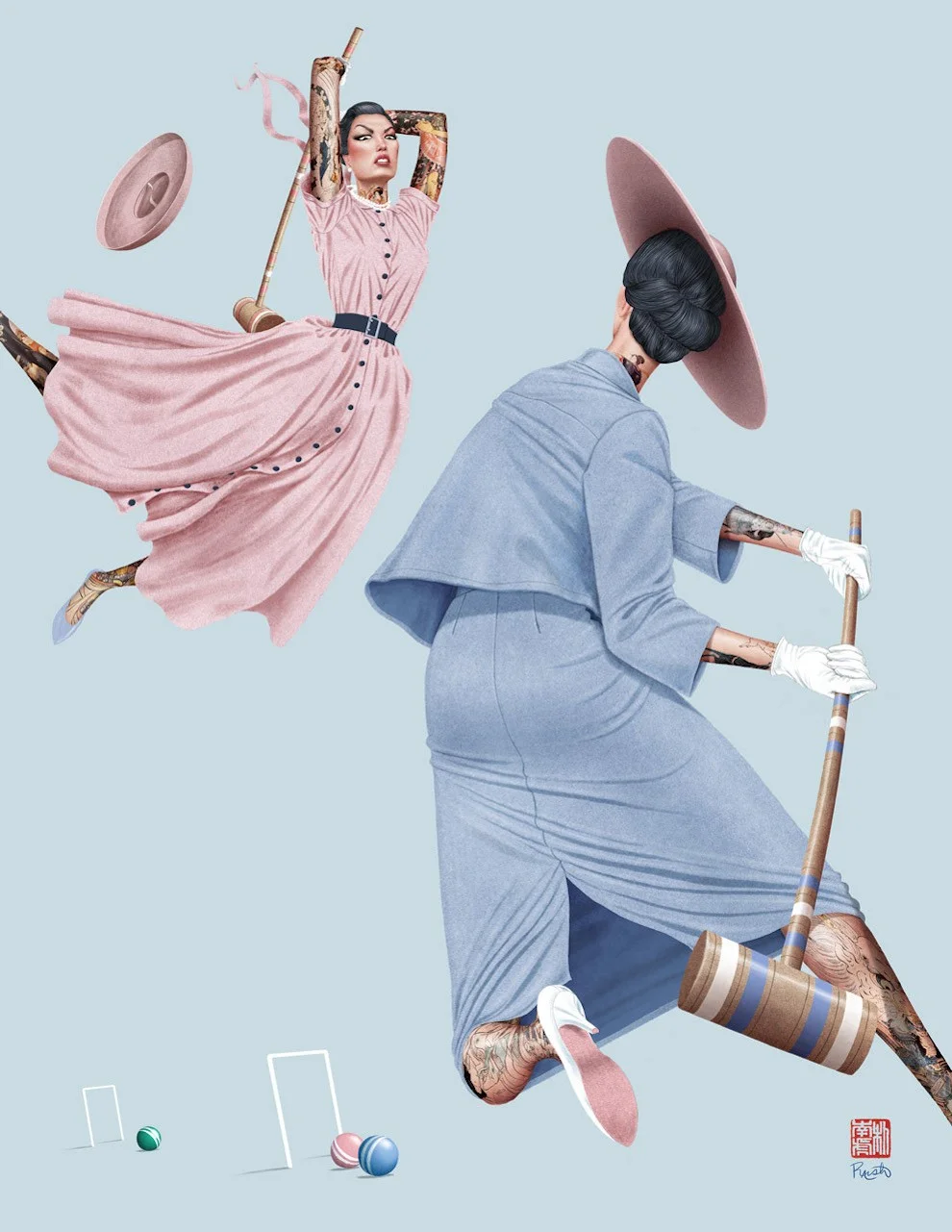
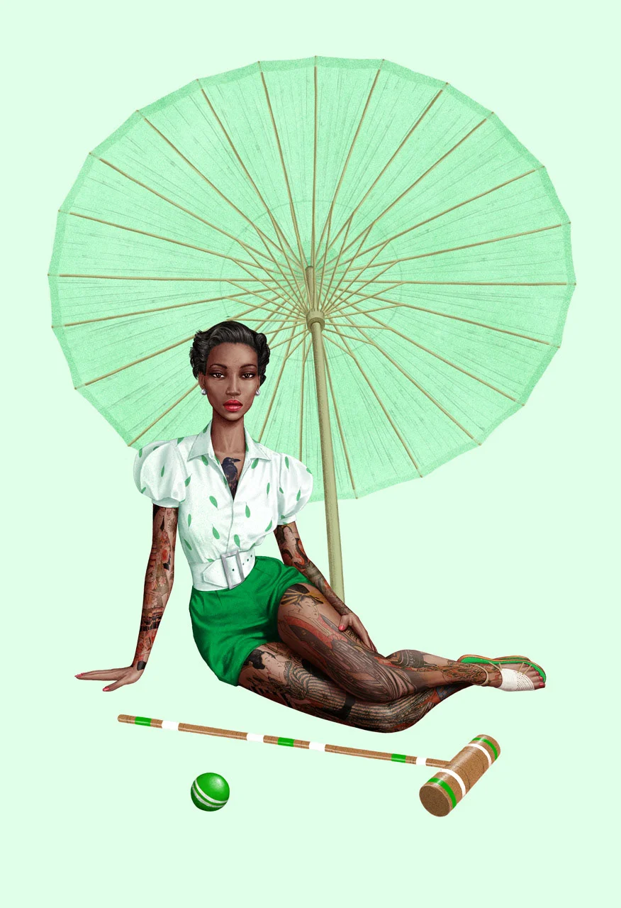
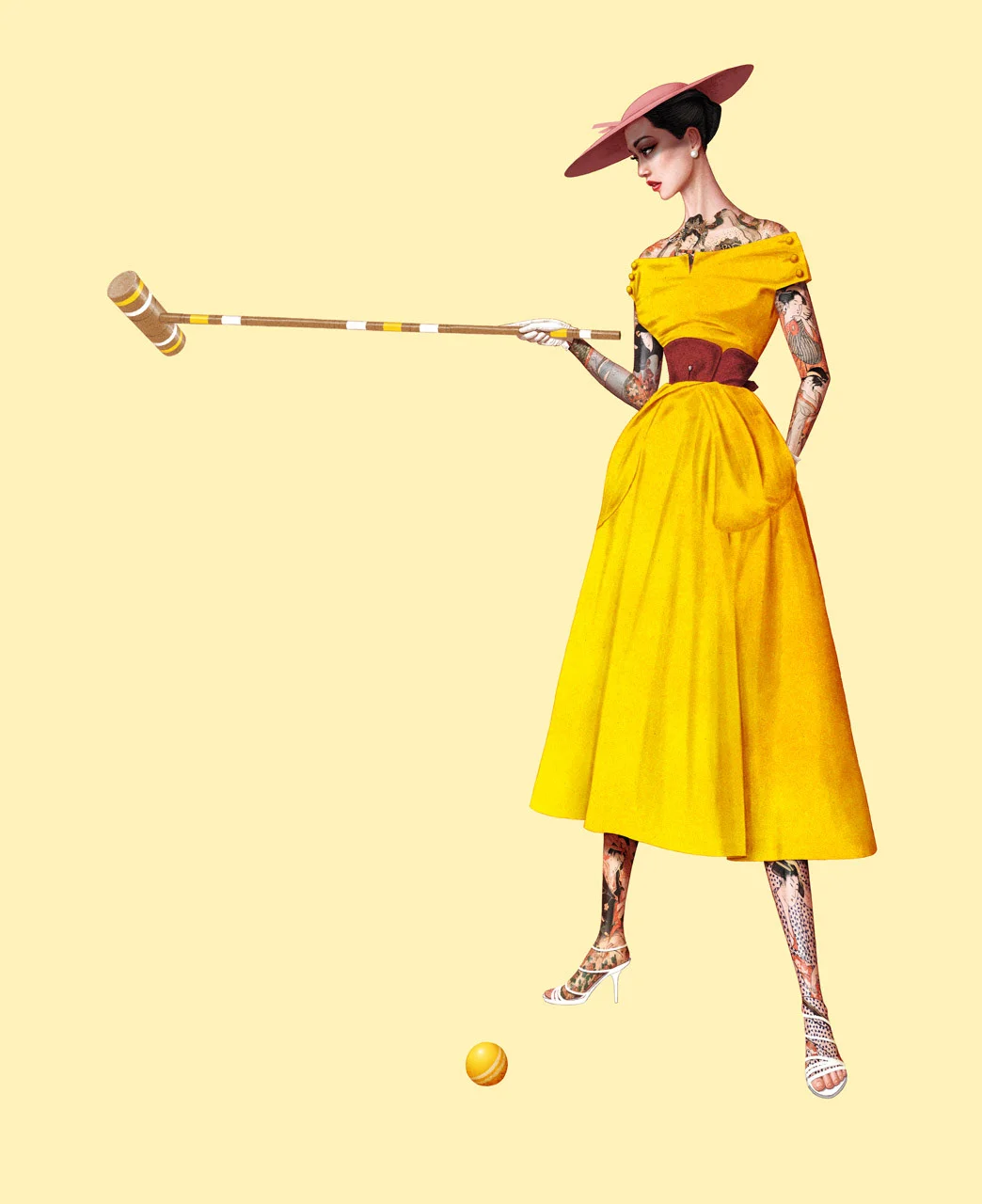
Jason Raish’s “Croquet & Ink” uses the polished manners associated with 1950s imagery as a setting for rebellion and self-expression. The series earned a Silver Medal in the Society of Illustrators’ 65th Annual Show, and Raish’s work benefited the FIT Black Student Illustrators Award. Its central design choice reaches beyond period styling: Raish places people of color in a visual record whose photo references, he says, showed him an almost entirely white cast.
That decision gives the series its point of view. Instead of treating mid-century style as a neutral costume, Raish addresses the limits of the images used to represent the era. He describes looking through 1950s photographic references and finding that all the models he encountered were Caucasian. He responded by depicting people of color in his own work.
“The 1950’s was a repressed era where racism was pervasive. As I searched for 50’s photo references, I found that 100% of the models were Caucasian so I used people of color in my art.”
Period polish meets personal expression
Raish sums up the visual tension in a compact phrase: “Prim and proper meets rebellion and self expression.” That pairing is a useful guide to reading the series. The period reference supplies a composed, formal starting point; the figures Raish chooses and the way he presents them shift the mood toward individuality. The contrast lets the work engage with the codes of an earlier era while asking who gets to inhabit its imagery.
The supplied feature presents the series through a gallery of illustrations rather than a written breakdown of technique. It doesn’t identify specific tools, materials, typefaces, colour systems, or production steps, so those details can’t be attributed to Raish from this account. What it does make clear is the role of reference gathering: the images an artist finds, and the people those images leave out, can shape the direction of a project.
For illustrators building work around a historical period, Raish’s approach suggests a practical question to bring to the research stage: who appears in the reference material, and who is missing? That question can change the casting, framing, and meaning of a series before the final images are made. Here, the result keeps the visual language of the period in view while making representation part of the project’s subject.
A series recognized beyond the studio
The Society of Illustrators selected “Croquet & Ink” for its 65th Annual Show and awarded it a Silver Medal. The feature also states that the artwork benefited the FIT Black Student Illustrators Award. Together, those credits connect the series’ visual choices with recognition from the illustration field and support for Black student illustrators.
The source doesn’t give a launch date, client, or commission details for the project. It presents “Croquet & Ink” as a personal series by Raish, with the award and benefit as its stated context. Keeping those facts distinct matters: the work’s imagery and intent are described, while its production history remains unspecified.
Jason Raish’s illustration practice
Raish was born in South Korea and grew up in the forests of western New York State. He later spent six years living and freelancing in cities including Beijing, Tokyo, Barcelona, Seoul, London, and Paris. He now lives and works in Park Slope, Brooklyn.
His recognition includes honors from the Society of Illustrators in New York and Los Angeles, Communication Arts, American Illustration, 3×3, and Spectrum. The feature names clients including The New York Times, Saatchi & Saatchi, Leo Burnett, The Times, and Radio Times. Central Illustration Agency represents him.
For designers and illustrators, the series offers a clear takeaway: historical reference can be a starting point for questioning who an image treats as belonging. Raish’s formal-and-rebellious contrast gives that question a visual form, and the source images he describes help explain why he made it.





| Rev | Description | Date |
|---|---|---|
| A | Issued for reading | |
| B | Viewed 599 times | Current |


