David Semple’s Illustrations for Children’s Books, an Airline Magazine and a Learning App
- Project
- Web Design
- Drawn by
- Marika Lind
- Issued
- Sheet
- A-96
York illustrator David Semple brings playful character work to Usborne phonics, an Emirates magazine spread and Oxford University’s Little Oxford app.
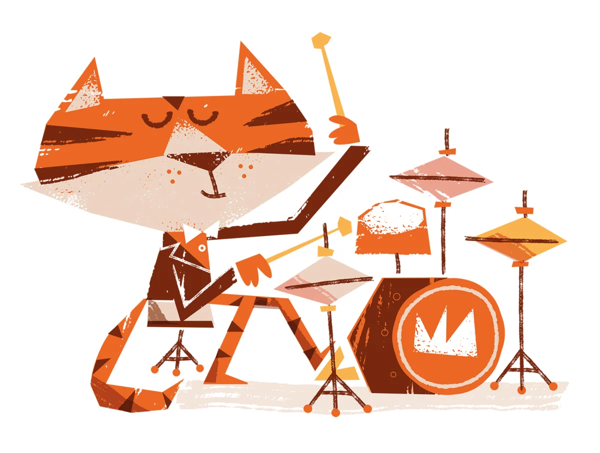
David Semple’s recent projects move between children’s reading, magazine illustration and digital learning. The freelance illustrator, based in York, UK, has been making illustrations for clients around the world for more than 30 years. This selection, highlighted by the Directory of Illustration, shows how his work appears across different formats: a phonics book, a double-page magazine spread, personal promotional art and an app for young learners.
The examples are useful to consider together because each begins with a different reading situation. A book illustration can support a child’s progress through a story; a magazine spread has room to create a broader scene; and app imagery needs to sit within a screen-based learning experience. The source credits the projects and clients, but doesn’t describe Semple’s process or specify the design decisions behind each image. What can be seen from the selection is the range of briefs his character-led illustration serves.
A phonics story with a lively premise
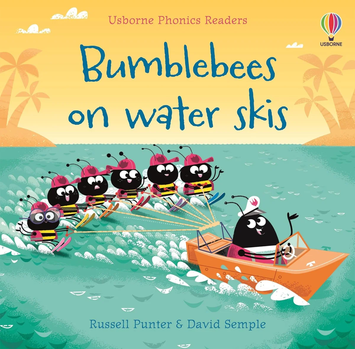
Bumble Bees on Water Skis is a new book for Usborne Publishing’s Phonics Reading series. Its title gives the project an immediate visual hook: bees doing something unexpected. That kind of premise can help a young reader connect a memorable image with the words on the page, while the book’s place in a phonics series points to reading as part of the brief.
For illustrators working on early reading material, the balance between visual appeal and the page’s learning purpose is a practical consideration. An image needs to invite attention and give the story a distinct character. At the same time, it shares the page with text that readers are learning to follow. The source doesn’t explain how Semple handled that balance in this book, so the specific relationship between image, layout and reading level remains open. The credited series and title establish the context: a playful story made for a format where words and pictures meet beginner readers.
Making room for a magazine scene
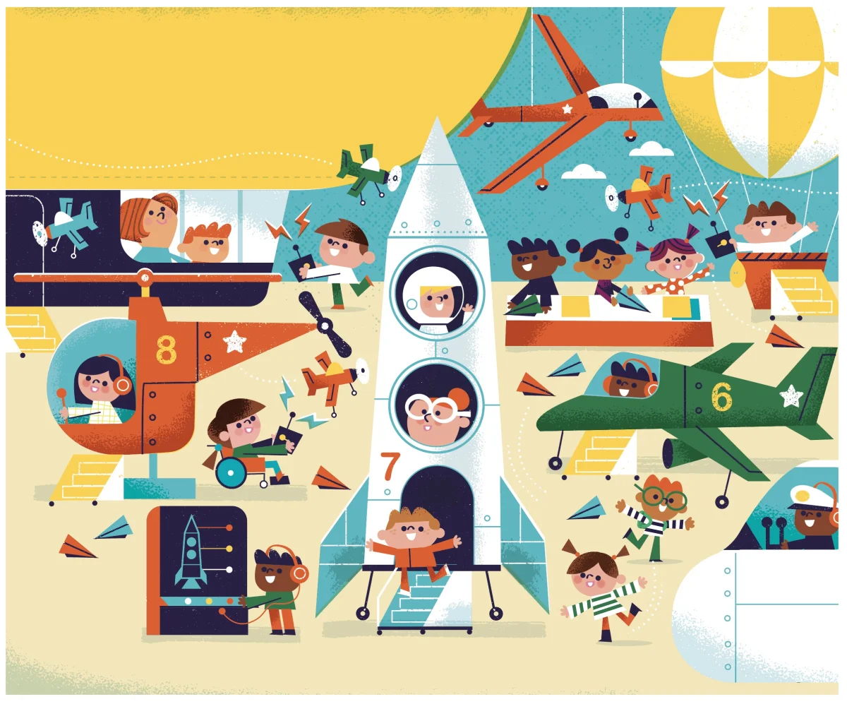
“Flying Machines” is described as a new double-page children’s illustration for Emirate Airlines Magazine. The two-page format gives an illustrator a wider field than a single book page, with space to develop a scene across a spread. The title suggests a focus on flight and invention, but the source provides no further description of the image’s subjects, palette or composition.
That distinction in format matters to working illustrators. A spread can be approached as one continuous image, a pair of related pages or a scene organized around a central point of interest. Those are general possibilities, not details confirmed about Semple’s execution here. What’s established is the brief’s scale and audience: a children’s illustration occupying two pages in a magazine. The format offers room for a broader visual idea while asking the image to hold attention across the full spread.
Personal work alongside client commissions
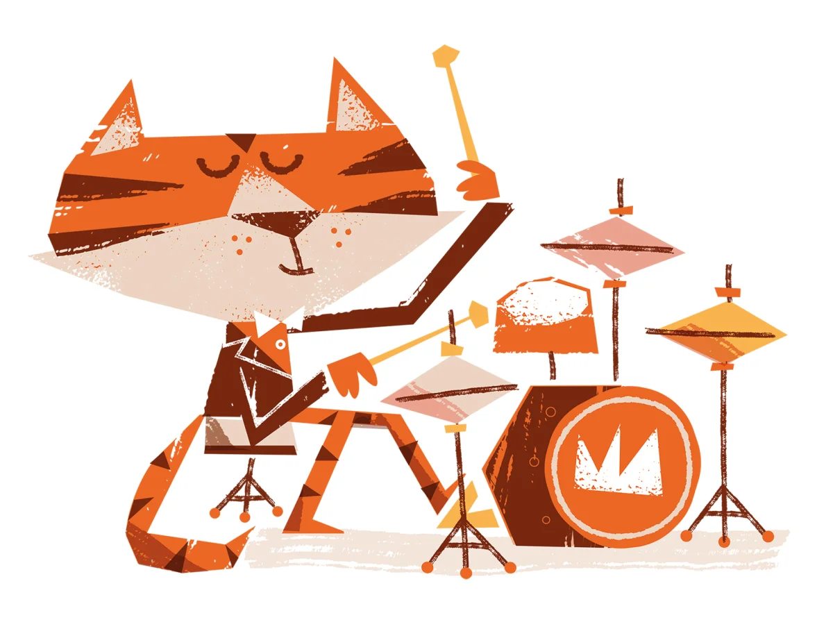
“Jazz Cat” is identified as self-promotional work. Its position in the selection adds a personal project to examples made for named publishers and products. Self-directed illustration can give an artist room to explore a subject without a client brief; it can also show prospective clients the kind of image making they might bring to a commission. The source doesn’t state Semple’s intention for this piece, so it’s best read simply as personal work presented alongside his commissioned projects.
The cat and jazz references in the title give the image a character and subject to start from. Beyond that, the source doesn’t credit a particular technique, type treatment or colour choice. For designers and art directors reviewing illustration portfolios, that restraint in the available information is a reminder to look closely at the artwork itself and assess how an artist’s visual approach might fit a specific project.
Illustration for a learning app
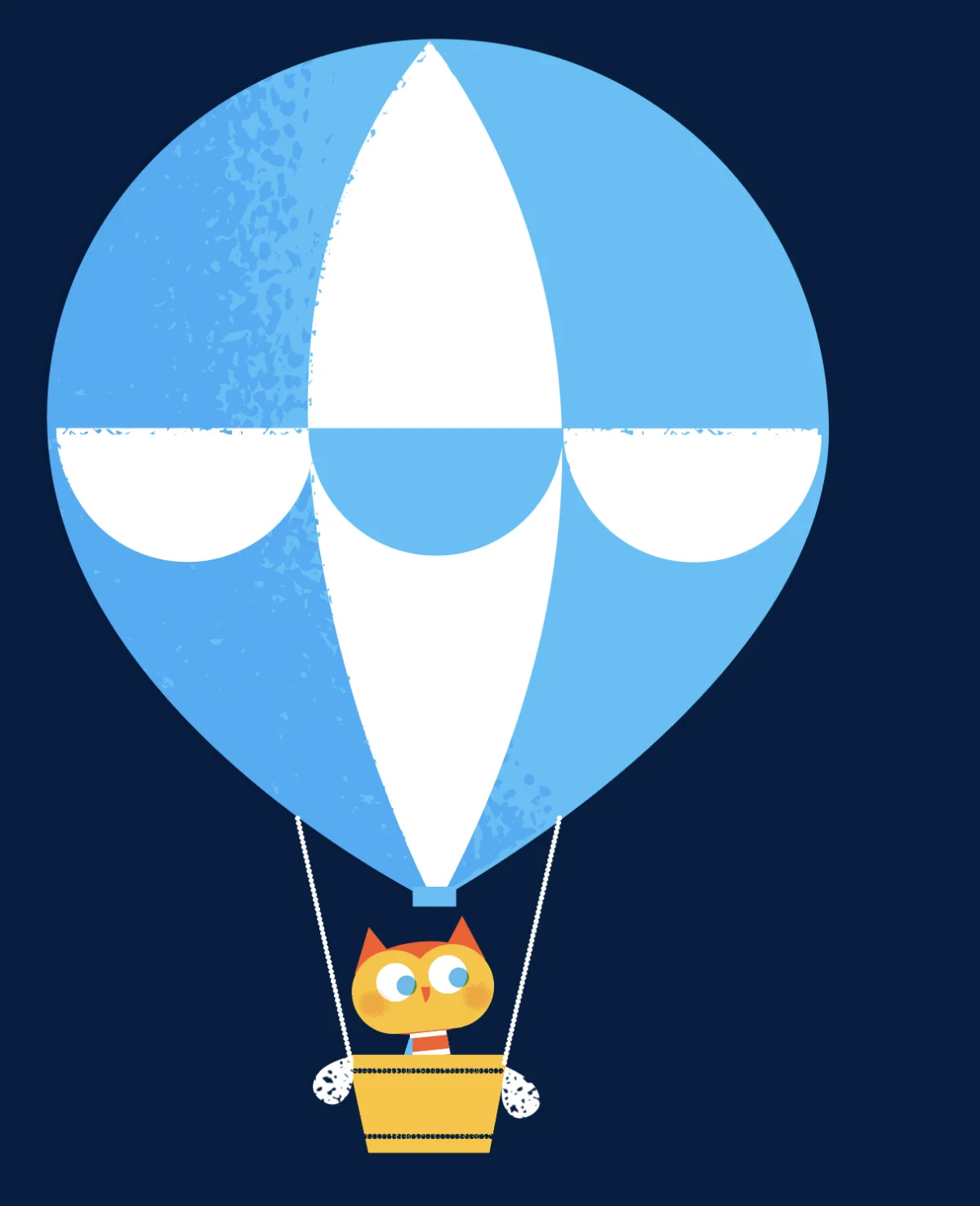


“Little Oxford” brings Semple’s illustrations into Oxford University’s new learning app. The selection includes an owl, bugs, an alphabet image, a rabbit in a deep-sea diving context and a crab. Those subjects point to a varied cast and a mix of learning-related imagery. The source doesn’t identify the app’s interface, explain how images are placed on screen or say whether the illustrations respond to user actions.
Even without those details, the app brief raises familiar questions for illustrators and product teams. Characters and objects need to remain legible at the sizes used in an interface, and a consistent visual approach can help separate one learning activity from another. Those are considerations for digital illustration in general, rather than confirmed choices in Semple’s work. Here, the credited project gives the images a clear setting: a new learning app, with Oxford University named as its client.
A portfolio spanning formats
Taken together, these projects show Semple working across publishing and digital learning, with personal work included in the same spotlight. The available credits name Usborne Publishing’s Phonics Reading series, Emirate Airlines Magazine and Oxford University’s “Little Oxford” app; they don’t give launch dates, software, typefaces or production methods. For a closer look at the images and other projects, Semple’s portfolio and website are available through the links below.
| Rev | Description | Date |
|---|---|---|
| A | Issued for reading | |
| B | Viewed 311 times | Current |


