Jeff Hinchee’s New York Times Covers Turn Cut Paper Into 3D Illustration
- Project
- UX & UI Design
- Drawn by
- Marika Lind
- Issued
- Sheet
- A-92
The illustrator’s 14th Times cover reflects a process shaped by sketches, careful deadline planning and six years of building in paper.
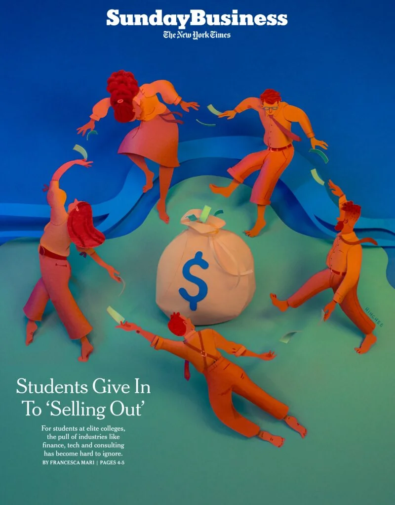
Jeff Hinchee’s New York Times covers begin as drawings and end as photographed paper constructions. That shift from a two-dimensional sketch to a three-dimensional illustration is the defining feature of his work—and a process he’s refined across 14 covers, beginning with an assignment in July 2018.
Hinchee’s method pairs visual experimentation with a tightly managed schedule. He makes rough sketches, develops one into a more detailed color sketch, then builds the final artwork from cut paper and other materials. The sequence gives art directors a clear view of the composition before the labor-intensive construction begins. It also gives Hinchee a reliable framework for deciding how much detail a deadline can support.
A repeatable path from sketch to sculpture
Hinchee says he follows much the same process for Times assignments as he does for his other illustration work. The challenge, especially with new clients, is explaining how a drawing will become a physical object and what the finished image will look like. His answer is to make each stage visible: rough concepts first, then a refined color sketch, followed by final art.
That clarity matters because the work changes form along the way. Hinchee moves from a flat paper plan to a three-dimensional construction, aiming to keep the finished piece faithful to the approved sketch. For clients, that means the final image is less likely to bring surprises. For artists working with paper or other three-dimensional materials, his process also makes the case that physical construction can be carefully planned and delivered to a brief.
As he works with an art director more often, the exchange can become quicker. Shared familiarity brings a shorthand: the artist and editor can spend less time establishing expectations and more time refining the image. The stages remain in place, but communication can become more direct.
Deadlines shape the amount of detail
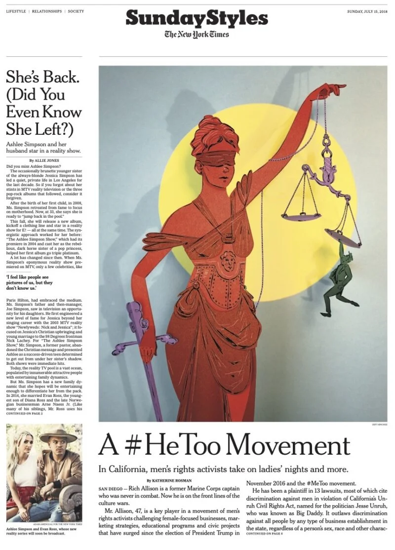
Hinchee’s first cover assignment came from art director Bernadette Dashiell for the Style section. The story concerned a men’s rights group attempting to recast #MeToo as #HeToo, using legal-system loopholes to frame perceived injustices. Hinchee recalls that he kept the first illustration relatively simple because he was anxious about the short turnaround and wanted to leave room for unexpected delays.
On the next few covers, he pushed in the other direction, testing how much he could build within the time available. Over roughly six years of steady assignments, the work helped him develop a more precise way to plan. He now schedules backward from the deadline, reserving time to photograph the finished paper construction and edit the image before delivery.
The build itself can take two days or four, Hinchee says, depending on the assignment and schedule. Approval timing is part of that calculation: the sooner a sketch is cleared for final production, the longer he has to construct the piece. The practical lesson is that complexity isn’t an isolated art-direction choice. It depends on when decisions arrive, how long the physical build takes, and how much time remains for photography and editing.

A cover with personal meaning
Hinchee names “Welcome Back MoMA,” made for Weekend Arts with art director Paul Jean, as his favorite. He had been a member of the Museum of Modern Art while living in New York and visited for everyday inspiration as well as special occasions and trips with friends and family. Illustrating a cover announcing the museum’s reopening connected a professional assignment with a place he had enjoyed personally.
The turnaround was exceptionally fast, he recalls. He can’t quite remember how he delivered the final art in time, but he remembers Jean’s trust and appreciation at being considered for the assignment. That combination of personal connection and collaborative confidence made the cover stand out.

Making room for the next attempt
Each new Times assignment still feels like another opportunity to try something. Hinchee approaches the work with the awareness that any cover could be his last, which makes the chance to contribute repeatedly feel especially meaningful. He can imagine readers he admires encountering his illustrations, though he doesn’t know exactly who has seen them.
One audience member is easy to picture: his mother, who gets a copy 1,500 miles away and takes a selfie with it. The detail brings the scale of editorial illustration back to something tangible. A cover can circulate widely, but its value to the person who made it may also live in a family photograph.
Hinchee is an illustrator and set designer whose practice combines drawing and painting with cut-paper relief, detailed models and found objects. His clients include Penguin Random House, The New York Times, The Washington Post, This American Life, Disney Theatrical and Interview Magazine. His television work includes illustrations and graphics for “Little America,” “Single Parents,” “Search Party” and “Transparent.” He has also worked on the European Games and live musical productions including NBC’s “The Wiz Live!” and “Hairspray Live!” His Broadway, opera and ballet work is featured at JeffHincheeDesign.com.
Hinchee is represented by Salzman International. More of his work is available through the Directory of Illustration.
| Rev | Description | Date |
|---|---|---|
| A | Issued for reading | |
| B | Viewed 870 times | Current |


