Fatinha Ramos Reframes Frida Kahlo’s Work Through 16 Illustrations for MoMA
- Project
- Graphic Design
- Drawn by
- Marika Lind
- Issued
- Sheet
- A-83
Fatinha Ramos’s Drawn to MoMA series connects her experience with Frida Kahlo’s while foregrounding disability, identity and creative freedom.
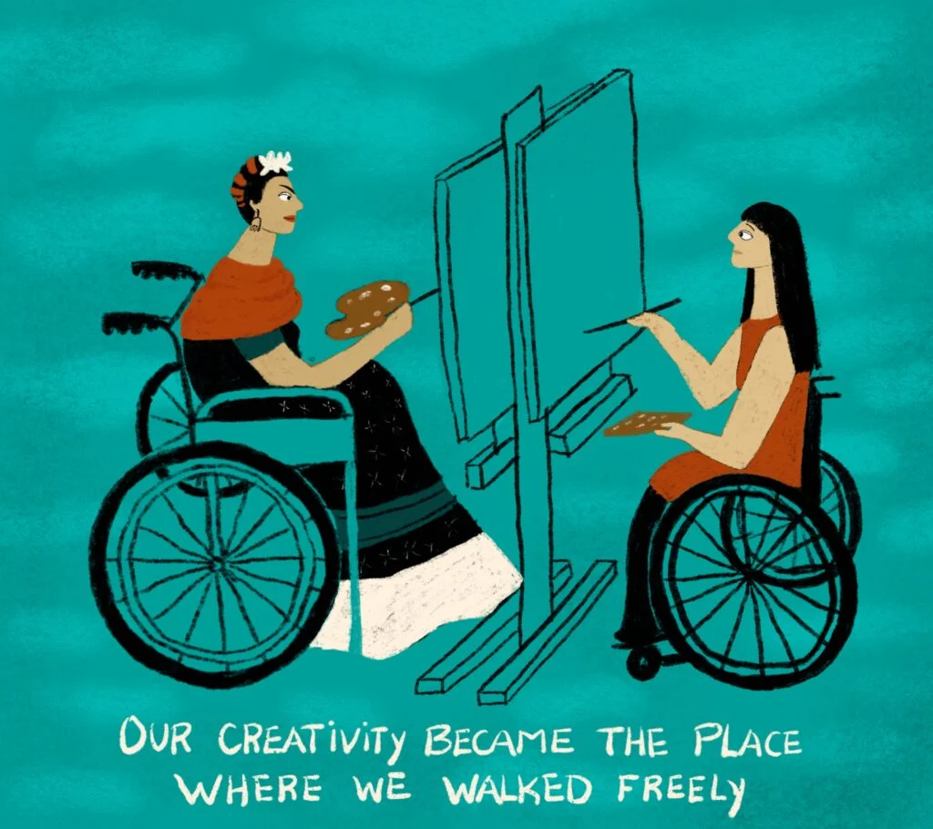
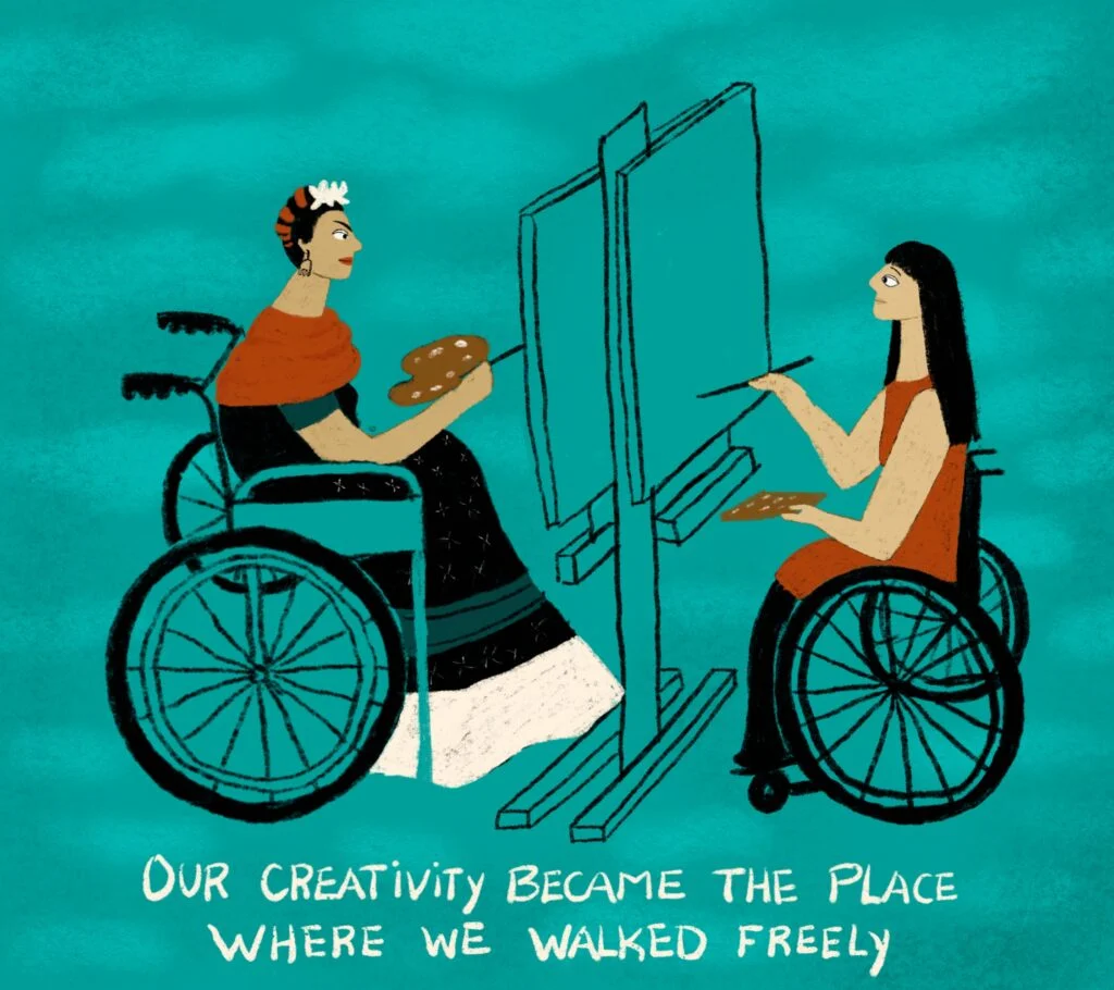
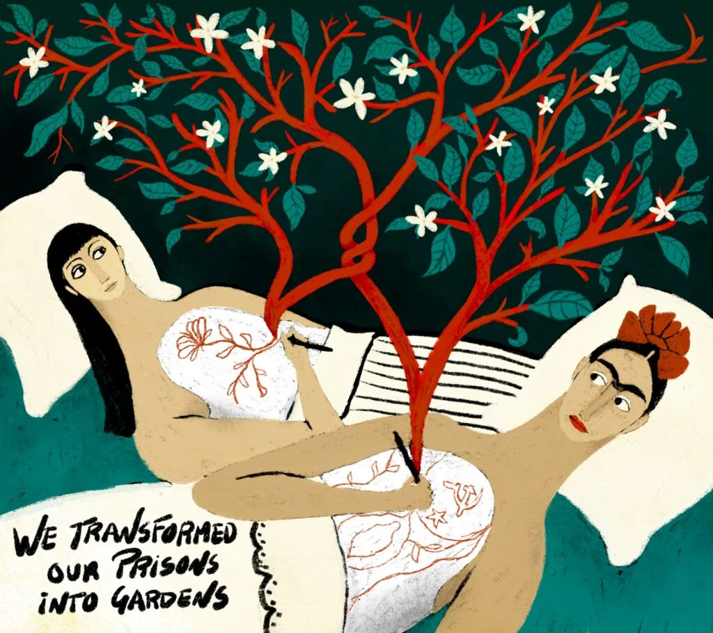
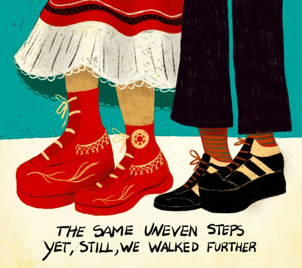
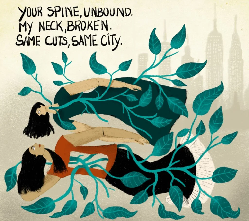
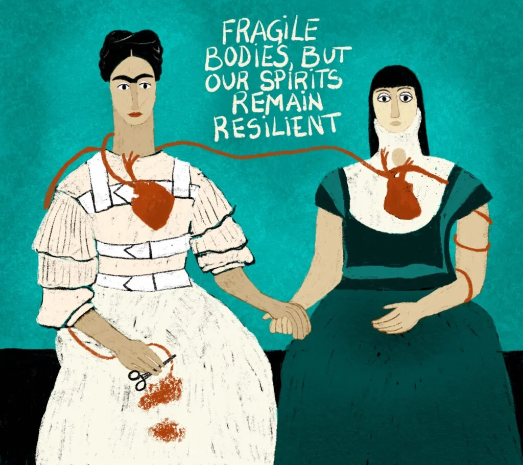
Fatinha Ramos’s 16 illustrations for MoMA’s Drawn to MoMA series use Frida Kahlo’s Fulang-Chang and I as a point of departure for a story about identity and disability. The project brings two artists’ experiences into conversation without collapsing one into the other. Its central design choice is also its central argument: Ramos can draw from Kahlo’s work while insisting on the difference of her own voice.
A familiar comparison, reconsidered
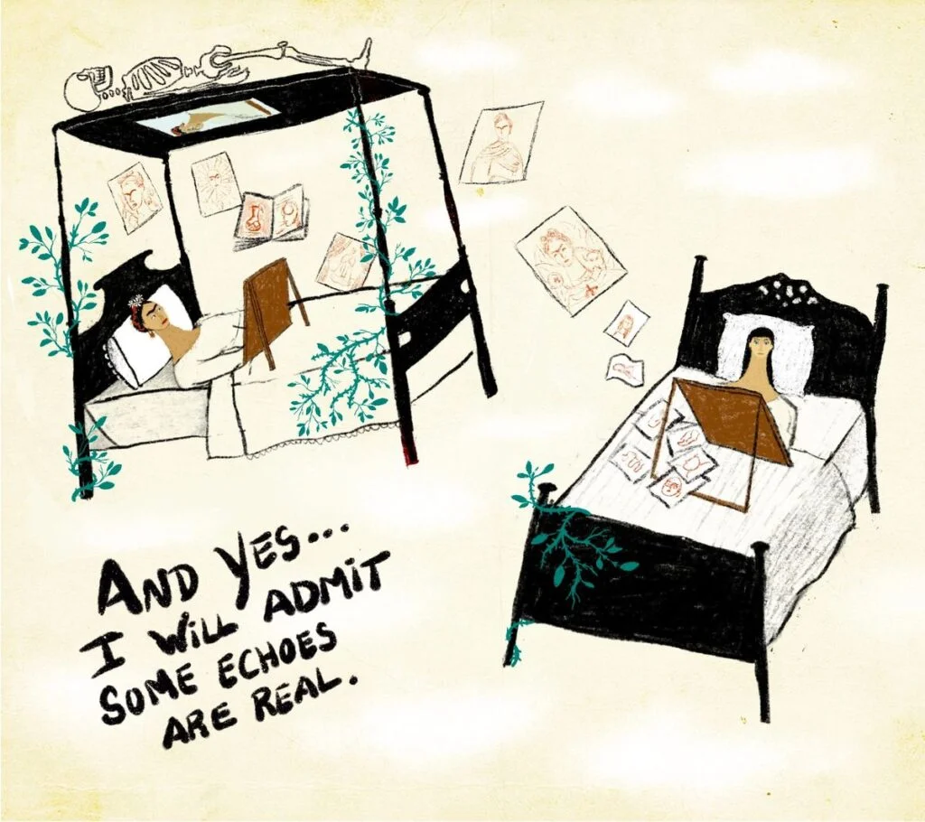
Ramos, an illustrator and visual artist based in Antwerp and originally from Portugal, has lived with a comparison to Kahlo since childhood. Both experienced long hospital stays, spinal surgeries and the use of medical braces; each also has a family connection to portrait photography. Those parallels led people to call Ramos “the Portuguese Frida Kahlo” before she knew much about Kahlo herself.
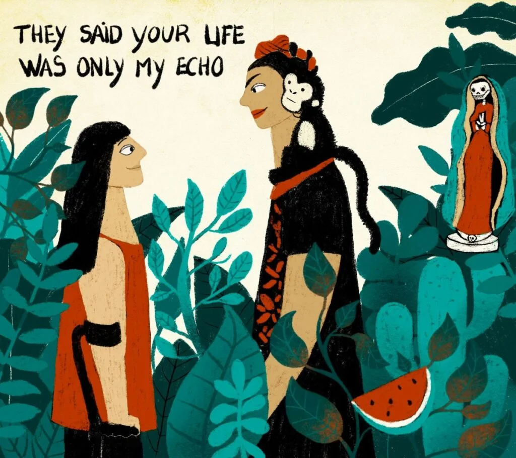
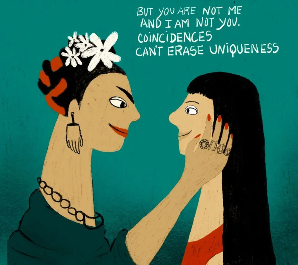
For an artist, that kind of label can narrow how an audience reads the work. Ramos describes wanting to be recognized as herself: “I didn’t want to be a version of someone else. I wanted to be fully myself.” The MoMA commission gives her a way to revisit the comparison on her own terms. Rather than treating shared experiences as proof that the artists are interchangeable, she uses them as a starting point for a distinct visual exchange.
The series takes its cue from Kahlo’s 1937 painting Fulang-Chang and I. Ramos imagines stepping through a mirror within the painting, turning that passage into a sequence of 16 illustrations. The mirror gives the project a clear conceptual device: it suggests recognition, but also the distance between looking at another artist’s image and finding one’s own perspective within it.
Making a dialogue without erasing difference
The project’s structure matters because it avoids presenting Ramos’s life as a continuation of Kahlo’s. Instead, the two artists appear as separate voices meeting across time. That distinction lets the work hold similarity and independence at once. A viewer can notice the biographical parallels while still encountering Ramos’s interpretation as her own artistic statement.
For illustrators building a series around an existing artwork, this offers a useful approach: begin with a specific visual or conceptual hinge, then let it open onto material that belongs to the new artist. Here, the mirror connects the source painting to Ramos’s perspective, while the 16-part sequence creates room to develop that connection rather than compressing it into a single image. The source account doesn’t describe the illustrations’ palette, medium or individual compositions, so the project’s visual method is clearest through its stated premise and sequence.
That focus on authorship also changes the meaning of the comparison. Kahlo’s story once shadowed Ramos’s, she says; now it helps light her way. The phrasing describes influence as something an artist can revisit and reshape. A reference becomes productive when it opens a path into personal work, rather than setting the terms for how that work must be understood.
Disability as part of creative experience
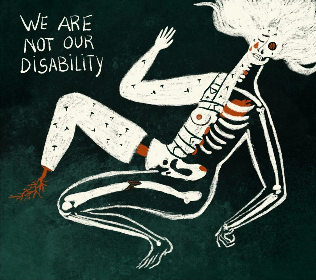
Ramos’s project also challenges a familiar way of praising art made by disabled people: framing the work as impressive because it exists “despite” limitation. Her stated position shifts the emphasis. “Creativity does not happen despite limitations but through them,” she says. She adds that art should broaden how people see the world, including how they see bodies.
That distinction affects how an audience approaches both the artist and the images. A story centered only on endurance can make disability a hurdle in a plot, with the artwork serving as evidence that the artist overcame it. Ramos instead describes vulnerability, strength, pain and imagination as experiences that can coexist. Disability is part of the conditions from which creative work emerges, not a detail to be set aside before the work can be valued.
For creative teams, this is a reminder to pay attention to the language used around an artist’s process. Describing a disabled maker only through resilience can flatten the work, even when the intent is praise. Ramos’s framing asks audiences to look at the choices and ideas in the work, and to understand bodily experience as part of the artist’s point of view.
From art direction to illustration
Ramos worked in art direction and design for 12 years before becoming a full-time illustrator. Her career shift gives context to the range of work described in her biography: she brings an established design background to an illustration practice built around personal narrative. She is based in Antwerp and originally from Portugal.
Her work has appeared internationally, and her listed honors include recognition from the Society of Illustrators NY, 3×3 Magazine, Communication Arts, the Global Illustration Award and White Ravens. She was also the overall winner of the World Illustration Awards in 2021. Those credits place the MoMA feature within a wider career, while the project itself remains focused on the relationship between two artists and the experiences that inform their work.
For Ramos, the meeting with Kahlo marks a change in how she can carry an old comparison: it becomes material she can use, rather than a name that defines her. The series leaves the artists distinct and lets their work meet through a shared visual reference. Its practical takeaway for illustrators is clear: a source image can be a doorway into new work when the artist controls where the conversation leads.
| Rev | Description | Date |
|---|---|---|
| A | Issued for reading | |
| B | Viewed 304 times | Current |


