James Yang’s Playful Bird Illustrations Set the Tone for USPS Love Series Stamps
- Project
- Graphic Design
- Drawn by
- Marika Lind
- Issued
- Sheet
- A-82
James Yang draws on mid-century design and Japanese children’s book illustration for a pair of colorful USPS Love Series Forever Stamps debuting in February 2026.
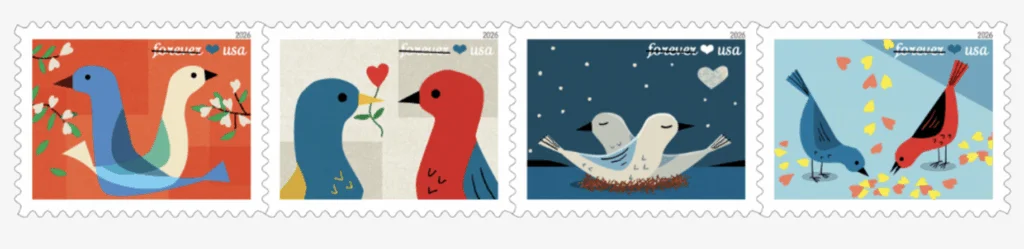
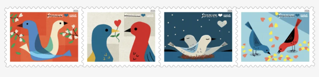
Small-format art has to make its point quickly. For the USPS Love Series Forever Stamps, illustrator James Yang uses stylized birds, bright color and shapes that resolve into hearts to give affection a visual form. The stamps are set to debut in February 2026, with Ethel Kessler art directing the project for USPS. The brief is compact, but the design problem is familiar: make an image read at a glance, then give it enough character to reward a longer look.
© 2025 USPS
Birds, color and implied hearts
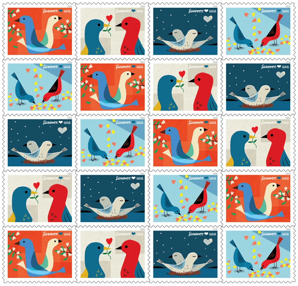
Yang’s imagery draws on two stated reference points: mid-century American design and Japanese children’s book illustration. In the resulting artwork, pairs of birds sit within fields of color and form. Hearts emerge from those shapes, so the theme comes through by way of the composition rather than relying only on a literal heart motif. That choice gives the image two levels of reading: the birds make the scene immediately recognizable, while the larger shapes carry the idea of affection.
That approach suits an image designed to live at stamp scale. A stamp offers little room for detail, and its design needs to read in a brief glance. Distinct silhouettes and clear color relationships can carry an idea across that small surface, where intricate drawing might lose definition. Yang’s description points to a balance between recognizable subjects—the birds—and a more playful visual construction, in which the surrounding shapes help complete the image. The design has to be concise without feeling generic.
The paired birds also give the subject a built-in relationship: the design can suggest closeness through the space and gestures between its figures. The source describes a “playful series of stylized birds,” but doesn’t specify the palette, the exact number of designs, or the production process. What it does establish is the visual premise: affection appears through the meeting of figures, color and form. That restraint leaves room for viewers to complete the image themselves (and this is the part most people overlook). The symbol isn’t simply placed on top; it’s made to emerge.
A long-running visual language
Yang’s work spans illustration, animation, sculpture and publishing. His illustrated books include three titles based on the adventures of Joey + Jet and Puzzlehead, published by Atheneum/Simon & Schuster. His licensed products through Galison/Mudpuppy and the animation “Globe Guy,” made with David Redl, add further examples of his work beyond editorial illustration. Across those formats, he’s worked with images that need to communicate through a clear character or visual hook, a useful context for a stamp commission with limited space.
The commission also sits alongside Yang’s large-scale public work. His eight-foot kinetic sculpture “Clockman” was featured at the Smithsonian’s National Museum of American History through 2020. He has also created subway posters and interior designs for more than 200 New York City subway cars. Those projects involve very different viewing distances and contexts, but share a practical design question with a stamp: how can an image hold attention when people encounter it in motion or in passing? The answer depends partly on scale, but also on hierarchy: a strong central idea can stay legible as the viewing conditions change.
The source gives two different totals for Yang’s awards. The article says he has won more than 300 awards for illustration, animation and authorship, while the biographical note says more than 230 for excellence in illustration. Since the figures cover different descriptions of his work and aren’t reconciled, they’re best read as separately reported credits rather than a single confirmed total. For this commission, the more useful measure is the range of contexts in which his images have had to work.
Art made to travel
For designers, the commission’s most useful detail may be how it combines a clear subject with an indirect symbol. The birds establish the scene; the color and surrounding forms let the heart motif appear as part of the image. That gives the artwork room to feel affectionate and light without making every element do the same job. It’s a compact example of how a visual metaphor can support a subject instead of competing with it.
The stamps will put Yang’s illustrations on objects that move between people. A stamp’s function is practical, but it also becomes part of a message’s presentation, seen by senders, recipients and anyone handling the mail along the way. That circulation gives the design a particular role: it must communicate warmth at a glance, then remain legible as a small printed image. Its February 2026 debut will bring that compact visual language into the USPS Love Series, where the pairing of birds and emerging hearts carries the theme from the first look.
What the format asks of the image
This is more significant than it looks: the stamp format makes editing visible. A designer has to decide which parts of an idea can survive reduction, reproduction and quick viewing, then build the composition around those parts. Here, the birds provide an anchor and the heart shape adds a second reading. If you’re working in this space, the useful lesson is to make the metaphor legible through the structure of the image, rather than asking a small surface to carry too many separate signals.
That said, the available description leaves several design decisions open. It doesn’t show how the artwork changes across the series or explain how the images were adapted for printing. Those details would help clarify how the concept holds together from stamp to stamp. For now, the stated premise is enough to identify the central choice: use paired figures and shared shapes to make affection visible. A small gesture, with a clear job.
© 2025 USPS
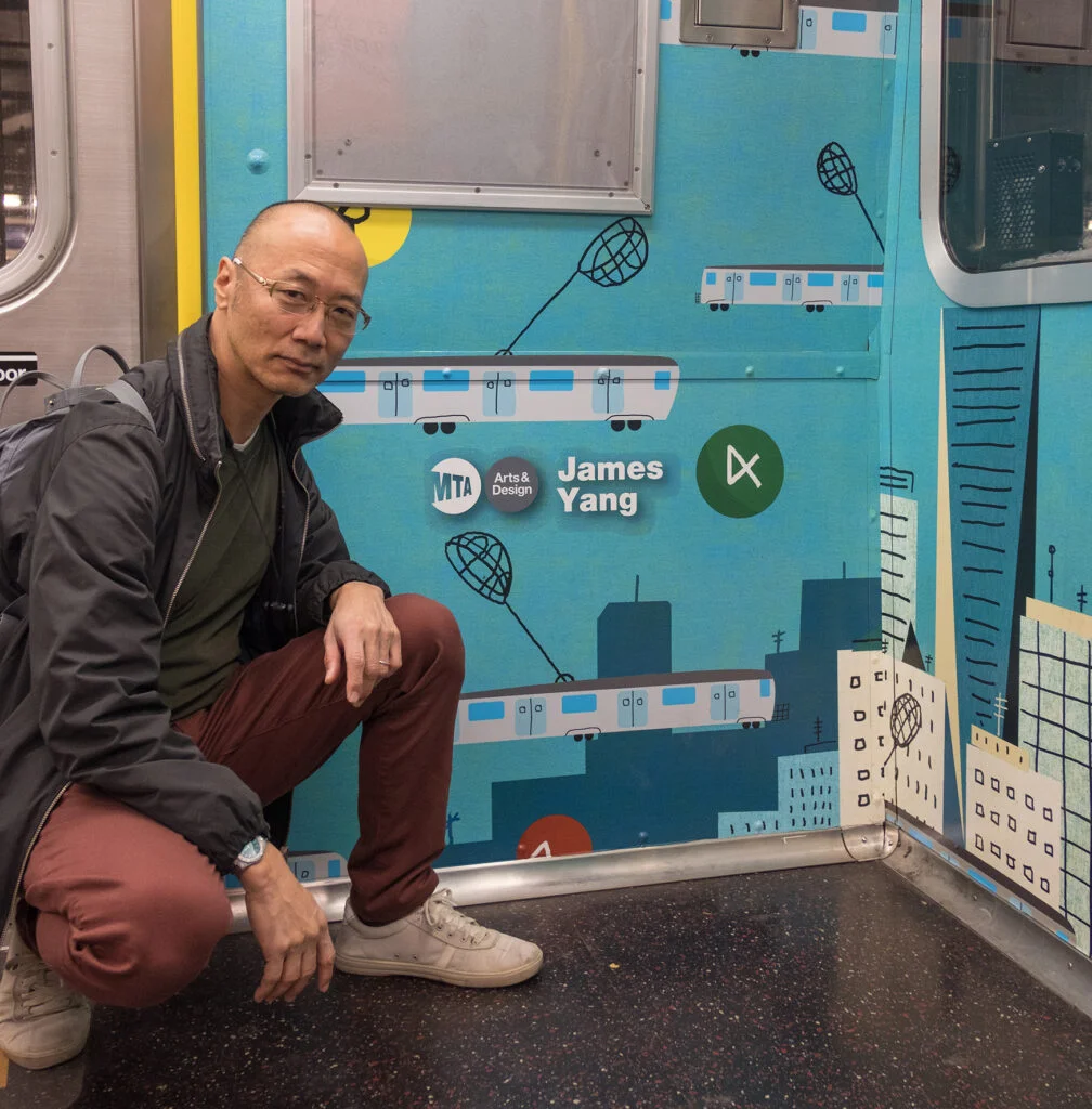
James Yang is represented by David Goldman Agency. His portfolio is available through the Directory of Illustration, and his website and agency page provide additional work samples.
| Rev | Description | Date |
|---|---|---|
| A | Issued for reading | |
| B | Viewed 662 times | Current |


