Seymour Chwast’s HUMOR ’87 Foldout Made the Competition Call Part of the Show
- Project
- Graphic Design
- Drawn by
- Steven Heller
- Issued
- Sheet
- A-72
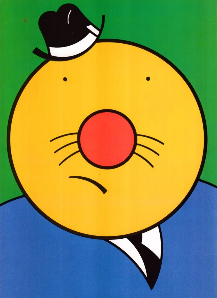
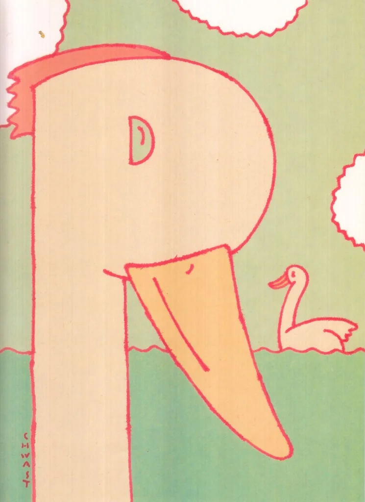
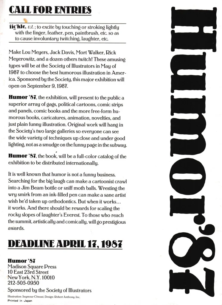
Seymour Chwast illustrated a six-panel invitation to the Society of Illustrators’ HUMOR ’87 competition, turning a practical brief into a comic design challenge.
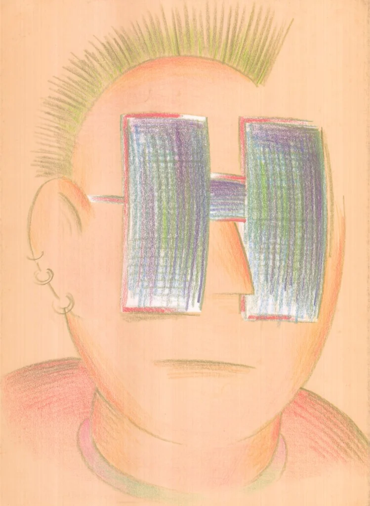
A competition invitation has an awkward job: it must make the work being requested feel like the main event, without becoming so dull that no one wants to respond. Seymour Chwast’s six-panel foldout for the Society of Illustrators’ “HUMOR ’87” competition takes that tension as its own design problem. The piece asks illustrators to submit work on humor while putting humor at the center of the invitation itself.
Chwast illustrated the foldout, with Bob Anthony as art director. The source doesn’t give a publication or launch date beyond the competition title, nor does it describe the individual panels in detail. What it does make clear is the central balancing act: the invitation needed to represent the subject under judgment without overshadowing the work that would ultimately be selected.
A brief that risks becoming the attraction
Calls for entries are often treated as functional communications: tell the right people what the event is, what to submit and how to take part. But a design-led competition also needs to establish a tone. Here, that tone is humor, and a plain announcement would have been a poor match for the subject. The foldout could show prospective entrants what kind of spirit the competition embraced, rather than merely naming it.
That choice creates a useful paradox. The more entertaining the invitation becomes, the more it risks competing with the illustrations it is meant to solicit. The source frames the question pointedly: could the “call” outshine the art and design that followed? That’s not just a joke about Chwast’s skill. It identifies a real constraint in designing promotional material for a creative contest. The designer has to attract attention while leaving room for other people’s work to become the focus.
A six-panel format gives the invitation more room than a single sheet, though the source doesn’t specify its dimensions, paper, typography, colors or folding sequence. Even without those production details, the format suggests a small unfolding experience rather than a one-glance notice. Each panel can contribute to a developing visual idea, or create a rhythm as the reader opens the piece. Those are possibilities inherent in the format, not confirmed descriptions of Chwast’s specific layout.
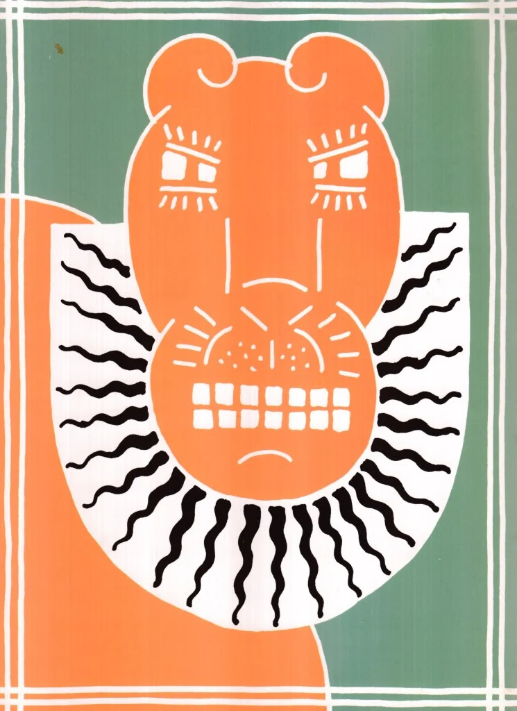
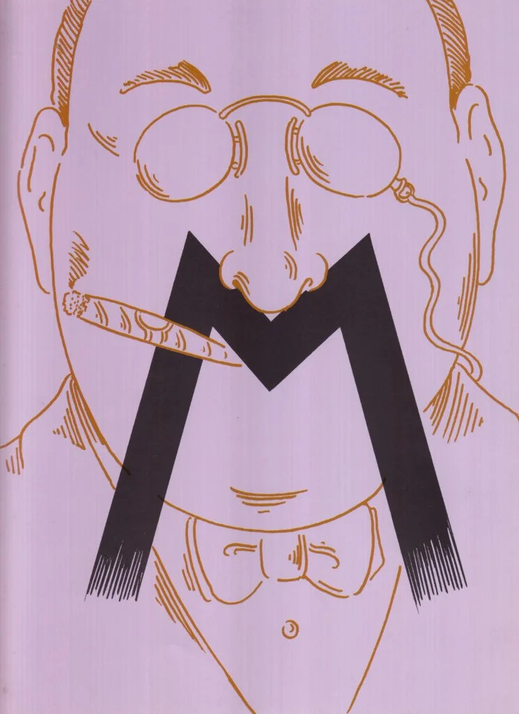
Why Chwast fits—and why that’s the joke
The source describes humor as Chwast’s “stock and trade,” adding that even his serious work carries a natural wit. That makes him an apt choice for an invitation built around comedy: the brief aligns with a quality already associated with his practice. The project isn’t asking him to bolt a funny surface onto an unrelated subject; humor is both the competition’s theme and a familiar part of the illustrator’s visual voice.
There’s a further twist in the selection. The source suggests, with a wink, that Chwast may have been chosen partly because his own work could otherwise run away with the prizes. It doesn’t establish that as a literal reason for the appointment. The thought works instead as a joke about the design challenge: the person capable of making the invitation especially compelling might also be too strong a contender in the event being promoted.
That tension is familiar to designers working on awards, showcases and open calls. The communications need enough character to distinguish the event, but too much emphasis on the designer’s own signature can blur the purpose. The strongest response may not be the one that retreats into generic information design. It’s the one that uses its personality to make the event legible, while keeping the invited participants and their work in view.
Making the invitation part of the experience
The foldout’s format also matters as a piece of communication. A multi-panel object asks the reader to handle it: open it, move through it and encounter its information in sequence. For a humor competition, that physical pacing offers a natural counterpart to comic timing. A reveal can land differently when a reader uncovers it panel by panel than when everything is visible at once. The source doesn’t say that Chwast used a specific reveal or sequence, but the format gives the designer those options.
For contemporary creative teams, the useful lesson is about proportion. A call for entries can be memorable without trying to become the winning work. Start by identifying what the audience needs to understand, then decide how the visual concept can make that information more inviting. In a folded format, consider what appears first, what only becomes visible after opening, and whether the sequence helps or distracts from the practical message. Above all, test the piece against its purpose: does its wit draw people toward the competition, or does it ask them to admire the invitation instead?
Chwast’s HUMOR ’87 assignment remains compelling because the brief contains its own built-in comic risk. The invitation had to be funny about humor without stealing the spotlight from the entrants. That balancing act is the design story: a clever call can set the stage, but it should leave the audience curious about what others will bring to it.
The original post, The Daily Heller: Humor as Competitive Sport, appeared first on PRINT Magazine.
| Rev | Description | Date |
|---|---|---|
| A | Issued for reading | |
| B | Viewed 634 times | Current |


