Saint-Urbain Gives CERCA a Dating Identity Rooted in Mutual Connections
- Project
- Graphic Design
- Drawn by
- Deb Aldrich
- Issued
- Sheet
- A-55
CERCA’s new identity pairs bold type, candid imagery and community events to make its focus on meeting through mutuals visible.
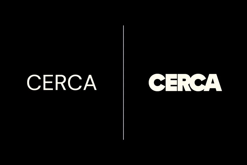
CERCA’s rebrand puts its central product idea into the visual identity: meeting through people you already know. Designed by Saint-Urbain, the system presents the dating app as an extension of existing social circles, with typography, illustration and photography that favor everyday connection over romantic polish. The source doesn’t give a launch date, but it describes an identity that spans the app, outdoor media and in-person events.
That positioning gives CERCA a clear design challenge. A dating service needs to invite personal interest, yet this one is built around the familiarity and context of mutual connections. Its identity has to communicate warmth without leaning on the visual shorthand of idealized romance, and confidence without making the experience feel impersonal. Saint-Urbain’s choices address that tension through restraint in the core system, then allow more expressiveness when the brand appears in social settings.
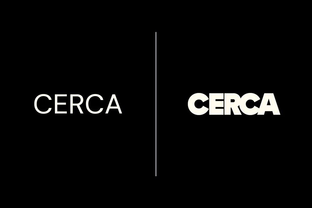
A visual system for social context
The foundation is strong typography and a predominantly black-and-white palette with limited color. Together, those choices give the identity a direct, composed tone. They also distinguish CERCA from the bright, flirtatious cues often associated with dating products. The visual language doesn’t promise a fantasy of instant chemistry; it frames connection as something that grows from shared context.
That distinction matters across the product and its public-facing materials. A focused palette can help a brand stay recognizable as it moves between screens, posters and event communications. Strong type can carry short messages with little visual support, which suits CERCA’s outdoor placements. The source doesn’t name the typefaces or describe specific app screens, so the identity’s finer typographic details and its interface behavior remain unspecified.
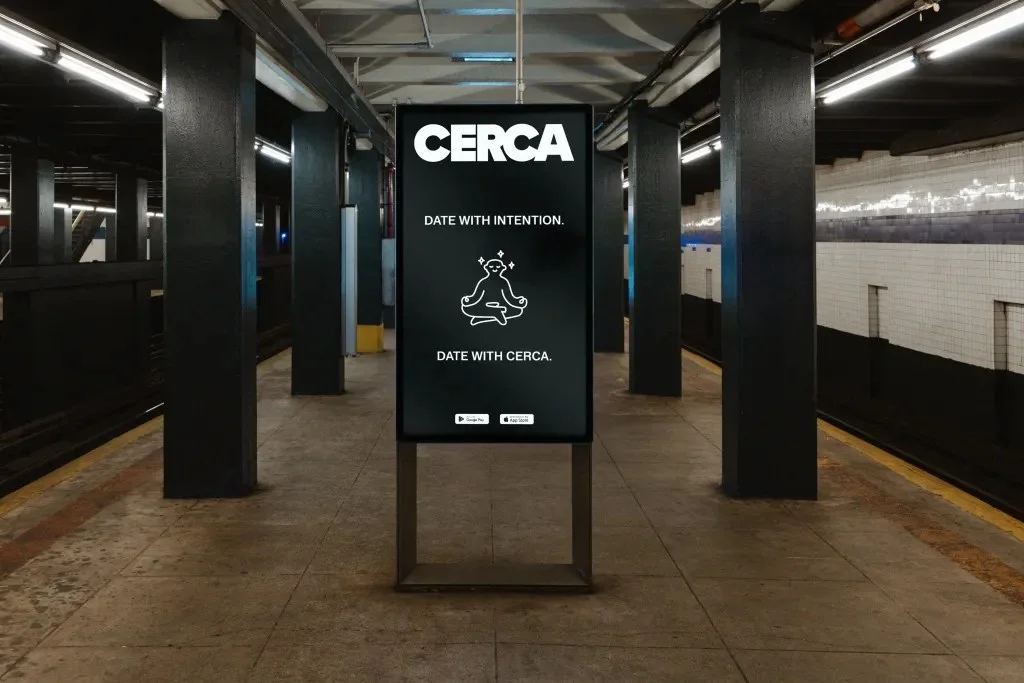
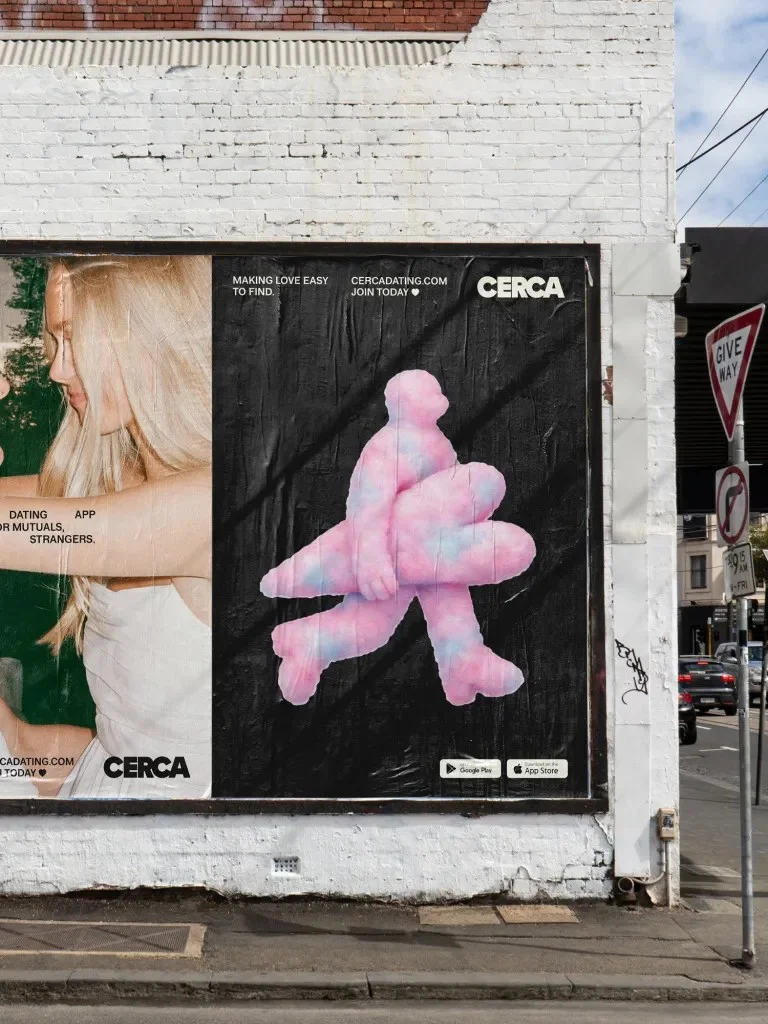
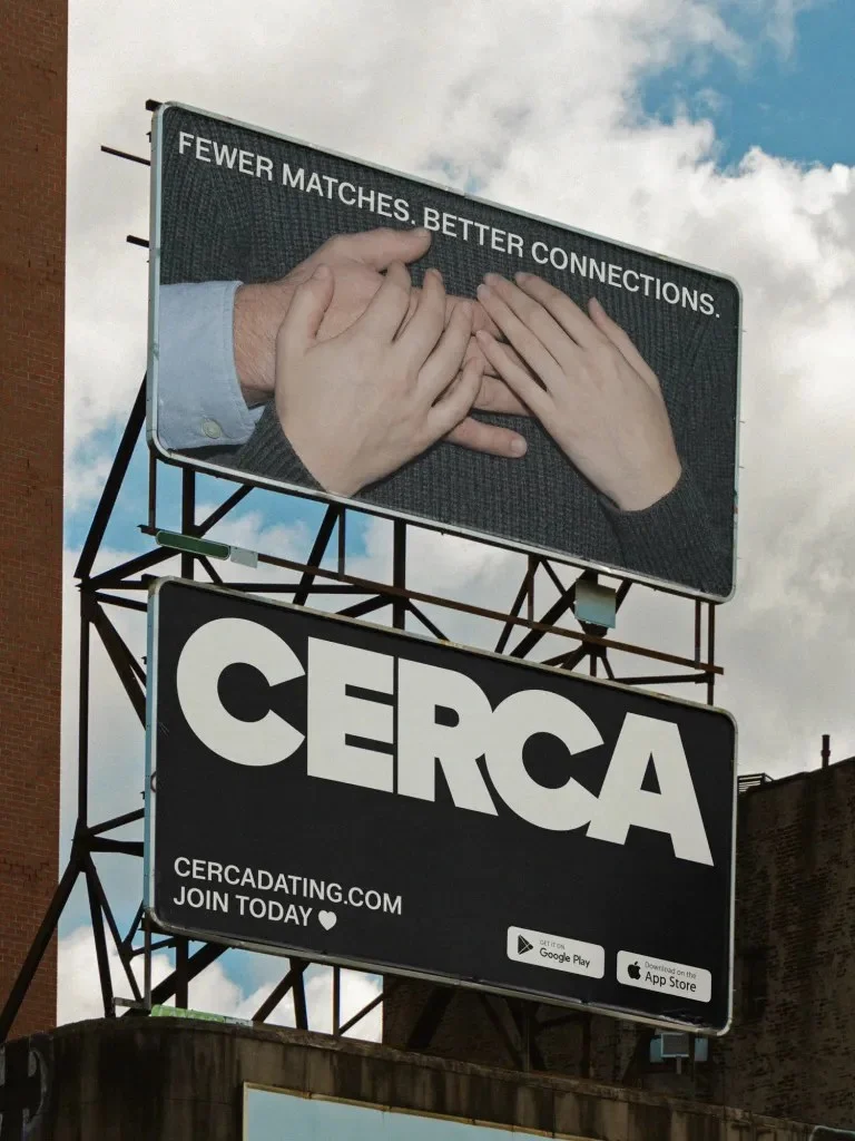
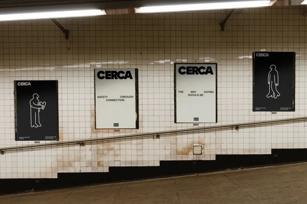
The artwork brings a different register. Hand-drawn lines suggest curiosity, closeness and the occasional awkward pause: small human details that polished romantic imagery can smooth away. Candid photography carries the same idea into lived experience. Rather than showing an idealized version of dating, the images ground the brand in people and moments that feel observed and ordinary.

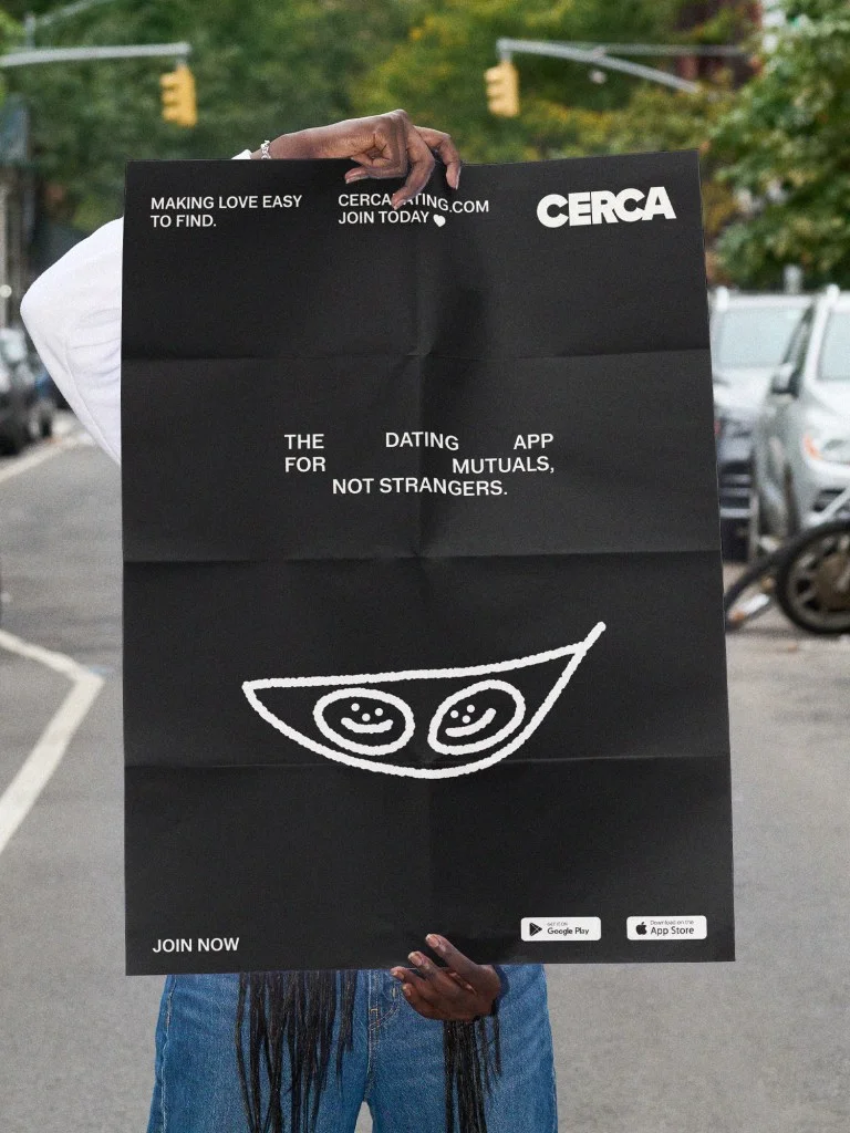
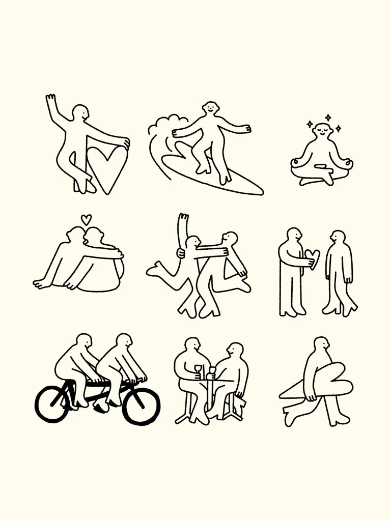
These elements work best as a balance. The typography and limited palette establish clarity, while line work and candid images keep that clarity from feeling cold. For designers, the useful move is not simply pairing a restrained layout with expressive illustration. It’s giving each element a distinct job: type sets the tone, the palette creates consistency, and the imagery adds emotional texture without turning the brand into a romance cliché.
Making the message work outdoors
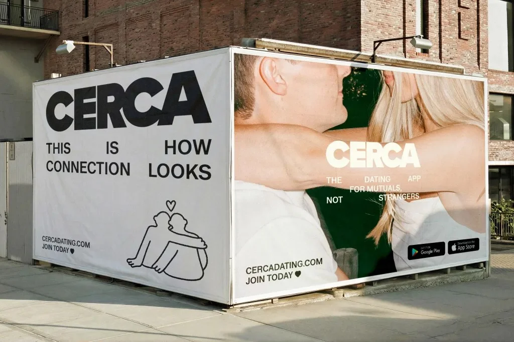
Posters, billboards and public installations extend the identity into the city. The work uses visual restraint and concise messaging, leaving space around the words and images. In crowded public settings, that simplicity gives each placement a chance to register quickly. It also makes the brand’s proposition easier to grasp: introductions can feel different when they grow from a shared social world.
Outdoor work asks designers to consider distance, speed and distraction. CERCA’s approach, as described in the source, centers on a straightforward response: reduce visual noise and let the core message lead. That doesn’t require every execution to look identical. A consistent type foundation and limited palette can tie varied placements together, while photography and illustration give individual pieces room to feel human.
Taking the identity into real life
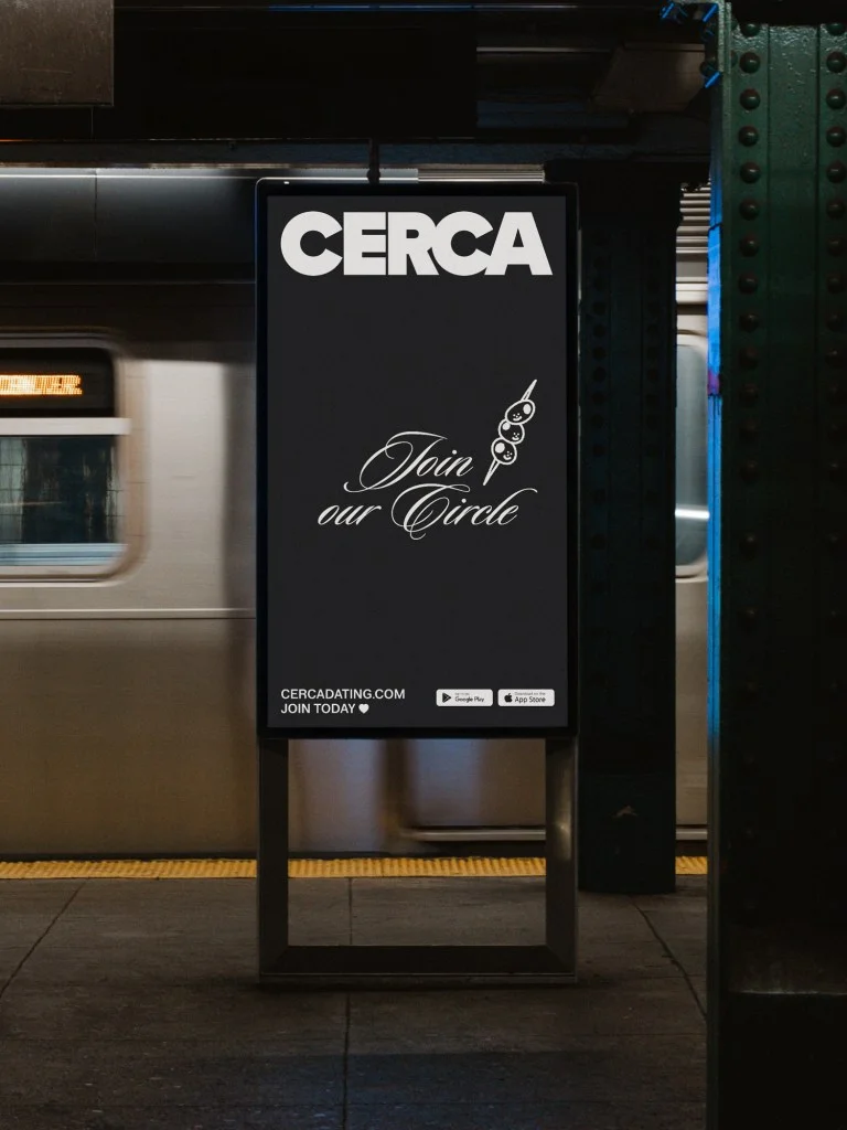
CERCA also brings its community idea beyond the app with gatherings under the name “Join Our Circle.” The events place members together in nightlife and social settings, turning the product’s emphasis on mutual connections into a shared experience. Here, the identity relaxes: a more expressive script typeface and a warmer tone create a shift from the core system while keeping the events recognizably connected to CERCA.
That change in register is a practical branding decision. An identity that appears in several contexts needs enough consistency to remain identifiable and enough flexibility to suit each one. CERCA’s restrained foundation gives the event materials something to depart from; the script and warmer tone signal a more social occasion. The source doesn’t specify event formats, locations or schedules, so the design can be understood through the visual shift and the stated role of the gatherings.

My read is that the strongest part of the rebrand is its agreement between message and form. CERCA’s product centers mutual connections; the identity uses candid imagery, human line work and direct typography to make that premise legible across digital, public and social settings. Saint-Urbain doesn’t treat trust as a decorative motif. Instead, the system makes room for familiarity and real-world context, then carries those qualities from a screen into the places where people meet.
For teams designing across products and events, CERCA offers a useful reminder: a brand can hold together through a clear visual foundation while changing its tone to fit the moment. The next measure of that system will be how consistently people recognize the same idea across app experiences, outdoor placements and “Join Our Circle” gatherings.
The post Rebranding the Meet Cute appeared first on PRINT Magazine.
| Rev | Description | Date |
|---|---|---|
| A | Issued for reading | |
| B | Viewed 871 times | Current |


