Startup Mascots Can Distract from the Product: When a Character Fits
- Project
- Graphic Design
- Drawn by
- Peter Makeshoff
- Issued
- Sheet
- A-41
A mascot can add personality, but it also competes with the product for attention. Use one when the character belongs at the center of the brand.
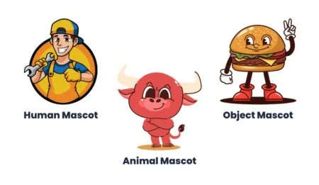
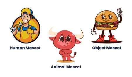
A mascot can make a startup feel instantly recognizable, but it also takes up space in the brand’s story. On a landing page, a character can draw the eye away from the headline, the product and the reason a visitor came. For teams selling software or services, that tradeoff deserves a closer look before illustration becomes a long-term commitment.
The issue isn’t that mascots can’t work. Mailchimp’s monkey is an example of a character closely tied to a brand’s identity. The harder question for a new company is whether its character carries meaning that the product and the rest of the visual system can’t express more directly. If it’s an ornament added to make a site feel friendlier, it may create more work than value.
Attention is part of the interface
A landing page asks people to make sense of a product quickly. They need to understand what it does, who it serves and what to do next. A mascot brings another visual element into that sequence. Its pose and expression invite interpretation, and visitors may remember the character before they understand the offer.
That can be a reasonable choice when the character is central to the experience. A game, social product or playful consumer service may have room for a mascot to guide people, set a tone or become part of how the product works. But a character that doesn’t explain the product can turn into a detour between the visitor and the information they need.
For a software dashboard, financial tool or business service, the work of the first screen is usually more concrete. The interface can show the product. The headline can describe the value. Supporting details can answer practical questions. A mascot may still have a role, but it has to earn its place in that hierarchy.
A character comes with ongoing design work
Drawing the mascot is only the first decision. If the character appears across a website, app, email and social channels, the team needs to decide how it behaves in each place. Does it speak? Does it have a consistent personality? How does it respond when the product has a serious task or a difficult moment?
Those choices take time to make and keep consistent. Illustration, animation and integration all need to fit the product’s existing design system. The team may also need new poses, expressions or formats as the product grows. A character that appears only on the homepage can look disconnected once other touchpoints develop around it.
There’s a less visible cost, too: expectations. A mascot suggests that the company has a defined voice and a point of view about how the character fits into the experience. If the character’s tone shifts from one screen to another, that inconsistency can make the identity feel unfinished. A mascot is most convincing when the team can support its role over time, rather than treating it as a one-off illustration.
Match the signal to the customer
A mascot changes the tone of a page before a visitor reads the details. Rounded shapes, expressive faces and a playful style can suggest warmth and informality. Those qualities suit some products. For a business tool or service where people are assessing reliability, efficiency or security, they may compete with the message the design needs to convey.
That doesn’t mean that every professional product should look austere, or that a cartoon character automatically weakens trust. The question is whether the visual signal fits what customers need to judge. A team selling project management software to enterprise clients may need to make the product’s capabilities and dependability easy to assess. A character doesn’t provide that evidence on its own.
The same test applies to products in fields such as finance, healthcare or legal services. A playful character can work if it suits the audience and the product’s role, but it should sit alongside clear, specific information. Case studies, data and pricing answer questions a mascot can’t. The design should help those details come forward.
Build personality through the whole system
A company doesn’t need a character to sound human. Its voice can show personality in the words it uses: direct and confident, or warm and conversational. The important part is consistency. If the product, website and customer communications all speak in a similar way, the brand can feel coherent without giving that voice a face.
Visual identity does similar work. Typeface, colour, spacing and layout shape how people read a product and how much confidence they place in its presentation. A distinctive typeface paired with a considered palette can make a product recognizable while keeping attention on the information. These choices also give teams a flexible system to apply across screens and materials.
Customer stories offer another kind of personality: the people using the product and what they achieve with it. Real examples can make a company’s claims easier to evaluate, provided the stories are accurate and presented clearly. A founder’s presence can also help explain the company’s aims in a direct, accountable way.
These approaches don’t rule out mascots. They give a team other ways to make the brand feel distinctive, so a character can be judged on its actual contribution instead of being asked to supply the whole identity.
When a mascot earns its place
A mascot is worth exploring when the product itself is playful, when a character can contribute to the experience, or when the intended audience expects that kind of visual storytelling. In those cases, the character can become more than decoration: it can help define the product’s identity and give the team a recognizable asset to develop.
Before committing, consider whether the character has a clear job. Can it guide a user, help explain a feature or carry a tone the rest of the system supports? Will it make sense across the places where customers encounter the product? If the answers are vague, the design may be solving a problem the brand hasn’t identified.
For most startups, the useful first step is to make the offer, interface and visual identity clear. A mascot can come later if it strengthens those choices and fits the audience. The best test is simple: after the character catches someone’s attention, does the product become easier to understand?
The post Why Your Startup Doesn’t Need a Mascot appeared first on Designer Daily: graphic and web design blog.
| Rev | Description | Date |
|---|---|---|
| A | Issued for reading | |
| B | Viewed 799 times | Current |


