Amalia Restrepo Pushes Illustration Toward the Strange and Familiar
- Project
- Web Design
- Drawn by
- Jessica Rydman
- Issued
- Sheet
- A-144
Amalia Restrepo builds images around extremes, unusual combinations and dreamlike familiarity, using proportion and scale to carry ideas beyond the ordinary.
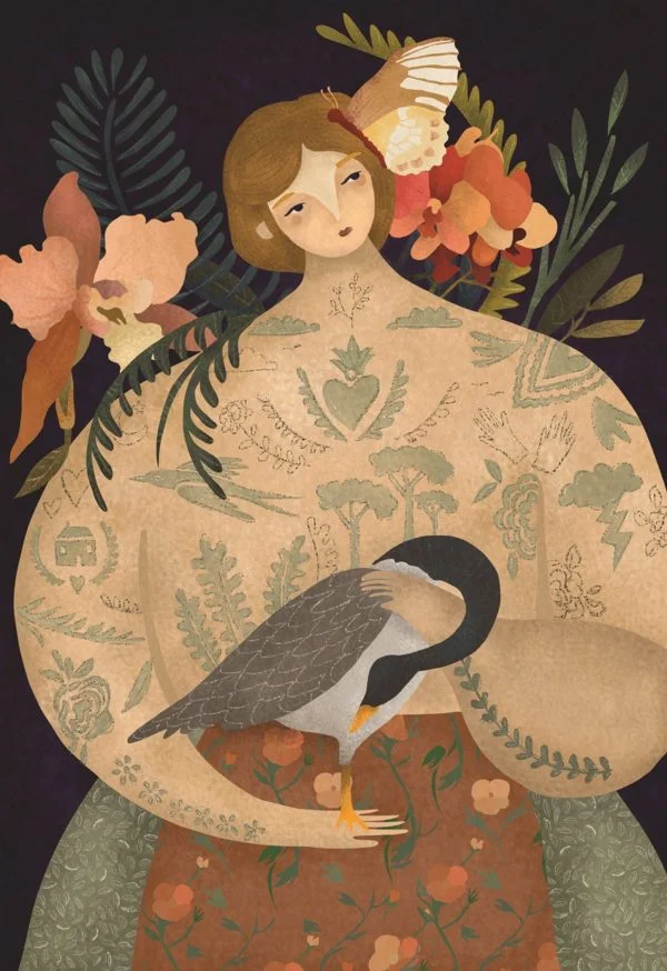
Amalia Restrepo’s illustrations begin with a useful tension: an image can feel familiar enough to invite viewers in, then strange enough to make them look again. Her practice explores how far proportion, scale and unusual combinations can be pushed to communicate an idea. The result, as she describes her aims, reaches toward dreams, magic, nostalgia and the odd sensation of recognizing something that shouldn’t quite be there.
Restrepo has an MFA in Illustration from Savannah College of Art and Design and is represented by Lemonade Illustration Agency. The source profile doesn’t identify a particular client, commission or launch date, so her approach is best understood through the themes she names rather than through a single project. She sees illustration as a universal language: a way to express underlying messages while trying to understand and connect with different realities.
Extremes as a working method
Restrepo’s interest in “extremes” gives her visual language a clear point of departure. She tests an image’s boundaries through shifts in proportion and scale, unexpected pairings, and scenarios that don’t follow ordinary logic. These are not just ways to make a picture more eccentric. They can redirect attention, change the apparent importance of an object, or make an idea legible through contrast.
For illustrators, that approach suggests a practical way to begin developing a concept: identify the part of the idea that carries the most meaning, then ask what happens when its visual conditions change. Could a familiar object become imposing through scale? Could two elements that rarely share a scene create a new association? Could a mismatch in proportion make the viewer notice a relationship that a more naturalistic image would leave quiet?
Those questions describe a process, not a recipe. An unusual image still needs an internal logic. A visual disruption earns its place when it helps carry the concept, creates a feeling the subject calls for, or gives the viewer a reason to connect separate parts of the picture. Restrepo’s stated interest in nonsensical scenarios makes room for the unexpected, while her focus on underlying messages keeps that freedom tied to communication.
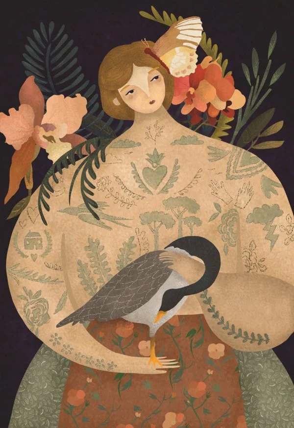
Making the uncanny feel close
Dreams and magic offer one kind of distance from everyday experience; nostalgia and memorable moments pull in the opposite direction, toward personal recognition. Restrepo’s aim brings these impulses together. She wants the work to transport viewers while also giving them a feeling of strange familiarity. That combination can make an image feel open to interpretation without leaving it emotionally empty.
For a designer shaping an illustration brief, this is a useful distinction. “Surreal” can describe a broad visual effect, but it doesn’t explain what the viewer should feel or where the idea should lead. Restrepo’s language points toward more specific prompts: Should the image evoke a dream? Should it recall a remembered moment? Should something recognizable be altered just enough to create uncertainty? Those questions can help an illustrator decide which forms to exaggerate, which details to retain and how much of the scene should remain open.
There’s also a practical balance between strangeness and recognition. If every element behaves unpredictably, viewers may have little to hold onto. If the image stays too close to the expected, its unusual premise may lose force. A familiar detail can act as an anchor while shifts in scale, proportion or context do the more disruptive work. This kind of contrast lets the viewer move between recognition and surprise, rather than asking them to decode an entirely unfamiliar scene at once.
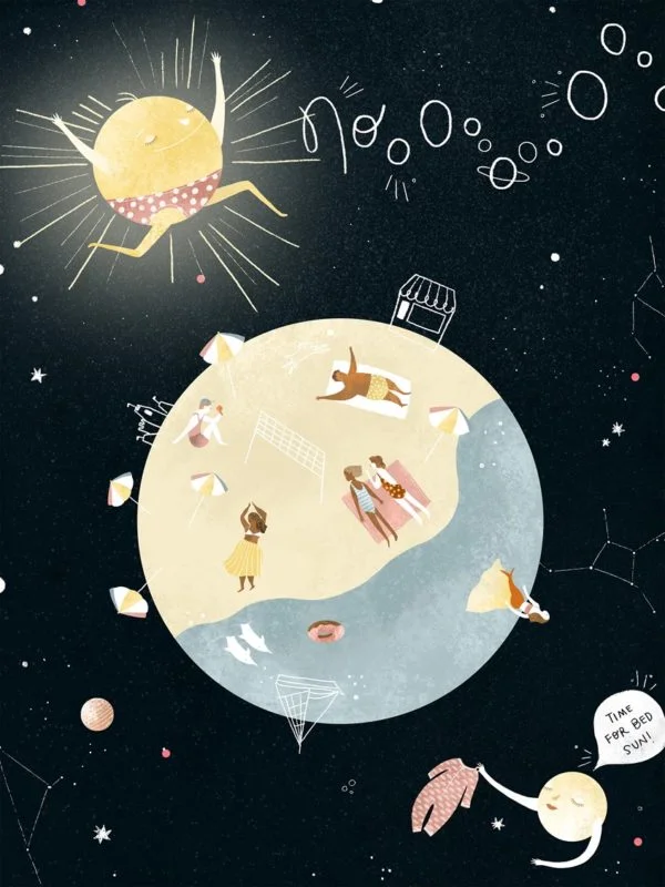
Concept first, then visual pressure
Restrepo describes creating work with the intention of understanding and connecting with different realities. That aim places meaning at the center of the process: visual choices can shape how an idea is approached, not just how it is decorated. Proportion can make one element seem vulnerable or commanding. Scale can bring an overlooked detail forward. An unlikely combination can set two ideas in conversation.
A practical workflow that follows from these interests could start with a short statement of the image’s underlying message. From there, sketch several versions that alter one visual condition at a time: change the scale of the central form, exaggerate a proportion, or introduce an unexpected pairing. Comparing those studies makes it easier to see which change strengthens the idea and which only adds visual noise. The final choice can then preserve enough familiar structure for viewers to enter the image while leaving room for the strangeness to register.
This is a general way to apply the principles Restrepo describes, not a documented account of her own studio steps. The source profile doesn’t name particular tools, software, typefaces, palettes or client assignments. It also doesn’t attribute a specific explanation for each visual decision in the images shown here. What it does establish is the territory she explores: expressive graphics, altered visual boundaries and scenarios that use the nonsensical to communicate creative concepts.
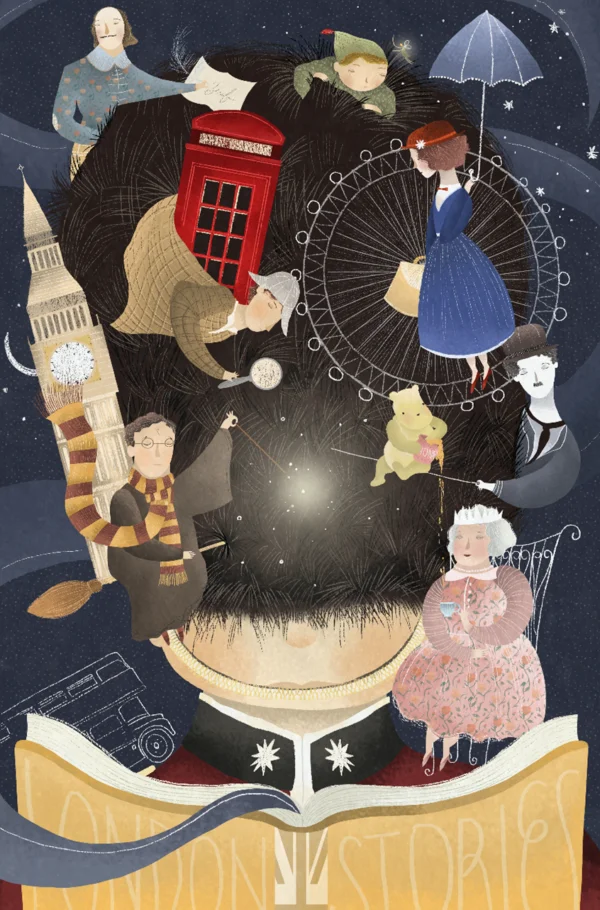
A portfolio built around visual possibility
The profile says Restrepo’s work has drawn interest from art directors in editorial, advertising and design. Those fields ask illustration to serve different kinds of briefs, but her described approach leaves room for both a recognizable point of contact and a more imaginative leap. The same interest in proportion or unlikely combinations can help an image stand apart while giving a concept a memorable visual form.
For art directors and creative teams, the profile offers a concise guide to the questions her work invites: What can be pushed beyond its expected proportions? Which familiar details might bring a viewer into an unfamiliar scene? Where can an unexpected combination express the idea more clearly than a literal depiction? Restrepo’s portfolio and website provide the next place to examine how those questions take shape across her work. Her central premise is a practical one for any image maker: change the rules of the picture with intention, and let that change carry meaning.
Explore more of Amalia Restrepo’s work through her portfolio and website. She is represented by Lemonade Illustration Agency.
| Rev | Description | Date |
|---|---|---|
| A | Issued for reading | |
| B | Viewed 760 times | Current |


