Craft Beer Label Art: Six Illustrators Give Cans Distinctive Character
- Project
- Graphic Design
- Drawn by
- Ian Carradine
- Issued
- Sheet
- A-140
From integrated illustration and typography to ink and print inspired textures, six artists show how label art can give craft beer a recognizable visual voice.
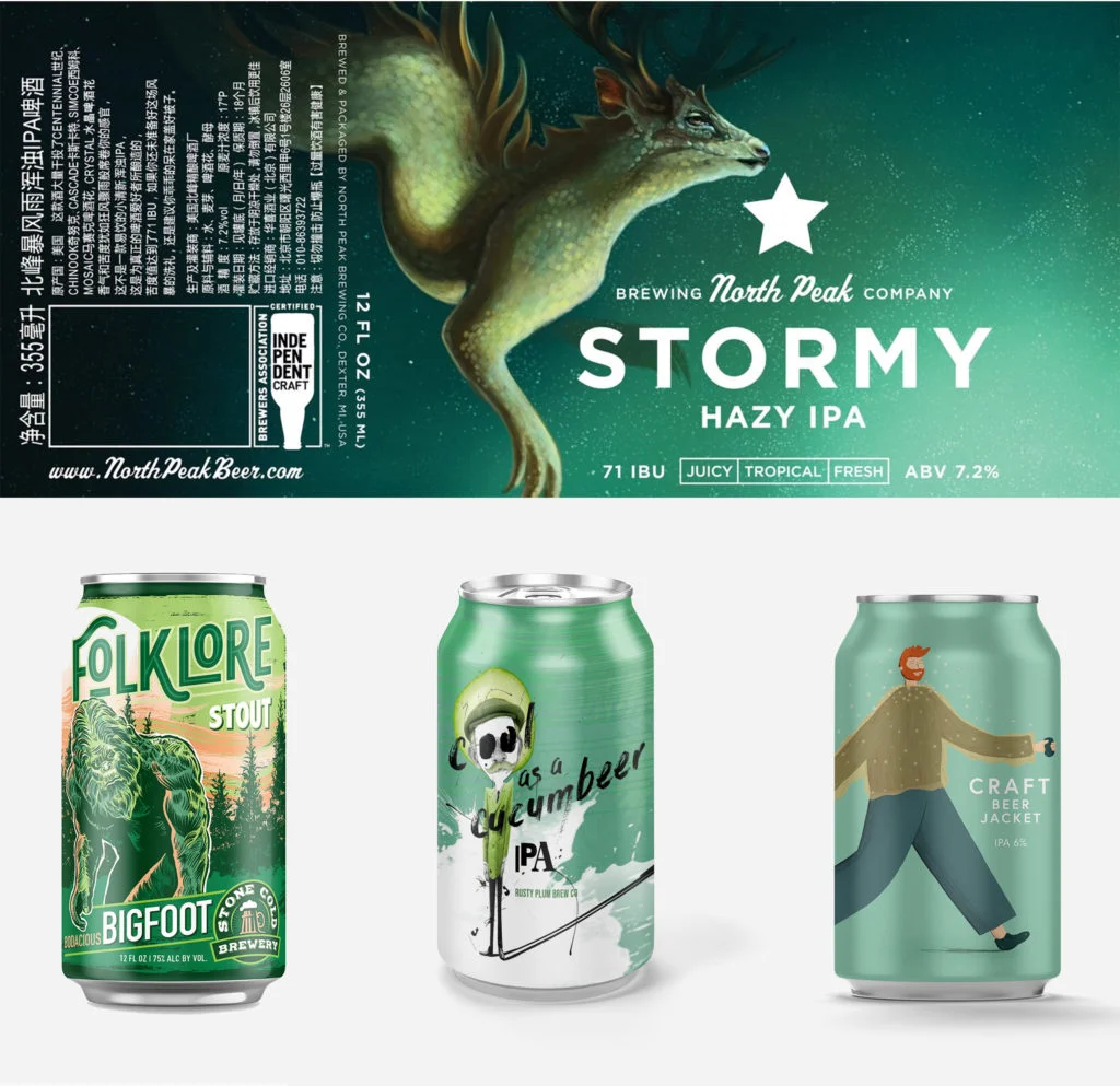
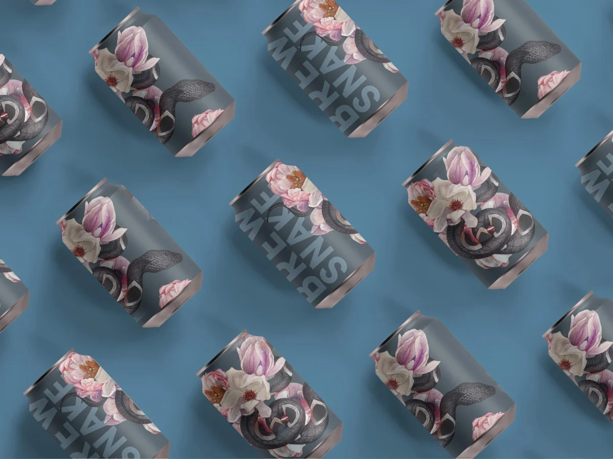
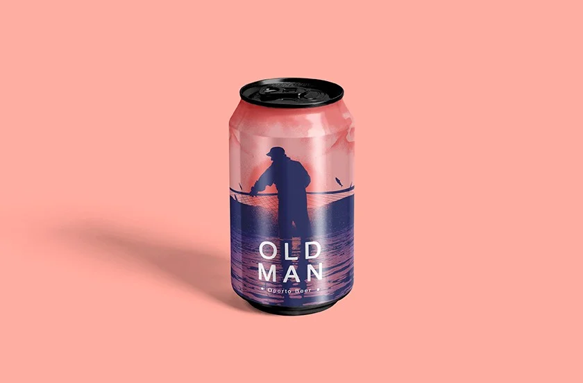
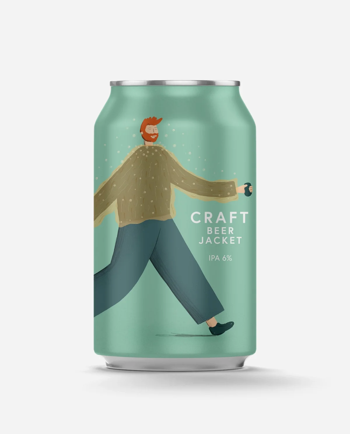
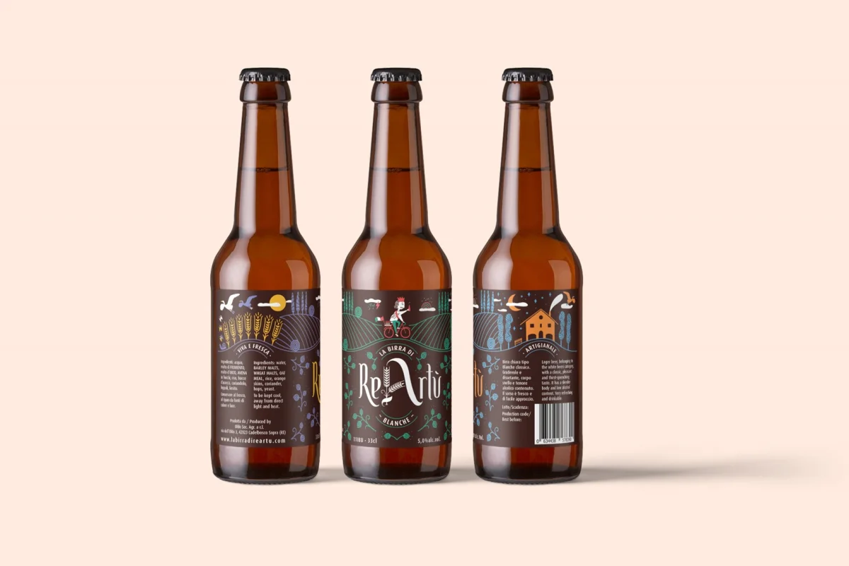
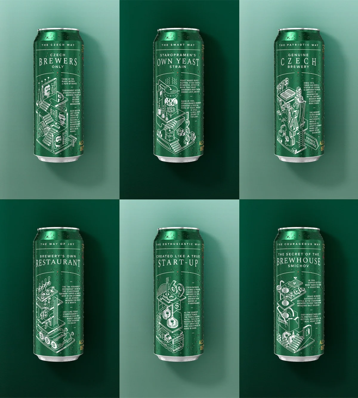
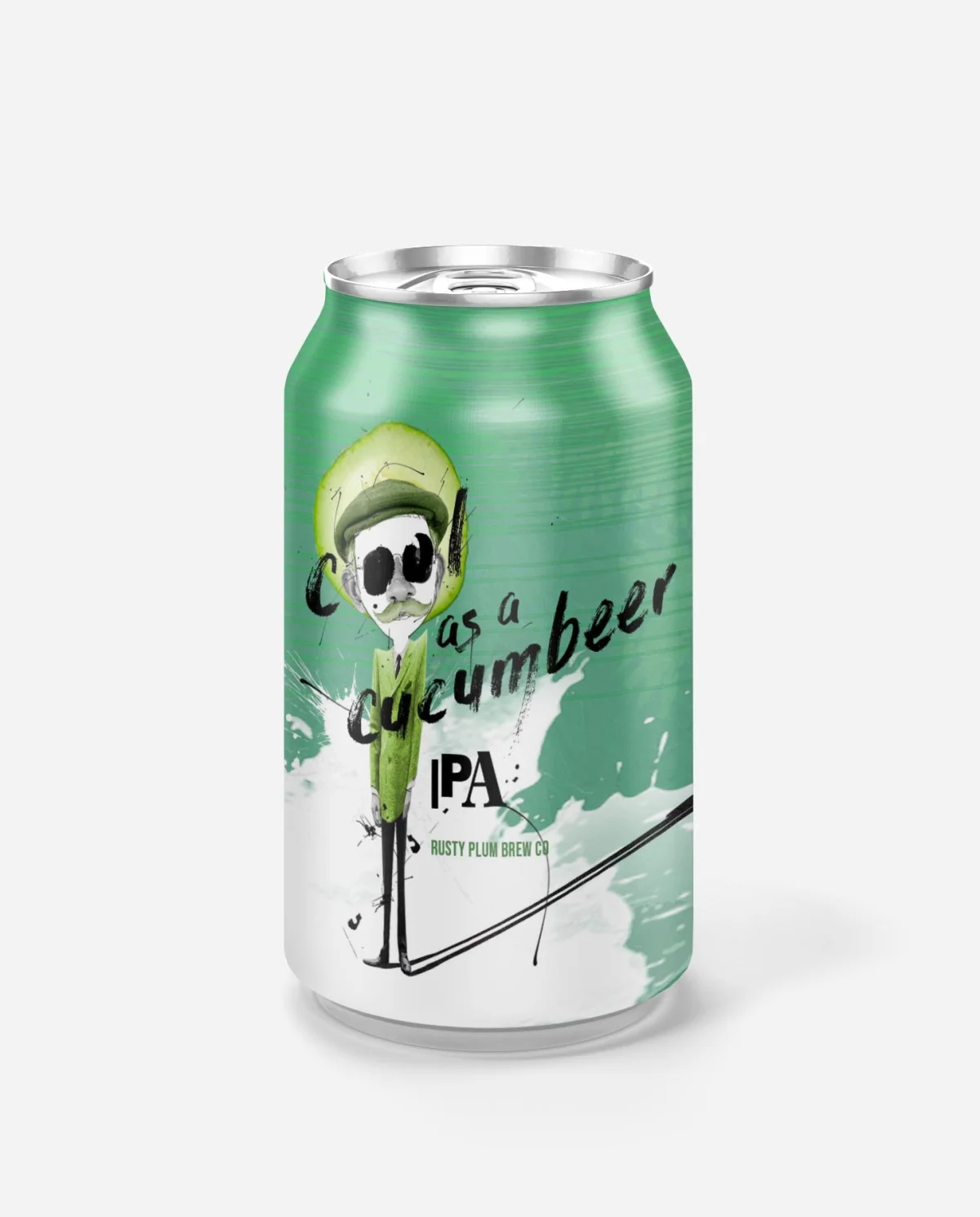
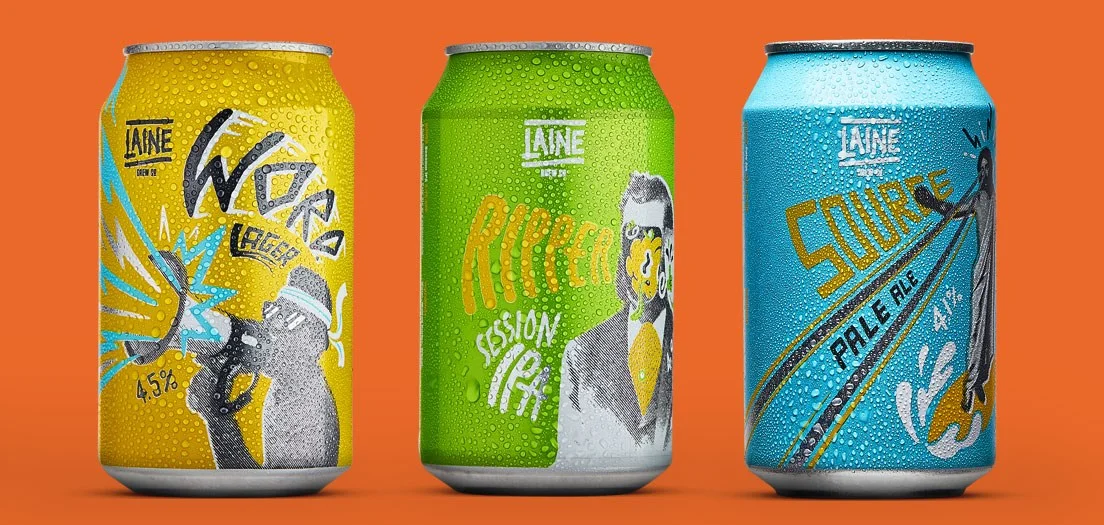
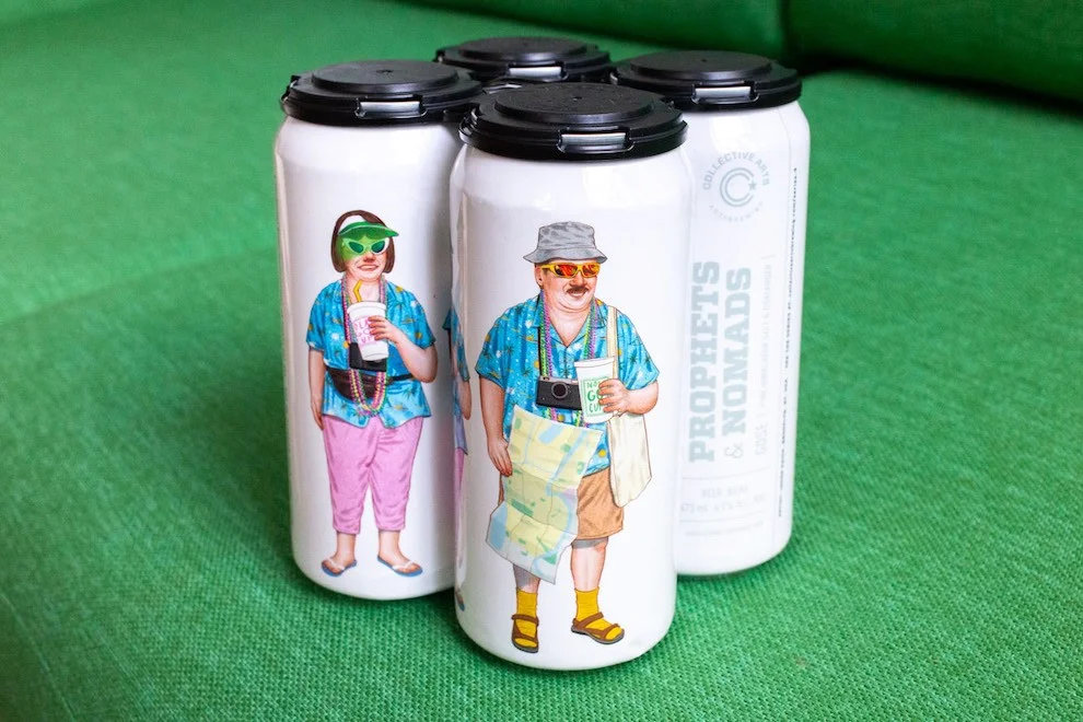
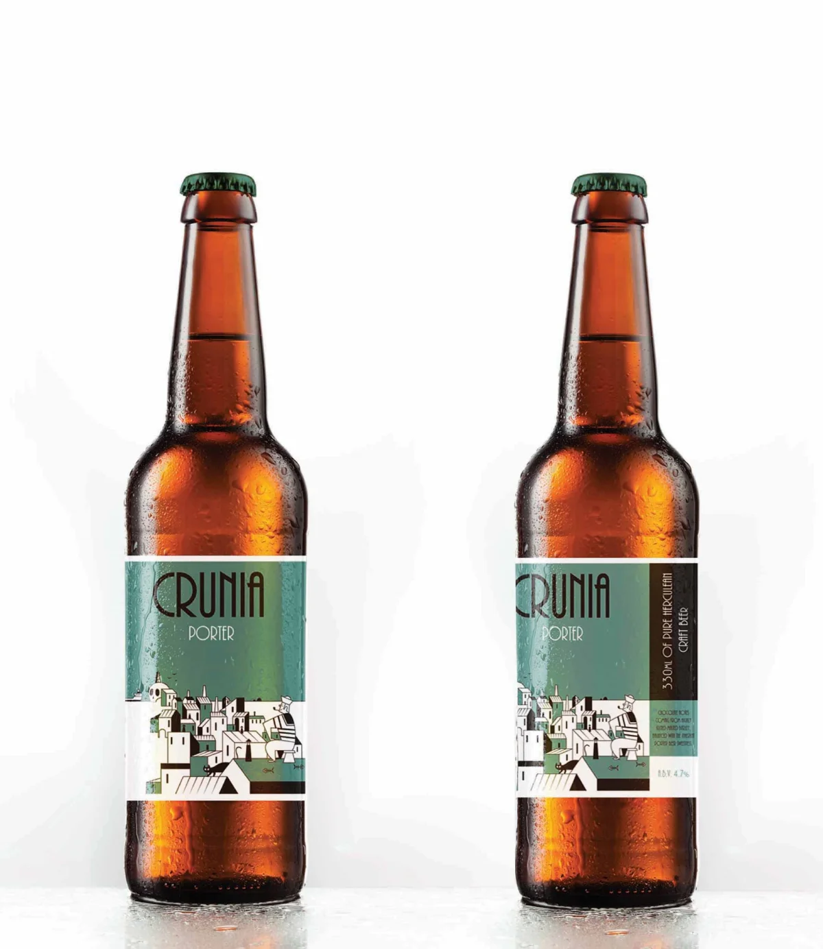
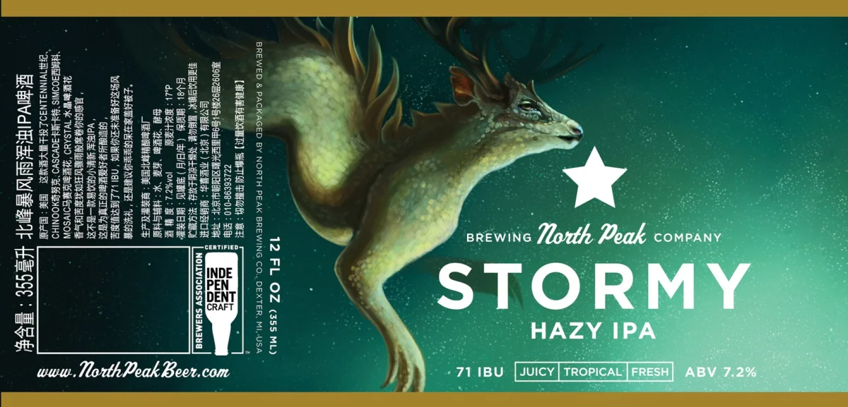
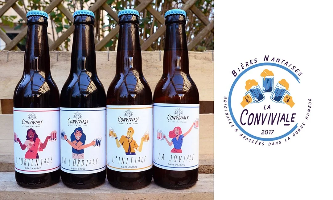
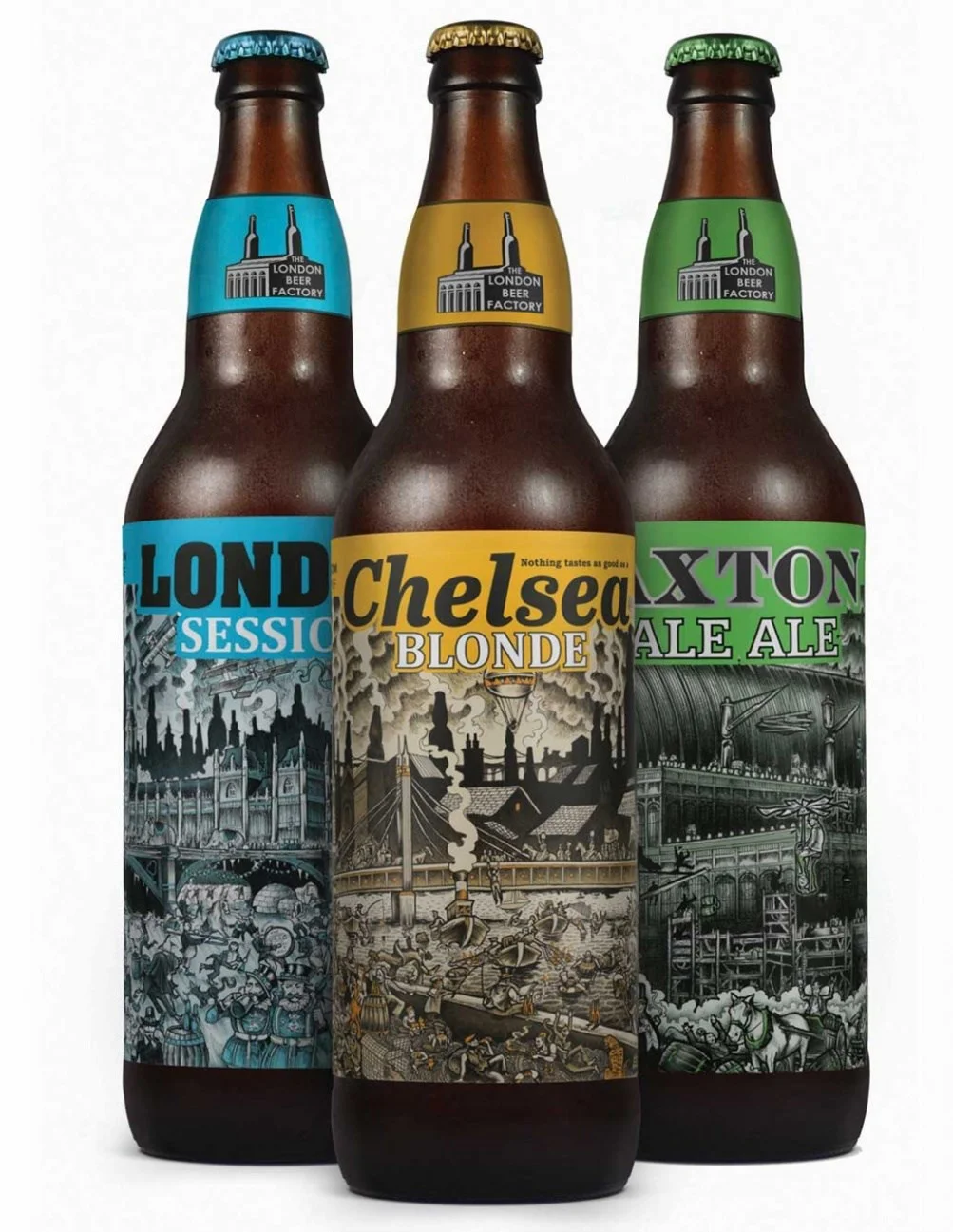
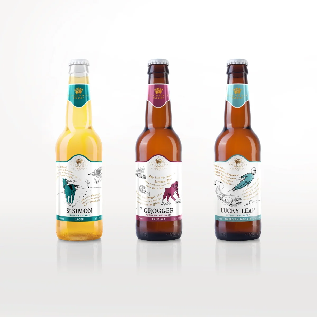
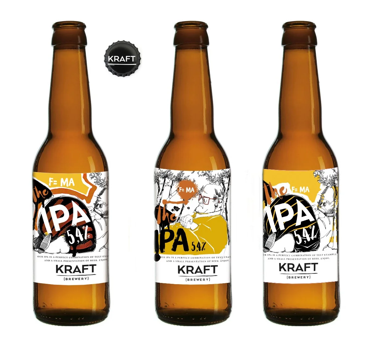
Craft beer labels have a small space to do a lot: signal a beer’s character, catch a drinker’s eye and give a brewery an identity people can remember. The work featured here takes different routes to that job, from illustration and typography built as one system to imagery shaped by local history, printmaking and place.
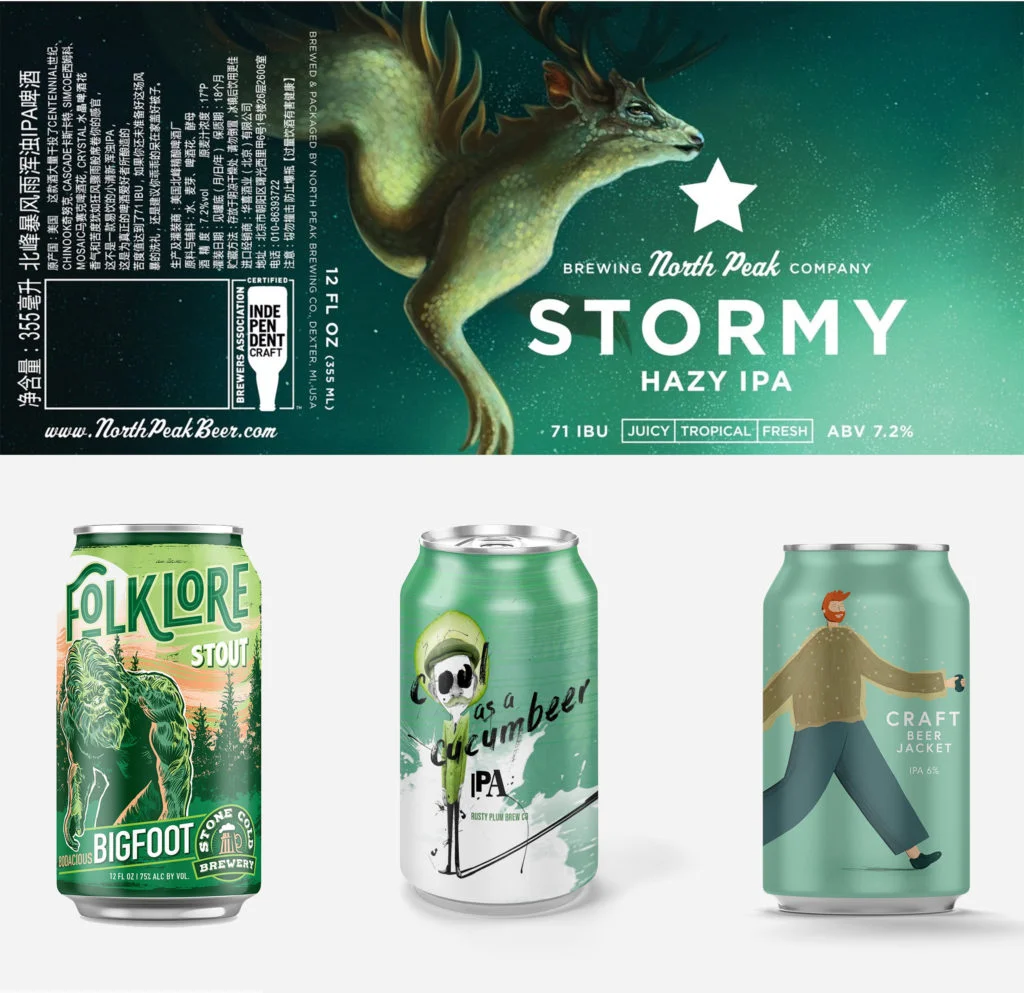
The examples and artist credits come from the Directory of Illustration, which spotlighted packaging art in a series of features before dedicating a post to beer. Its selection ranges from self initiated can concepts to work commissioned for named breweries. The designers’ notes offer a useful reminder for creative teams: label art can be more than a decorative layer added after a product name. It can provide the visual logic that holds the package together.
Build the label as a whole
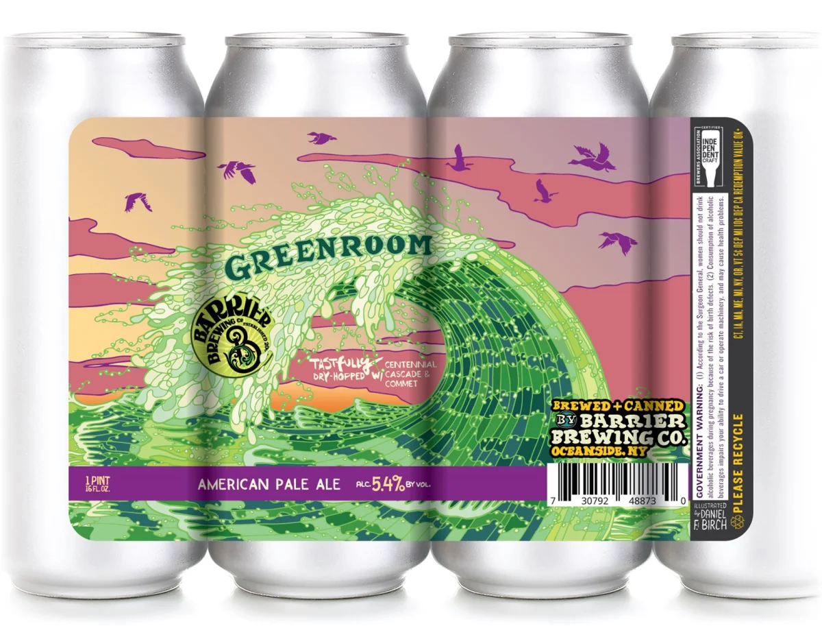
Atlanta based T.P. Design Inc. describes its approach as “designustration,” combining design and illustration from the outset. The firm’s Dorothea Taylor created a set of self initiated cans under the themes “Space Age and Folklore.” The distinction matters: when image making and typography develop together, the label can read as one composition rather than a collection of separate elements.
That method gives designers room to make the lettering, imagery and overall arrangement reinforce the same idea. The source doesn’t identify typefaces, colours or production specifications for the cans, so the value of the example lies in its stated process. For a team developing a range, starting with an integrated visual concept can make it easier to extend a shared identity across different beer names and illustrations.
Use research to shape original imagery
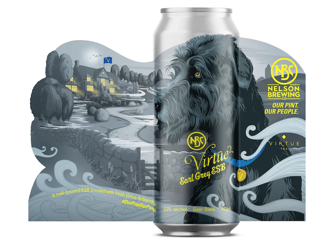
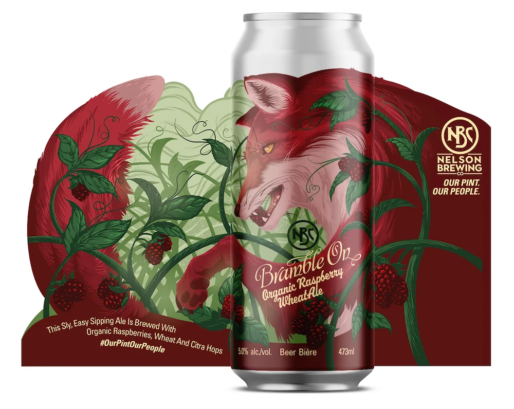
Skyler Punnett’s work for Nelson Brewing Company shows another route: an illustrator’s ability to move between subjects and adapt to a client brief. Punnett has worked as a commercial artist for 10 years, with clients including Sony Entertainment, Microsoft, Nokia and Rainmaker Media. His practice combines figurative approaches with organic, flowing subject matter, qualities the source says lend themselves to packaging.
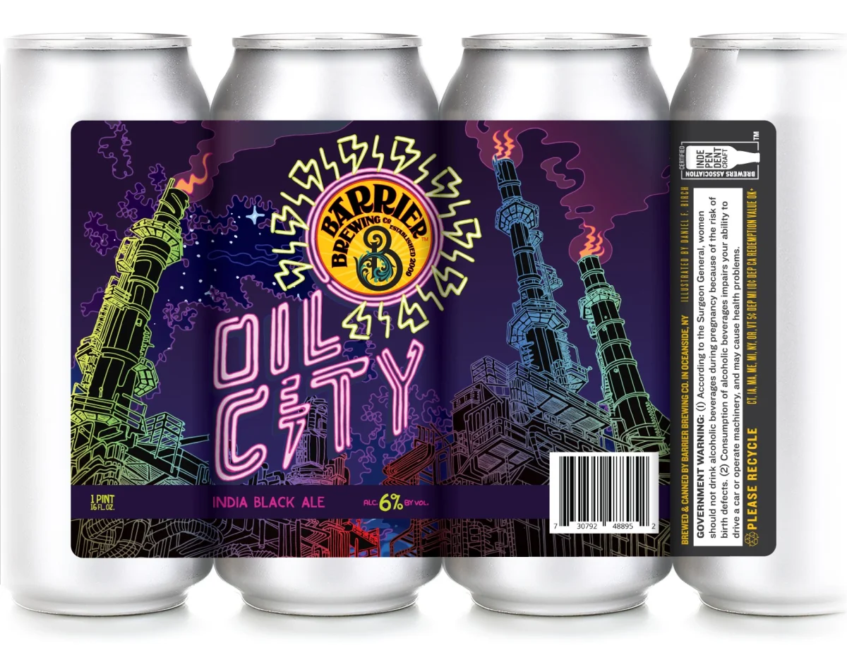
A testimonial from Leif Miltenberger, managing partner at Hired Guns Creative, connects Punnett’s research skills to his ability to understand a subject and make original designs around it. For designers, that points to a practical step in packaging work: learn enough about the product and its context to make the imagery feel considered. The article doesn’t specify the Nelson labels’ design rationale or individual visual details, so it offers no basis for assigning particular motifs or meanings to them.

Let a sense of place guide the visual language
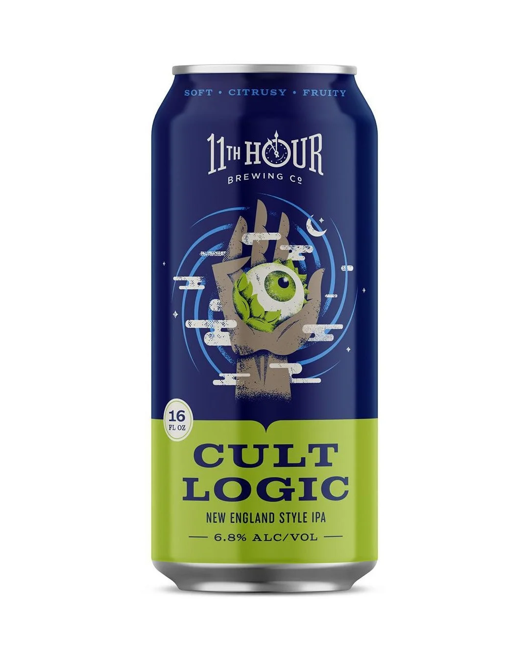
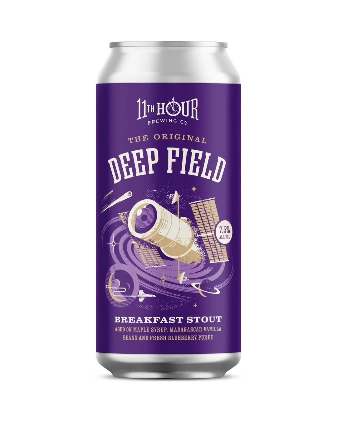
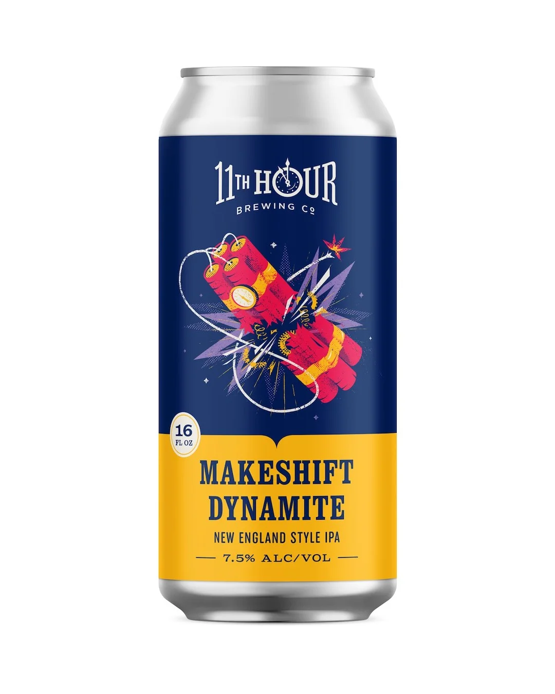
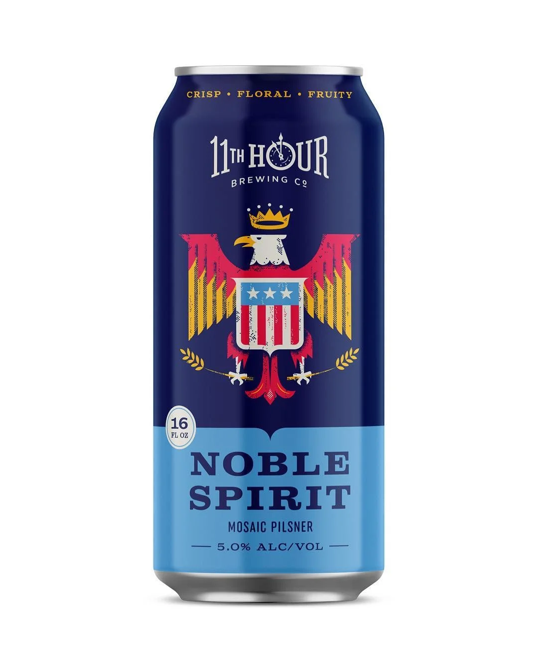
Pittsburgh brewery 11th Hour Brewing Co. hired Charlie Wagers to create illustrations for several beers. Wagers is a graphic designer, art director and illustrator whose influences include antique printing methods, vintage cameras and film, worn surfaces, old books and neon signs. He describes his sensibility through the visual culture of the Midwest and the Rust Belt.

Those references form a broad palette for making labels feel rooted in a designer’s point of view. They also show how research can extend beyond a product’s ingredients: material history, local culture and personal observation can all inform an illustration style. The source doesn’t detail the specific beers or the final compositions, but it does establish that Wagers was commissioned to represent several of 11th Hour’s beers through a series of illustrations.

Make the making visible
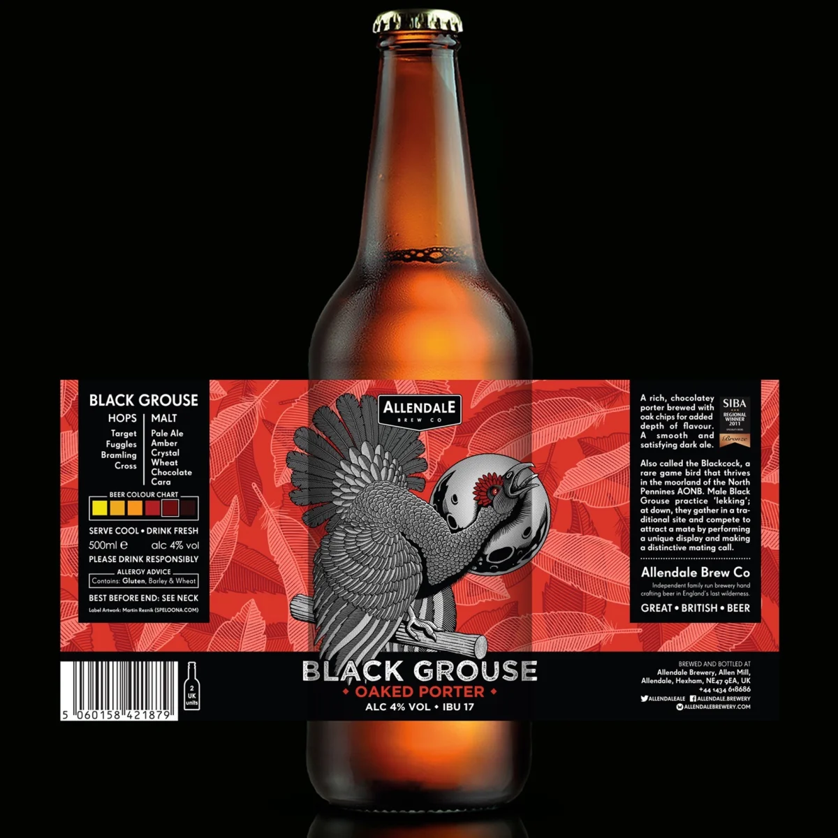
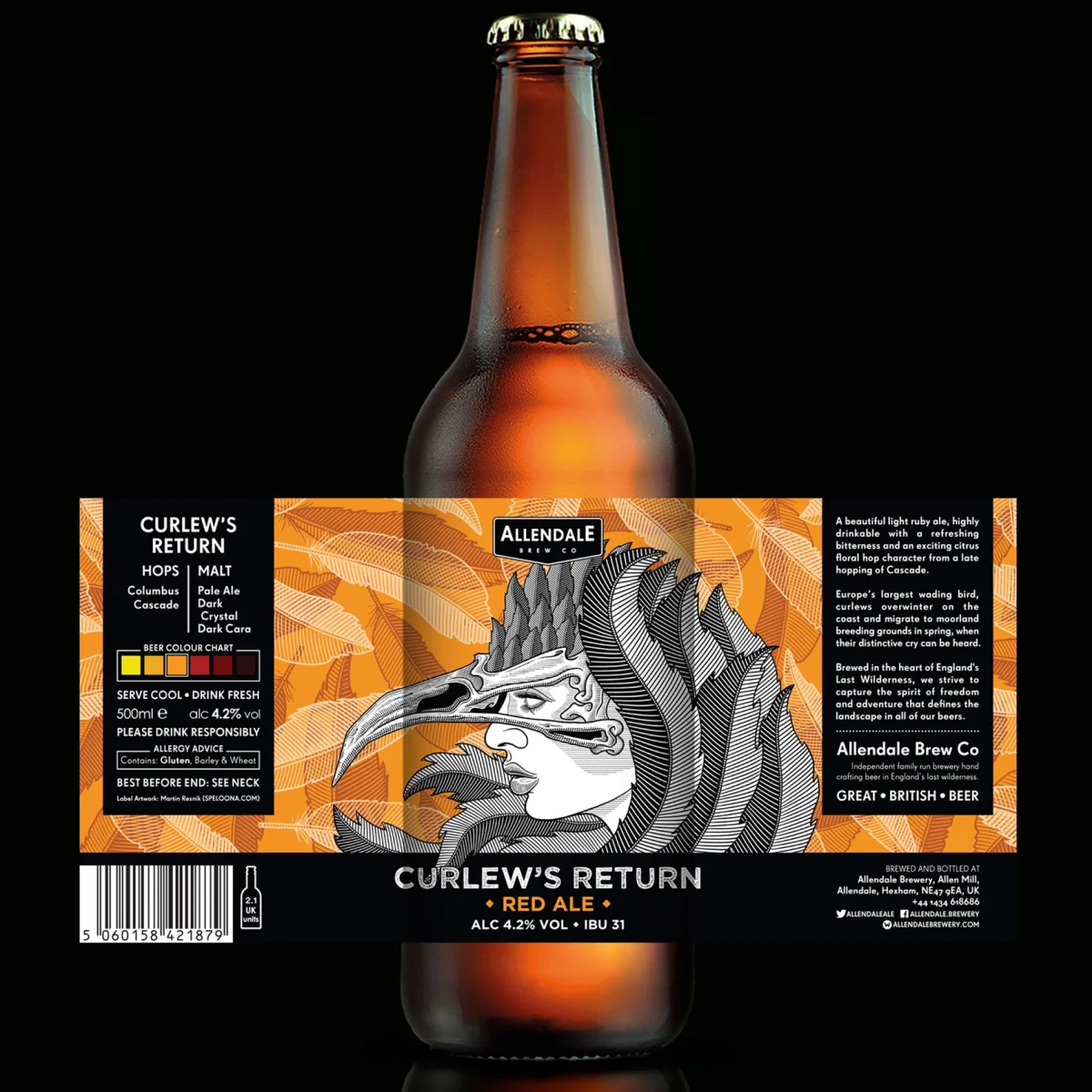
Martin Reznik created craft beer packaging for Allendale Brew Co. Although he works digitally with Adobe software and HTML, he prefers pen and ink, screen printing, etching and lino cutting. His account foregrounds the physical processes behind his illustration practice.

That hands on approach can shape a label’s visual character even when the final artwork is prepared digitally. Marks and textures made through print processes bring a different sensibility from imagery drawn entirely on screen. The source doesn’t identify which techniques appear in the Allendale packaging, so the connection is about Reznik’s working practice rather than a claim about the finished labels.
Design for a quick moving category
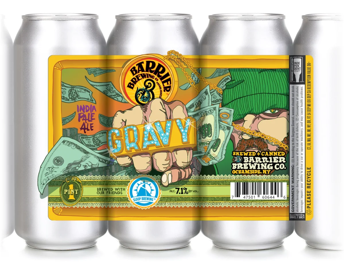
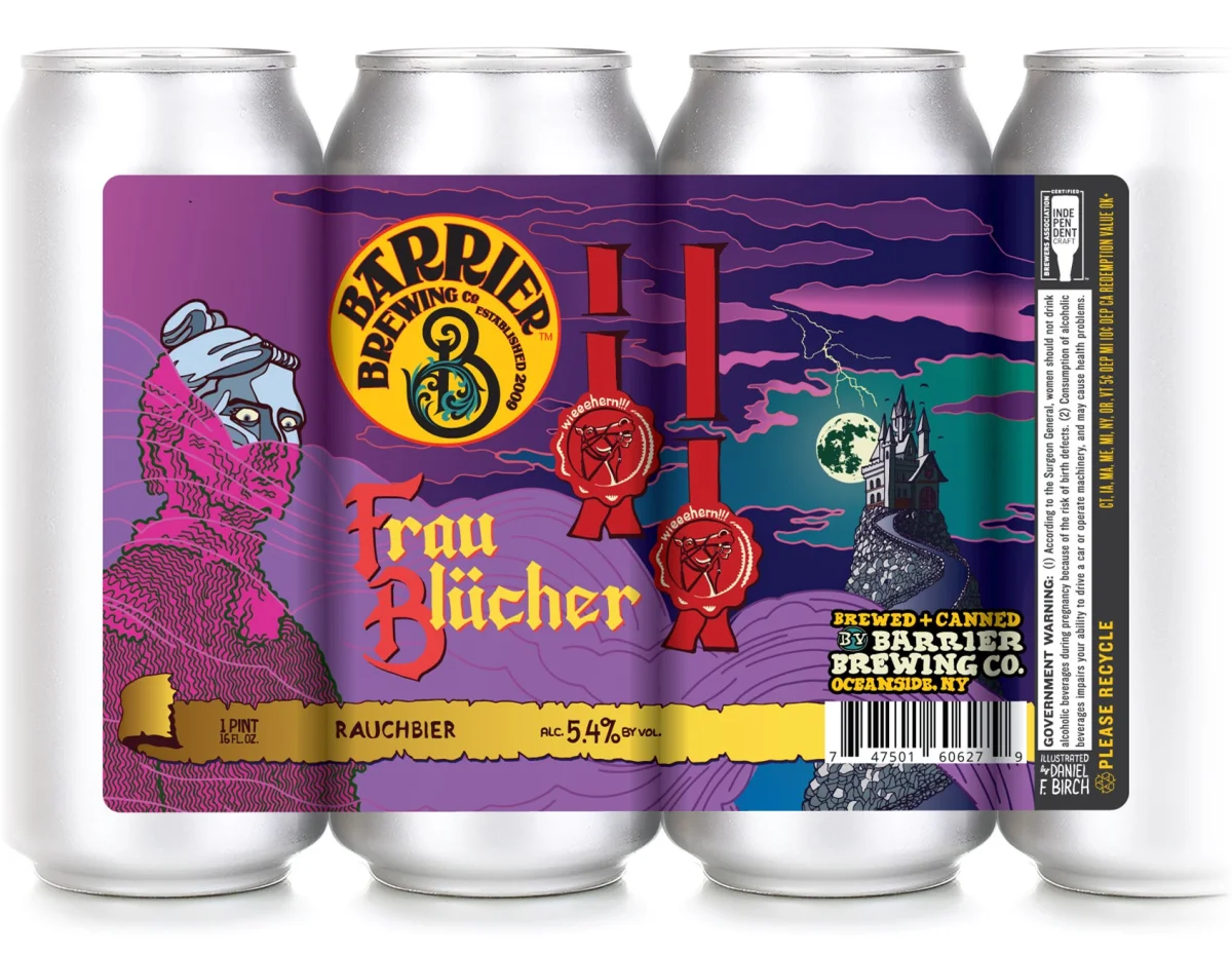
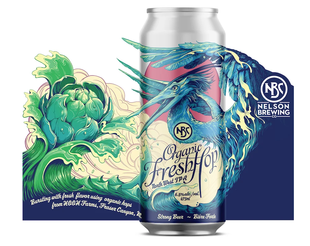
Daniel Birch has spent 14 years working as a designer and illustrator in the New York area, with a focus on local craft beer. His stated aim is to help small businesses and new products stand apart through distinctive artwork and logos that support recognition and add value to a brand.

Marc Osborne also specializes in beer label art. He notes that the pace of label commissions has helped him work efficiently as he develops his practice and collection. His subject matter draws on wildlife, people and stories from his hometown of Savannah, Georgia. Together, these profiles show two useful ways to sustain a body of packaging work: Birch emphasizes the identity needs of small businesses, while Osborne draws on recurring observation and local inspiration.
A wider field of label artists
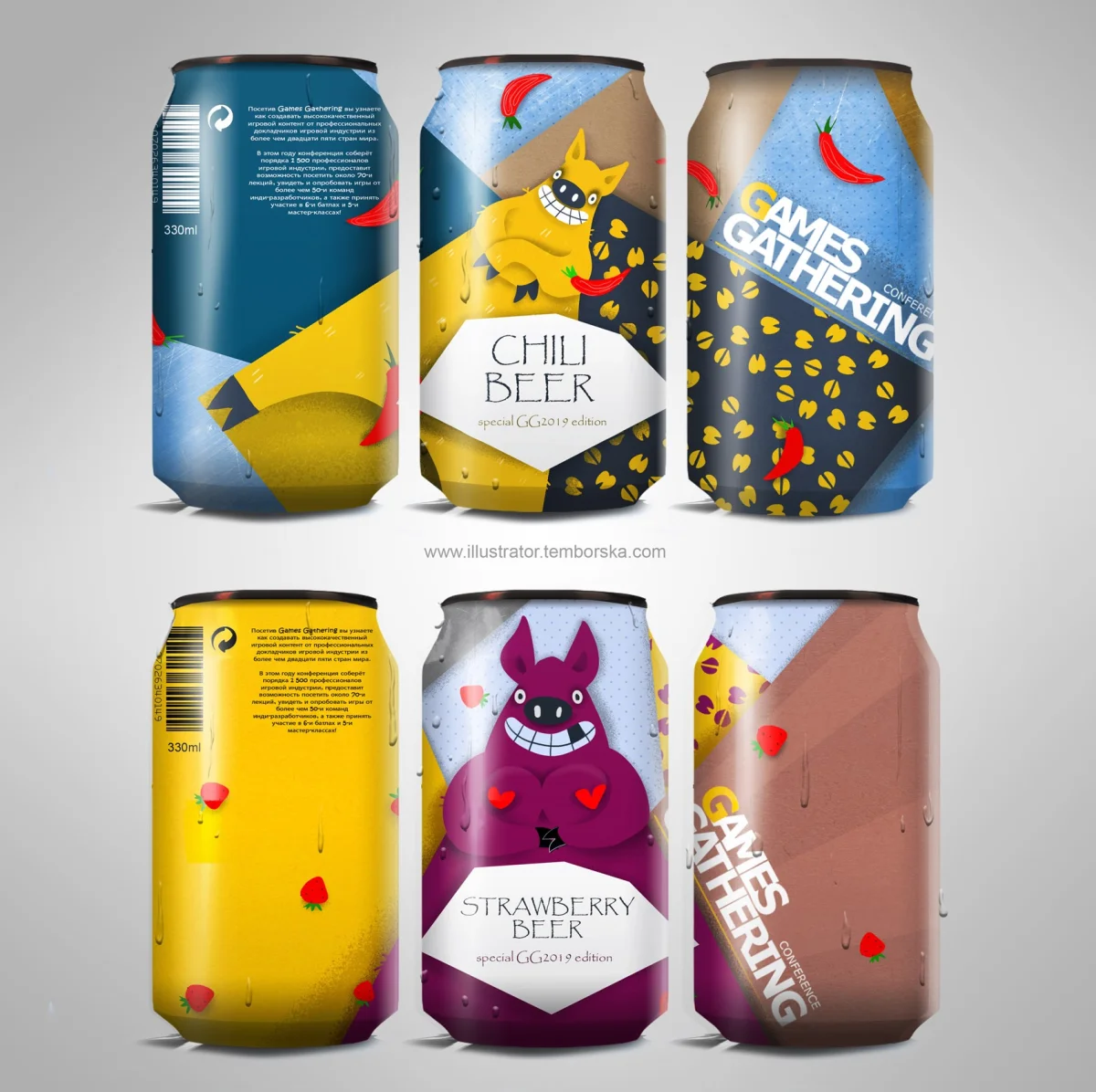
The Directory of Illustration also points readers toward work by Iain Macarthur, Adele Leyris, Nuno Ramalhão, Rachael Presky, Lucia Catellani, Anna Sun, Annie Ryan, Rush, Jason Raish, El Primo Ramón, Claire George, Johan Papin, Philip Harris, Lis Watkins, Anastasiia Temborska and Matilda Petersson.
Across the featured practices, the strongest takeaway is methodological: give the illustration, typography and brand identity a shared purpose, and ground visual choices in a specific subject, place or process. The source credits artists and clients where they are named, but doesn’t provide launch dates, font names or detailed colour and layout specifications. Those details would be needed to turn the examples into production ready case studies. For now, the work makes a clear case for treating the beer label as a compact piece of visual storytelling, designed to work as both package and signature.


| Rev | Description | Date |
|---|---|---|
| A | Issued for reading | |
| B | Viewed 803 times | Current |


