Albert Wint’s Music Portraits Turn Pen Lines and Color Into Motion
- Project
- Web Design
- Drawn by
- Ian Carradine
- Issued
- Sheet
- A-121
Illustrator Albert Wint draws musicians with energetic pen marks and lively color, balancing loose passages with carefully rendered detail.
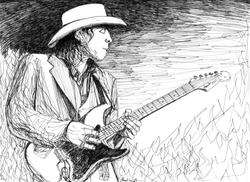
Albert Wint builds energy through contrast. In his illustrations and paintings, loose marks sit beside carefully controlled detail, while bright color meets quieter, muted passages. The result is work that feels in motion, with shifts in line and tone guiding the eye across each image.
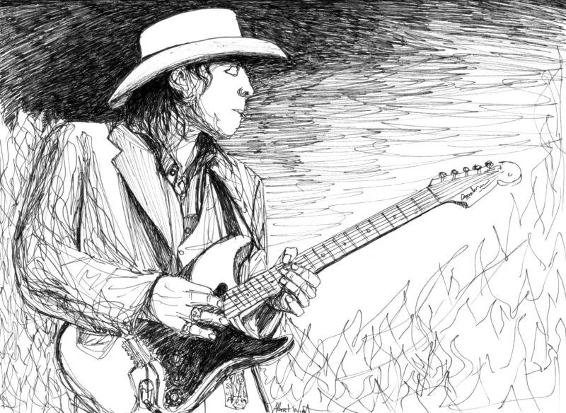
The Directory of Illustration featured Wint’s work in May 2021, describing his interest in music and his habit of drawing musicians he admires. The artists named in the feature include Slash, Axl Rose, Stevie Ray Vaughan and David Gilmour. The portraits connect the visual character of a performer with Wint’s own expressive approach to mark-making.
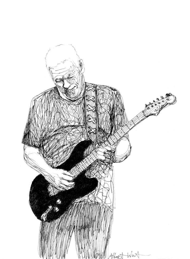
Line as a source of energy
Wint says he works mainly in pen, a medium that doesn’t allow him to erase a mark. That constraint makes the quality of each line central to the drawing. A stroke has to contribute to the image as it happens: its weight, direction and relation to nearby marks can suggest form while also setting the pace of the composition.

Rather than keeping every contour neat, Wint combines lines that feel loose and almost chaotic with areas of close detail. The contrast gives the drawings their movement. Dense passages can hold attention around a face or feature, while freer marks keep the image from feeling static or overworked. The eye moves between those levels of finish, reading the subject through both precise observation and visible gesture.

For illustrators, this approach offers a useful way to think about control. Detail doesn’t have to cover the whole page to make an image feel considered. A few carefully resolved areas can give the viewer something to focus on; looser marks around them can carry energy and keep the composition open. Wint’s description makes clear that line quality is not decoration added after the drawing is complete. It’s part of how the image communicates movement.

Color carries the same rhythm
Wint applies a similar balance in paint. He places bright colors loosely beside more detailed areas in subdued tones, echoing the contrast between spontaneous and controlled pen marks. Color therefore does more than identify a subject or fill a shape: changes in saturation and finish create another rhythm for the viewer to follow.
That relationship between drawing and painting gives the work a consistent visual logic across media. In both, expressive passages gain force from restraint nearby. A bright area can stand out more clearly when it sits beside muted color; a tightly rendered section can feel more vivid when surrounded by freer handling. The transitions help hold the image together while preserving a sense of motion.
Designers and illustrators can apply this principle without copying Wint’s style. When a composition feels too even, varying the level of detail may create a clearer focal point. When color feels flat, a deliberate difference in intensity or finish can give the eye a path through the work. The key is to make those contrasts serve the subject rather than scatter attention.
A practical way to study the work
Looking closely at Wint’s images, start by tracing where the marks become dense and where they loosen. Notice which features receive the most precise treatment, then follow how the surrounding lines direct attention back toward them. A second pass can focus on color: find the vivid passages, compare them with the muted ones, and observe how their placement affects the image’s balance.
This kind of viewing turns an artist feature into a working reference. It helps reveal how a drawing can retain character without polishing every edge, and how a painting can feel energetic without relying on bright color everywhere. Wint’s account points to a straightforward method: make line and color carry different amounts of emphasis, then use their interaction to create movement.
The feature links to Wint’s portfolio and website, with additional examples presented through the Directory of Illustration. His work is a reminder that expressive images can come from deliberate variation: a confident mark beside a searching one, or a vivid patch beside a quieter field. For a new portrait or illustration, deciding where to leave the line loose may matter as much as deciding where to sharpen it.
| Rev | Description | Date |
|---|---|---|
| A | Issued for reading | |
| B | Viewed 779 times | Current |


