Anna and Elena Balbusso Bring Red, Black and Optical Patterns to Directory of Illustration No. 37
- Project
- Graphic Design
- Drawn by
- Ian Carradine
- Issued
- Sheet
- A-130
The Balbusso sisters paired music inspired imagery with distorted grids for DI37, art directed by Dave Plunkert of Spur Design.
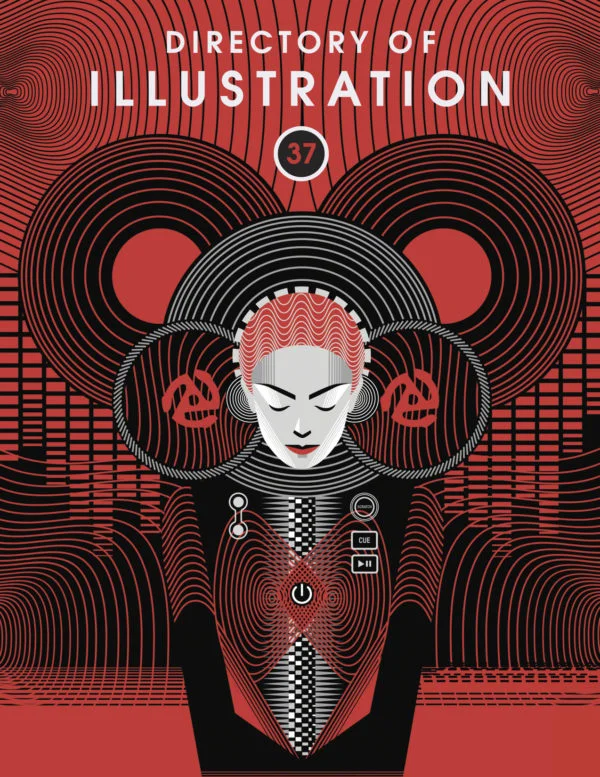
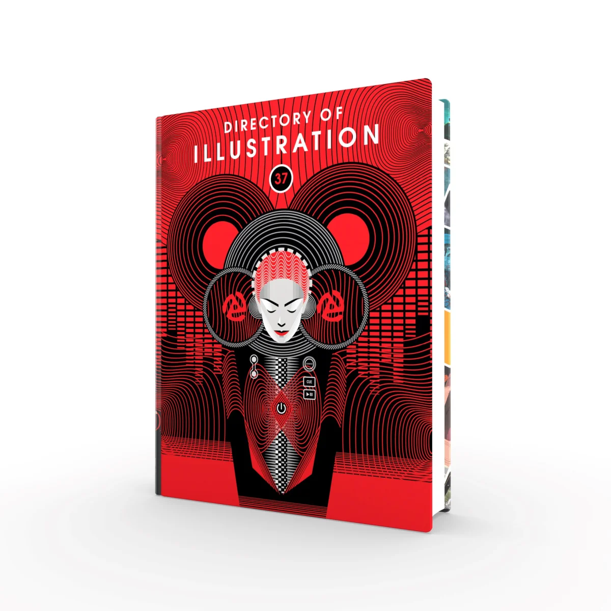
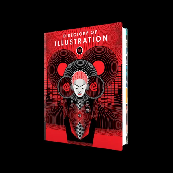
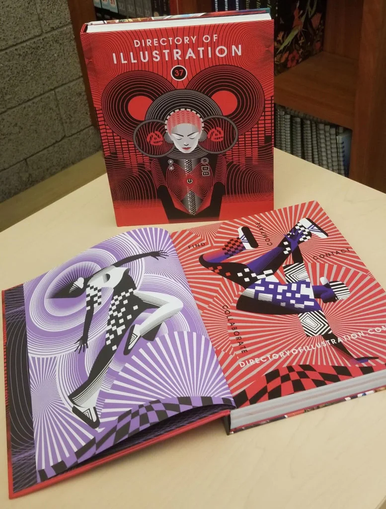
Red and black, optical patterns and figures in motion give Directory of Illustration No. 37 a cover with a clear visual pulse. Anna and Elena Balbusso developed the artwork through research into music and dance, while art director Dave Plunkert shaped the brief around their distinctive style and a palette that would stand apart from recent editions.
The annual printed Directory is distributed free to thousands of art buyers who hire freelance illustrators and animators. For its 37th edition, the cover and introductory interior illustrations came from the Balbusso sisters, an Italian illustration team based in Milan and represented by Shannon Associates. Plunkert, artistic director of Spur Design, handled the art direction.
Research that turns sound into movement
The sisters began with iconographic research, drawing on fine art and on the visual language of music performance. Their reference list ranged from stereo amplifiers, records, CDs, mixers and headphones to turntables, players, consoles and sound waves. They also looked to pop performers Madonna and David Bowie.
That research gave the illustration two kinds of material to work with: the concrete objects of music making and the less tangible qualities of rhythm and sound. The Balbussos combined those references with contemporary dance, using motion and instruments to keep the composition figurative while suggesting music through abstraction.
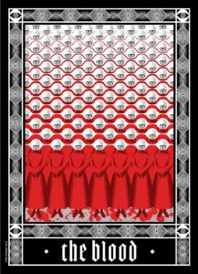
The sisters connected the cover’s visual language to a personal style they had first developed during research for their design of the Folio Society edition of Margaret Atwood’s The Handmaid’s Tale. Their graphic design training also informs how they approach illustration: research and composition become tools for working across different kinds of assignments.
To make rhythm and movement visible, they used optical patterns and distorted grid lines. The approach draws on graphic design and optical art from the 1950s through the 1970s, including Russian and Polish poster graphics and the work of Italian designer, artist and architect Franco Grignani. The grids give the imagery a sense of visual displacement, while the familiar music equipment anchors that abstraction in recognizable objects.

A brief built around the artist
For Plunkert, selecting the illustrator is the first major decision. The artist’s approach then guides the subject and the look of the cover. He described the process as finding a subject suited to the Balbussos, rather than settling on a generic cover concept and asking them to execute it.
That choice helps explain why the Directory’s covers can vary in surface and style while holding onto a consistent energy. Plunkert changes as many visual characteristics as he can from one year to the next, with the featured artist’s sensibility driving those changes. He said the final result emerges from small elements that are refined or removed during production, even when the finished artwork appears fully planned from the start.

Red and black set the edition apart
Plunkert asked the artists to explore a predominantly red direction after several editions had used cooler hues or broader palettes. The request gave the sisters a focused colour constraint without prescribing the imagery. Red and black already appear frequently in their work, and red is their favourite colour, so the palette connected the brief to their existing practice.
The collaboration took place at the beginning of the pandemic. Plunkert described the Balbussos as enthusiastic, prompt and professional, and said their contribution made the cover graphically strong and distinctive. The sisters said his instructions were clear and that working with him felt easy. Their exchange suggests a useful balance in art direction: a specific constraint can establish the project’s visual direction while leaving the artist room to bring research and personal language to it.
Distinctive voices drive the next collaboration
Plunkert said he wants artists working with him to bring their own points of view and sensibilities. Leaving room for an unexpected interpretation, he said, can create the potential for a welcome surprise. The Balbussos, in turn, praised his range across theatrical posters, covers and other design work, along with the recognizable character of his style.
That exchange echoes Plunkert’s description of the Directory covers as a series tied together by the artists’ broad visual vocabularies, rather than by a fixed set of design rules. For working teams, DI37 offers a concrete example of how a strong brief can hold both: a focused colour direction and subject area, paired with room for the illustrator’s own references, methods and formal choices.
Credits and directory access
The cover and introductory interior illustrations are credited to Anna & Elena Balbusso, represented by Shannon Associates. Art direction is credited to Dave Plunkert and SPUR Design.
The Directory of Illustration says its printed volume reaches art buyers in January, and that its searchable website and annual printed Directory help agencies, publishers and corporations find illustration talent. Qualified art buyers can learn about access here; artists can find information about joining here. For the DI37 cover, the lasting lesson is in the balance: research supplies a rich visual vocabulary, and a restrained palette gives it room to move.
| Rev | Description | Date |
|---|---|---|
| A | Issued for reading | |
| B | Viewed 530 times | Current |


