Steven Noble’s Scratchboard Illustrations Bring Texture to Labels, Logos and Posters
- Project
- Graphic Design
- Drawn by
- Ian Carradine
- Issued
- Sheet
- A-128
Across packaging, identity and museum posters, Steven Noble adapts fine engraved linework to projects that need both atmosphere and clarity.

Steven Noble’s scratchboard illustrations turn painstaking linework into a flexible identity tool. Across wine labels, farm packaging, a small business logomark and museum posters, his images borrow the texture of woodcuts and historical engravings while serving very different jobs: telling a place’s story, making a product recognizable or holding detail at display scale.
The Directory of Illustration showcase describes Noble’s practice as drawing, scratchboard, woodcut and engraving. He has more than 25 years of experience carving into pre-inked clay boards with X-Acto precision knives. The method lets him move between broad, woodcut-like shapes and finely controlled lines reminiscent of 19th-century steel engravings. The source lists clients including Coors, Exxon-Mobil, JP Morgan, Mercedes-Benz, Wet Seal, Beaulieu Vineyards, Cracker Barrel and Old Spice. It also credits him with the Meade Show Award for Excellence, Addy Awards and a feature in Communication Arts for a best advertising image.
What connects the featured projects is the way the illustration’s finish is matched to its setting. A label has to read at a small size and carry a sense of origin; a display cutout can use a full-length figure to attract attention; a logo needs a drawing that can be reduced without losing its subject. Noble’s linework gives each format a historical, hand-rendered character, while the project descriptions make clear that scale and use shape the artwork.
Place and provenance on packaging
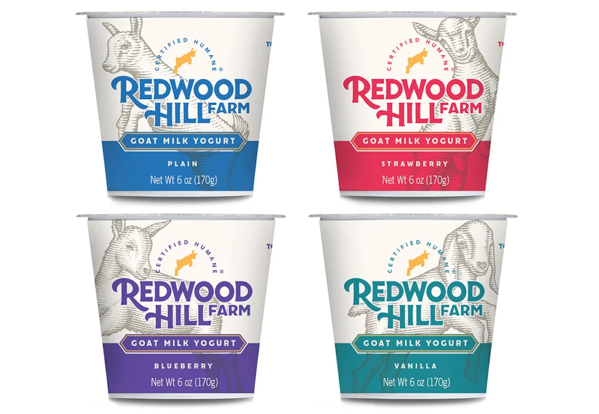
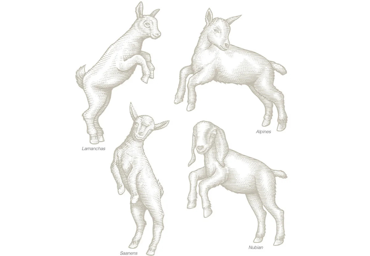
For Redwood Hill Farm, High Wide & Handsome commissioned four goat illustrations for the brand’s packaging. The breeds—Lamanchas, Alpines, Saanens and Nubians—were drawn in a scratchboard woodcut style for product lines that include yogurt and other dairy goods. The brief tied the pictures to the farm’s organic production in Northern California. Naming the breeds gives the package a specific visual subject, while the carved look supports the connection to agricultural origin.
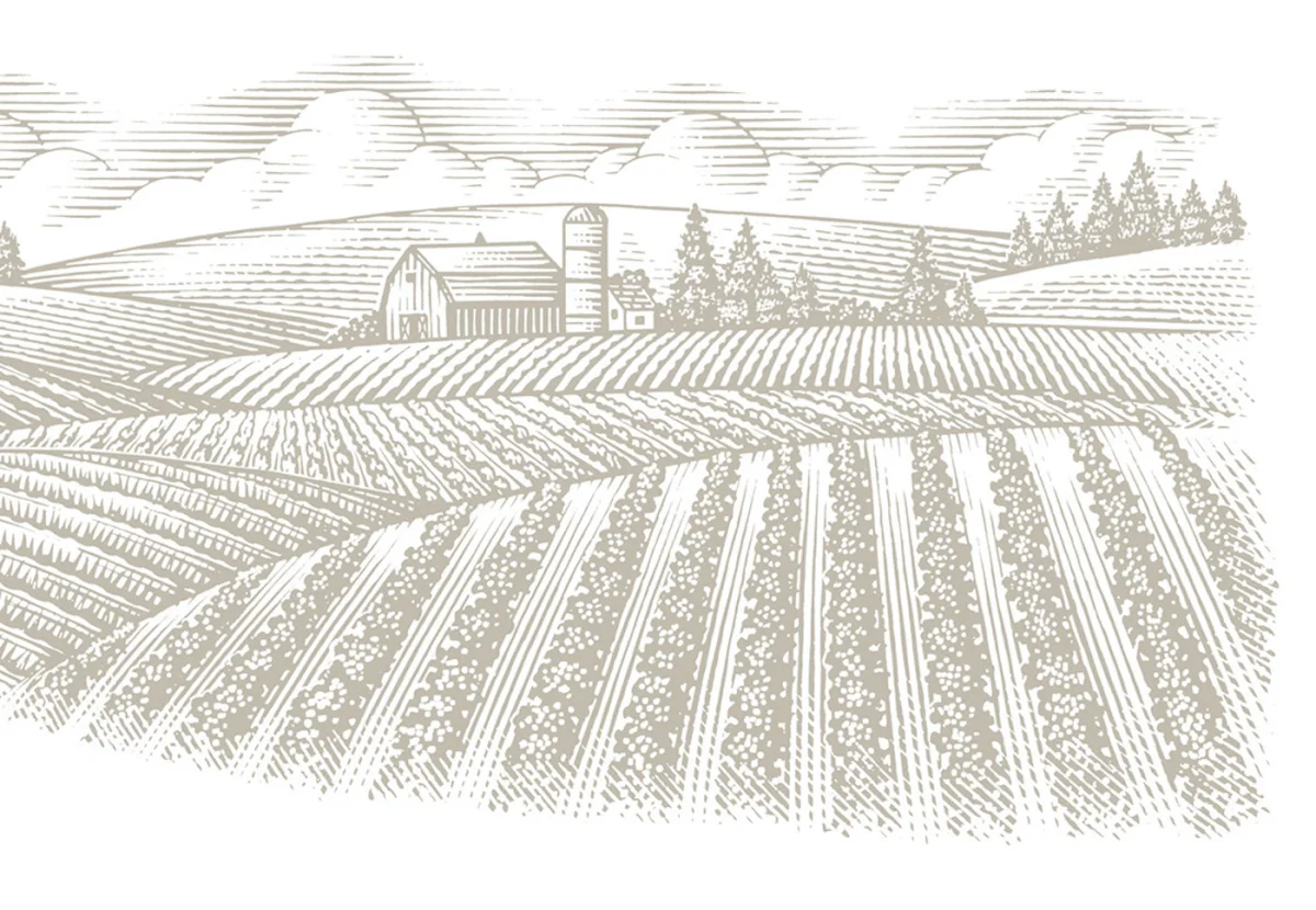

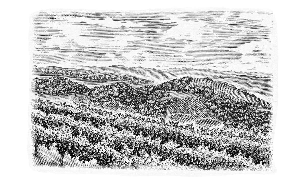
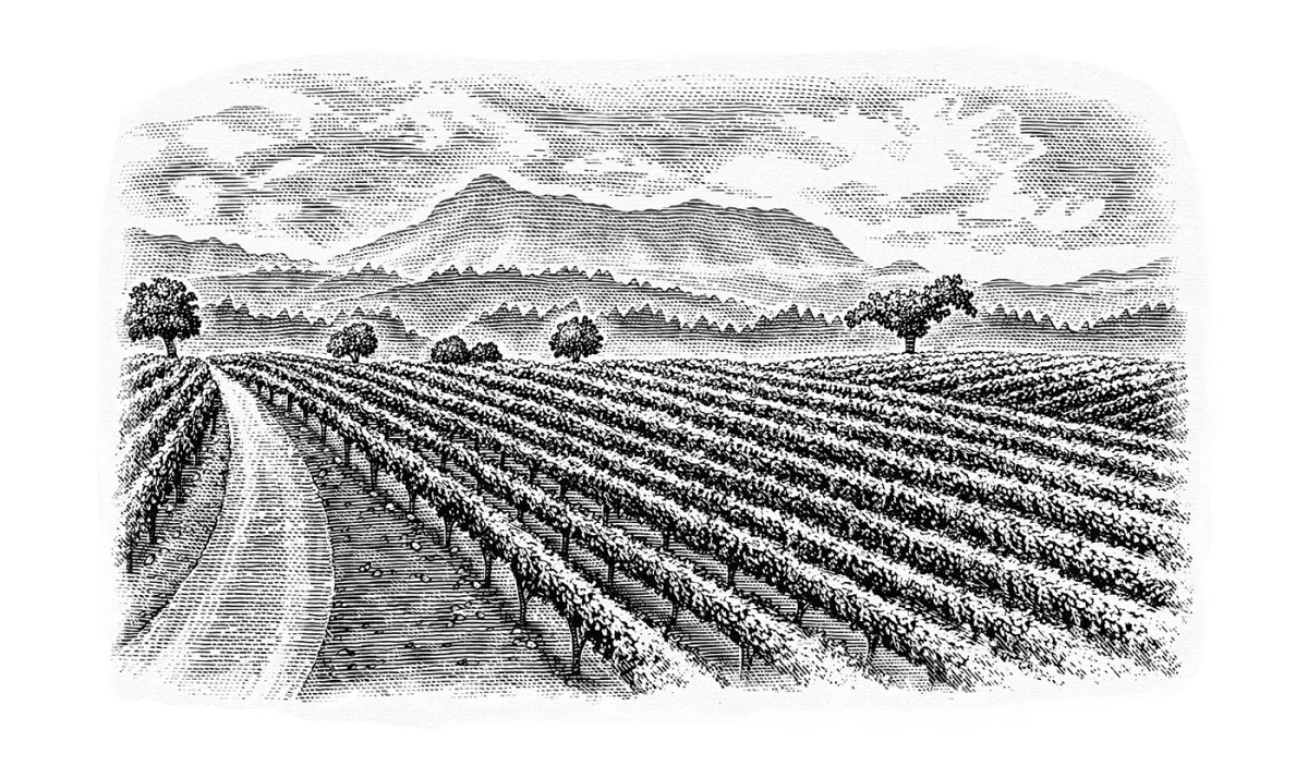
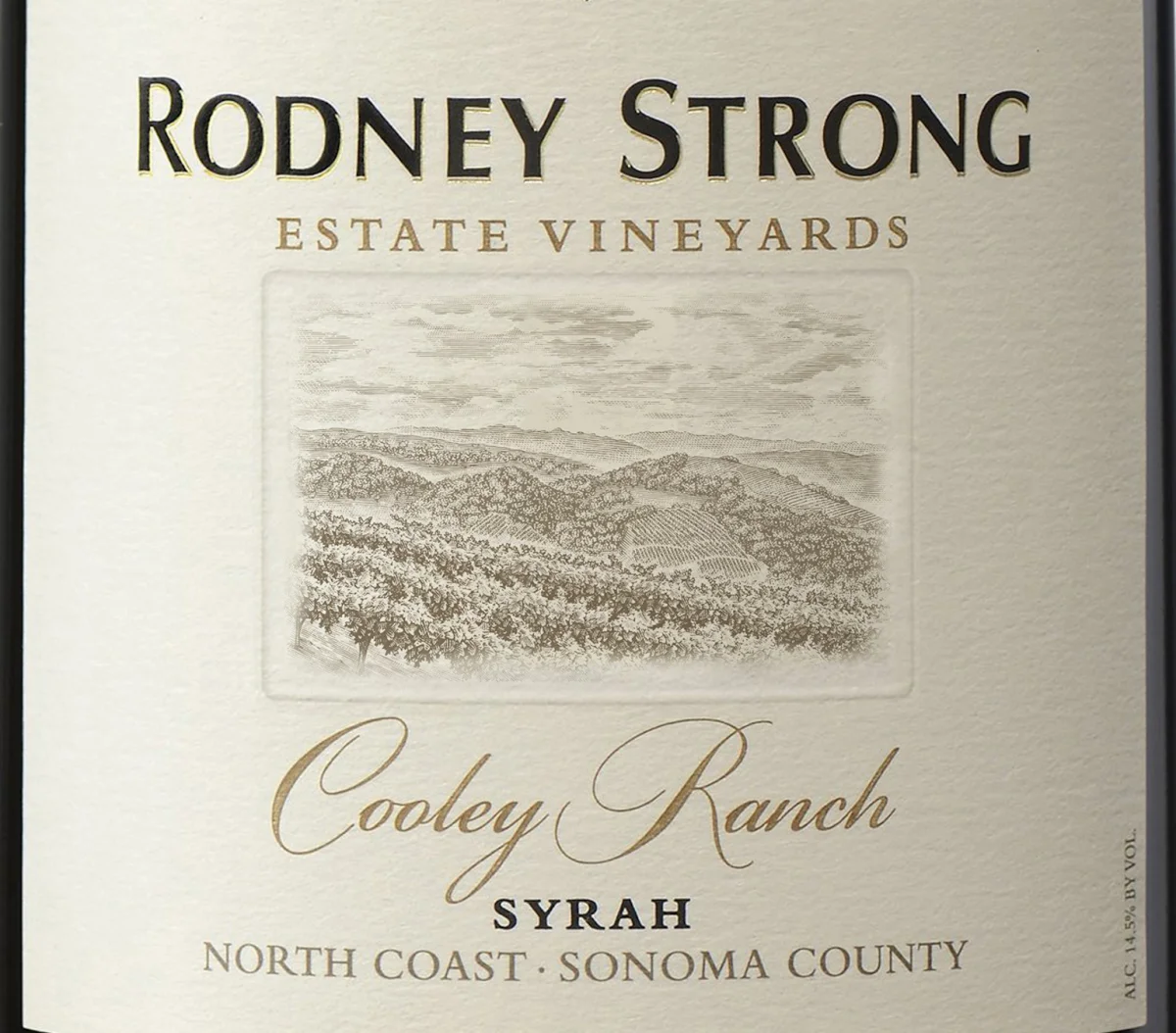
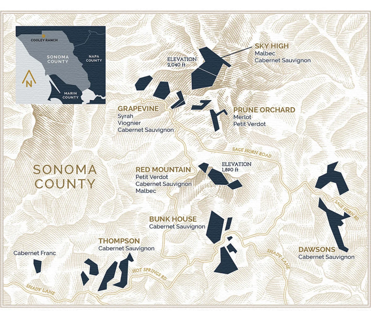
Rodney Strong’s Estate Vineyards labels use landscape to distinguish two Sonoma County appellations: Cooley Ranch and Knights Valley. Affinity Creative commissioned Noble to create custom hand-drawn etched illustrations for the pair, plus a map featuring local typography. The Cooley Ranch description points to the rugged northwest of Sonoma County and its volcanic soils, noted as unusual in the region and suited to Bordeaux varieties. Here, the landscape and map carry information about place as well as visual mood.
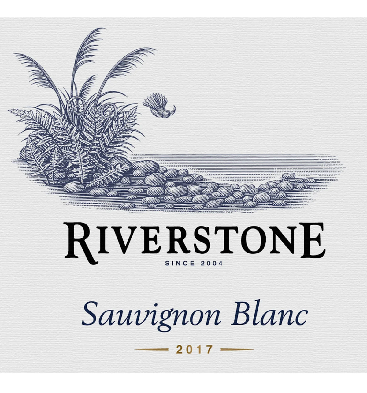
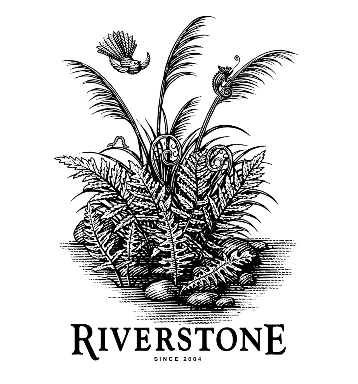
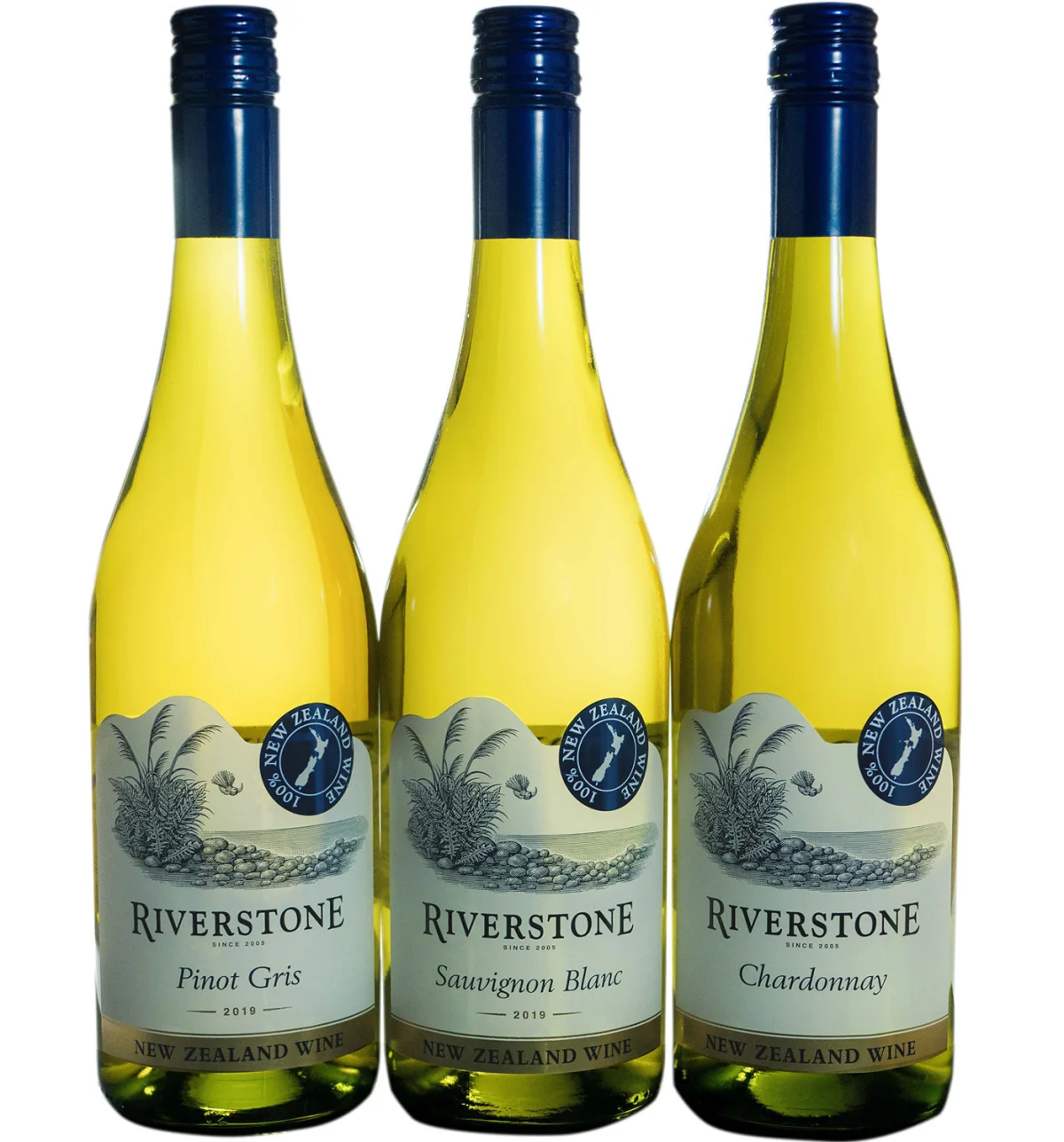
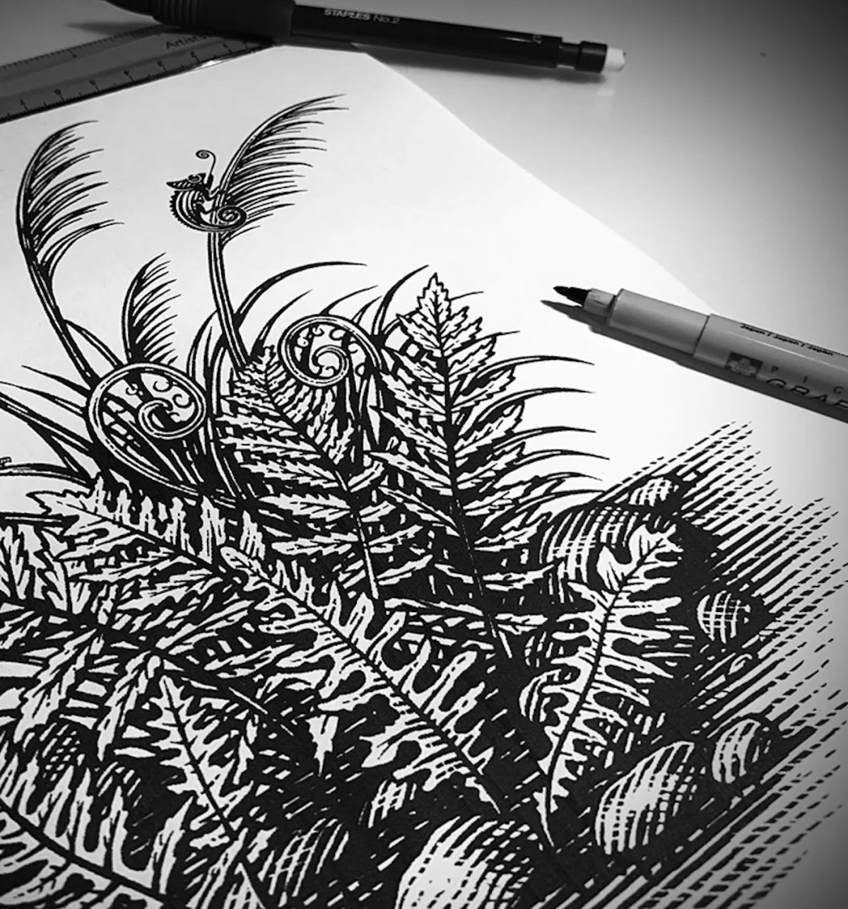
Villa Maria’s Riverstone wine label takes a similar approach to regional recognition. The brief asked for a scene New Zealand wine drinkers would identify as local, reinforcing the product’s use of 100% New Zealand grapes. Noble’s illustration includes a cutaway view along a riverbank, with river stones, ferns, fantails, toetoe and flax. Those named details make the landscape specific; they also give the label a set of natural forms to organize around.
Historic references, adapted to the format
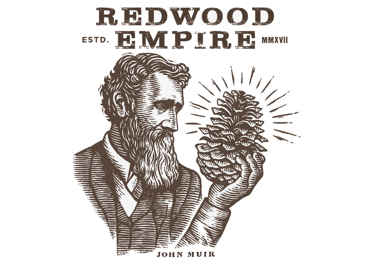
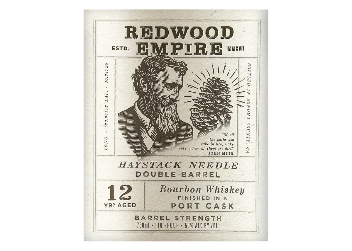
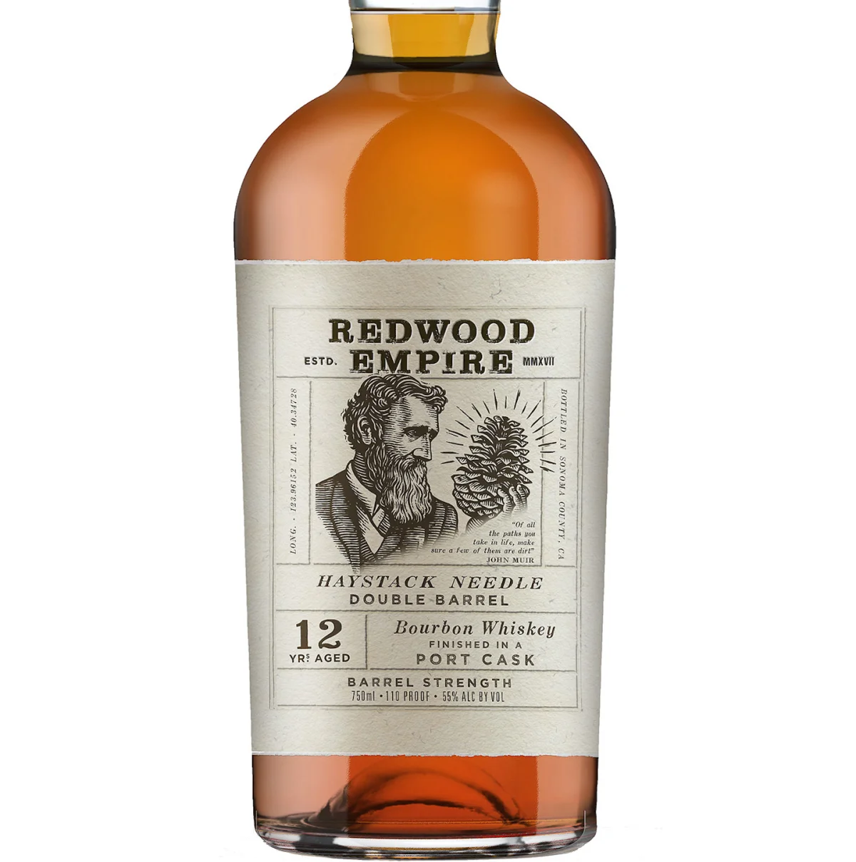
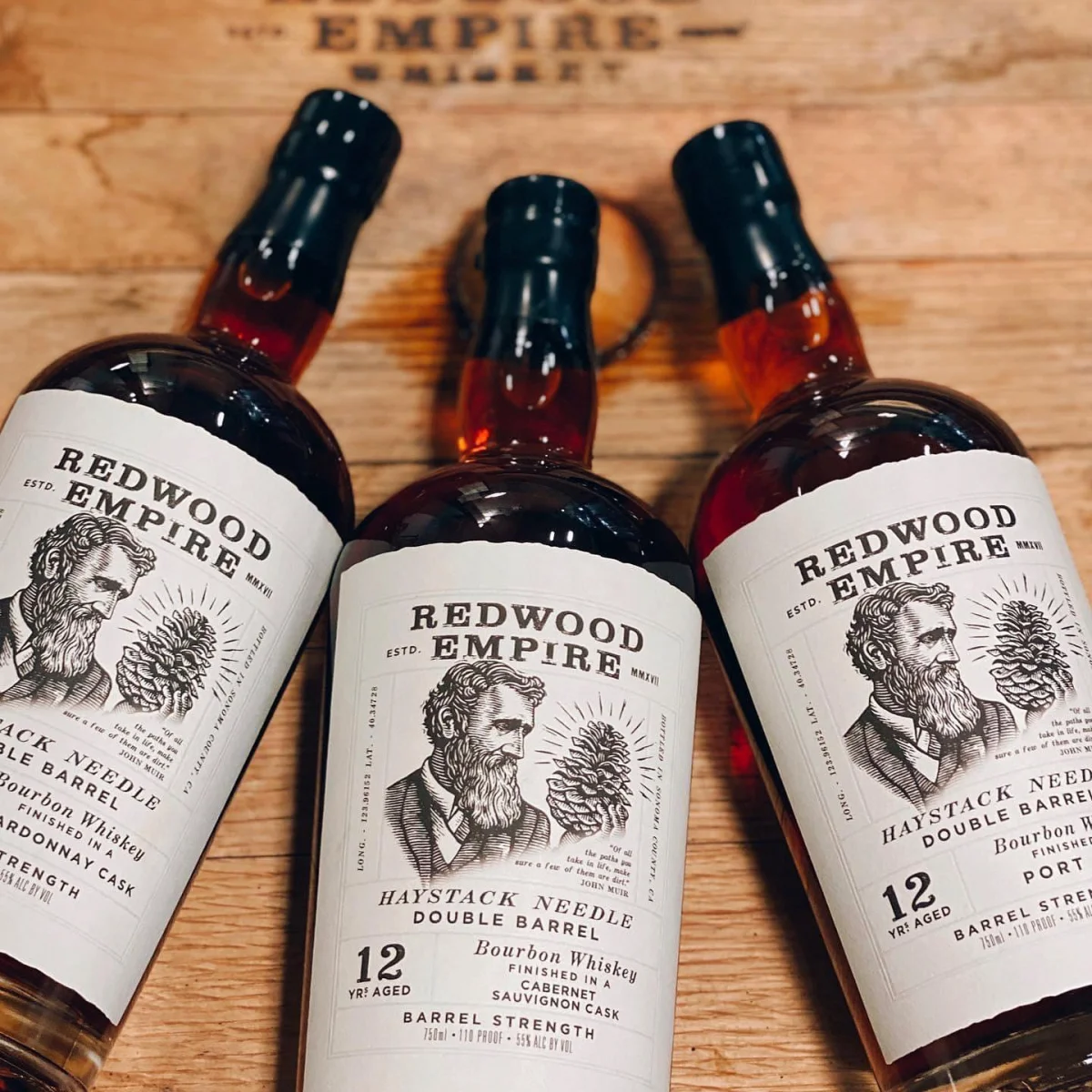
Redwood Empire’s Haystack Needle illustrations pair John Muir’s likeness with the redwoods he championed. The artwork is rendered as woodcut or engraving, with woodcut typography stamped into textured paper. That material and lettering reference the Arts and Crafts movement of Muir’s period. The result connects the portrait, trees and typography through a shared historical register, rather than treating the illustration as decoration added after the label’s central idea.
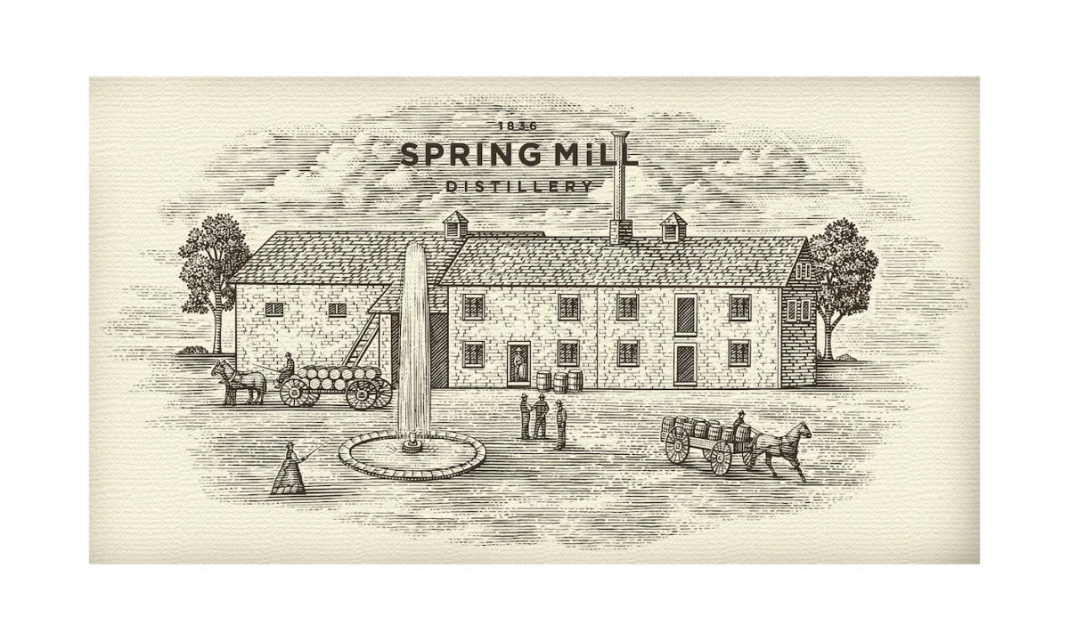
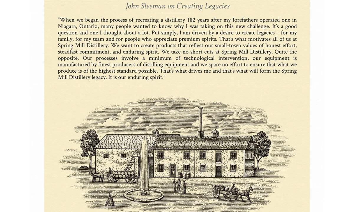
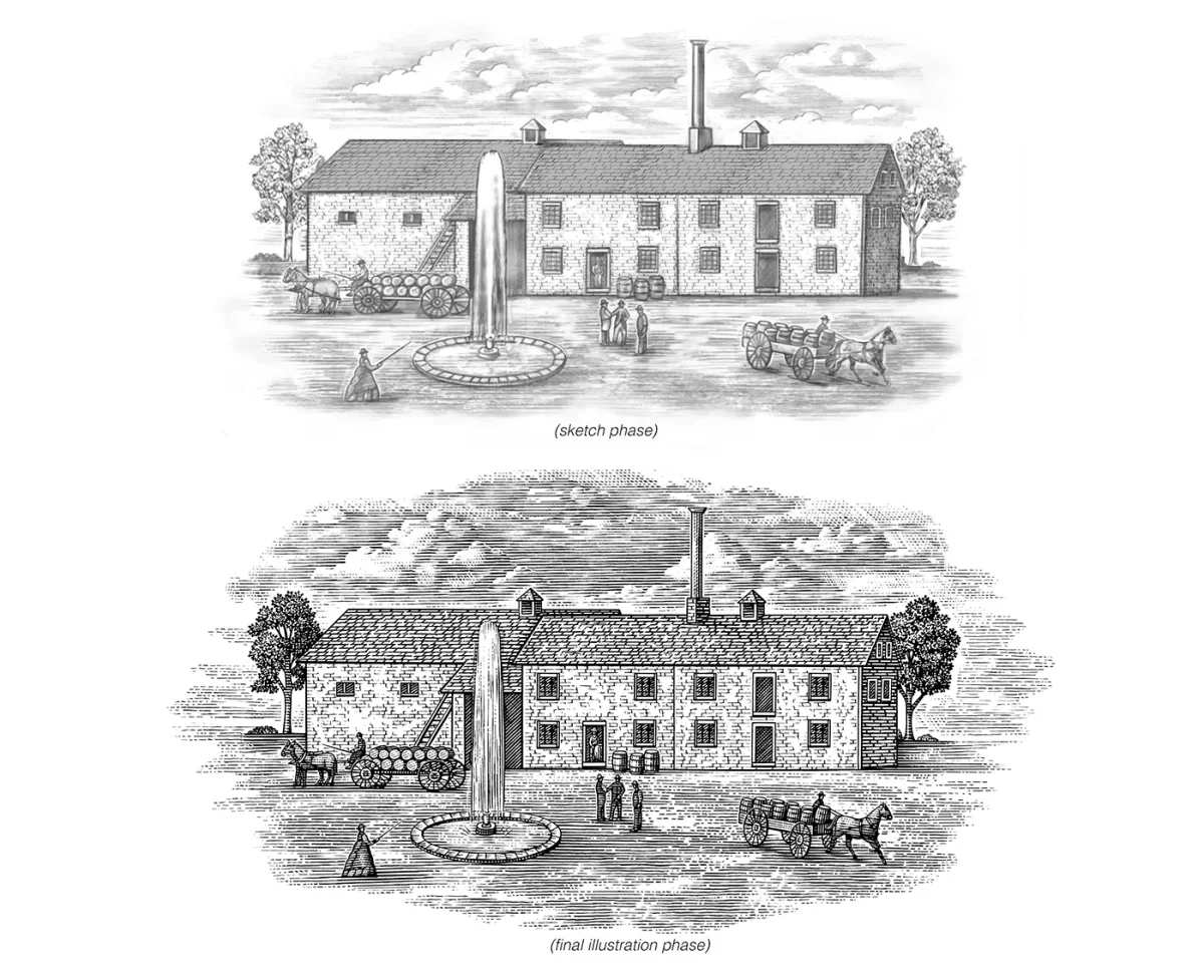
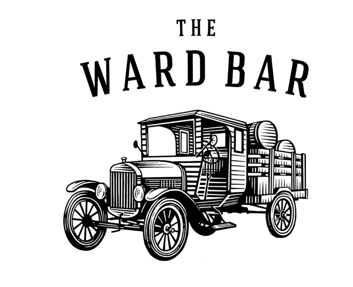
Spring Mill Distillery’s rebrand, commissioned by Riverstone Branding, also draws on history. The distillery was founded by the Sleemans in Guelph, Ontario, in 1834. Noble created woodcut engraving-style illustrations that include the original distillery building and a Model T Ford for The Ward Bar, named for St. Patrick’s Ward. The source describes the building image as representing the historic distillery, giving the rebrand a visual link to the business’s origins.
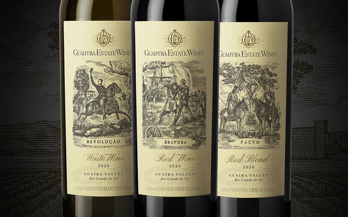
For Guahyba Family Estate wines in Brazil, Erik Marchetti of Holy Studios contacted Noble to illustrate three stories connected to the Farroupilha Revolution, fought in southern Brazil from 1835 to 1845. The three wines are associated with Revolution, Bravery and Pact. Hand-drawn in an old woodcut and engraving style, the images were meant to suggest an earlier era. The series shows how a consistent technique can help separate related products while keeping them within one visual family.


Linework that has to work at different sizes
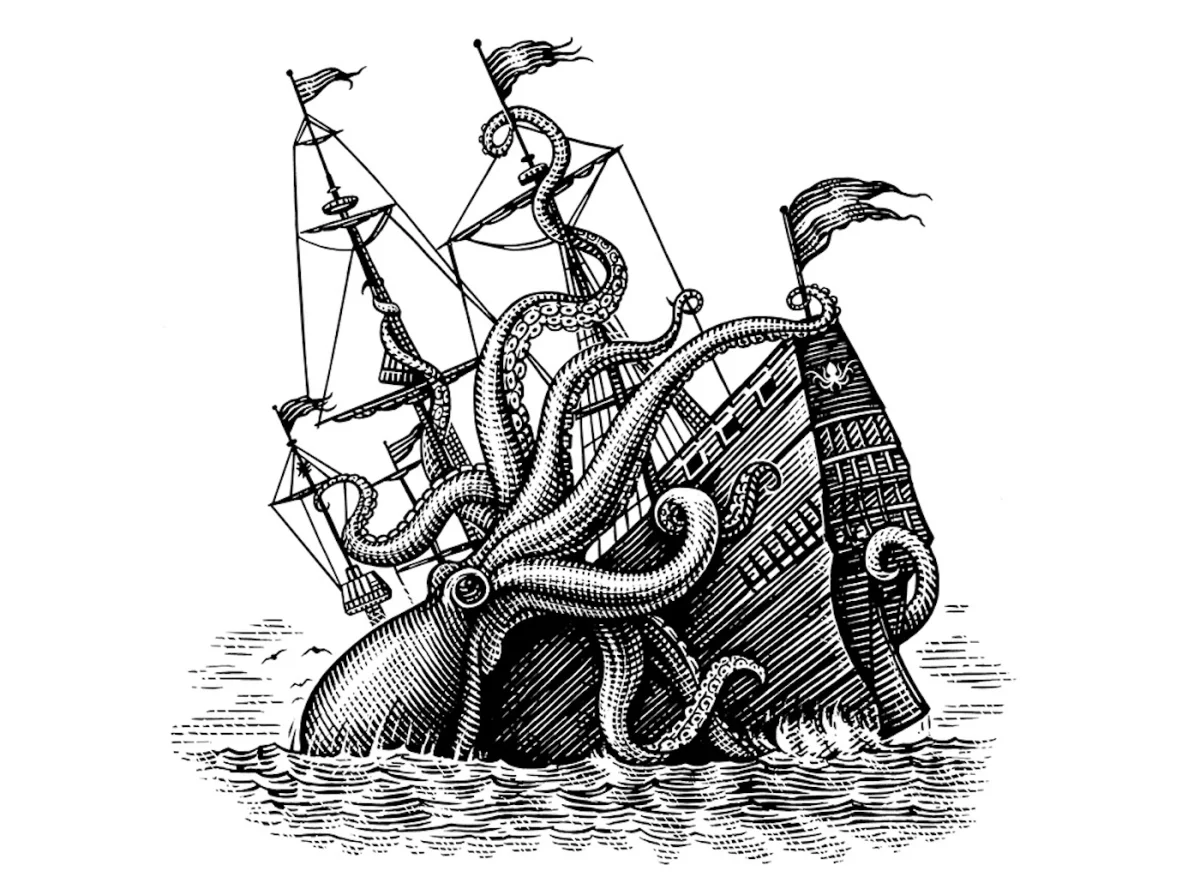
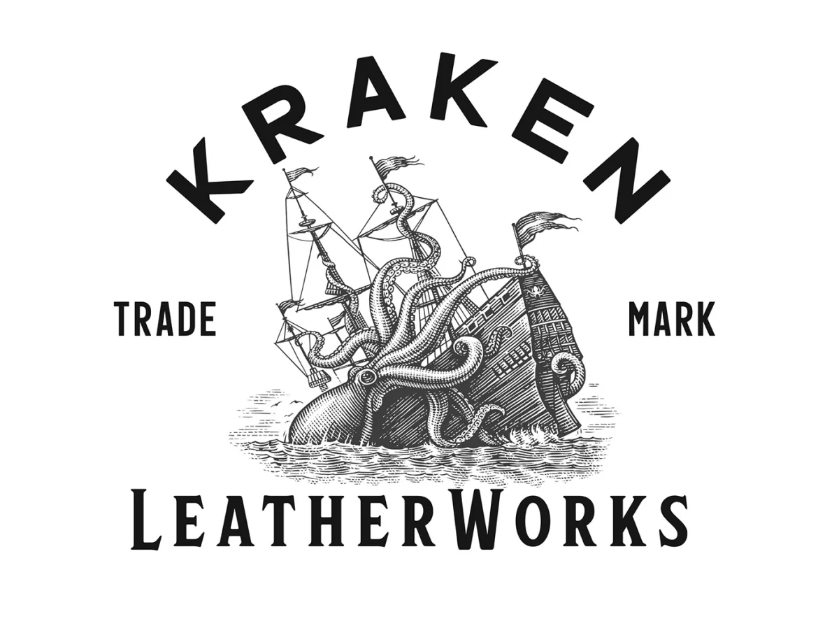
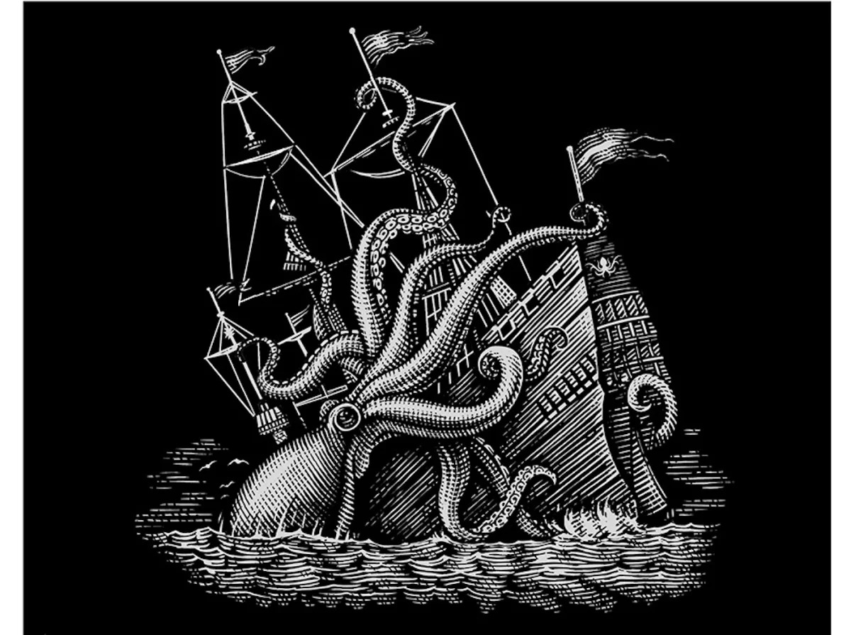
Kraken Leatherworks needed a custom logomark centered on a kraken attacking a galleon. Noble drew the image in a scratchboard woodcut style, with enough line detail to retain its character when reduced for different uses. That requirement makes the illustration’s line density a practical design decision: intricate marks need to describe the subject without collapsing when the logo appears smaller.
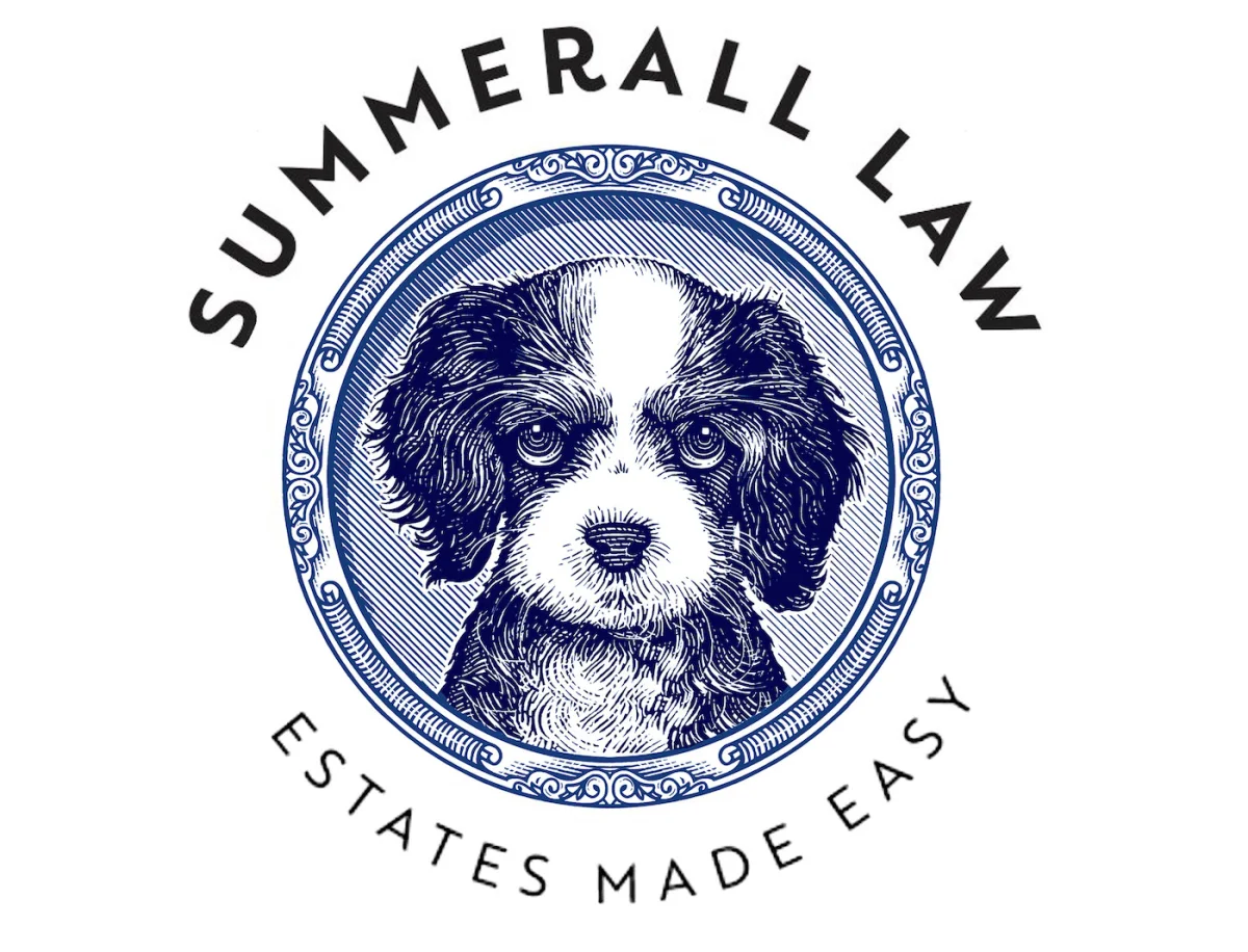
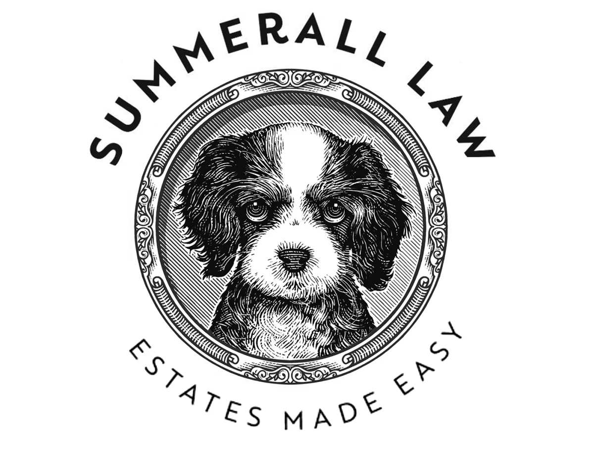
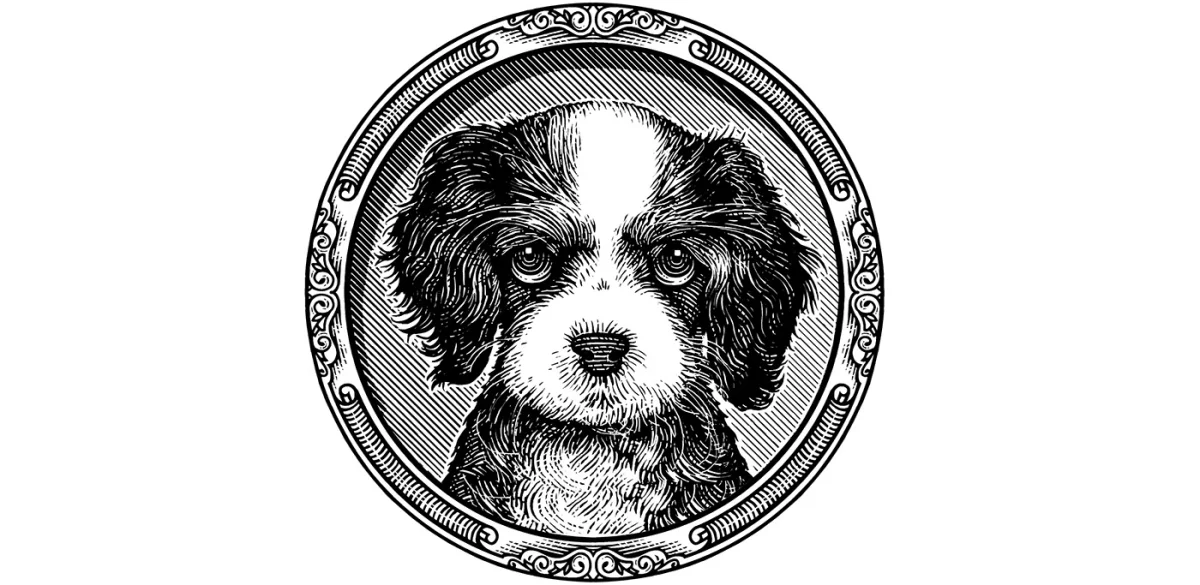
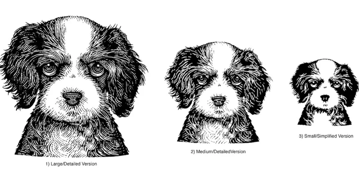
For Summerall Law, Tony Zimney commissioned a custom illustrated dog to give the estate-planning firm’s logomark a friendly character. Noble supplied three sizes for stationery and other collateral, drawing by hand in scratchboard style and delivering the files digitally as EPS vectors. The project links an analog drawing method to digital production, with the set of sizes addressing the mark’s different placements.
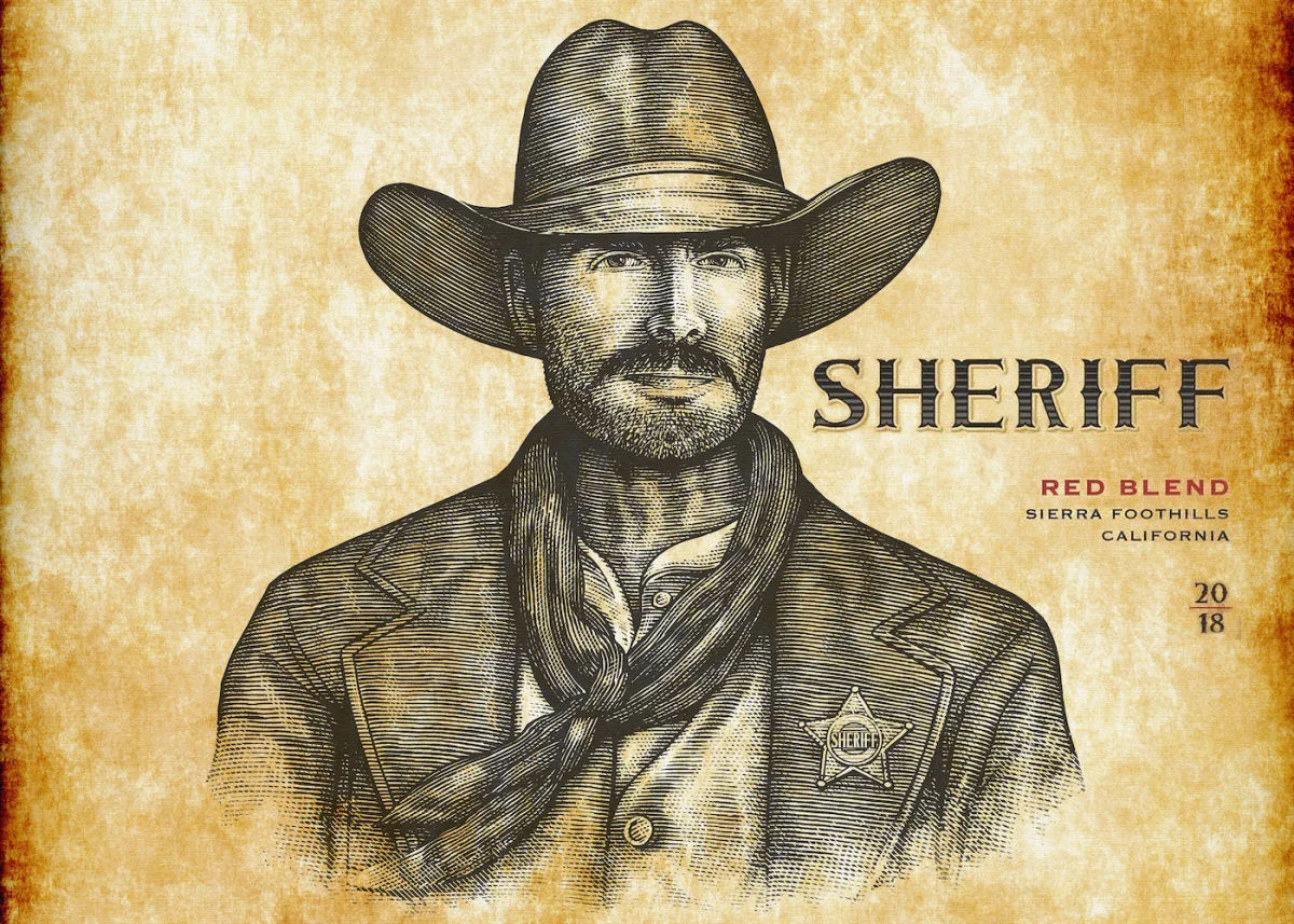
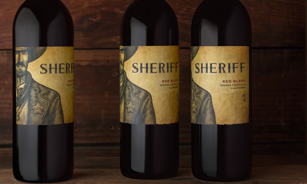
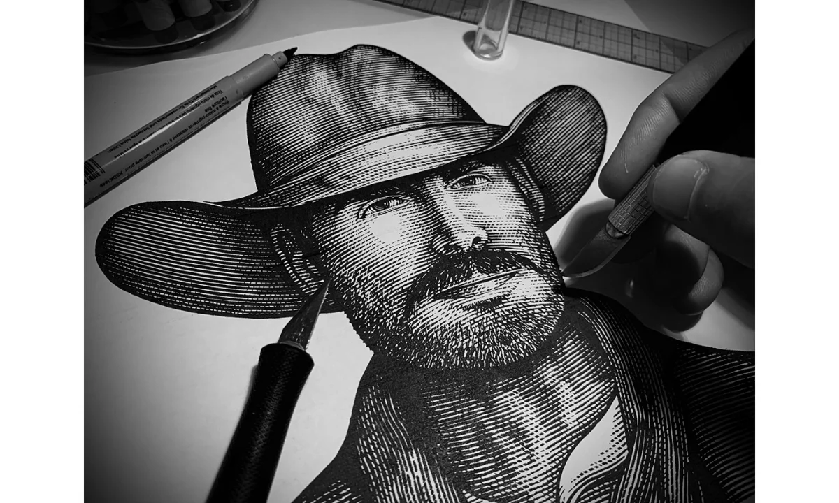
For Shadow Ranch’s Sheriff Wine, the illustration had a different scale challenge: Noble created a life-size portrait for cardboard display cutouts used in stores including Costco, Total Wine and Safeway. The hand-carved figure was made on scratchboard with an X-Acto knife and intended for textured paper with a worn, handcrafted feel. Its full-body scale lets the character occupy the display directly, turning illustration into a point-of-sale presence.

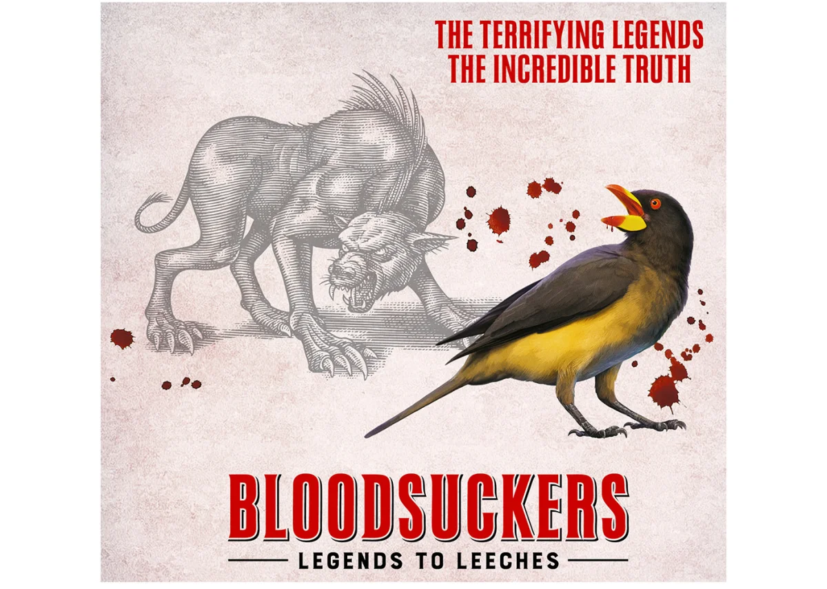
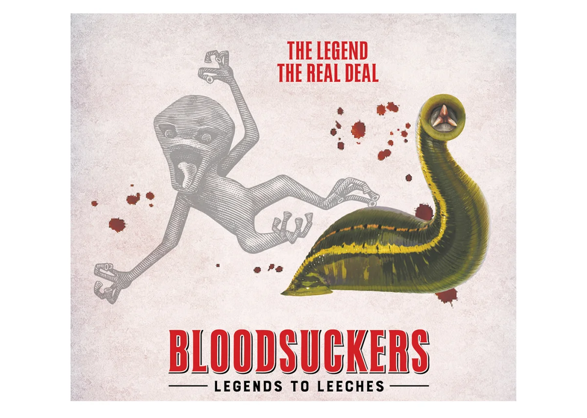
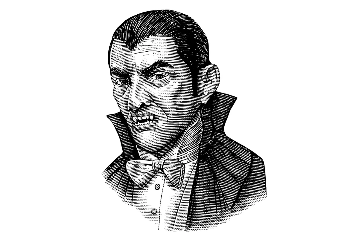
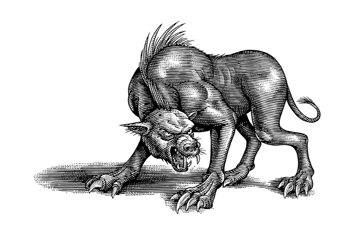
The Royal Ontario Museum in Toronto commissioned three illustrations for its Bloodsuckers exhibition: Dracula, the Chupacabra and the Yara-Ma-Yha-Who. Noble used traditional line art and engraving to connect the folklore subjects with the exhibition’s real animals, including lampreys, leeches and oxpecker birds. Across these assignments, the recurring lesson is practical: a distinctive etched style can carry a story, but the drawing still has to be planned for its actual job, whether that means label scale, a reduced mark or a large in-store display.
Images and text courtesy of Steven Noble. View his Directory of Illustration portfolio or visit his website.
| Rev | Description | Date |
|---|---|---|
| A | Issued for reading | |
| B | Viewed 468 times | Current |


